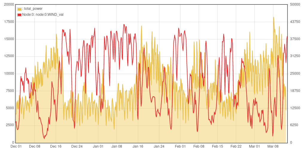
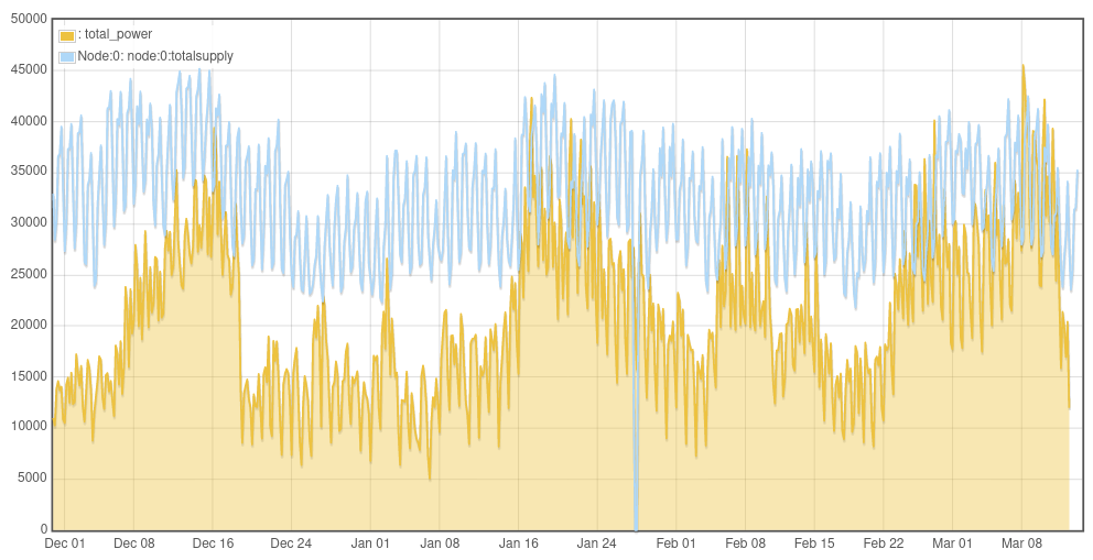
It’s possible to combine this dataset with the heat pump aggregation on a single graph by including the feedid of the uk grid dataset of interest. Here are a couple of examples, that highlight partly what we know already about low temperature periods also often being less windy:
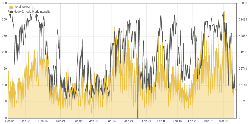
I need to check the carbon intensity calculation behind this one, it was based on one of the other sites recording carbon intensity but probably needs revising.
The correlation between those two is pretty tragic. Partly because the duration of the high intensity looks like it’ll go beyond the capacity of a cleanly-charged on-site battery powering a heat pump.
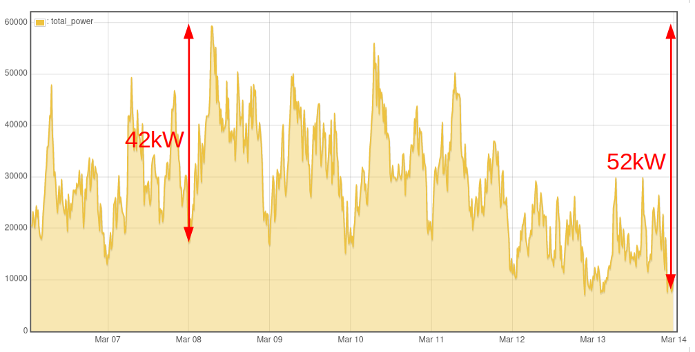
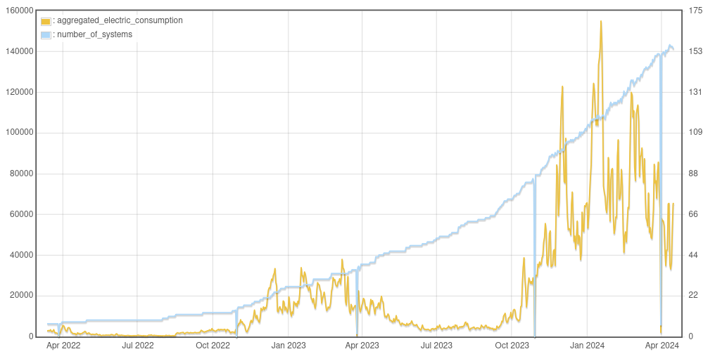
We had the highest peak consumption yet at 7am March 8th reaching just under 60kW. Maybe interesting to look at the ramp rate from the minimum of 18kW which was at midnight. A total ramp of 42kW over 7 hours (+6kW/hr). Probably all better expressed as proportions as the exact kW is not really relevant.
The difference between the highest peak consumption and the now milder weather minimum is 52kW - or milder weather maximum 60kW - 30kW = 30kW.
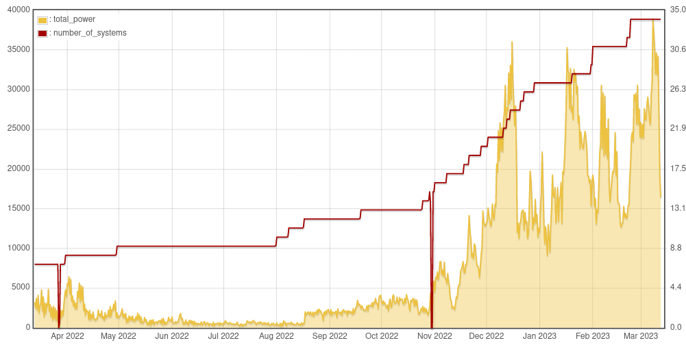
It will be interesting to see how this evolves as more systems are added. How much further smoothing do we get at the granular level…
I know a few people also have battery storage e.g @glyn.hudson and are not drawing from the grid at peak times. We are just seeing the heat pump consumption side of things here isolated from the overall consumption that the grid sees minus load shifting with batteries and onsite solar, though only expecting some short timescale shifting and relatively little solar at these times?
When I get a bit of time I will try and relate the above wind / heat pump comparison to the ZeroCarbonBritain hourly energy model that I helped convert to a web tool. It has both a significant wind component 66% of supply and a large heat pump component 90% of heat demand (the online hourly model tool can be found here: https://openenergymonitor.org/zcem/.
The heat pumps in that model drive a large component of the required backup capacity (renewable methane with gas turbines). Approximately 13% of the heat pump demand is provided via that long term storage route with the rest provided mostly directly.
So exciting to see how this is really coming together!
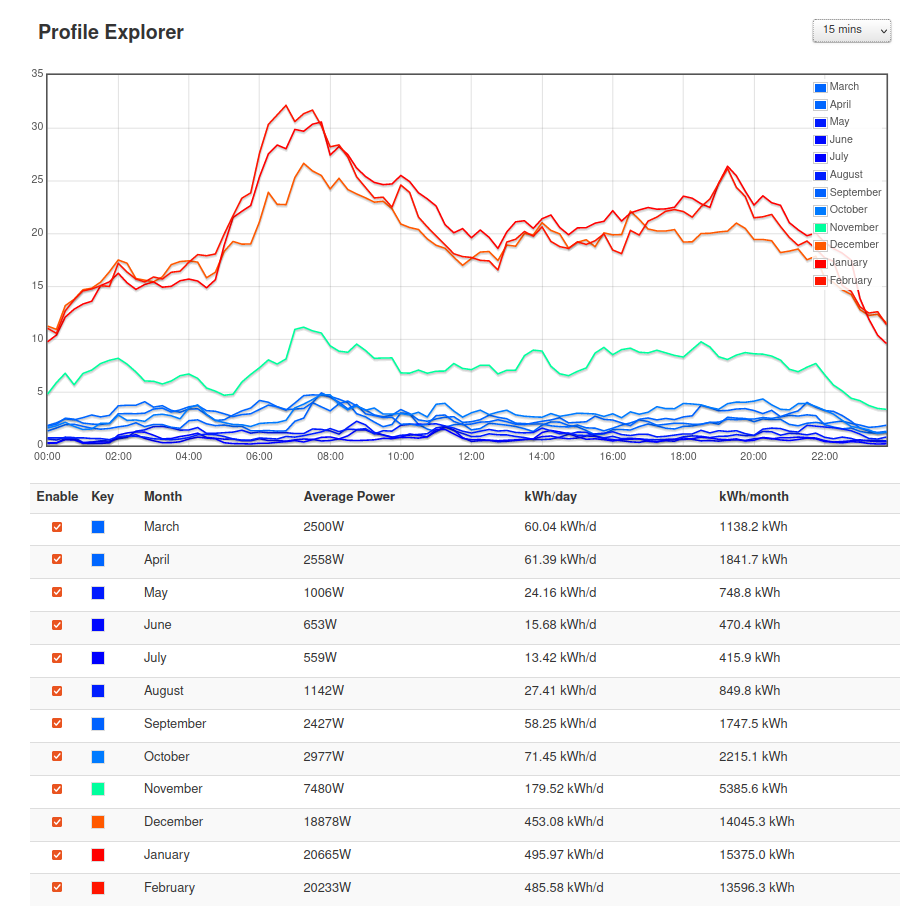
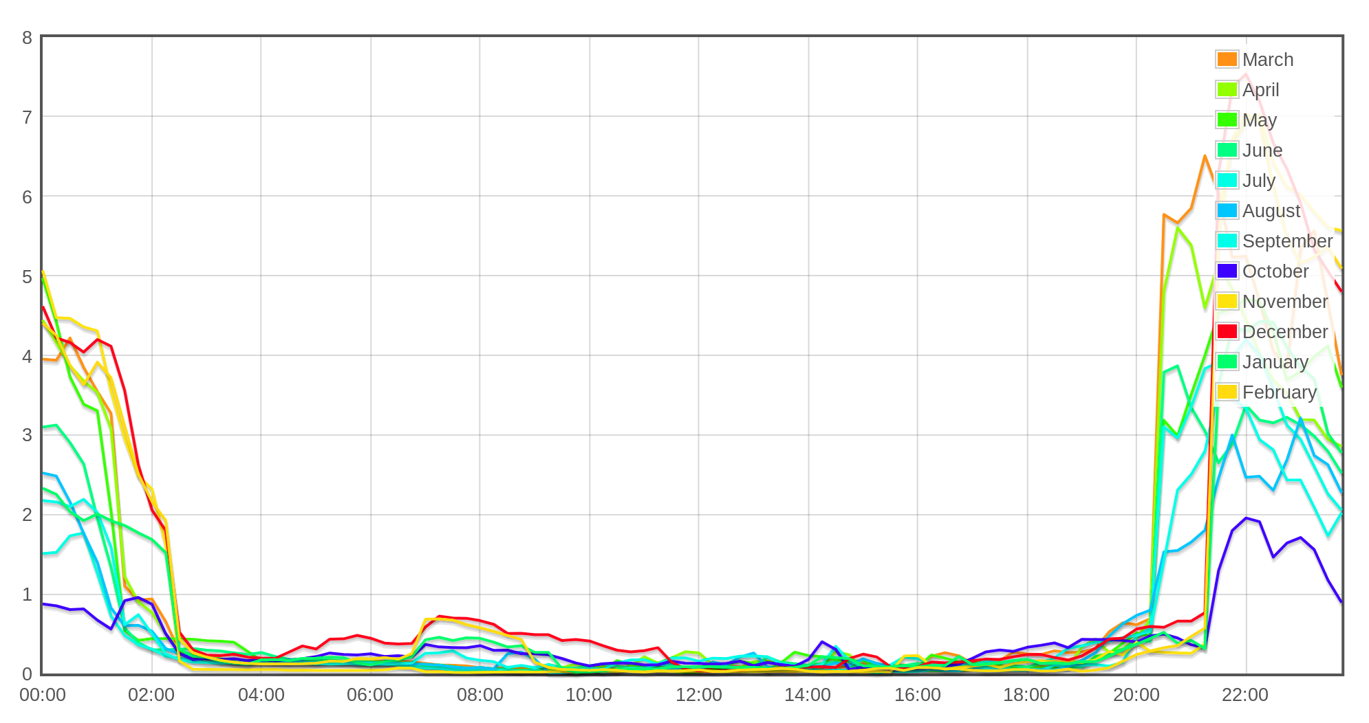
Does each month in the profile explorer only include heat pumps that have data for the whole month? Definitely can see the morning peak coming through although the profiles are much flatter than others in the literature (see below). This supports the original hypothesis that prior studies don’t show what is possible with high quality installations, controls, etc.
It would be useful to normalise the profiles in some sensible way…need to think more about this one.
The earlier months only have a few heat pumps, the number of heat pumps included in each months profile increases over time. The data from each heat pump is included even if that heat pump starts sharing data say mid December and yes no normalisation yet.
Did you mean to include a link with other profiles?
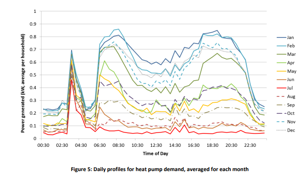
Oops yes, I meant to include these (from Customer Led Network Revolution project and an academic paper by J Love et al which used data from the Renewable Heat Premium Payment dataset).
Interesting chat on normalisation above. For the profiles I’m curious to see normalisation using either the total heating system rated output or the maximum consumption measured over the year (trickier without a full year’s worth of data for all the systems). Normalising by total heating system rated output would give an idea of what consumption would be expected if say 500 homes installed 5 kW systems - how high is the typical daily peak compared with 2500 kW? Of course that would be 2500 kW heat demand and we’re plotting electricity demand here, so the COPs would be factoring in as well but maybe that’s OK.
@TrystanLea It will be interesting to see how this evolves as more systems are added. How much further smoothing do we get at the granular level…
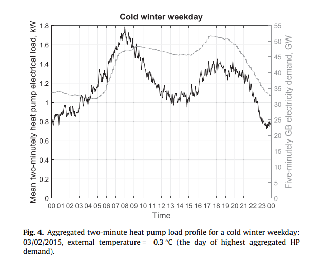
We may be close to the point where there is not much more smoothing, I’m curious to see! The Love paper found that the After Diversity Maximum Demand was 1.7 kW per household (with 700 homes in the study). If we’re seeing about 60 kW peak with 33 systems that’s 1.8 kW per household. But it may go down further due to the smoother overall operation of our sample.
Thanks! that cold winter peak is not too dissimilar to what we are seeing i guess, the difference between the night time minimum and maximum peak on March 8th is 42kW / 60kW = 70% which is more than the 1kW/1.8kW = 56% seen in that cold winter weekday example…
Interesting that all the example profiles in the J Love et al paper all have similar morning peaks. I would have thought it would have been higher evening peaks but looks like it’s the coming back from night time set back that’s driving the peak, rather than bumping up temperatures later in the day…
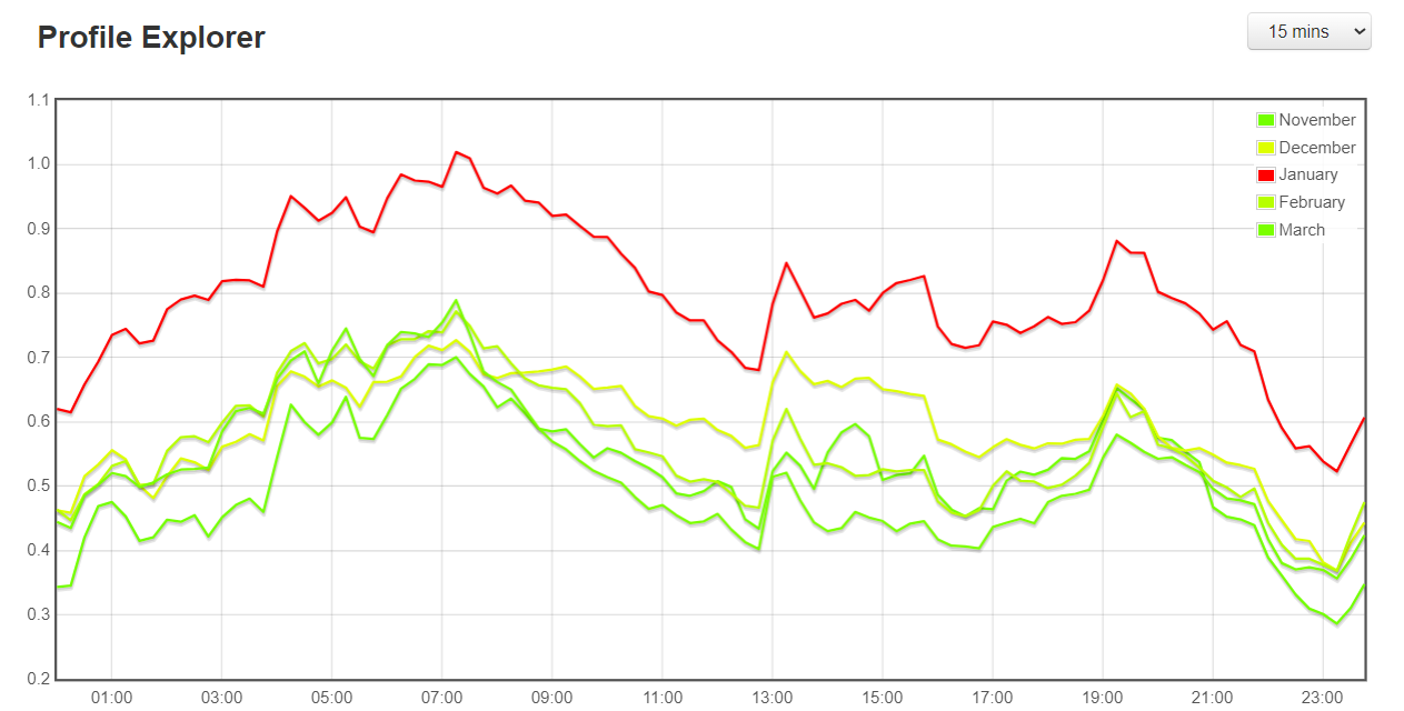
This is my import profile as seen by the gird, this is whole house including EV etc.
The mini peak at around 7am-8am is the heat pump coming out of nighttime setback, in the colder months my 9.5kWh battery is not quite enough to last all day, so I delay the battery output until about 10am to make sure it lasts until after the evening peak. However, after looking at the data above I think it would be a better idea to run the battery from 6am-10am then 4pm-8pm rather than just delay it’s starting time. This will require some custom automation since the battery controls only allow setting one start and one end time per day.
My Octopus Go Faster off-peak tariff starts at 21:30pm-2:30am, so this is when the battery and EV starts charging back up, hence the big peak! I’ve only got a small solar PV array, so solar doesn’t contribute very much during the winter.
SSE now have plans to allow load aggregators to pay them extra at the most popular times for electricity use, sell “flexibility”, and stuff like that. They say that they want 50kW minimum aggregated and they don’t seem to specify where that be located.
At home, I did things differently. Recognising poor availability of rooftop solar on the coldest winter days, I kept the gas boiler and got a small heat pump, 0.7kW(electrical) 2kW(thermal) to be run for free with local rooftop solar power whenever it is both cold and sunny, as today. It seems from your charts that there is poor availability of national grid power too at the times when I’d most wanted it, so I’ll want more renewables, preferably some local onshore wind.
Hi Trystan, can you explain a little the data we see here https://emoncms.org/heatpumpmonitororg… eg March has higher kWh/day than Feb but for kWh/month the situation is reversed? Actually looking at it more closely it looks like only March 2023 is looking odd. Also are graphs totals or averages? Wouldn’t averages make more sense?
I’ve updated the script that runs this aggregation and it’s now working again, it’s still normalising by dividing total demand by the number of heat pumps in the sample so perhaps not the best way of normalising but it is back up and running anyway.
Interesting how the HeatPumpMonitor cohort has a small peak/plateau around 13:15-15:45h (and a dip around 12:45h)?
Is this set / skewed by 1 or 2 of the larger systems?
Hot water heating? No idea how/when most have theirs configured, but running during the warmest part of the day may make sense? Assume the y axis is electrical demand?