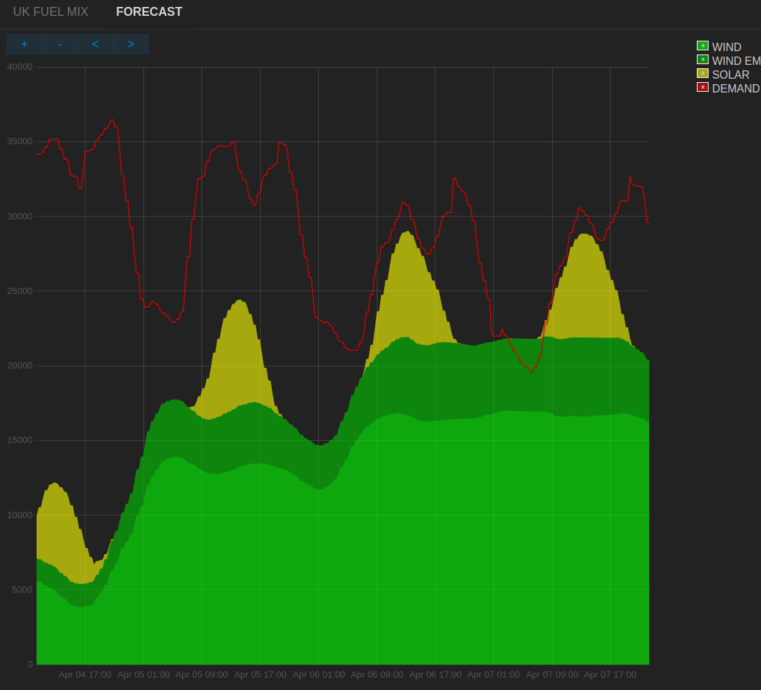
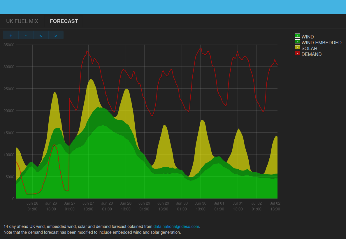
In addition to historic fuel mix there are a number of useful forecasts including a 14 day ahead wind, solar and demand forecast! I’ve created an Emoncms app to graph this data, a public version is available here:
I’ve been trying to explore if I can schedule my EV charging during times of high night time wind output and having a 7 day ahead forecast really helps to see when it might be a good time to do so (I dont have home solar and am on the Octopus GO tariff). I will try and do an analysis of my success or otherwise in doing this at some point.
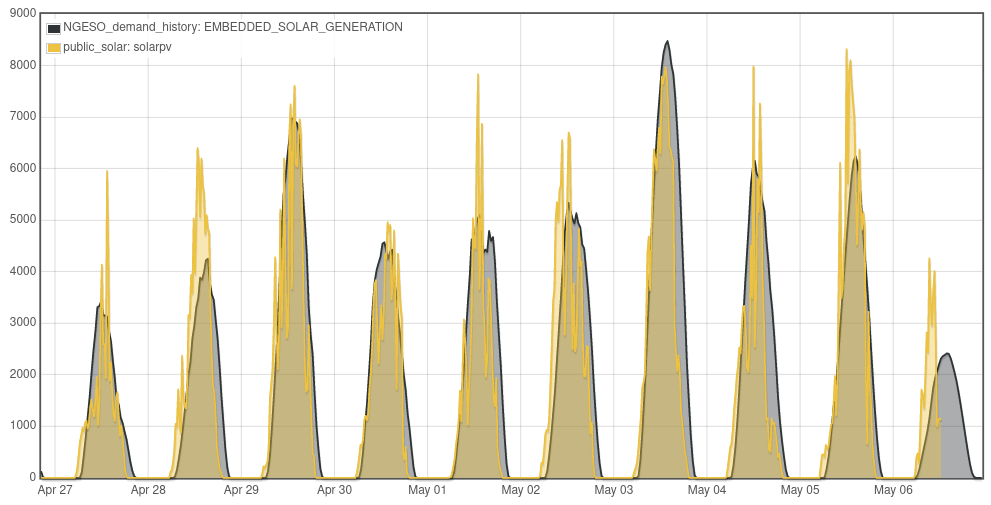
I’d like to compare my solar generation graphs over the last few years with the UK solar generation, mainly so I can see how my personal generation here in the south of England looks compared with the overall UK generation.
It’s not that easy to view historical UK solar data from the composite ones shown here. Do you know if UK solar only can be viewed easily without having to extract it from the datasets?
Hello @arnoldh we do ideally need a better way to access public feeds like this across accounts. Are you using emoncms.org or do you want to compare on a local pi?
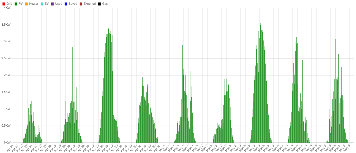
I am using a Microchip PIC based monitor to collect the data, which I analyse through a server running on a local pi. For example the PV I generated over Apr 27 to May 6 looks similar to the chart you attached.
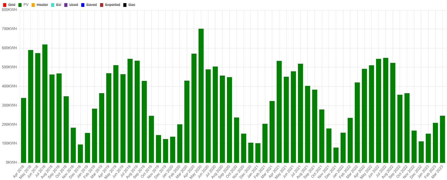
When I submit my Feed In Tariff generation readings to Scottish Power, I’m sometimes told the amount generated is more than they expect from my 4KW PV installation. Probably they don’t take account of regional variations in solar generation. I’d like to compare the shape of my data with the country as a whole. For example the solar energy I generated over the last 5 years looks like this
There seem to be two problems when I look at those links. In reverse order:
(1) The feed/view link leads to a display that shows a pale grey ‘Feeds’ in the top left and not much else apart from a arotating circular gizmo in the centre of the screen (FF 102.10.0esr (64-bit))
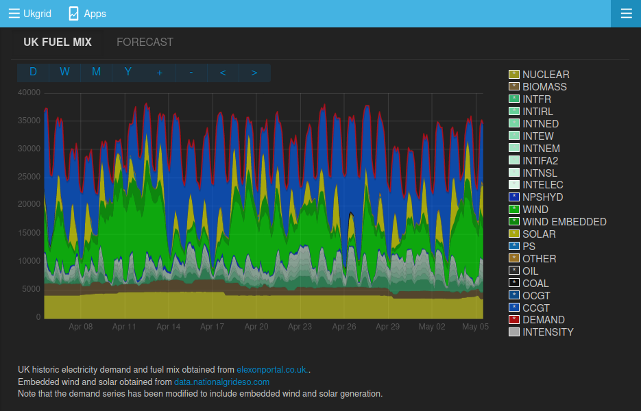
(2) The graphic display shows OK, but I don’t understand the numerical values. I take the left hand axis to be MW (it isn’t labelled)? In which case the graph of demand appears to be consistent, but the generation graphs aren’t. At the very left hand end where the wind looks to be about 5000, the tooltip says 779 MW. … Ah, never mind; it appears the graphs at the bottom are stacked above each other just to confuse me. A label to that effect would help!
@TrystanLea in the absence of the forecast data, a couple of years ago i implemented a fairly simple algorithm for my EV charging…
At the start of each half hour in the Go offpeak period, I read the carbonintensity.org grid emissions forecast for the next half hour. I then set a target SoC for my car in inverse proportion to the carbon intensity…
If the SoC < 40%, it will always charge to 40%, and i limit it to the 80% upper threshold (unless i set a specific SoC target).
Its very rare that the car ever gets down to 40%; in winter theres lots of wind, so its only in the occasional Dunkelflaute period that the car gets that low. In summer i have PV divert anyway, which does a good job of keeping it away from the bottom end when there’s not much wind at night.
I really should set up some logging of total carbon but I’ve not got round to that yet!
Hi, sorry do drag up this old thread, searching I couldn’t see any other similar queries.
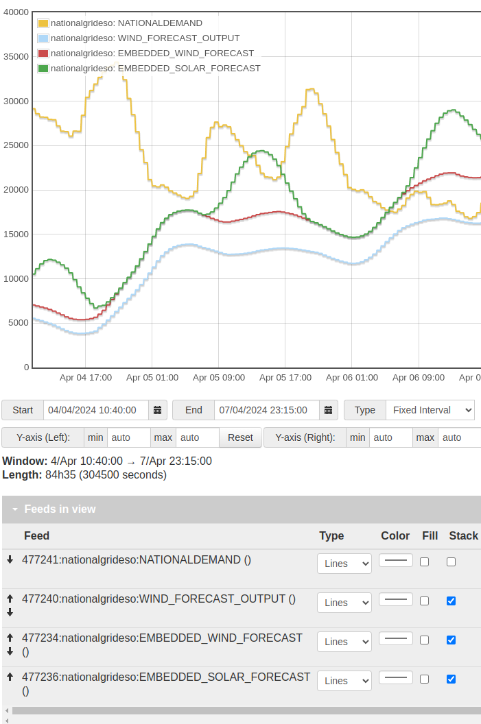
I’ve been poking around with your graphs a little lately, thanks so much for providing them. I’m confused about what looks like a difference between the main graph and the data in the Data viewer page.
Example is around 4pm on the 5th April - in the main graph I’m seeing Demand around 30.7MW But in the Data viewer it’s only showing about 21MW.
Any ideas on why I’m seeing this difference - I thought they were using the same data? Thanks very much.
Ah, I’ve modified the demand to include embedded wind and solar. The national grid demand figure is residual demand after embedded wind and solar has been subtracted and so if we’re showing these embedded generation values in relation to that demand we need to add the embedded values…