Introducing HeatpumpMonitor.org - a public dashboard of heat pump performance

Very nice! The new buttons look great. The cost comparison tool is very cool. Would it be possible to colour the cost green if it’s less than gas and red if it’s more than gas? This would make it very clear that most heatpumps on the site are cheaper than mains gas to run.

3 Likes

That does depend on the Unit Price you are paying for either, of course.

@Timbones looking at this,

image

I am not sure which value that 'Cost per kWh` is referring to. Should it be effective p/kWh (and swap the column with the gas column I’d suggest).

I think what you are trying to demonstrate is that for the measured heat output achieved, it has cost x in Electricity and would have cost y in gas.

Do you take into account the efficiency of the boiler (probably increases gas cost)?

It is an interesting stat.

Yes, this is “Cost per kWh of supplied heat”, compared to (say) 11p/kWh for gas heating.

I’ve assumed that gas powered systems are (at best) 90% efficient; possibly a bit generous but still a fair comparison.

2 Likes

For some reason the sorting by daily cost does not seem to work correctly?
PS this is now looking so cool.

4 Likes

Might be worth looking at making that clearer in the wording or a further explanation at the top.

I’d add that next to your ppu figures at the top.

It is a really good metric for comparison.

2 Likes

@Timbones It’s looking great now!

I do have a digital signal for DHW/Heating, so it could be left to users to find a way to tell the system as suggested by @dMb .

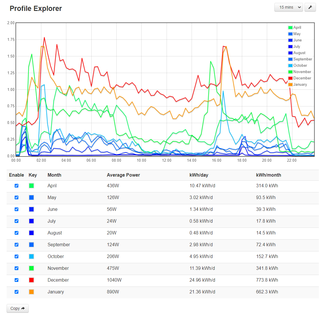
I wonder if you could also add, on the charts page, an option to do an average profile of all systems (possibly being able to select out GSHP/ASHP or some other paprameters that could be thought about - e.g. something on average ambient temperature or degree days) using something like the existing ‘Profile Explorer’ App. From a personal perpective I’m thinking that his could start to get quite useful from a policy/grid reinfrocement perspective when there are a few more systems on board, but it does also provide a way for people to compare their own system with the average in a more granular way. It may be a bit of big ask :slight_smile: , but just thought it might be interesting. This is my ASHP profile… (not got a full Feb or Mar yet)…

2 Likes

A monitoring trial of real-world efficiency of condensing boilers in 60 homes measured an efficiency of 82.5% https://assets.publishing.service.gov.uk/government/uploads/system/uploads/attachment_data/file/180950/In-situ_monitoring_of_condensing_boilers_final_report.pdf

It looks like quite a good study with lots of interesting graphs.

Only a few boilers got close to 90% efficiency, I think using 85% as the average efficiency would be closer to real-world:

4 Likes

Thanks Glyn, I might use that. That puts effective cost of a gas system closer to 12p per kWh of heat, meaning more of our heatpumps are “cheaper than gas” if they have a SCOP better than 2.9.

3 Likes

I’d agree with 85% - I was going to quote the same study Glyn posted, but it’s quite old - 2009 - and with recent campaigns to get people to lower flow temperatures averages are likley to have gone up a bit, but 90% seems pretty hard to achieve!

Rachel

5 Likes

Hi everyone. I’m a product manager at UK not-for-profit Icebreaker One, responsible amongst other things for the Open Net Zero net-zero data index.

We love HeatpumpMonitor and would like to index it but we’re having trouble finding the data behind the visualisations - our aim is to index the data itself to make it more readily available for people analysing it, rather than websites with tables or graphs.

Could someone point me in the right direction please, or tell me it’s not ready for that yet? With my “encouraging good data citizenship” hat on, I’d also recommend you publish a specific licence for people using the data on the site. The Creative Commons or Open Data Commons licences would be a good place to start (can’t link to them due to new user limitations on the forum). Happy to answer any questions about this.

Thanks!

Welcome, Chris, to the OEM forum.

You should be able to now.

Hi Chris,

We’ll need @TrystanLea and @Timbones to comment on the practicality of providing access to the underlying data.

The point about licensing was raised on a recent webinar discussing HeatpumpMonitor with a recognition that including Attribution for bare data is problematic and that a more permissive license might be appropriate - but the key thing is to declare which license applies.

We also discussed whether we would need the individual contributors to opt-in to making the data more widely available, which might need bottoming-out first.

Yes agreed that would be interesting to see. Will try and look at that next time I get a development window on this.

Seems fair to me

1 Like

Hello and welcome @chrispointon!

Are you after an API for the tables on heatpumpmonitor.org or the API’s for the high resolution data used for each individual heat pump e.g as used for creating an individual heat pump dashboard? Emoncms - app view dashboard.

Is your intention to mirror data on your servers? and what level of detail would you be seeking to mirror? e.g 10s data, daily summaries for individual heat pumps, 30 day data table comparison, annual?

Yes we need to sort and be clear on the licence as @dMb mentioned.

1 Like

Not necessarily an API. It could be as simple as one or more CSV files (or JSON or Parquet or format of your preference) that are refreshed periodically with the data. My thinking was it would be the data you’re publishing openly in the tables on heatpumpmonitor.org as this would be most easily set up. It is also anonymised which means the privacy controls can be less stringent.

For the granular individual data, I assume the heatpump owners wouldn’t want to publish it openly. We are working on a Trust Framework mechanism similar to Open Banking, where a third party service (an app for instance) can use a standard mechanism to get permission into an individual’s energy data. In that case you (the data publisher) and the app provider would need to be registered in the Trust Framework so your users can be confident the data access is from organisations that have been checked out and approved.

We’re not there yet, so I think we can assume individual device data is out of scope for the immediate term. I thought I’d flag up the concept as the heat pump data use case would be interesting to get set up.

No, we don’t mirror data. We just index it and point to the data resources on the data publisher’s site. As I mentioned, we prefer to index underlying data files rather than web renderings of the data as our intention is for the index to be fully machine-accessible to make it easier to include in data analysis tooling.

1 Like

Ok great, here’s the json data file that is used for the heatpumpmonitor.org front page, stats, costs and graph pages: http://heatpumpmonitor.org/data.json. This file is updated hourly, though you are unlikely to see much change during that interval, the 30 day stats will probably change a bit every day but not by a large amount.

2 Likes

Heres a good reason for not using EPC data as a reference…

Rachel

2 Likes

The Climate Change Committee put out a detailed proposal for overhauling EPC ratings earlier this month. We’ll have to see whether it goes anywhere.

3 Likes

A few folk have asked for a way to compare more detailed plots of e.g COP vs outside temperature, or COP vs flow - outside temperature using more granular data for each system e.g hourly averages… I’ve made a start on this… not finished yet but through Id update on progress so far:

Here’s an example with @Timbones’s heatpump in red and my heat pump in blue showing hourly average COP vs flow minus outside temperature over the last 30 days:

The size of each marker is proportional to the heat output in that hour.

My reading of this plot is that we have a lot of overlap especially below a DT of 26K (flow-outside). Then I seem to have some higher COP’s from 26-32K and very few points at the wider DT’s that @Timbones is seeing.

Comparing my system (blue) with @glyn.hudson’s system (red), gives a clearer shift in performance:

My system (blue) vs the Gloucestershire Ecodan (highest performer in the last month):

Any suggestions for things to incorporate would be welcome

7 Likes

This is awesome! Exactly the sort of thing I was hoping for. :heavy_heart_exclamation:

Some quick questions:

  • could this be packaged into an ‘app’ within EmonCMS, so that people can view their own data without having to share it? Perhaps without the comparing-to-another feature.
  • I’d really like to see how well my heat pump performed in February vs. December, or vs. this time last year. Either by selecting two time periods, or shifting the shade of the dots as they get older - is this useful to people generally? Or just tweakers?
  • is it just COP vs. temperature? what other comparisons are available? any thoughts on which ones could be useful?
  • is there a particular advantage to doing hourly averages? would daily averages require less processing while still providing the same insights?
2 Likes