Thoughts on the new Input and Feed page layouts

As part of the device module integration roll out there were significant changes to the input and feed pages (these changes can be used without the device module), I have recently tried the new pages and thought I would share some thoughts. (ref

Overall I like the new layout, but I would prefer the pages opened with all the subsections collapsed rather than open. However I’m pleased that it’s recognized that different users have different preferences and that’s being addressed (see emoncms/emoncms #990) the idea that the current status of the collapsible panels is held in the session cookie sounds great, although I think would still like to see a user default preference (open or closed) for new sessions.

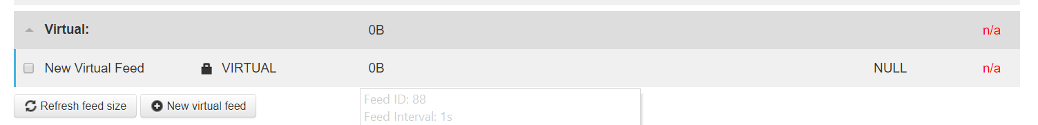
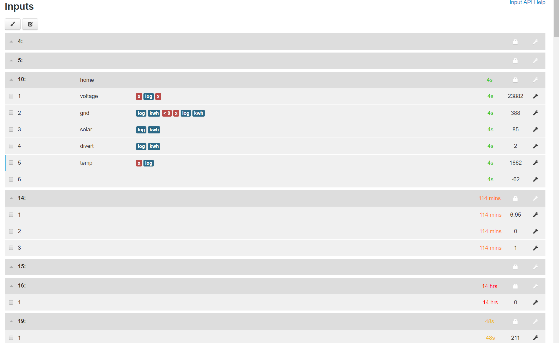
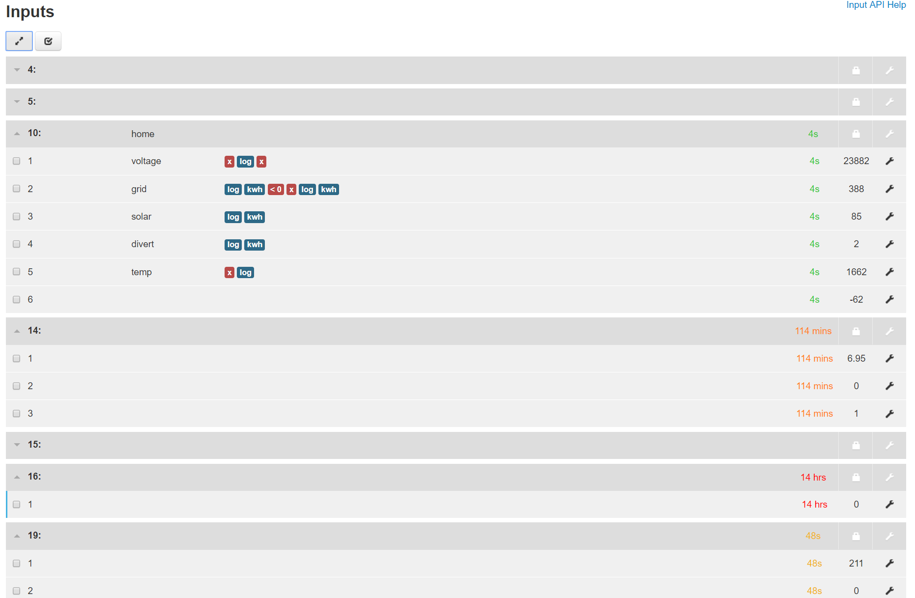
Most of my initial observations are about formatting and layout, they are my own thoughts and may well differ to other users, but here we go, here’s a look at a section of the feeds page

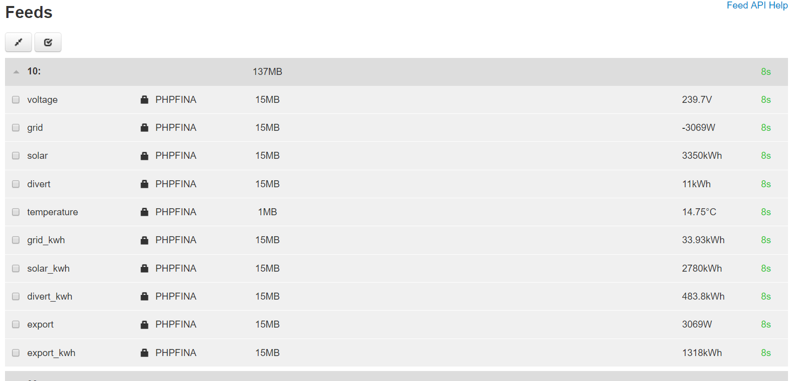
Firstly the most prominent thing that catches my eye first is the long column of padlocks and big “PHPFINA”, it dominates the page and is the least important info. I would like to see that info in a less prominent place, in fact it would be better placed in the fantastic little hover-over info box

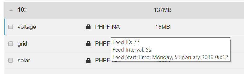
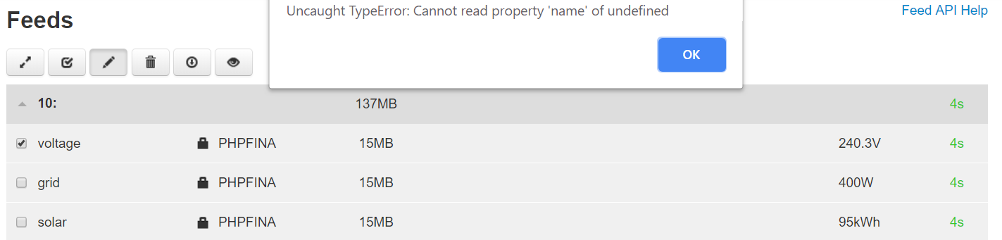
Small point, that info box has nothing in it to link it to a feed from the list, as you can see from this screen print, there is no way of knowing which feed I was hovering over. I know, but when presenting this to the forum for debugging etc there is no way of knowing without being told. For that reason I would like to see the feed tag:name in the hover over eg

10:voltage
Feed ID: 77
Feed Type: PHPFINA (5s)
Feed Start Time 1517818320
Monday, 5 Febuary 2018 08:12
Not public

It should also include the feed type so that can be removed from the main page, only if the feed type is “PHPFINA” would it also display the fixed interval (in brackets?) I think it’s maybe misleading to include the interval of 1s for PHPTIMESERIES and VIRTUAL feed types, they do not necessarily record data every 1s and sort of implying a PHPTIMESERIES is like a 1s PHPFINA further confuses the need to match PHPFINA intervals to the incoming data intervals ie if a phptimeseries is 1s and can be updated once an hour, why not use a phpfina 5s for the same job?

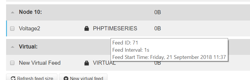
(the above screen shot is from the “Voltage2” feed but both the phptimeseries and virtual feeds display the same)

Also note in that last screnshot the feed start time is the current time, that might be because the feed hasn’t been used yet, or it might be because it isn’t a phpfina, so it doesn’t actually have a start time meta field, I haven’t confirmed which yet.

On the subject of start time, the seconds are omitted in the timedate string which need to be present and since we predominantly work in timestamps, the timestamp must be shown, I would prefer the timestamp to a datetime string if only one is shown, but both would be great.

I also think the public/not public indication could be in the hover over, but if it is to remain in the page table it should perhaps be moved to the far right.

With regards to the feed size values, again it is in the most prominent position and although pretty important info, it is most likely stale info unless you have refreshed the feed sizes using the button at the bottom.

image
and why are these buttons still at the bottom? Could they not go with the buttons at the top?

image

Perhaps the (stale) feed sizes could also be included in the hover over and the “refresh feed size” button changed to “show feed sizes” and the updated feed sizes are only shown after clicking the button, this clears clutter and prompts a refresh to specifically view the feed sizes, also, can we loose the old dialog box that displays the total feed size and forces an acknowledgement click?

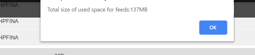
The total feed size could also be sited in that top button area (next to the “show feed sizes” button?) and that would negate the need for the dialog box and ack, and at the same time help those of us with near non-existent short term memory that have to refresh more than once as they forgot the total size as soon as they clicked “ok”.

The feed units are a really nice touch, but IMO there should be a space between the value and the unit for readability,

Given the size of each row, perhaps a more generous font size for the name and value could also be used to make reading easier.

When I make the browser window very narrow it hides most of the above stuff and looks so much neater and easier to read but it isn’t practical to work that way.

(although the eye is still drawn to the padlocks first)

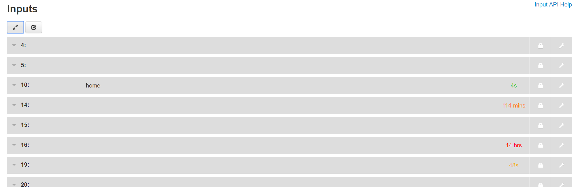
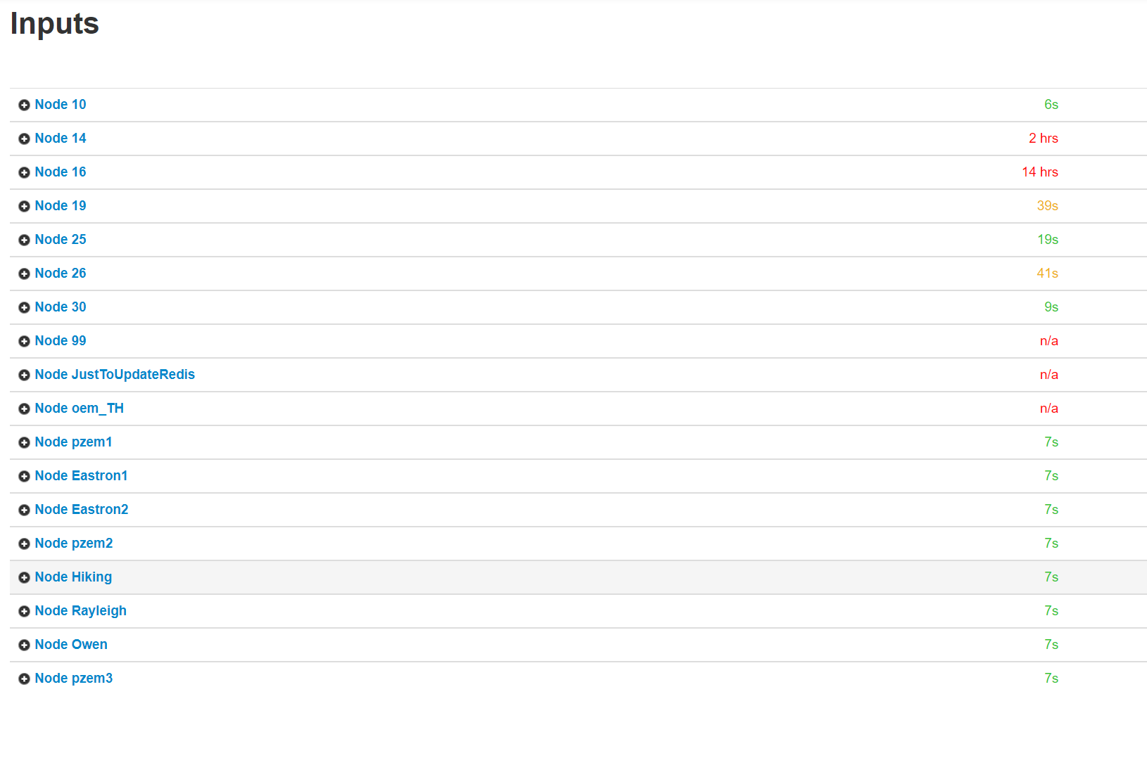
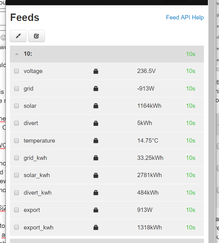
Likewise, the input page is so much cleaner

it could also benefit from a little boost in font size or weight (within the same row height?), but otherwise it looks great.

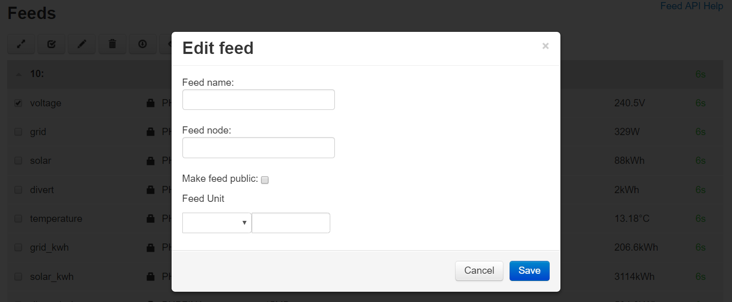
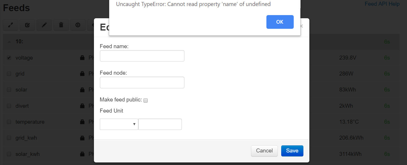
[edit] Just noticed, where is the edit virtual feed process list button on the feeds page now?

2 Likes

Those look pretty sensible suggestions to me.

1 Like

Thanks Robert, I can do sensible now and again :smile:

My point really was, it’s so very, very easy when you’re developing something like this to put in things that are important to the development process, and lose sight of what is useful and informative for the majority of the time to the end user.

One more: why is the feed size stale when the window is first opened?

Good suggestions @pb66 Im sure we can incorporate most of these, would you mind creating github issues for each one so that we can keep track of them on there?

I think that decision was made to lighten the load and open the feeds page quicker. so it uses saved data and only when you click the “refresh feed size” does it recalculate and update.

I have also just noticed a reference to " v2 feeds layout" in this github discussion, so I wonder how much of the above might still be relevant (Colours indicate feed status of activity · Issue #988 · emoncms/emoncms · GitHub)

Sure, but is this still the current layout moving forward (see my last post) is there another new one in the pipeline?

no Colours indicate feed status of activity · Issue #988 · emoncms/emoncms · GitHub was an idea that we wanted to test, to apply background colours as to active/inactive so that its clearer on mobile devices. @Emrys has just been working on that. I think Im keen for no change of background colour…

Deleted my post as Il add my comments to each item on the github issue list, I think it will be good having them all seperate issues there as it will keep our discussion organised around each item :slight_smile:

I’ve done the following issues, I’ll do the rest over the weekend

Remove feedtype from new feeds page (#1027)

Remove public “padlock” from feeds page (#1028)

Feed page hover-over info not clear as to which feed it belongs to (#1029)

Only phpfina feeds interval needs to be shown in feeds page hover-over info box (#1030)

Current time shown in some feed page hover over info boxes (#1031)

PHPFINA start time meta is displayed as a time/date string rather than a timestamp (#1032)

Seconds are not displayed in the hover-over info box (#1033)

Thanks @pb66 much appreciated!

No problem, I will try do the rest later.

[edit - A couple more]

Space between value and unit in feed view (#1035)

Feed and input page font size and weight (#1036)

Where have the virtual feed edit processlist buttons gone? (#1037)

Feeds page buttons at both top and bottom of page (#1038)

Just the ones relating to feed sizes left to do I think.

I’ve not had the new “beta” switched on much as I’ve been testing the indexedinputs branch which doesn’t work with the new interface pages yet.

I have however noticed i have an issue with the “edit” button all my pre-existing feeds, those that are updating and those that are currently dormant or never used. Both phpfina and phptimeseries (my single virtual feed works fine). I have been through the whole list and they all seem to raise this error.

When I click ok I get an unpopulated edit box, the feed units dropdown is the only thing in any of the boxes.

Oddley, but I think just a quirk and unrelated to the above issue, if I click another window whilst the first error notification is onscreen (ie I haven’t clicked ok yet) the unpopulated edit box appears underneath that notification the moment focus is taken to another window.

I’m on master branch, I’ve cleared the browser cache and I have rechecked for db updates, the browser console reports

Line 729 of the source is

I don’t know how I missed that?!! thanks for spotting it. Pull request in with the fix.

1 Like

Thanks @emrys.

@TrystanLea, Emrys has made quite a few changes for items in this thread, can they be merged for testing?

I just ran another update to my test repo to pull in any recent changes (still 8.9.31!) and switched to the “device integration beta” again, still having various issues eg some inputs give this error when trying to edit them (click of the spanner icon).

Also what I think maybe a new issue (not 100% sure, but cannot recall seeing previously) when I first open the inputs page (yes I have re-confirmed this after a ctrl-f5) some inputs are collapsed and some are open, below is a screenshot following anothe ctrl-f5.

as you can see, nodes 4, 5 and 15 are collapsed whilst 10,14,16 and 19 are open.

If I then click the collapse/uncollapse button they all collapse

click the button a second time and I get the same as the original page

However, that is it! the button no longer works. I have tried this multiple times and after 2 clicks each time the button stops working, only by refreshing the page or navigating away and back again does it give another 2 clicks of use (but no more than 2).

What is really odd about nodes 4,5 and 15 is that they don’t actually exist!

If I switch back to non-beta then the inputs are not there

confirmed they are not in the mysql tables using phpmyadmin

so I’m not entirely sure whats going on there. It’s quite possible I have deleted some test inputs at some point, but I have restarted this server in the last 2 weeks so there shouldn’t be anything orphaned and lingering in redis (I’m not willing to flushall() as my live server is on this same server).

Maybe something to do with indexedinputs??? But I’m definitely on master currently, but I was switching about a fair bit when this thread and the indexedinputs thread were active.

It seems to have gone a bit quiet again on the emoncms dev front, both here and on github.

Ok! So I have just tried switching to indexedinputs and tested, no change, the phantom inputs are there in beta mode but not in the classic view. Needless to say switching back to master hasn’t changed anything either.

HOWEVER!

What I have just discovered is that it seems to be that the new “beta” page uses an input “group” method or reference that the older view / version doesn’t use.

I have added 8 test devices (actual devices, not emoncms input “devices” from the device module) today and wanted to clear them off after testing, so I used the input/clean api and now I have 8 more phantom inputs, the actual inputs (each input id) has been deleted, but the input group remains, since the group is empty, that is why it doesn’t expand and collapse, there is nothing to expand.

But where does this input grouping exist? somewhere that only the new input page accesses and uses it I guess?

Okay, answering my own question here now, I found it, it’s stored as a device in the device table (duh!), so we now need to manually delete each device, deleting all the individual inputs is no longer enough to get rid of the “input” aka “device” aka “node”, well that’s a bit of an eye opener!

[edit] - and with hindsight this was possibly better discussed in the Using the new emoncms device module integration thread, I’ve added a link back here.

Yes, these are devices and part of the device integration.

After getting used to the way it works, I’d be interested to know if this presents a big problem to the usability of the interface. The idea is that there is now this new definition of the device that is integrated in the interface, I wanted to be able to access all the functionality available from the device module itself through the input interface. If devices without inputs were hidden, would you need to navigate to the device module to access these devices?

The work on the “new look” being discussed on this thread seems to have slowed up so I’m no longer running beta as the work is incomplete and not currently moving,

I’m not yet sold on the idea of all inputs being devices, but that aside, there are 2 other issues I’ve reported in the 2 posts above, an Uncaught TypeError: Cannot read property "description" of undefined error on some but not all inputs when I try to edit and the collapse button only works for 2 presses unless I refresh the page and then the whole page is uncollapsed again so collapsing burns up one use every time I open the page and the second press only uncollapses once with no way to collapse again, so the button is effectively useless currently (except to collapse all once to how I believe the page should open).

I have so many inputs and feeds that the fact the page doesn’t open with all collapsed is a deal breaker for me, even if the button does work.

Another concern for me with the “all inputs are devices” is the fact that we rely heavily on “odds” for security, the apikeys are a very simple security method and has generally worked well so far. But I currently have 20 devices set up (only a small number were via the device module, the rest have been made into devices by the new integration) As I see it I now have 21x as many chances of having my data corrupted by chance eg someone posting with a typo in their apikey etc. I have not done the maths, it may well still be unlikely to happen, but none the less it is 21x more likely to happen than before and I am not gaining anything for that risk as I’m not using any of those new devicekeys. Those 20 “holes” in my security are not serving any purpose.

I have said this before in the early device module discussions, I would prefer devices were created without a devicekey and only assigned one when I choose to set one (if the device already has a devicekey assigned) or generate a new random one at a press of a button to then pass on to the device in question. This was an issue for me when I only had half a dozen “devices” now I have 20 of them on this test emoncms instance, if I want to use the “new look”.

is this behaviour present if you do not have devices with empty input lists? struggling to replicate this case? Is it related to the saving of collapsed/expanded state in the cookie?

I will look into a way of disabling per device access keys per default, that was a part of the device module. The device keys could be enabled by clicking on new access key in the device configuration interface.