Agree.
Axis labels are fab, thanks!
Agree.
Axis labels are fab, thanks!
Agree it’s a very useful addition, but not sure if it’s OTT for most users? The Auto-update indication is kind of useful, but IMHO most people are not going to care which source of data you’re using.
Love it, though you can probably lose a decimal place on the numbers.
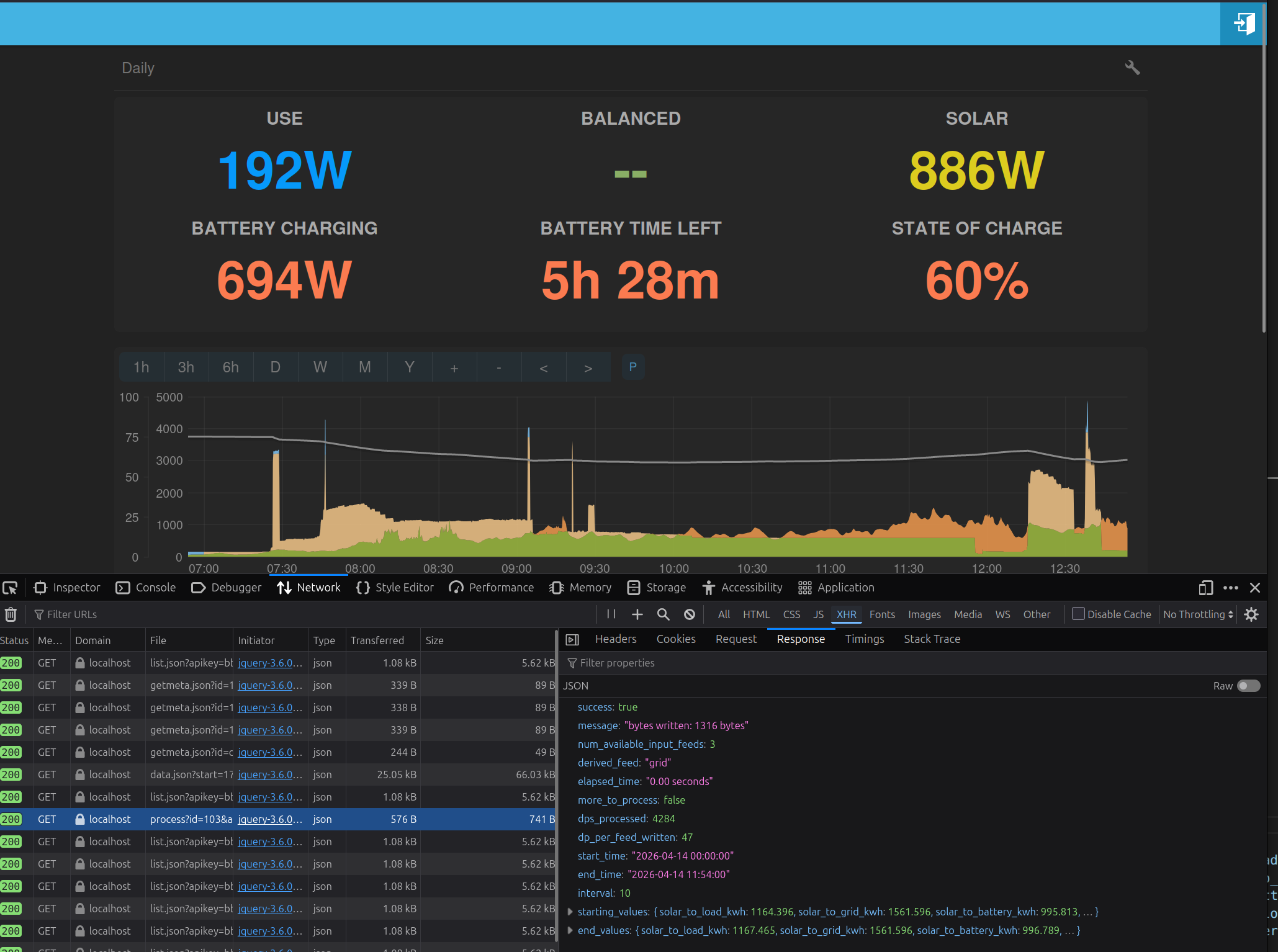
Also, daily history includes today, but this will never have data in it. Can this be show up to yesterday instead? An additional shift by half-a-day would also be nice, if possible.
Edit: I’d expect a week to show 7 bars, and a month to show 30.
Tooltip is very nice, but is often empty on the daily chart. The bottom 2 or 3 series are usually fine, while the upper ones are usually not. Nothing in the console to say why this is.
Oh. It is working now. Not sure what’s changed; perhaps something got stuck in cache.
And another thing (sorry)…
The tooltip only shows when the mouse is near a data point, and not when in the coloured area between points. Given that the contents of the tooltip is the same for any series at a given point on the X axis, can it simple appear all the time?
It’s after midnight, and I’ve a crazy idea. I don’t know if it’s any good, but here it is:
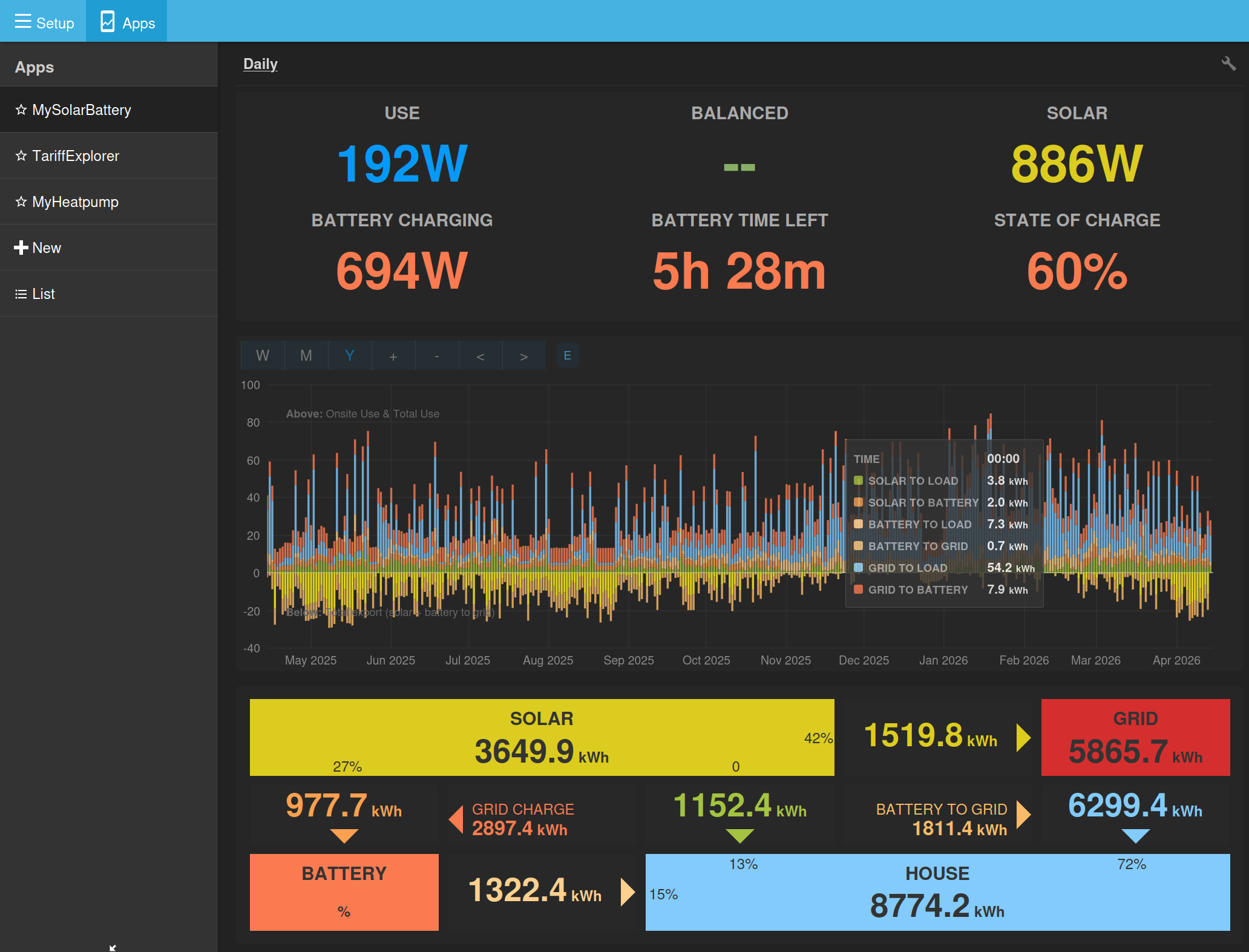
Many emoncms users who have solar and battery installed are also likely to have a heat pump too, so how about adding that to the chart? Or is that too much?
Option 1
The simple option: add 1 extra feed, overlaid on top of the other data (blue/purple in my mock-up). Base load appears above the heat pump consumption. Stats box for ‘House’ has another one beneath it for ‘Heat pump’ with kWh and percent.
Option 2
More complicated is to split ‘House’ in two: heat pump vs the rest. These then get stacked on top of each other so heat pump sits on top of base load. (Only showing consumption here)
To really do this properly, you’ll need to have separate numbers for solar_to_heatpump, grid_to_heatpump and battery_to_heatpump, plus 3 new colours that fit in with the others, and then 3 more kWh feeds to be preprocessed. Might give some lovely stats on real running costs…
A potential issue here (at least with my system) is that house consumption and heat pump consumption power measurements could come from different sources at different times and intervals, so the live subtraction between the two can result is discrepancies and glitches. Less of a problem at the kWh scale, so long as preprocessing is done in the right order. Of course, this disappears when if both power measurements come from CT clamps via EmonPi.
One could use the same mechanism for showing PV divert, something that has been requested of this app. The right generic solution could be used for either (but not both together).
Stretching this further, EV charging could also be separated out using same system. Or, go whole hog and add solar_to_ev, grid_to_ev, and ev_to_house.
Supporting all three at once would be mind bogglingly complicated, so I suggest having either a) one single additional feed that can be used for any of those 3 with solar vs grid vs battery energy flow, or b) 3 optional feeds that are shown as sub-components of house consumption without energy flow.
solar_to_X, grid_to_X, battery_to_X
X_to_house, X_to_grid, X_to_battery (if EV)
or
House consumption X kWh (Y% heat pump, Z% immersion)
![]()
Thanks @Timbones, I’ve been thinking along similar lines. I’m not totally sure if we need to show it on the power graph—although that makes more sense for divert. Where I think integrating that disaggregated data could be really useful is to get at stats like:
Average unit rate of electric delivered to: heat pump, car, rest of the house.
% of each demand type delivered direct via solar or solar + battery.
Carbon intensity of each demand type.
I think it may require integrating these in the post-processing as well, which could certainly be mindbogglingly complicated as you suggest, but worthwhile if we can get there.
I applaud your creativeness and ambition, but there is something that has been troubling me for a while which I haven’t been able to express clearly enough, so I have kept (mostly) quiet about it. Adding heat pump and/or divert to the app is only going to make it worse, so now I need to have a go at explaining it. Here goes…
A system with Solar PV (and Load and Grid) only is simple to understand, the flows of power are obvious and unambiguous. Introducing a battery, however, also introduces a strategy. How? There has to be some battery control logic - when to charge, when to discharge, and at what rate. In the most basic (and obvious) case the strategy will be to:
Use whatever Solar there is to power the Load
if there’s some Solar left over, use it to charge the Battery
any remaining Solar has to be exported to the Grid. It has to go somewhere.
This is the strategy the app uses to calculate the 3 Solar flows (Solar-to-Load, Solar-to-Battery, Solar-to-Grid).
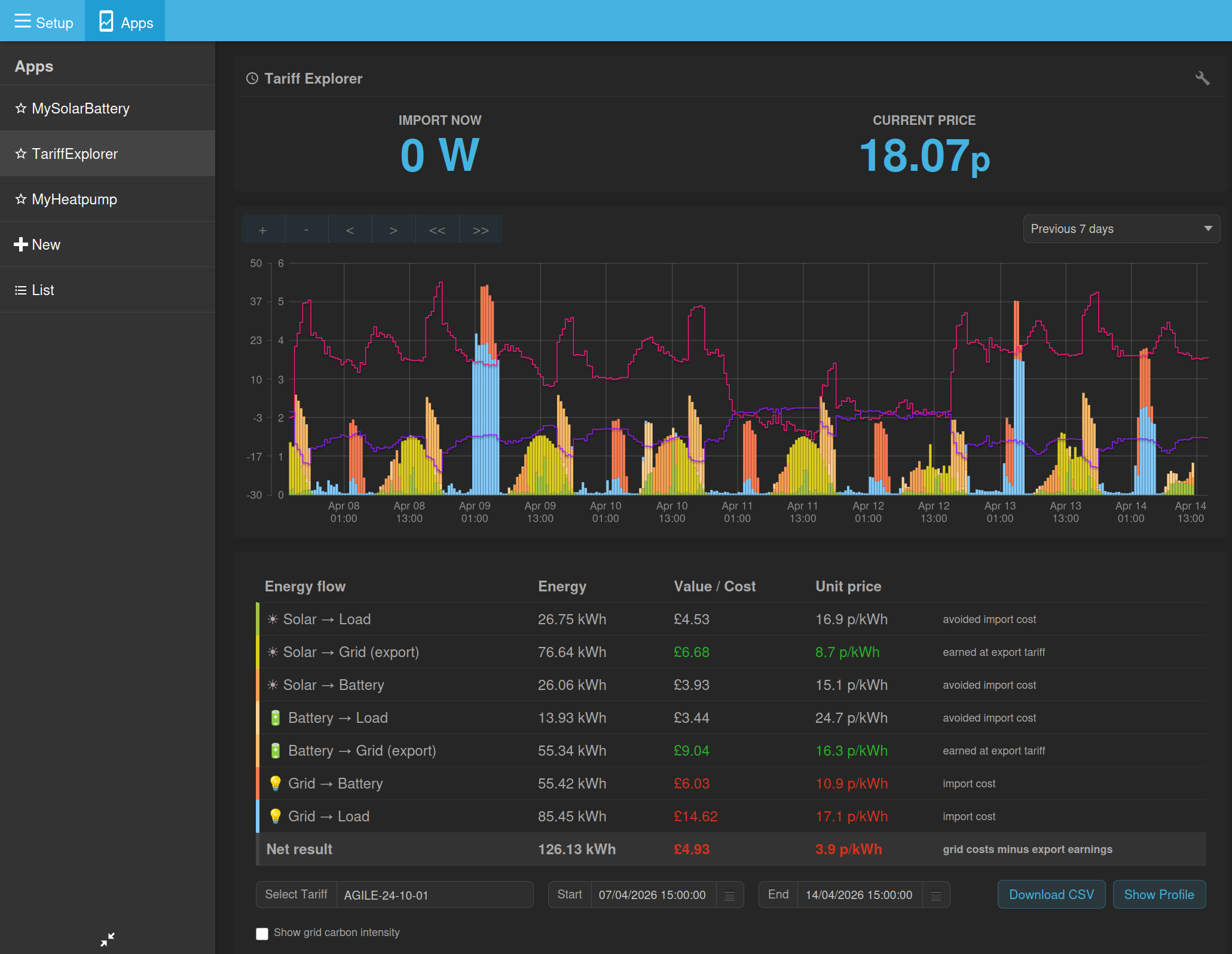
But the world is no longer simple. Many of us employ time-of-use (TOU) tariffs, either fixed (e.g. Octopus Go/Flux, or dynamically variable such as Octopus Agile) and the set of 'Intelligent’ variants. Many will also be using the Smart Export Guarantee (e.g. Outgoing Octopus) so that there is an additional value in exporting to the grid.
Battery systems exploit these new tariffs by using a dynamic strategy, which is primarily based on the cost of importing and exporting power to the grid at any particular time and whose goal is normally to minimise cost to the user (others are possible). They do this by dynamically controlling the battery charge/discharge rate - it is the only thing they can control. The result is that the battery indirectly controls grid import/export (within limits, because there is a physically imposed maximum charge and discharge rate).
The problem is that the app doesn’t have any idea about this strategy. So when it allocates power (and derived energy) to the 7 possible routes (solar to load, solar to battery, battery to grid etc etc), it sometimes gets it ‘wrong’. Wrong is in quotes because it’s NOT wrong, the app is just using assumptions which may be different fro the ones actually being used by the system. So it’s possibly better to say ‘misleading’.
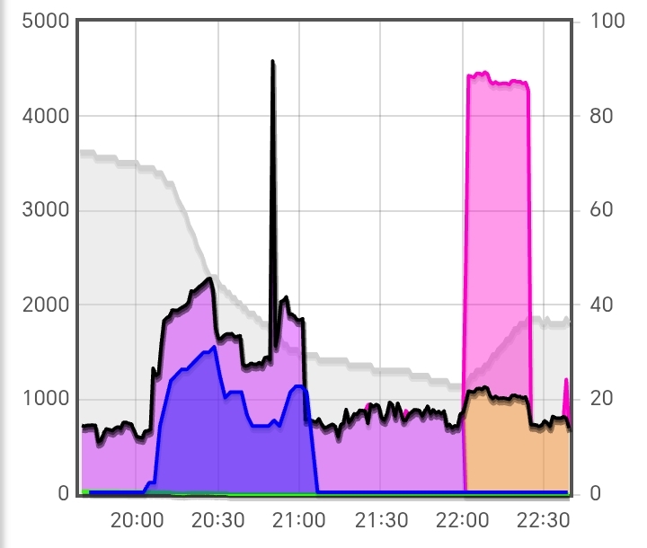
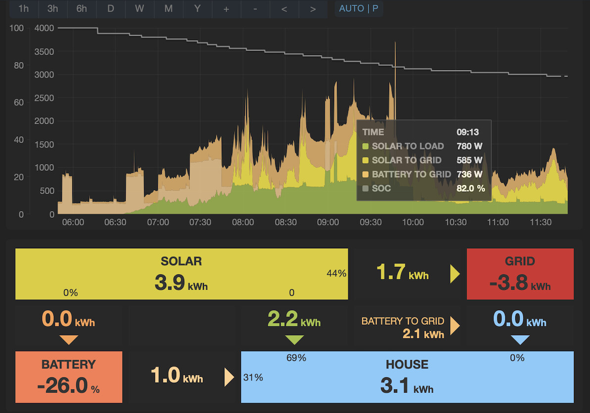
Does this matter? Partly. It does NOT distort the energy totals generated/consumed by the 4 entities Solar, Battery, Load and Grid. It DOES distort how the flows of power and energy between the 4 entities are presented though. So for example:
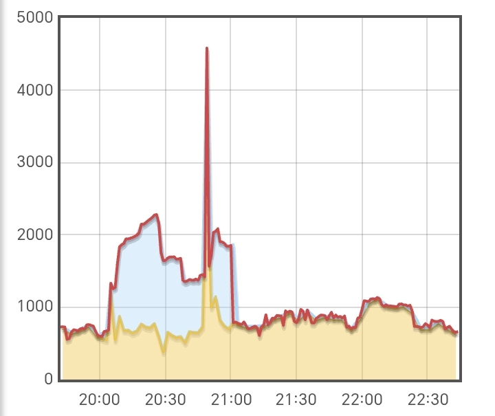
…the most striking area of concern is in the energy distribution section at the bottom, the totals in the boxes are correct. The distribution of energy between them assumes a different strategy from the one actually being employed by, in this case, my Tesla Powerwall battery system. So the energy flow values are not ‘wrong’, they are different from the ones that the Tesla app will show you (sometimes by a lot) which reflect the Powerwall’s strategy. For example the Tesla app will show you that Solar-to-House is 0 kWh, Solar-to-Grid is 3.9 kWh (1.7+2.2), Battery-to-Grid is 0kWh and Battery-to-House is 3.1 kWh (1.0+2.1).
Of course the Tesla app can do this because it is the one who is controlling the battery charge/discharge rate - it has ‘inside information’. Incidentally Tesla historically have not been very obliging when it comes to sharing such information via an API for example, so there’s no potential solution there I don’t think.
Of lesser concern is that the realtime graph and tooltip show the app-assumed values which are different from the flows reflecting the battery’s strategy.
So again, does it matter? For me the main issue is that anyone using this assumed flow information literally might be being misled over how their system is operating; and one of the biggest benefits of this app is that it helps people understand their systems, and in this case it is compromised. Of lesser concern is that I personally just have to remember to ignore all the flow information, which means I have to interpret the colours of the realtime power graph differently and I probably won’t use the Daily charts at all.
I don’t know if this is possible or likely, but people might also try and attribute monetary values to the different flows, and it could be easy to get them wrong.
I know @Timbones has observed this issue too. I desperately wish I could offer even the bones of a solution, but I can’t.
My one remaining question is this: is it better not to show the flow information at all, rather than displaying potentially ‘wrong’ information?
It is this issue that caused me to stop developing this app to include Diverts a few years ago. Adding heat pump is, as I said, going to introduce yet more assumptions I fear.
Apologies for the ramble. I think it’s important.
Great points @PeteF
It seems to me in your example there is a specific strategy that could be select-able in the app. E.g:
Are there more strategies or calculation approaches than this?
This is the current flow calculation code for reference:
function flow_calculation(input) {

    const solar = input.solar;
    const use = input.use;
    const battery = input.battery;
    const grid = input.grid;

    // Import/export split: positive grid = import, negative grid = export
    const import_power = grid > 0 ? grid : 0;

    // SOLAR flows
    const solar_to_load = Math.min(solar, use);
    let solar_to_battery = 0;
    if (battery < 0) {
        // Battery is charging: solar to battery is the lesser of available solar and battery charge power
        solar_to_battery = Math.min(solar - solar_to_load, -battery);
    }
    const solar_to_grid = solar - solar_to_load - solar_to_battery;

    // BATTERY flows
    let battery_to_load = 0;
    let battery_to_grid = 0;
    if (battery > 0) {
        // Battery is discharging
        battery_to_load = Math.min(battery, use - solar_to_load);
        battery_to_grid = battery - battery_to_load;
    }

    // GRID flows
    let grid_to_load = 0;
    let grid_to_battery = 0;
    if (import_power > 0) {
        grid_to_load = Math.min(import_power, use - solar_to_load - battery_to_load);
        grid_to_battery = Math.min(import_power - grid_to_load, battery < 0 ? -battery - solar_to_battery : 0);
    }

    return {
        solar_to_load: solar_to_load,
        solar_to_battery: solar_to_battery,
        solar_to_grid: solar_to_grid,
        battery_to_load: battery_to_load,
        battery_to_grid: battery_to_grid,
        grid_to_load: grid_to_load,
        grid_to_battery: grid_to_battery
    }
}
Yes, for sure there is at least one which @Timbones reported earlier in this thread, concerning battery charging from grid - he could explain it better than I though.
I fear that there are many more possible scenarios, but it may be that some or many of them are either illogical or very unlikely to occur. How many possibles? Well you have 3 sets of calculations (solar flows, battery flows and grid flows) so there are 6 possible orders in which they could be done (e.g. you could calculate grid flows first, battery flows next, then solar flows). Within the solar flow calculation you have 3 solar flows to calculate so the order in which you do these also has 6 possibilities. Within the battery and grid flow calculations, only 2 possibilities each. I think that might yield 144 possibilities, which is clearly untenable. I think the best approach might be to go through the 7 flow routes, and pose questions about possible strategies for each. I’ll try this evening, but not promising a result!
The other aspect of this is that the strategy can be dynamic, the battery can (and does in the case of Tesla) change strategy depending on TOU and/or dynamic pricing. So this (static) approach is not guaranteed to work for all of the time; but again, it may be that it turns out to work almost all of the time, so much so that it doesn’t matter.
Thank you for engaging in this concern ![]()
Thanks @PeteF
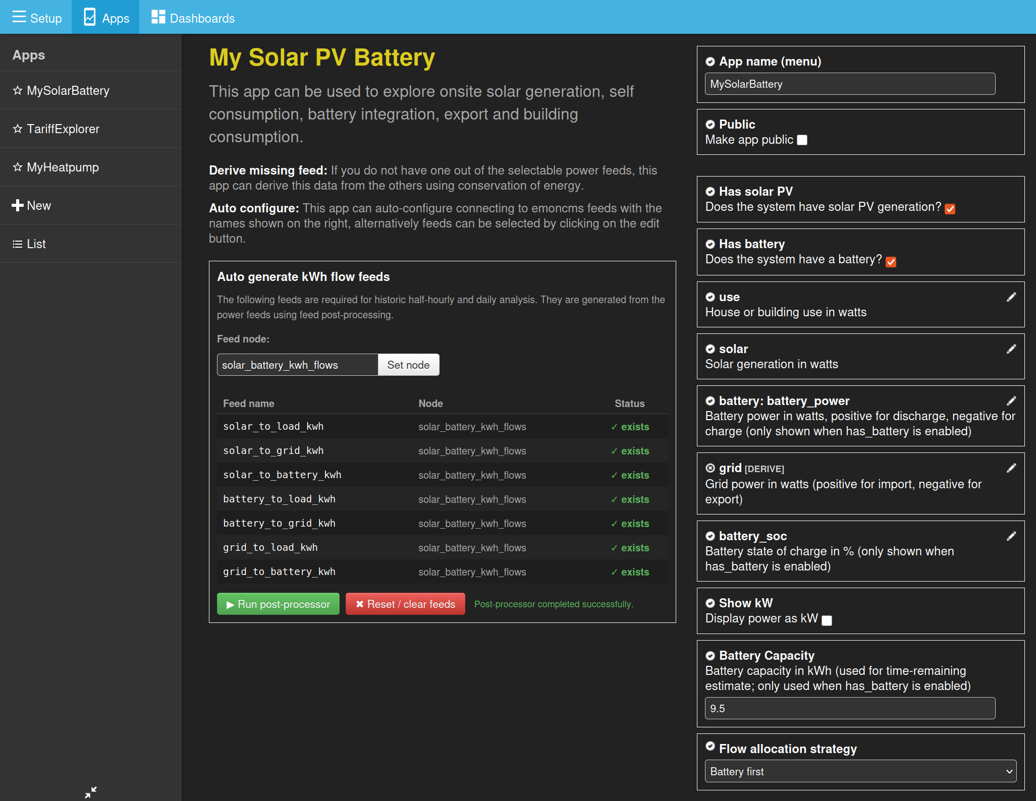
As a preliminary test, I’ve added the option to select between “Solar first” and “Battery first”:
I wonder if you could test this on your system? You will need both the latest mysolarpvbattery branch and the latest postprocessing module. When you change the selection, the history feeds need resetting and then reprocessing.
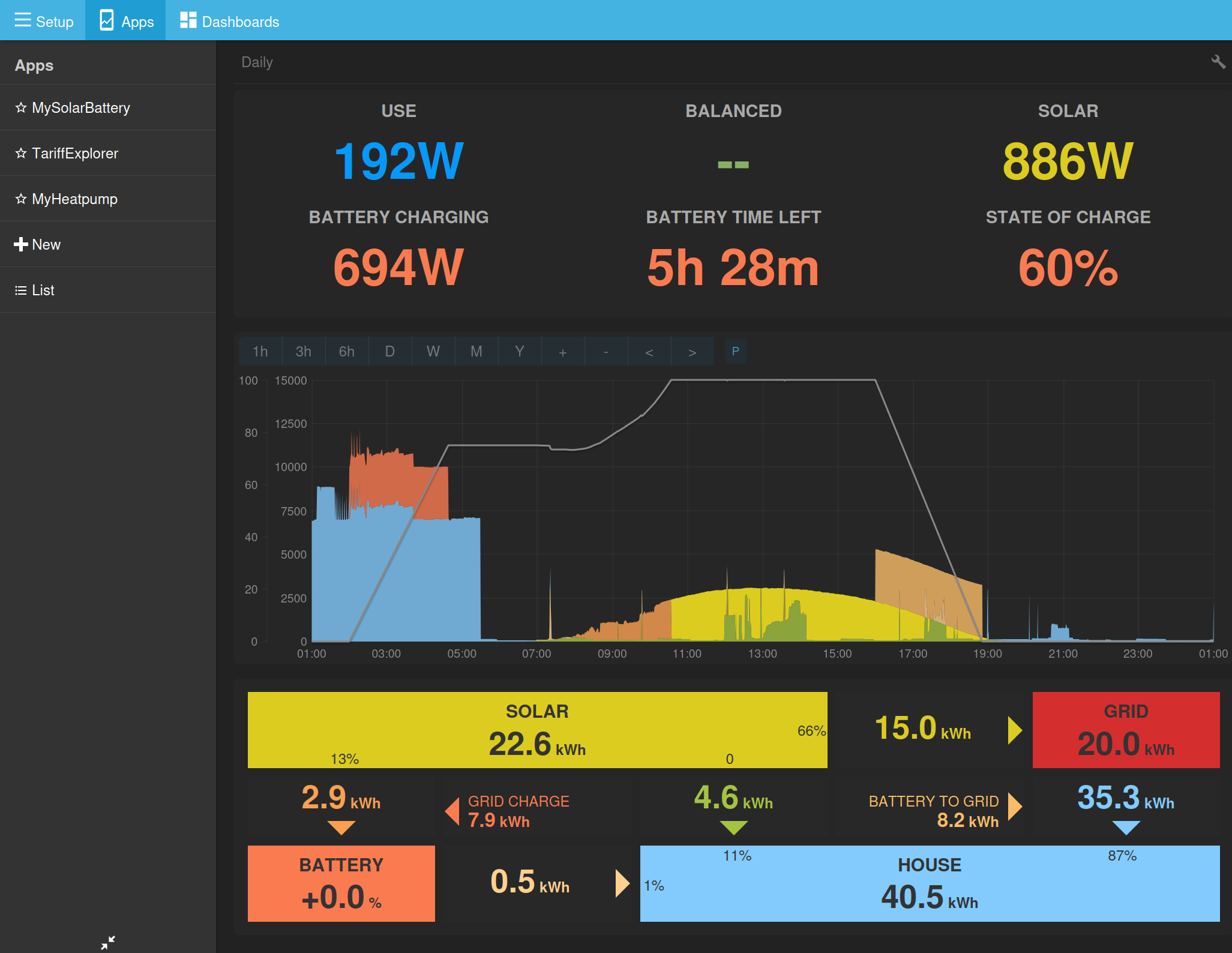
An example:
Solar first:
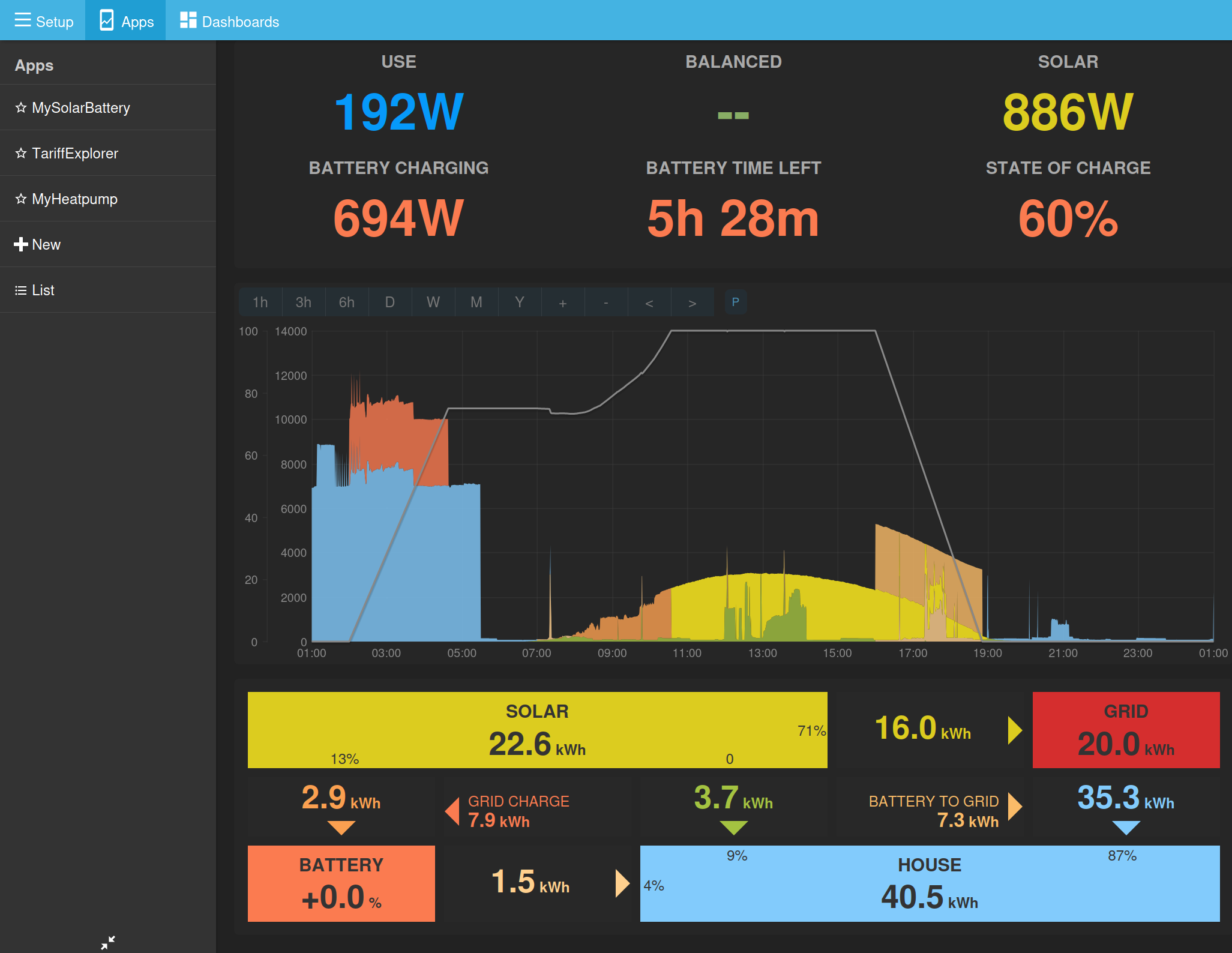
Battery first:
Notice how a bit of that battery output around 17:30 gets allocated to load first and the solar gets exported instead.
Interesting @TrystanLea. It definitely shows different behaviour - in the right direction - but I’m not sure the values are right yet. The tooltip colours don’t seem to match the graph though?
This makes no difference to me. I created two identical apps with different strategies, and they look the same to me. I think it’s because I never export from battery, only solar. I cannot find any combination of feeds that looks any better than what the app already does.
On tool tips, when on the daily energy chart, would be nice if this showed Date instead of Time.
Would be useful to see dates on the power chart too.
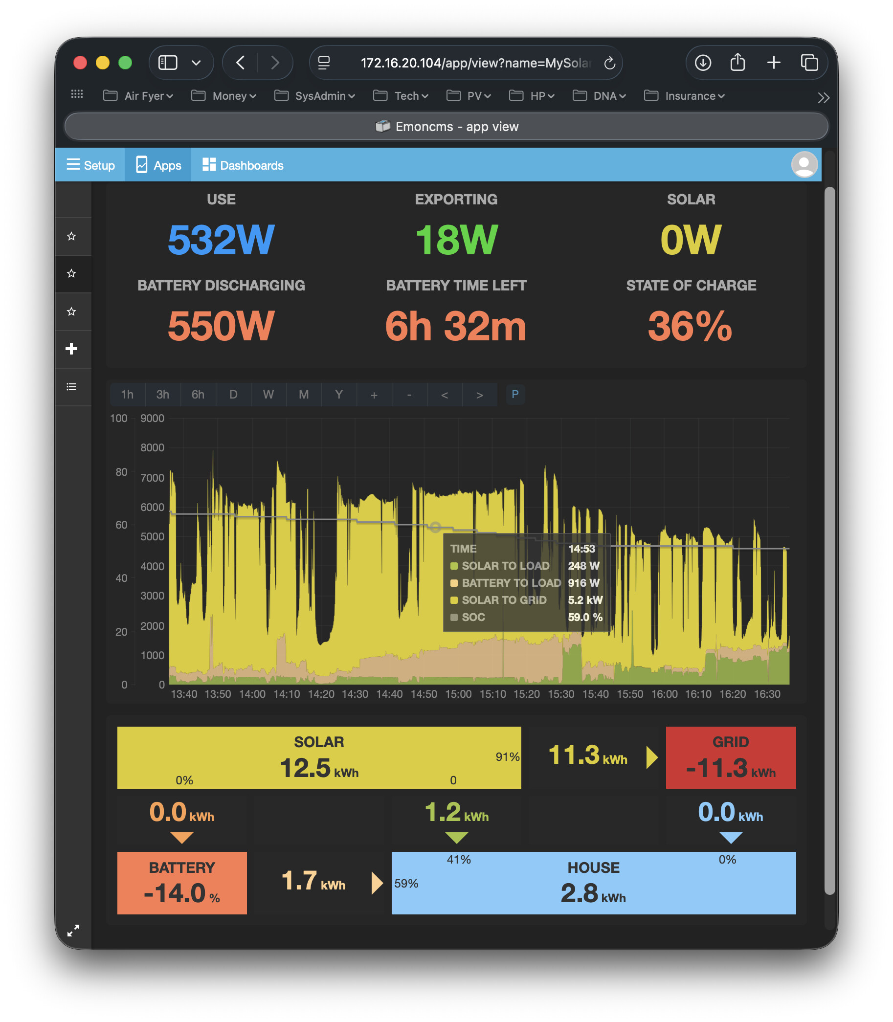
@Timbones this (below) was the situation you mentioned earlier, could you screenshot it again with the tooltip in place please?
@TrystanLea In trying to verify the ‘battery first’ strategy display, I’ve uncovered a graph redraw bug. To reproduce it, refresh page then switch to 1hr timescale. After a short pause it refills the right-most portion with identical values, and SOC is missing. After a minute or so it resumes plotting normally but without SOC and with a plateau of identical values still there.
Also the tooltip behaviour is still not quite right near the right edge of the graph. If you move the cursor to where the tooltip switches over, and then continue moving the cursor to the right, the position of the box moves relative to the cursor so that the top right corner of the box ends up way to the right of the ccursor and hits the edge before the cursor does.
Thanks @PeteF the colours look ok to me in your screenshot - which probably means there’s not enough contrast between them and we need to adjust the colours slightly.
You’re absolutely correct, I hadn’t zoomed in, added contrast would be great. Is there space to make them slightly larger as well?
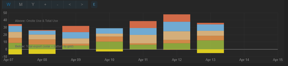
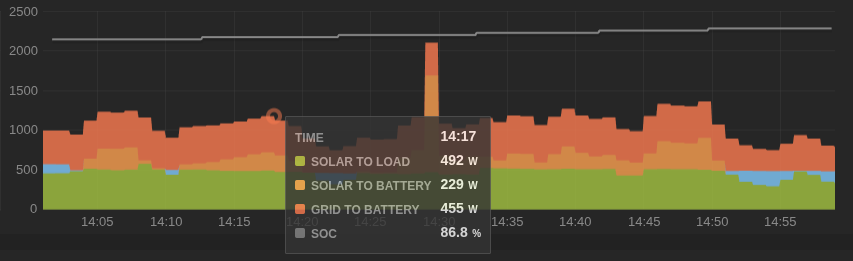
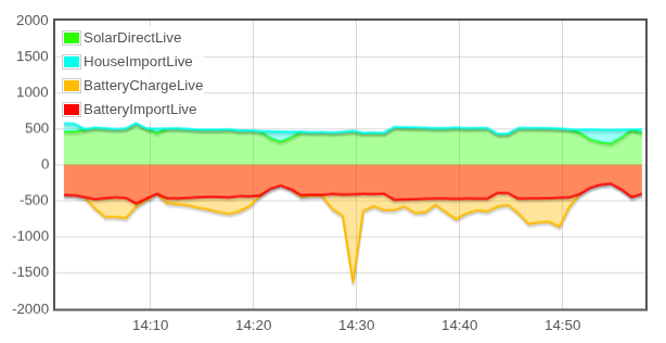
[April 3rd, 14:00 to 15:00]
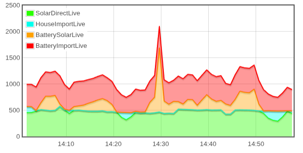
Here’s the same data presented in Graph widget:
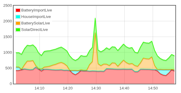
I can swap solar to home (green) with grid to battery (red), and get practically the same shape:
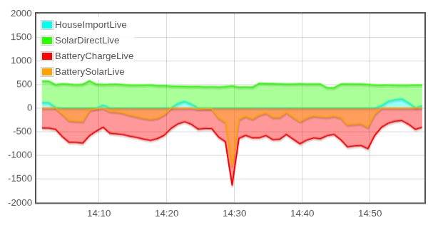
Or I can put the battery charging as negative power:
Or this other different way, swapping top two and bottom two:
This shows how inverter will pull extra watts from the grid (red) to match solar use (green).
Not sure any of these are “better”, and this is only 1 of the modes the system can be in.
(does not show discharge or export, but they’re fine)