Is the daily bar chart and background post processing/ auto generation of the kWh flow feeds working for you now @PeteF?
I debugged the code, and found the problem: postprocess_model.php has a hard-coded path on line 23 for where phpfina dat files live, rather than using phpfina[datadir] out of settings.ini. Replacing that with my own path appears to have fixed it.
It appears to be, although I have not checked the actual values displayed properly yet.
The post processes do not show up in the Post Process tab - should they?
I have just figured out that the post process runs each time you open the app/refresh the page. It might be useful to document that in the post process config box.
When I delete an app, presumably the post process schedule entry is deleted, it certainly stops running as I can see from the last time the feeds were refreshed. But I have found I have to manually delete the feeds and their data. Is that expected?
Also, given the auto generation of the kWh feeds, would you advise removal of their separate generation in input processing?
Thanks @Timbones much appreciated, I’ve applied a fix in latest master: fix get datadir from settings · emoncms/postprocess@6b4e0d0 · GitHub
Thanks @PeteF this is now fixed in latest app module mysolarpvbatteryfix branch. Cheers!
Yes that’s correct, they are just ran directly from the app and so are not registered in the list.
Ok sure.
Yes they are not deleted when you delete the app, at the moment the same feeds are shared/used by the tariff explorer app and so it makes sense to keep them I think.
It’s probably worth keeping your input processing calculations in place for now as long as they are not actually writing to the app created kWh feeds. I would delete the hopefully soon to be obsolete feeds written to via input processing when this new development reaches full maturity (stable release, release on emoncms.org etc).
Thanks @Timbones yes I think this is a bit red.
I wonder if you’d like to play around with different options here? app/apps/OpenEnergyMonitor/mysolarpvbattery/mysolarpvbattery.js at mysolarpvbatteryfix · emoncms/app · GitHub just change that line to try different pallets?
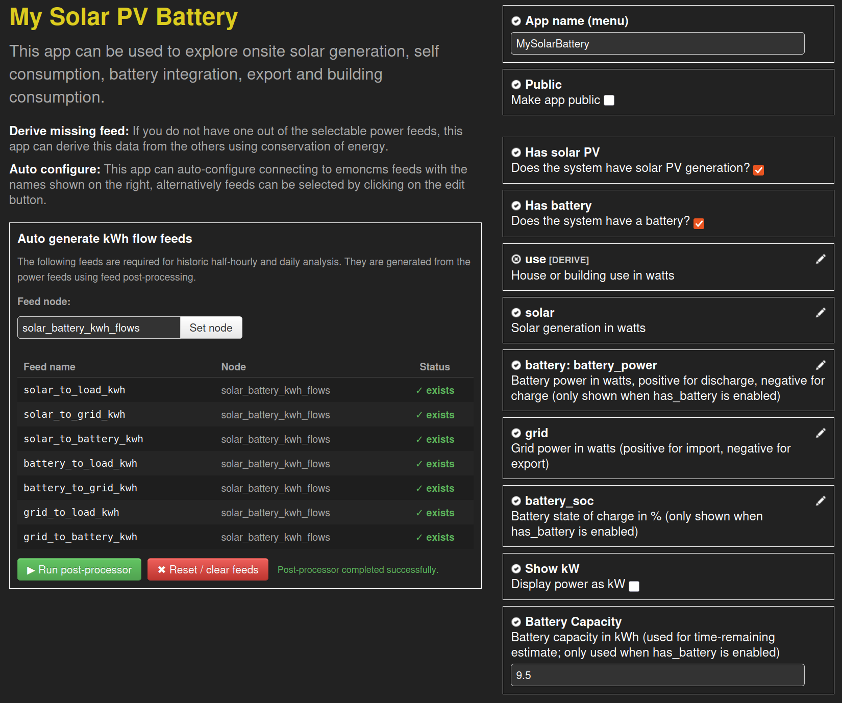
Thanks, I tried a few. flow_colors_blend is ick, too dark.
flow_colors_contrast has yellows for solar, and green for battery discharge, which doesn’t feel right.
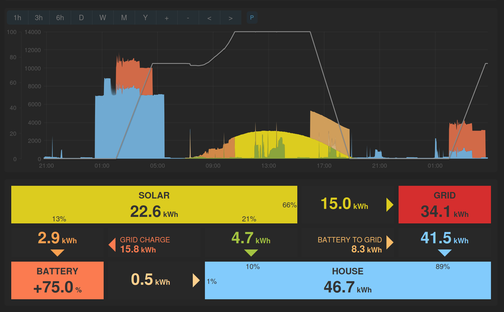
flow_colors_tariff_app is better, with yellows & greens for solar, and original orange for discharge. I’d prefer to have the old colour for grid charge: #fb7b50 (at 05:00).
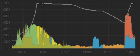
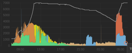
I do still prefer flow_colors_old though - possibly because that’s the one I’m used to? The three solar colors are very distinct, though solar_to_load is very similar to grid_to_load - maybe a green like #6f9 would look good for the former (09:00 to 17:00).
I also noticed that the minimum height of the graph has reduced to 100px, which is too small for my liking. I’ve hacked line 573 to be 200px. Again, this might just be what I’m used to.
Could I make 2 small change requests to improve usability of the app please?
- Could the tooltip’s display box flip to be to the left of the pointer on the right hand side of the graph area - as it does for the Tariff Explorer app. Otherwise the tooltip is useless near the right hand edge of the window.
- Maybe it’s just me, but I find numbers on the axis labels are almost illegible. Rather than increase the point size, which is probably not desirable, could you increase the contrast i.e. make them a significantly lighter shade of grey?
Thanks @TrystanLea
Thanks both, will get back to you on both your points shortly.
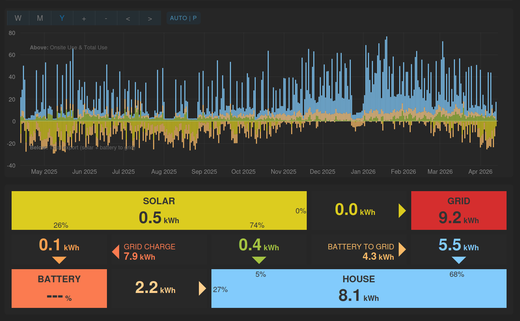
Happy to say the latest version finally sorts one of my big bugbears with the power view, it now switches to using the kWh flow data if you zoom out further than 1 week. This keeps the totals calculation accurate as you zoom out to long timescales ![]() . There’s a little indicator just right of the graph navigation which shows what mode it’s in and also whether it’s in auto update moving window mode.
. There’s a little indicator just right of the graph navigation which shows what mode it’s in and also whether it’s in auto update moving window mode.
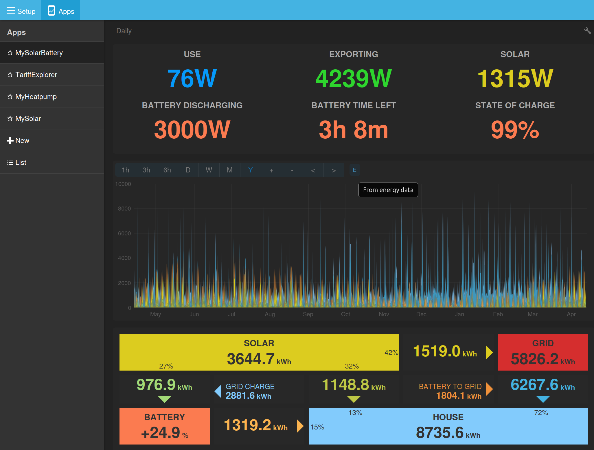
When it’s in auto / moving window mode:
The automatic post processing of power -> energy doesn’t work when not logged in, and the returned content for process query is HTML showing the default view for Emoncms.
My URL is like /app/view?name=SolarBattery&readkey=X where X is my read key.
If I change X to my read & write key, then it works correctly.
This is probably working as expected, but could do with handling that scenario better to avoid confusion in future.
Thanks @Timbones good spot! I will probably need to set an over-ride on that specific route to work with the read key as it needs to work off a readkey link as well ![]()
This is great, I like it very much. However, a few niggles:
- mouse cursor switches to
 when hovering of it, making it look like a clickable thing. It’s not.
 - indicator does not show on mobile (or when width < 768px) - I appreciate there’s not a lot of space. Maybe it can be overlaid on the graph instead?
- when left idle for a while (i.e. minimised) when it updates it only gets the latest value, and drawing a solid block from the previous value.
Cheers, fixed
I was partly thinking of having this in for development only, but do you think I should make it a permanent feature and find a way to show on mobile?
Latest version just pushed hopefully fixes this.
Thanks @Timbones
I’ve enabled this now with only read access.
These are both now fixed, thanks @PeteF
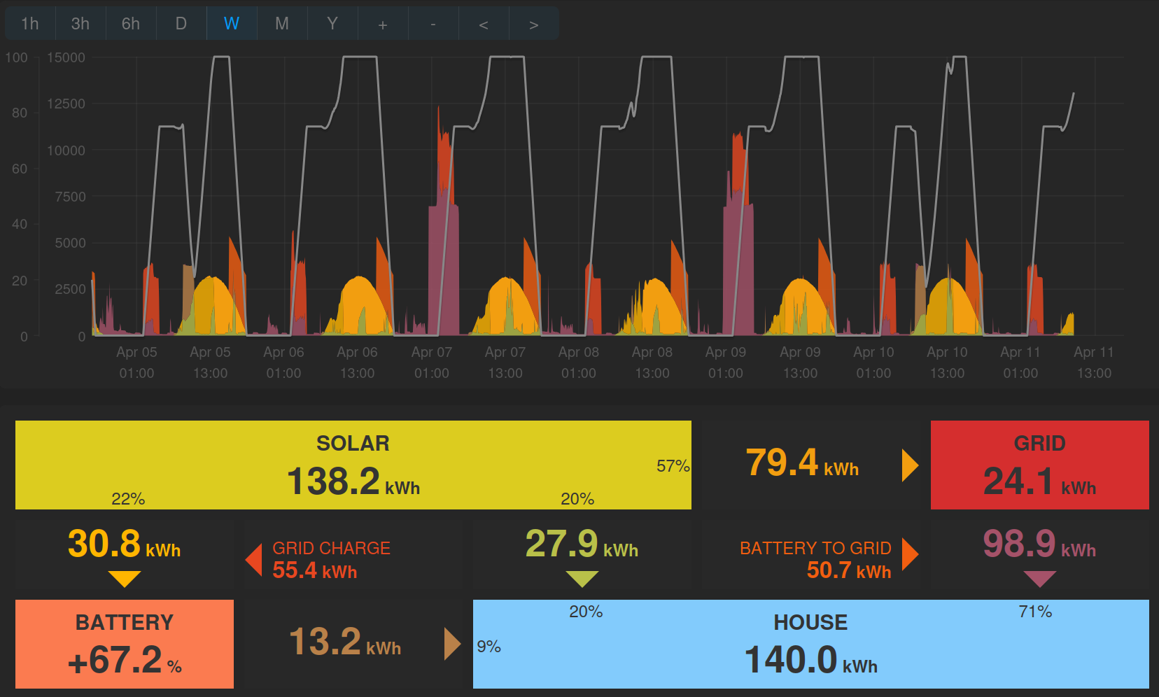
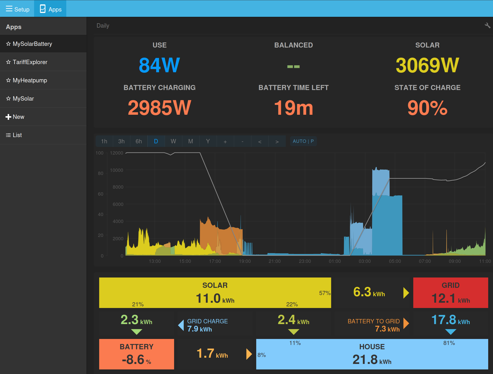
A question, in bar graph mode the stats boxes at the bottom just show the flows for a single day, as you hover over the chart:
I think it would be more consistent and useful to move showing the daily values to a hover-over tooltip and use the statsboxes to show the totals for the selected view.
Would both of you be happy if I make that change?
Still does not work for me.
The “flipped-near-the-right” tooltip isn’t quite right. At the point it flips, it’s in a good place, but as the mouse moves to the right the tooltip moves to the right faster until it squishes up against the right-hand edge.
Edit: only happens when browser is narrow.
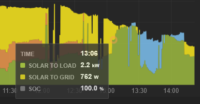
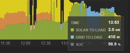
This does sound more useful, yes. Happy to give that a go.