Done! sorry that took so long!
3 Likes
Perfect, looks great. Thanks @TrystanLea ![]()
1 Like
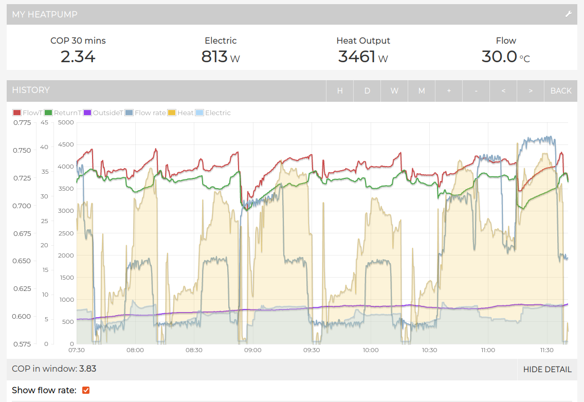
I’ve added an option to show flow rate on the MyHeatpump dashboard. To enable:
- Open the app config and select your flow rate feed, towards the bottom of the list.
- Save and fully refresh the page.
- Click on a day bar to open the power view.
- Click on ‘Show detail’
- Put a tick in the ‘Show flow rate’ box.
The units for the flow rate are picked up from the units field on the feeds page. So make sure to set that appropriately if you want to see the units.
If you are sharing the dashboard on heatpumpmonitor.org and want to make the flow rate public, make sure to make the underlying feed public on the feeds page as well ![]()
3 Likes
Brilliant addition @TrystanLea
You must have known I’ve been messing with my pump speed last few days to see the results of different flow rates!! ![]()
1 Like
Could a page be added that states what the dataset required is, to join?
Perhaps a ‘Want to Join - this is what you need’ type page.
Yes that would be a good idea. I’ve created an issue to log this https://github.com/openenergymonitor/heatpumpmonitor.org/issues/17
1 Like
I’ve added a few more of the feature requests / improvements discussed to the heatpumpmonitor.org github issues page here: Issues · openenergymonitor/heatpumpmonitor.org · GitHub
Please feel free to expand on these and add new ones on there.
1 Like
Great idea ![]()
I am wondering why there are small discrepancies between the individual heat pump dashboards and the summary figures on HeatpumpMonitor.org. So looking at my system
The Heat Pump Org sheet is saying 2085kWh elec
But the heat pump dashboard is saying 2101kWh elec?
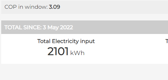
This will have been a snapshot taken at midnight, whereas the 2101 kWh is a live view at the point you looked at it.
3 Likes
OK great.
1 Like
I may have missed it reading through the thread, how often does SCOP get updated? Everything else seems to be real time?
Thanks
Daily.
2 Likes
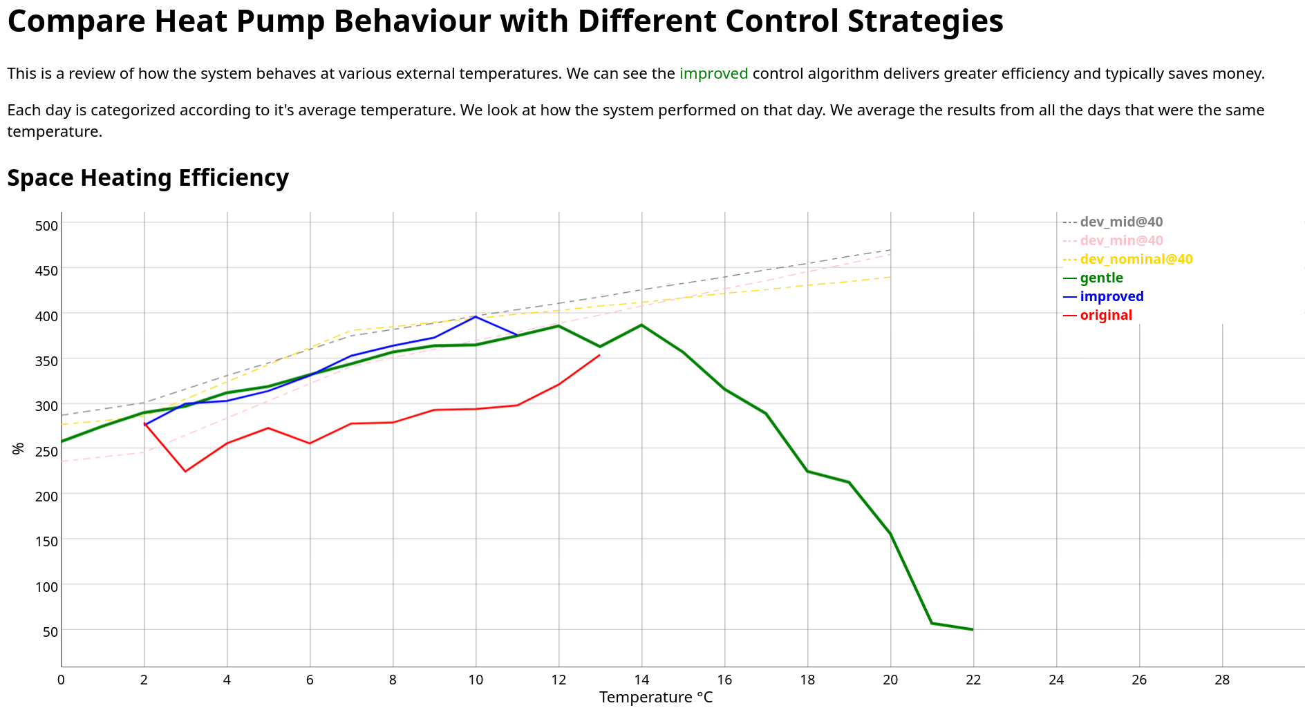
A long time ago on a dodgy web page far away I got excited and used temperature as the x-axis.
I’m so happy to see what you’ve been doing with your charts @TrystanLea
So, here’s my list of things I created charts for (some with marginal value.) Of course being me, it’s in a machine-readable format:
{
    "Cycles per Day": {
        "units": "#"
    },
    "numberOfCycles": {
        "title": "Total Cycles for this Temperature",
        "units": "#"
    },
    "dayCount": {
        "title": "Number of Days",
        "units": "#"
    },
    "Total Energy Produced": {
        "units": "kWh"
    },
    "Total Energy Consumed": {
        "units": "kWh"
    },
    "Hot Water Cost": {
        "units": "£"
    },
    "Space Heating Cost": {
        "units": "£"
    },
    "Total Cost": {
        "title": "Heating and Hot Water Cost per Day",
        "units": "£"
    },
    "OperationMode": {
        "title": "Amount of Operation",
        "units": "%"
    },
    "OutdoorTemperature": {
        "units": "°C"
    },
    "ReturnTemperature": {
        "title": "Return Temperature",
        "units": "°C"
    },
    "RoomTemperatureZone1": {
        "title": "Utility Room",
        "units": "°C"
    },
    "Hot Water Efficiency": {
        "units": "%"
    },
    "WaterPump1Status": {
        "title": "Main Pump Operation Time",
        "units": "%"
    },
    "WaterPump2Status": {
        "title": "Radiator Pump Operation Time",
        "units": "%"
    },
    "WaterPump4Status": {
        "title": "Hot Water Pump Operation Time",
        "units": "%"
    },
    "readingCount": {
        "title": "Number of Readings",
        "units": "#"
    },
    "TankWaterTemperature": {
        "title": "Hot Water Temperature",
        "units": "°C"
    },
    "Space Heating Efficiency": {
        "units": "%"
    },
    "SetTankWaterTemperature": {
        "title": "Target Hot Water Temperature",
        "units": "°C"
    },
    "HeatingEnergyConsumedRate1": {
        "title": "Heating Energy Consumed",
        "units": "kWh"
    },
    "HeatingEnergyProducedRate1": {
        "title": "Heating Energy Produced",
        "units": "kWh"
    },
    "HotWaterEnergyConsumedRate1": {
        "title": "Hot Water Energy Consumed",
        "units": "kWh"
    },
    "HotWaterEnergyProducedRate1": {
        "title": "Hot Water Energy Produced",
        "units": "kWh"
    },
    "FlowTemperature": {
        "title": "Flow Temperature",
        "units": "°C"
    },
    "Efficiency": {
        "title": "Overall Efficiency",
        "units": "%"
    }
}
I found things such as Cycles per Day useful when I was trying to stop it doing 80 cycles in a day ![]()
I’ll share my underlying data structure too, but I did rather frustratingly (for you) add another dimension which was related to the control algorithm that I was using which gave the different behaviours. I’m not suggesting you do that, we can use date as a proxy for that.
My “summarization” code produces this four-column text file which my old charting code used as a source. Apologies, I have a history in OLAP databases.
| Metric | Scenario | Average daily outdoor temp | Value |
|---|---|---|---|
| Space Heating Efficiency | improved | 2 | 2.76 |
| Space Heating Efficiency | improved | 3 | 3.0 |
| Space Heating Efficiency | improved | 4 | 3.03 |
| Space Heating Efficiency | improved | 5 | 3.14 |
| Space Heating Efficiency | improved | 6 | 3.31 |
| Space Heating Efficiency | improved | 7 | 3.53 |
| Space Heating Efficiency | improved | 8 | 3.64 |
| Space Heating Efficiency | improved | 9 | 3.73 |
| Space Heating Efficiency | improved | 10 | 3.96 |
| Space Heating Efficiency | improved | 11 | 3.76 |
I used daily averages, but it comes at a terrible cost. The temperature is the average of the day and so these shoulder months with wide temperature ranges have a wide range of CoP for example and it can be confusing to look at. It also hides the big impact I see from heating / not-heating during the night when it is cold outside. That’s why I started using EmonCMS because I wanted to look at the details within a day and the mechanics for doing that within EmonCMS are wonderfully simple and flexible.
1 Like
Which other dimension?
Are you referring to Cycles Per Day? Yes I find that useful too. Although obviously when you have defrosts going on the Cycles Per Day goes up quite a lot.
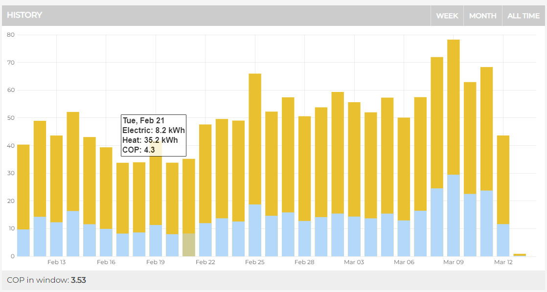
Could I be cheeky and ask for another feature request please? ![]()
On this summary graph, would it be possible to add average outside temp (if recorded)?
I think it would give great context to the amount of energy used.
4 Likes
Apologies @Zapaman , I’ll expand on what I said.
In the past we’ve mostly just plotted “flow temp versus time”. We’ve been using time as a proxy for other things. For example we look at the chart over a year and see the flow temp is higher in the Winter. We conclude that it’s colder in Winter so flow temp is higher in Winter.
Trystan’s change now allows us to use something more direct. We can plot “flow temp versus external temp” for example. So now our analysis is more precise, we’re not using a proxy of “time indicates external temp”.
The next thing we’re investigating is altering system behaviour. So we might say “in March I changed my pump speed”. Then we would use time as a proxy for pump speed and we’d compare last April versus this April to see if pump speed made things better or worse.
As you can imagine, there are other variables interfering with our analysis because things like the weather last April will be different to the weather this April.
So rather than using time as a proxy I added “scenario”. In my case it’s the name I gave to my different control algorithms. I used this to create another way to split up my data. In OLAP we call this “adding a dimension”.
I’m then using this extra dimension to create multiple lines on the chart so I can compare the different scenarios visually because I am but a mere human.
1 Like
OK (gotcha) yeah I’d generally call this a scenario rather than a dimension, but that is just language.
I have been doing similar analysis on our system over the last 23months since we’ve had our ASHP and making operational tweaks. I’m not sure how easy it would be to implement in the Heat Pump Monitor (on a single page), although you could already do something similar by using the “Compare” page and choosing 2 different start and end dates.
2 Likes
I thought daily would be better somehow, but experimenting with the charts I can see much better correlations when looking at the hourly data, I think partly due to having more points and narrow ranges.
1 Like
I realise that the issue with daily in our compare tool is that the temperatures are averages for the whole period including when the heat pump is not running, which gives incorrect results. They need to be averages when running which gets complicated to calculate form the way the emoncms api returns averages at the moment…
1 Like