No, I don’t think we want to disable editing on a mobile, or make it any harder than it already is, we just don’t the the “edit-mode” icon/button taking up valuable screen space when it’s unlikely to get used. just on the “edit-mode” button in view-mode is good I think.
from the screenshot that looks better than the tiny icon on a button, I can take a closer look and try out it later.
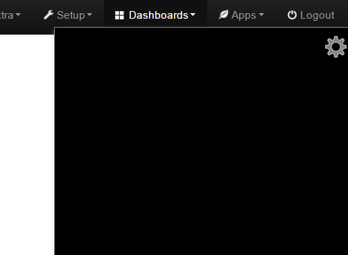
@Andreas_Messerli - Having tried this latest version I was surprised to find the gear was a fixed grey colour with no background, so as @Paul 's gif demonstrates in on github, it is unseen on grey backgrounds.
The icon must be an icon file, not a png if it has no background color and is placed directly on something that can change color, so the the color of the icon can then be determined and set by the background color.
with the old ref to the icon (just to test an “icon” without a button or palette behind it!)
<span class='icon-cog' ></span>
Although way too small, if you try changing the dashboard background to various colors you will see this “icon” changes color dependent on background so it always contrasts to whatever color the background is. This doesn’t happen for a png because it’s a fixed color image rather than a “font character like” icon that can have it’s color controlled in CSS.
As I previously said, we need to increase the size of the existing icon or use a larger “icon”, suggesting we make our own set of emon-glyphicons so they can be used in the palette (and other places too), but there was no response to that suggestion.
I’m really glad to see the back of the solid grey button though!
Based purely on appearance the first one would scale better as it is a “bolder” image but the size is 128pxx128px so unless it can be scaled down it is most probably too large.
Bootstrap specifically uses glyphicons not .png or .ico files by default, I do not know how to scale the native glyphicon icons nor do I know if an .ico file will/can be recognized as an icon so that the inverse CSS can work.
I am currently thinking if we can scale an icon (glyphicon?) we don’t need a new cog .png or .ico, and if we cannot, then using an alternative file type to gain scaling might not work with the inverse CSS, which is why I said create our own custom glyphicon set and in various sizes too.
I’m not able to experiment with a .ico file right now, but if it’s both scale-able (like the png) and invertable (like the icons) then it should work ok. Using any non-glyphicon style images may have a performance impact (although would I guess quite minimal)
I can provide the cog icon, any size, any colour, but agree if we scale bootstrap, that would be the best option.
Matt has previously suggested importing a more modern package such as font-awesome (which are scaleable) alongside bootstrap. But that adds over 1MB to emoncms…
It seems it’s not possible with our old bootstrap we are using. At least this is the common tenor about it in the forums.
We would have to move up to at least version 3. It’s a spritesheet and the icons are tiny already there.
Scaling them up will look terrible.
@ PB66
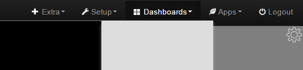
Even if I use the boostrap glyphicon it’s not working and barely seeable. I already tried that and thats the reason I said it’s NOT working on black dashboards. The glyphicon is simply not the same black as the container and that’s the reason why it is visible. It’s not changing its color. See the example here:
But to be honest, even if it is bigger, you would have to search for it on the screen. And if you have bad luck and set the same black value as the glyphicon for the dashbaord background it’s not visible at all.
And by the way the glyphicons are ALL also a PNG file. The glyphicons are coming from the glyphicons-halflings.png spritesheet file in the bootstrap lib. So I just replaced a png with a png The issue is the same, if we use a glyphicon or not. We would have to migrate to bootstrap 3 at least to get rid of the spritesheet.
Just look up this file and you will see the reason I want to use bigger icons. We simply can’t use the ones from bootstrap as base is already way to tiny.
So I’m still coming back to the proposal to add the edit button into the main menu bar or into the setup dropdown menu, only available if you are on a dashboard. Or the other simple solution could be to have the icon with a white border around it. Not like a button but like going completely around it. It’s not visible on bright background but will give a contour on dark background. What do you think?
@ Paul Reed
Yes, font-awesome would be a solution but as you said really big. We just need some icons and not that much I think.
@glyn.hudson Would you be happy to do away with the ‘edit dashboard’ link/icon completely and instead edit dashboards via the setup menu?
It’s 3 mouse clicks as against 1, but it’s not everyday we edit dashboards, and we could always look at a possible keyboard shortcut to enter edit mode quickly?
We’ve spent considerable time exploring this option and getting the right icon positioning/format is proving elusive. It may never be the best solution aesthetically…
That would at least offer some explanation to the odd behaviour I had previously reported when using a standard button verses a but-link button.
I’m not able to do any tests right now, I may try and look at it again later if I find time, I would suggest not getting hung up on this too much and concentrate on the palette itself if anything, perhaps a menu option is the way to go?? we can always revisit this after the palette is finished, this seems to be a hurdle that would probably get changed along the way anyhow. leave it to the end, we know the functionality works.
Yes, we should proceed with the other things. I think with the actual white contour on the icon it’s usable on 99% of the use cases. So no one should end up searching the icon on any colored dashboard.
I also pushed this to my prod server to let my users decide how they like it. All of them like the palette already a lot, especially the new features Matt has introduced to move the widgets with the keys and also having the back/forward option.
Does someone have the above icons to download? I would try to add them to the palette. Even if the colour is not right at the moment still worth testing them.
Here’s the ones I proposed (the’re still in blue and size is not optimized) i did only post them for comment but you are welcome to them as is, I just haven’t put much time into them without getting some feedback first.
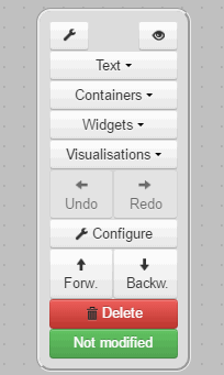
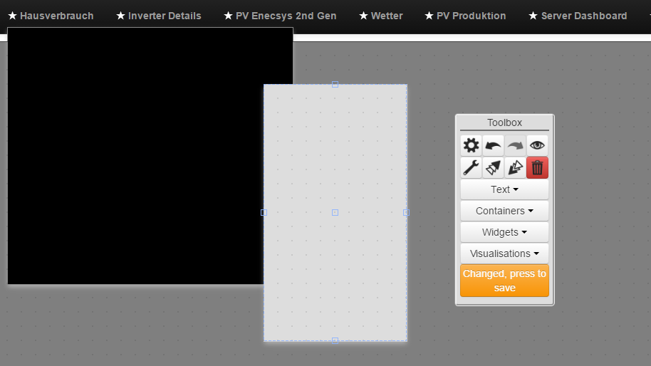
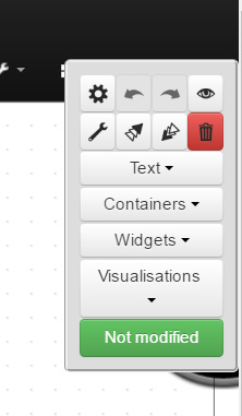
Need to think about how to handle this “not modified case” and orange “modified” case.
A rework of designer,js is necessary to add the buttons as icons with their own icon. At the moment it’s looping through the widget folders and automatically creating a set of buttons. One code is doing it all. I now have to separate it and read out of the array. Maybe need some help from a more experienced php programmer here will try how far I can get.
Is there a need to display ‘Not modified’? - it really doesn’t serve any purpose.
Why not just display a red ‘Save’ icon if a save is required.
I’m not sure that these specific functions can be represented as icons. They are unique to emoncms, and IMO probably need to remain as text labels.
The ‘configure’ and ‘view’ palette icons have tooltips describing what function the ‘icon button’ does.
It would make the icons easier to understand if we had consistency across the other ‘icon buttons’.
I will try it with just the save icon visible when something has changed. It’s of course a bigger change to what was there since a longer time. Users could be confused to not see anymore the “not modified” part and could get unsure whether they have changed something or not.
I think the Icons Paul (pb66) has mentioned in one of his posts are more than suitable! Gimp and photoshop are able too to only show icons for standard stuff. I think the icon for Widgets and Visualizations are spot on here.
I will push my actual work as a PR so that we can start from there. It’s already a lot better with the smaller icons for undo/redo and front/back!
I’ve enhanced the PR to include the buttons and help texts on the buttons when over them with a mouse. Wording of course needs to be approved but there I guess it’s better when you decide as english is not my native language
Now merged to ‘palette’ branch.
It’s looking really nice now with the addition of the new icons & tooltips.
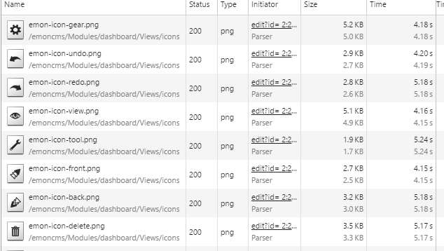
It may however be worth ensuring that the icon’s sizes are proportional & web optimised.
For example; the eye icon is almost 5kB in size, and 233 x 234px in size yet is only displayed at 25 x 25px.
Although these images will be browser cached, the network report shows;
By comparison, this eye is #333 colour, transparent background, and 25 x 25px in size, yet is just 750B.
It’s worth visiting http://www.iconsdb.com/ where they have a large library of icons, and you can specify the size & colour.
Yes absolutely. They need to be smaller. A font version would be best as they scale the best. I was also looking at Elusive Icons. it’s free even for commercial usage! http://elusiveicons.com/ and they also work good together with bootstrap themes.
They have 304 icons available and they scale well. Here is the icon list: Elusive Icons Icons It’s smaller than fontawesome and others.
I also added a title to the box and a spacer and title value (tooltip)
Tooltip which appears when being with the mouse over the tile is “Click and drag to move the toolbox”. Is it worth adding this? I think it looks more professional like this. What do others think about it?
I had looked at Elusive icons previously, and yes they are about half the size of Font Awsome @ 500k but still a lot to add, when just adding 8 icons could amount to just 6k.
The palette title is a great idea, as it’s something to grab hold of, when moving it around the dashboard.
Don’t think that a tooltip is necessary though, if users have hovered over it, they will know what to do!


 The issue is the same, if we use a glyphicon or not. We would have to migrate to bootstrap 3 at least to get rid of the spritesheet.
 will try how far I can get.