@Andreas_Messerli has put together a floating palette for the emoncms dashboard as a proof of concept and I wondered what members thought?
We’ve noticed that of late, the existing dashboard edit menu bar is starting to fill up, and with other functions in the pipeline it’s going to be necessary to find a way of accommodating them without eating into the workspace & not looking cluttered, so Andreas suggested this for consideration.
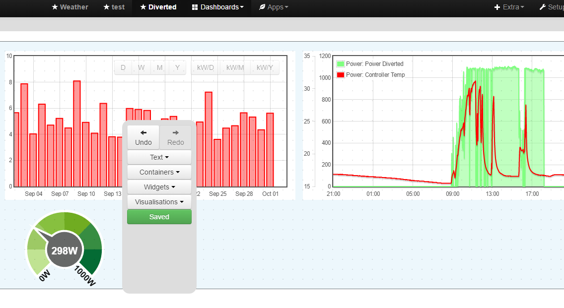
The palette floats in the dashboard window, and can be moved to an area that you are not currently working in, similar to Photoshop, and many other commercial packages.
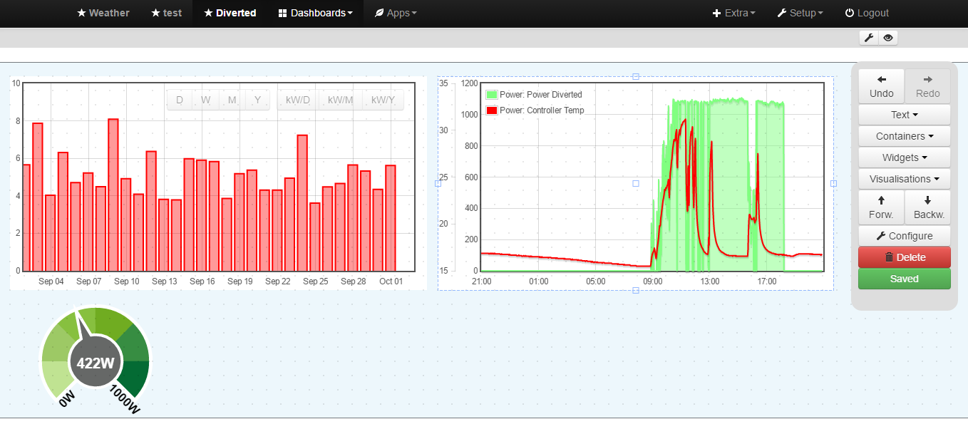
Now that the undo/redo and layer functions have been integrated into the dashboard, work is now continuing to develop the dashboard floating palette, as per this thread.
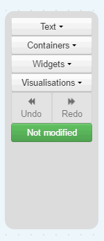
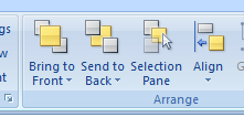
At this time, the palette looks like the below screenprint, and the Configure/Forw/Backw./Delete buttons only appear when an element has been selected
As you will note, the ‘layer’ navigation labels have been abbreviated to ‘Forw’ & ‘Backw.’, because to use the full words would unnecessarily widen the palette.
Whilst this is still in development, I would value user feedback as to how the layer actions can be best described in the palette (using as few letters as possible!) which would clearly describe what they do.
i prefer either raise / lower or up/down because i think of it as a Z order integer value. You either raise or lower the value or move the value up or down (like increase / decrease value). Or if you think of it as move up a layer / move down a layer … Forward backwards is more like an X axis value but not sure if all people would think of it this way. I think a window on windows also has a z order value that defines which windows are placed on top of other windows
edit: the wiki page actually defines it as forward / backward but i guess it depends on the way you think if you think about 2d games for example mario bros the x axis defines mario’s forward moving & backward moving while the z (order) would define mario placing in front of the background objects or going behind objects that are in front of him.
If you imagine mario 1st person 3d game, forward / backward makes more sense then.
Since widgers are actually like windows so basically 2d i was more thinking about the 2d concept in games thats why i think forward / backward was weird and said it looks like an X axis value.
I’d use what is most used already to avoid confusion. If PS and Autocad use same terminology, avoid to become another GIMP. I use PS a lot and Gimp from time to time at work (freeware) but hell why wanting to change names to be different from PS ? Each time I’m loosing time to find what I need since they use weird unusual names for usual functions …
@bidouilleur, don’t you think that using the same wording as Photoshop would make the buttons too wide?
You’ve got to remember that Photoshop use that wording in a drop down menu from the menu bar, where wordage is not so much an issue, but here it is being used as a button label with limited space.
@joyrider3774 I agree with your comments. I always view layers as a pile of papers, where you can only see the top one. By moving a sheet UP from the bottom makes that sheet visible, similarly, moving the top sheet DOWN in the pile hides it.
I was searching in the boostrap library for better pictogramms but was not successful so I just shortened the wording for now. I think we can not solve everything with bootstrap and have to look for alternatives.
I also changed the icons for undo redo on my productive used instance to single arrows. The ones used by Matt are for me actually forward/backward (Media Player buttons):
I agree with @bidouilleur on the “forward/backward” thinking over “up/down” or “raise/lower” orientation, but also with @Paul that the size of the wording is obviously long/big for the buttons. I also wonder what will happen when users start translating into other languages.
I think the way forward is to use icons and possibly back that up with hover over tooptips.or if that’s not possible a “?” or “help” button that brings up a legend. Over time we may see more categories of elements and/or more editing functions and tools, so the option to reduce the other buttons to an icon may prove useful down the line so the floating palette size doesn’t need to increase.
For example it would be nice to enable/disable snap-to-grid and even set the size from the palette. And perhaps we could lose the small dashboard edit toolbar too, there could be a button for the dashboard settings pop-up and a “preview on/off” button where the palette remains to exit “preview”. (note I am not asking for these features to be introduced, just using them as examples).
These are the fairly intuitive icons used in Excel, personally I would like to see something like these with expanded wording in a hover over tooltip.
I just went to pull this to try it out and found it hasn’t been merged, in future if feedback/testing is required before adding to the master branch could it be submitted as a separate branch so that it can be tested with a simple “git pull” and “checkout” ?
Looks really good, but I will probably wait for it to be available via the repo.
Yes, I was aware of that option before I commented. I stand by my comment, it maybe “easy” to use a diff, but it is “easier” with a “pull and checkout”, especially if you start altering the incoming code as is usually the case with stuff that needs evaluating and testing. I can wait it’s no problem for me.
Thank you @Andreas_Messerli but I am not that keen on changing the source either, if I need to, I will get the code in one way or another, I wasn’t saying I cannot do it, I was saying it should be done differently to make it easier for all users to chip in, I certainly would’nt have thought twice about pulling in untested features on a separate branch as I could switch to and fro at will, this is the way it has always been done within the project previously, it’s not your fault, ideally it should be merged or if it is deemed it needs further ‘community’ evaluation it should be directed to a separate branch.
I made it that way because on windows machines it’s a simple rename old folder and copy new folder and your done
It’s just the dashboard folder so no change on anything input or feed processing related.
We just wanted to make it at least 80% right before making it available in the normal branch. As you pointed out the opportunity could be even by really adding all config related stuff there.
As Andreas has said, we want to ensure that the code framework is established before merging, especially as it would expose so many users, and also unnecessarily pollute the git history making it more difficult to backtrack through the code if future problems arise.
I agree “Front” and “Back” works well, (even if just for the short term).
But it does just shift the burden of finding suitably sized naming to each language translator, any English words may not translate well globally, For example “front” and “back” in German is “zurück” and “vorderseite” and in Italian it’s “indietro” and “davanti”, these will not fit the buttons so easily.
Also just to “split hairs” even “front” and “back” is a little misleading as the selected item doesn’t necessarily move all the way to the front or back unless there are only 2 items or it was already only one place away, as it moves forward/backward one place at a time. (and this minor point may not translate so well either)
However, IMO we should definitely proceed with “front” and “back” so as not to allow the naming to hold up the great work Andreas is doing.
And then…
On a separate but related point it would also be nice to see if we can work towards using globally recognized icons with non-size restricted hover tooltips that serve as help text and can be freely translated. it also opens up the possibility of reusing the same button for extended tasks, for example the “front/forward/up/raise” button’s hover-over tooltip could be
Move forward
Moves selected item(s) forward, one place at a time to a higher position in the “stack” of elements on the current dashboard. Use this and the “move backwards” button to reorder all or any items to prioritize which elements are seen in full and not obscured by other elements.
Can also be used with the CTRL button held to bring the selected item(s) all the way to the absolute front in a single move.
note this is just an example of a concept, not my tooltip writing abilities (or lack of such).


 <------------>
 <------------>