I now used a transparent background DIV with a slightly red tone to make it at least a little bit visible. The button itself is now normal visible and does not have opacity. When the outer div is completely transparent the user is not able to see a dragging area. I used 0.1 as color transparency value.
The positioning is a different topic. With it beieng on the right we of course maximize the usage of the dashboard on the left side and “normal” user behavior is reading from left to right with a slight down path. So the icon could be overseen. But putting it on the left is maybe annoying because in most cases its over some content.
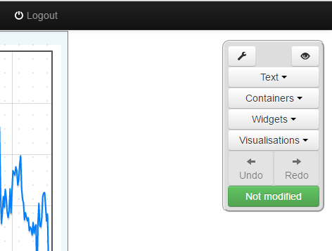
Instead of using a button with an icon in it, would it look better if it was just the icon?
The icon could then be a little larger and there would be no need for a text label (keeping it small and avoiding translation issues).
Looks better being opaque, it doesn’t need to divert attention away from the graphs & widgets
Maybe ‘not opaque’ when mouseover to highlight it’s purpose??
I don’t see the point in it being moveable, as whenever you change or reopen a dashboard it defaults to the top right. Why would you want to move it?
As you’ve already commented, possibly need further CSS adding to present it differently on small screens.
I have just submitted a PR for a transparent button/palette background in view mode and at the same time aligned the 2 palettes a little better to each other and tighter into the corner.
The icons do still need to be much bigger IMO, as I’ve already mentioned, I would consider dropping the text labels altogether, but at the very least the “config” and “preview/edit” buttons should be half-width and double height like the “undo/redo” or “forward/backward” button pairs.That would make the single “edit” icon easier to see/select when in view mode.
.
I don’t know off-hand how to alter the existing icon sizes, but if we are thinking of introducing some custom icons maybe we should add them in different sizes eg “emon-iconA-small” and “emon-iconA-large” to get a better quality rather than enlarging small icons, there seem to be a few guides out there for creating your own glyphicon files,
A few suggestions (including some we already use), ignore the blue color I’ve used, I think the icons just need to be monochrome to be converted to glyphicons.
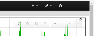
and Move backwards/down and move forwards/up and undo and redo OR Containers and frames text boxes, Visualisations, Dials and Widgets Configure (both dashboard and widgets?) Edit mode, View mode, Delete Item(s), Save dashboard
@jon had already applied a correction based on @Bill.Thomson 's first incorrect correction. So I wasn’t sure whether to undo or redo Jon’s correction, therefore I just put it right instead, sorry for leaving these comments hanging
When I first made the suggestion I didn’t think about the order of the two words till a few minutes later. Then I made the second suggestion. So partly my fault too.
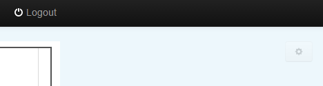
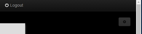
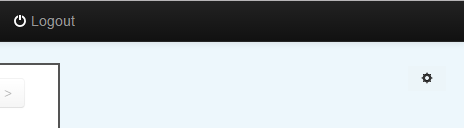
Following on from trying the transparent button, While it works well on a light background the cog disappears on a dark/black background.
I thin the slightly opaque button is required to give the icon a sort of “halo” to make it standout from dark colours BUT. the fact that the opacity setting gets applied to the icon too is an issue too. as you can see here the icon is tricky to make out on a light background.
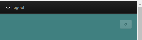
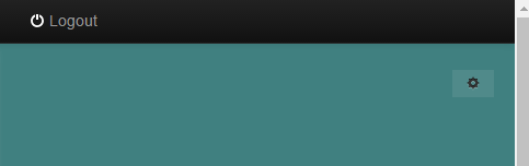
But opacity 0.2 is great for a button body as it just gives a mild milkyness when over darker backgrounds without being too prominent.
But the Icon should be fully opaque (zero transparency) to get a strong contrast between the icon and the button.
The PR I submitted earlier uses a “but-link” button that has a fully transparent background without effecting the icon, perhaps later I will try adding an opaque colouring behind the button to get the fully black icon against a opaque button shape under the transparrent but-link, maybe that would be better? seems like a difficult way of doing things though.
I think if the button has its opacity set via its background with an alpha value < 1 (i.e. background-color: rgba (200,30,30,0.5)) then the child element (the icon) doesn’t inherit it and could be made more opaque.
That’s right @Gwil ! But as @pb66 said on dark black containers it could be still an issue so maybe only a slight opacity is ok but I would definitely propose to use a grey background.
Following common UX guidelines normally says that when there is an action associated with it, it should be a button. It’s even here on the forum like this. Even if the top row does not seem to have buttons they are, as soon as you move your mouse over it it will be styled as a button. We can, of course, try to do the same but then we again have the issue if the icon will be shown on a black container you have to search it with your mouse. This behaviour, like here in the forum or on Twitter, is ok when the element is fixed on a stable background. With the button being in the workable dashboard area it can of course happen that someone has set the background colour to black for the whole dashboard and then the icon is not visible anymore without being designed as a button with a lighter colour like grey.
I used the following approach:
style=“background: rgba(221, 221, 221, 0.8)”
Really just a slight opacity but besides that using the normal grey as used for the grey container.
I think you mean a “slight reduction in opacity” or “slight transparency”. 0.0 is fully transparent, 0.1 is slightly opaque, 0.9 is slightly transparent or very opaque and 1.0 is fully opaque or solid.
I have been recommending a “slight opacity” of 0.1 so the button can only just be made out depending on background. Personally I see no value in a 0.8 opacity setting, we are trying to make the button less obtrusive by being able to see clearly through it, a high opacity like 0.8 just means you might see there is something behind it and actually creates a need/desire to move it.
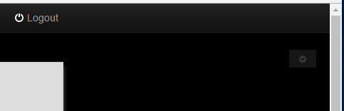
Thanks @Gwil that did the trick, it looks much better with a solid icon on light backgrounds
and much better on darker backgrounds with the solid icon on a slightly opaque button
However now I have switched back to a standard button rather than a transparent “btn-link” button the icon now seems to switch to a light shade when over a black background…
this wasn’t what I expected as previously the btn-link didn’t change, the icon simply disappeared into the black, I don’t mind this behaviour because it allows the button opacity to be lower, it would need to be higher to make a black icon stand out. It does still seem bizarre that the icon on a transparent background doesn’t switch depending on the page color but a button with a albeit slight color does switch but there we go!
This button style doesn’t impair visibility even when it does clash with page items
although I do think the edit mode button and therefore the editing palette must default to a position tighter into the corner to avoid clashing with visualization controls, but for accessibility rather than visibility reasons.
I realise that we haven’t dealt with the icon format on desktops yet… but would it be an option to hide the button completely for screens less than ???px width.
This would hide it for mobile users, so dashboards are not obscured.
At the moment, all but the most basic dashboard editing is impossible on touch devices, it’s difficult to move elements, or even move the palette to see the elements, so why not restrict dashboard editing to bigger screens?
Ref - Redirecting…
as we are using a really old bootstrap its .hidden-phone.
I’ve added this class to the button. It’s not not appearing on smaller screen. Shall I also add that to the palette? It will not appear then on phone. One downside is that there is no exit point if you open up the link manually via browser address bar. You would have to go to “Setup” > “Dashboards” and there click on teh view icon. Maybe not that wise?
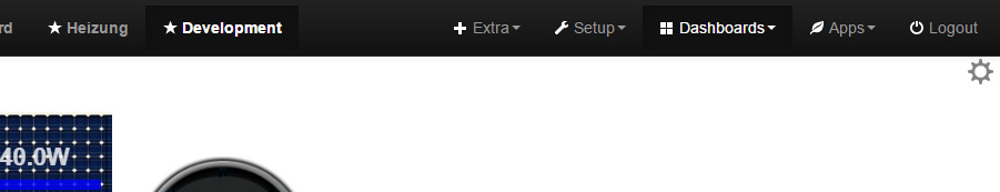
I have created a PR with the hidden icon for phone screens and also now using a custom gear icon (transperent PNG file) on a fixed position in the top right corner.
Let me know what you think about Paul (PB66). What do others think about this?
We can adjust the size of the icon. It’s now at 65% size.


 .
. 
 and
and  Move backwards/down and move forwards/up
 and
and  undo and redo
 OR
OR  Containers and frames
 text boxes,
  Visualisations,
  Dials and Widgets
 Configure (both dashboard and widgets?)
 Edit mode,
  View mode,
  Delete Item(s),
  Save dashboard