Floating Palette for dashboard

I just tried it with binding in elusive Icons. Its adding 48kb via the min.css file. Seems to be a lot but when thinking on single icons, even if we shrink them, they could still add up to 20-25kb. So not that far away from the elusive min.css variant…

…but…

… The necessary icons for undo/redo and front/back are still missing.

It seems that we really have to draw and use our own set of icons for this particular use case.

I will try to shrink the ones we have now as much as possible without loosing quality.

IMO the best option would be to look at http://www.iconsdb.com/
You will struggle to keep the quality if you simply shrink the existing ones.

Paul

Ok, I downloaded and used some of iconsdb.com as Paul suggested. I think 780b is ok and should not be an issue for a webbrowser, not even for an older RPI2 I guess:

I was not able to find something similar for front/back as the others above. Could we live with the ones I have chosen or do some other find better ones there?

If users are unsure what the icon does, the tooltips will help.

Looks good to me Andreas!

Paul

Unfortunately these smaller buttons do not work with a high resolution touch screen laptop.
The icons are too small to make out properly and it’s really tricky getting the right button, even when you know which one your after…

When the 2 buttons migrated across from the 2nd navbar, comments were made about their size being too small, so I am quite surprised to see the better sized buttons reduced to the size of the “too small” buttons.

Currently, just as much palette space is taken up by the “Text” and “Containers” buttons as the 8 major functions, that seems a huge imbalance in my mind.

Glad to see some area added for dragging, it is impossible to move on the touchscreen laptop without resorting to a mouse.

I would be happy to rework the icon files once we reach a decision so I wouldn’t get too concerned about optimization until we are sure what we want.

When I proposed the icon set and merging the 2 config buttons, I also thought a complimentary “not-selected” status could hide the “text”,“container”,“widget” and “visualisations” buttons when any item is selected.as they become redundant as the forward/backward, config and delete buttons appear and so they may as well disappear to make room.

My thinking was bigger buttons AND a smaller palette (smaller than previous versions not this latest small buttoned palette)

I can not agree with you here, Paul.

I work on 4k Monitor and do not have a single issue. For me the buttons are even still too big even if my scaling on windows is on 100%. To illustrate that I set the gimp toolbar right beside the dashboard toolbar:

As you can see the other toolbar from Gimp is way smaller than the toolbox. As Glyn stated we should not worry too much about this touchscreen cases. Maybe we can introduce a config setting which switches between touch friendly large buttons and Desktop efficient version in the future. For now I propose to proceed with desktop aligned version.

I personally see no point in bringing back Icon + Text buttons. This would lead into a very longish toolbox, eventually even too big to fit on one smaller screen.

How do you work with tools like Photoshop or Gimp on such a Notebook with touchscreen?

Is anyone else finding this a problem other than pb66?
I’ve found the palette buttons ideally sized and consistent with the other software applications I use (although mine is not touchscreen).

For comparison - Libre Office, Gimp & Emoncms palettes in the same screen;

Paul

The size of Gimp and Photoshop button are of little consequence here other than to justify your preference, I do not use those programs on the laptop, I do (or did prior to these changes) use emoncms on my laptop when onsite and at clients.

There have been comments made on other threads about making the dashboard editing more touchscreen friendly and even Glyn’s comments were made about mobile phones not touchscreen laptops.

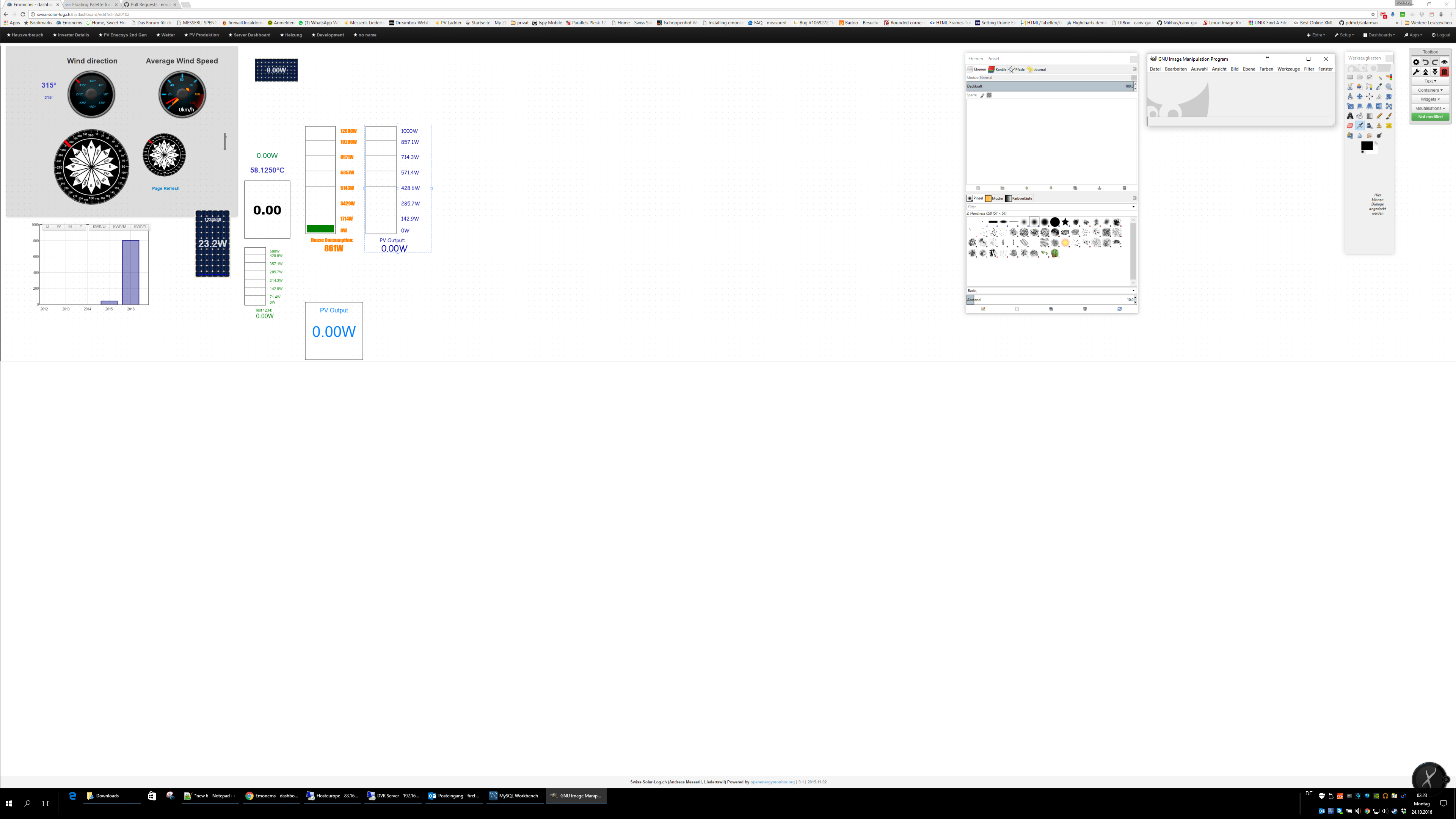
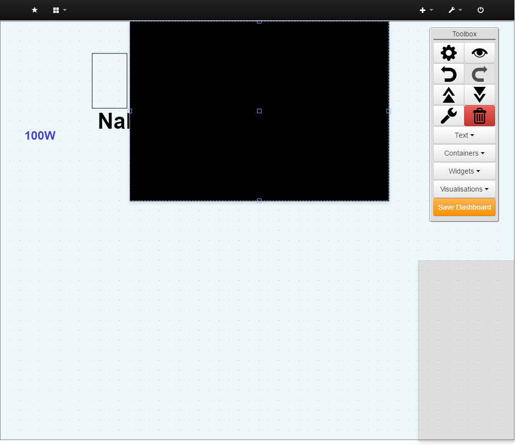
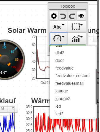
The fact remains that the original toolbar was usable, but was getting cramped with the new buttons coming on board, but aside from being anchored to the scrolling page rather than the viewing area, it was totally usable. The previous palette was a huge step forward and made it much easier to use with a touchscreen, but this latest move to buttons that are 25% of the size is a an even bigger step backwards in being touchscreen friendly, as it is now harder than the original toolbar for small high res touchscreen laptops.

In short, what I could do before the palette I can no longer do without scaling the screen, losing 10-25% screen area just to make the buttons usable, the palette now blocks the use of a device I could previously use no problem.

Even the Arduino IDE now has an “interface scale” in recognition of these devices and that only has a cluster of 5 buttons on a single row toolbar.

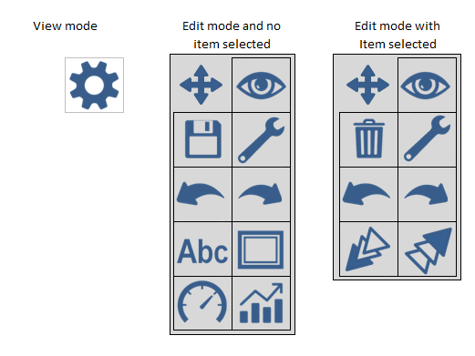
Your own comments said the 2 small buttons from the old toolbar “look lost” and Paul replied saying they should be same height and twice the width.

I agree and have not suggested that!

I suggest you do that as I can see I am in a minority and I do not want to hold back your development. I just thought there was plenty of room for compromise in that massive 75% reduction, especially when I have repeatedly suggested ways to make the toolbar smaller on the whole despite bigger buttons.

If matching other unrelated programs is more important than making emoncms more usable for a wider audience then fine, I will make my own arrangements or changes to emoncms once you’re done.

ps - I can see from your screenshot how keeping the buttons so small is just as essential to enable using a 42" 4K monitor, as space is tight :smirk:

Yes, but that was when the 2 buttons were about half of the height of what they are now, I said that they should be the same height as the then ‘configure’ button, which it is now the case.
Also, I suggested changing the width, purely to fill the space (aesthetics), and for no other reason.

Paul

Exactly my point, the current need to have our buttons match Gimp’s was not a priority then, and yet it is now!

I can see I’m fighting a losing battle here, if the response to my comments about usability are “tough, we want it to match Gimp and look nice rather than support touchscreen devices” fine I can reluctantly accept that, but this direction cannot be justified with a NEED for such small buttons, especially when there is so much space wasted with a duplicate config button and 4 full width buttons 4 times the width of the others just to fit the words that could be in tooltips and totally hidden when an item is selected, that’s an additional 13 button places wasted and 4 buttons that apparently are acceptable to not match Gimp.

Please just carry on regardless, it’s clear there is little to be gained by pursuing this.

Paul, who said I’m finished? I never said this is the last finalized version of it.
I’m still searching for an easy way to get rid of the text buttons but they are created with a for each statement in designer.js. I simply can’t add an icon there as they will use the same for all of the 4 buttons. So I have to rewrite that completly. I’m not that fast, sorry if I do not meet your expectations here speed wise.

And also who said that it should not match a palette of Gimp of Photoshop? That was the whole intention of the palette when starting it and not just a current need as you are stating it. I just said the buttons are looking lost there because we did not have better icons for the rest and it was work in progress and did not have the time to style them as the others.

And I really don’t think this is looking good on a PC to use:


It’s also not wise either. On my work Notebook with a 1600x900 resolution the palette this way occupies almost 50% of the screen height. It maybe solves your edge case touchscreen issue but it really does look wrong even if the text buttons are getting icons it still looks odd on a normal PC.

You are not fighting a loosing battle here if you see it like this I’m sorry.

As there is not much feedback from others we maybe should stop working on that until there is some more feedback around.

Andreas. I have not suggested you are finished or made any assumptions about the final version. Nor have I any expectation for your speed or quality of work, I appreciate your work and believe it or not I am trying to help you.

I did not say the buttons should be as you have displayed them, I said I did not oppose the suggestion by Paul because it was workable. The buttons should indeed be square, I have not suggested any size other than “larger”, they could be slightly larger they could be alot larger, I only want them large enough to use, that’s it!

I totally agree, which is why we should never see both the item edit buttons and the item selection drop down buttons together at any one time, regardless of what size they are or what icons they have.

For arguments sake let’s say the buttons were square and 1.5x the size they are now (1.5x Gimp size) and/or 2/3rds of the original “Icon plus text” size ( about midway between them) a layout like this (done rapidly and roughly in excel so ignore the detail and colors etc delete and save button can still be coloured)

Would be the equivalent 1 “gimp sized” button narrower and 1.5 “gimp sized” buttons shorter than the current layout even with buttons 1.5x as big! Plus with the drag area occupying a false button space the need for a header and the large surround are removed which also reduces the size further, As I keep saying larger buttons AND smaller palette !

Well I’m certainly not winning, that’s for sure!

That too is an acceptable reply, I have no problem coming back to it, I simply raised a valid point for consideration, in fact I suggested we do the same thing about the view-mode icon, “Maybe! but’s let’s come back to that” or “Get stuffed! we’re not doing that” are both more acceptable than the current reasons behind saying “No! the buttons must definitely be small and it’s not negotiable”.

OK guys, time out!

Paul, I can see that this is something which you feel strongly about, but let’s not lose sight that this is Andreas’s inspiration and something which he has devoted lots of time & effort to bring the floating palette to what it is today, and I for one are very grateful.
Being an opensource project, all things can change & evolve, and touchscreen compatibility may be something introduced later, but for now, Andreas has acknowledged & considered your comments, but believes that the current size of the buttons represents the best option for the vast majority of users.

That being the case, can we draw a line under this (for now!) and get back to supporting Andreas in the other areas of development.

Paul

Hi guys, sorry I’ve not been keeping up with this thread.

My thoughts are that mobile touch screen support should not be a priority for the dashboard editor. I don’t expect users to be building dashboards on mobile devices. Dashboard building should be a one-time-setup operation best suited to a desktop enviroment. IMO the overly large buttons look out of place next to the rest of the Emoncms interface.

I vote for proceeding with a palette optimised for desktop pointer use.

1 Like

Just tried a version with only graphical icons. I think the icons work well and are understandable. Even the widgets and vis icons should be clear I think:

As there are dropdowns related to this buttons shall I leave them “doubled” size compared to others or shall I also reduce them to the same size as the others?

With dropdown activated:

2 Likes

I think that they look OK as they are - double sized. It sets them apart from the more generic buttons.

IMO I prefer the drop down menu list to be left aligned instead of centre, to be consistent with other emoncms drop downs.
Also, could the drop down menu width be reduced, at present there is a lot of white unused space.

I like the choice of icons, they are easily identified (I assume they will have tool tips like the rest), also they are optimised to be about a quarter of the size as the previous icons at about 700B, so will load quickly.

Paul

1 Like

Left aligned them:

The issue with the dropdown is that they of course use the standard classes from bootstrap. There, a min-width of 160px has been set. So the box is always 160px or wider. I played with a overwrite in the code itself and set the min-width to “auto”. Only the Vis dropdown menu profits from the releasing of this boundary and gets a little bit smaller. But the others are mostly staying the same. I also think it acts nicer if the box sizes do not jump around too much.

I then tried to declare the .dropdown-menu css class in emon.css and renaming it to .dropdown-menu-toolbox but funny thing is that the dropdown does not show up anymore then. It’s finding the class (visible in console output) but the dropdowns are not working anymore. Even with a direct copy of the class from bootstrap.css to emon.css. As soon as the name changes it does not work anymore.

Does someone also experienced such a behavior in the past when coding such things? Will check later if I find my mistake.

Ah well, it’s only a minor issue, and we’ve lived with it so far.
The menu looks more familiar left aligned.

Nice work !

Paul

Looks great! Have we got consensus on this? Shall we get these latest changes merged into master so all users can test? Things can obviously still be polished and tweaked in the future, however as it stands the palette is a big improvement for the dashboard editor :thumbsup:

Will try to create a PR this evening. Was a little side tracked by town stuff I had to do this week.

1 Like