Howzabout…
 …and…
…and… 
using the arrowheads as layers rather than a separate arrow and pointing in a more neutral direction (back/down and forward/up)?
Howzabout…
…and…
using the arrowheads as layers rather than a separate arrow and pointing in a more neutral direction (back/down and forward/up)?
I like that
Looking at the other functions and buttons that may need icons I’ve come to wonder if we really need 2 configuration buttons, couldn’t the “widget configuration button” also bring up the dashboard configuration if a widget is not previously selected? This would get rid of one of the 2 buttons in the almost pointless 2nd navbar/toolbar, leaving only the preview functionality to be tackled.
if a preview button was included on the floating palette (to lose that bar altogether) it would mean to get into “edit mode” the first time would involve going via setup => dashboards rather than having a permanently displayed navbar just as a quick link to edit mode.
Personally I like that idea but I understand many will not like not having an edit button on permanent display, perhaps we could have a hidden (well documented but not displayed) keyboard shortcut too. bearing in mind the “preview” button on the palette could toggle preview/edit so it is only the initial entry to edit mode that would be any different in actual use.
I like the first two! Maybe a small change - the grey is “was” and black is “will be”. If I have to explain it maybe it isn’t quite intuitive?!?
 <------------>
this looks like undo <—> redo for me.
Andreas’s floating palette has now been merged in a new dashboard branch - ‘palette’ for testing.
To try the new feature, run from your dashboard directory;
git checkout palette
git pull```

After testing, to return back to 'master' branch;

```git checkout master
git pull```

If switching branches on a emonpi, don't forget to put it in RW mode first, and return to RO afterwards!

PaulHaving tried the palette now, I like it a lot. although I’m not really a fan of floating toolboxes and usually prefer to dock them if possible, but this is really nice to use,
I think the main reason it’s so nice to use is the original toolbar scrolled up with the page so working lower down the page was a headache as the tools where off screen and now the new floating tool palette does not move with the page despite being dragable, I like that it is floating but NOT anchored to the page, well done @Andreas_Messerli.
2 quite minor observations with the palette, 1. it’s the same colour as the “stock grey” and has no border so it kinda blends in too well when positioned over other grey items and 2. the visualisations dropdown makes it difficult to use in the lower half of the screen, could the dropdowns open upwards when positioned in the lower half?
If the opened dropdown could be made into a slightly shorter scrolled list and take focus of the mouse wheel that might work also and save us all from that incredibly long journey all the way down the screen to the last items on the visualization list and back 
The preview and dashboard config buttons do still scroll off page, so that’s another good reason to consider moving those buttons to the palette as mentioned previously.
Hi guys,
I’ve just tested the floating palette. Thanks to @pb66 for putting it in a feature branch to make it easy to test.
I like it a lot. I agree with Paul that it would be good if the preview and dashboard config buttons were also on the pallet (top would be a good place) since this would put all the buttons in the same place. When working on a large screen these buttons get a bit lost up on the top right.
IMO the gray colour of the pallet is fine, I guess adding a border might make it stand out slightly.
I guess this would be nice but IMO since the dock is floating the dock can easily be moved upwards towards the top of the screen if menu overflow is an issue.
Minor tweaks aside, the palette seems to work as advertised. I’m happy for it to be merged into master. Nice work @Andreas_Messerli 
I would say “you’re welcome!” but it was actually @Paul (Reed) not me… 
Woops, sorry @Paul 
What about something like this:
The buttons look a little bit on the lost side there 
What about the “border” I used “border-style:grooved” for it. I kinda like it.
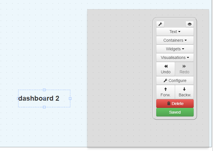
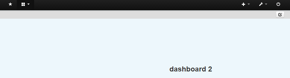
So with this variation there is only one button left and this is the common dashboard edit button. After clicking on it the grey submenu bar will disappear:
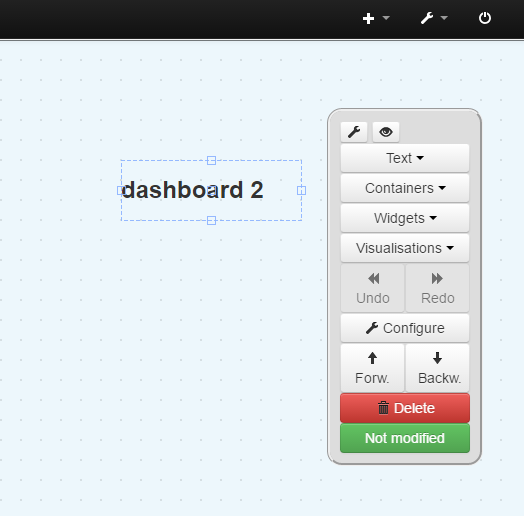
After clicking on the edit icon it looks like this:
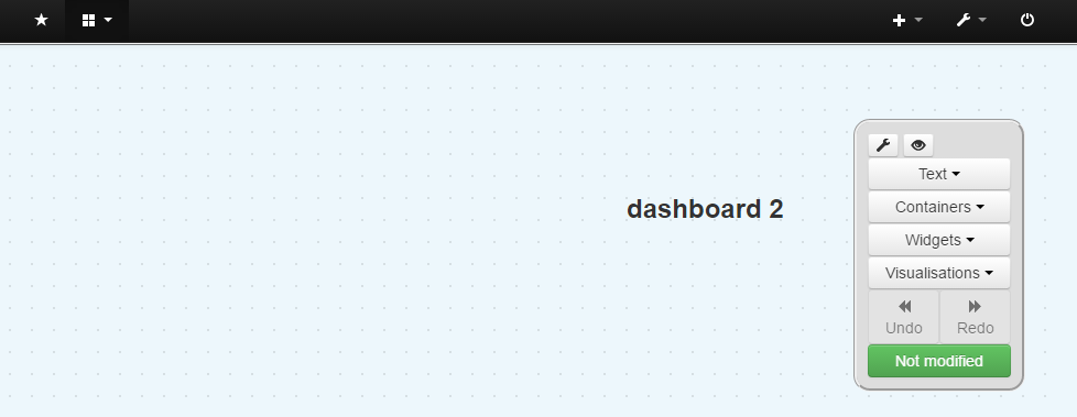
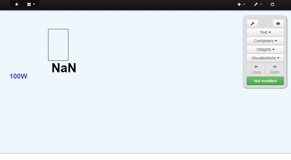
I also made the palette auto growing instead of having a big grey box with half of it empty when nothing selected:
What do you guys think about it?
Now merged to master, so it’s available now for emonpi users by running ‘update’.
The ‘palette’ branch is still available for ongoing development.
Paul
I like it, it adds a dimension to the palette.
I think we need some button size consistency, and would look better if they were the same height as the ‘configure’ button, but half the width - like the ‘Forw./Backw.’ buttons, so they can sit side by side.
Don’t worry about the icons - they could be changed if necessary.
We just need to decide where to put the common dashboard edit link/button… unless we just remove it completely, and instead access it as @pb66 has said via setup => dashboards.
This would be a good addition, and @mattjgalloway has added some css recently which does exactly that.
If you edit L521 of dashboard/Views/js/designer.js from;
widget_html += "<ul class='dropdown-menu' style='top:30px' name='d'>"+select[z]+"</ul>"; to;
widget_html += "<ul class='dropdown-menu scrollable-menu' style='top:30px' name='d'>"+select[z]+"</ul>";
you will get as per the screenshot below.
Auto-growing is a nice feature, and as you have said avoids seeing a lot of blank space.
Paul
Ok, I added all my changes and enhancements into a new PR on Git.
We maybe need a nicer scrollbar, his looks so old school
Thanks Andreas, squashed & merged into the ‘palette’ branch.
Paul
Good work @Andreas_Messerli, I like the revisions.
The palette border looks much better, the scroll-able dropdowns are good and moving the 2 buttons from the 2nd navbar is a huge step towards getting rid of that bar altogether.
I wonder if rather than having 2 config buttons, the same button could be used for both dashboard config and widget config depending on whether a widget is selected at the time of clicking.
It’s also a shame we still have the full width toolbar for the one remaining button in view-mode. Would it be feasible to make a tiny palette with a transparent background in view-mode with one single button, also with a transparent background so only the icon was visible? this “floating icon” in view mode could replace the “edit icon” and that whole 2nd navbar in view mode.
Since I notice the new toolbox palette always initially appears in the same location, the “transparent edit button” could appear to open into the full palette and close again as you toggle view and edit mode without any mouse movement if the 2 palettes positions were the same, obviously the position would reset each time it’s clicked if the edit palette is dragged, but it does that anyway, I think that is a better option as the transparent edit-mode’s button position should be consistent to be easily located.
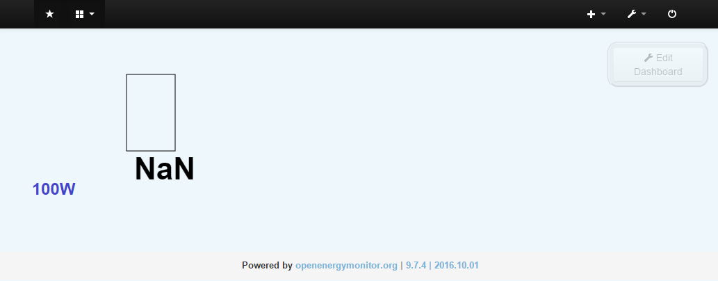
Trying out your suggestion Paul by adding a floating Edit Dashboard button instead the submenu bar:
Naming and icon have to be agreed for sure. Added opacity style to reduce visibility
The question is how big should it be. On normal PCs it’s fine but its not usable at all for mobile application. It will be hard to move around if is just the small standard icon, so I added a text. Using my phone it’s too big for sure and occupying too much screen when using a button with text.
Suggestions? Maybe just a simple gear icon as used by many other applications for setup menus?
Yup, gear icon would do the job.
I don’t think making the dashboard editor work on mobile devices should be a high priority. I don’t see many folks designing a dashboard layout and drag-and-dropping on a mobile device!
However, viewing dashboard is a different story. @jeremypoulter is making a start on improving this:
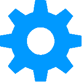
Yes agree - gear icon.
If you can’t find anything suitable in bootstrap, I’ve attached 2 images below to consider.
Both are PNG’s, web optimised with transparent backgrounds, one in shade #333 (to match the black used in emoncms) and another in #0699fa - the same blue as used in the forum.
@Andreas_Messerli - Do you want to replace the text with an icon first - before merging the PR?
Paul
gears.zip (1.6 KB)
Good work! I look forward to pulling in the changes to see it “in the flesh”. I agree the gear icon would be better too,
From the screenshots alone though, I think a gear icon on a transparent button/palette would give a more prominent icon than reducing the opacity of the whole palette including the icon. At the same time it would also be more discreet on the whole whilst retaining a larger grab area so if you did want to move the toolbox you could do so by grabbing “around” the icon, although I’m not sure there is a need to reposition a collapsed toolbox/palette.
@Paul - I think we should pull in the current changes without the new icon as the general concept probably needs assessing before deciding the finer points, there will no doubt be further changes and a change of icon can happen at any point.
Paul, before merging anything, I check through the code, load up a diff, check for errors & functionality using different browsers & platforms which I’ll be doing this evening, by which time Andreas may have added the icon, which would be my preference.
Paul