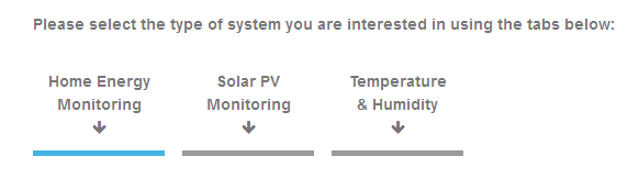
However I’d still have more questions than answers as a newbie. It still dives in too quickly. I’d also say it was not obvious that to get to the 3 different bits (Home Energy Monitoring, Solar PV Monitoring, Temperature & Humidity) you needed to click on the image/text). I really, really dislike hidden text in pages. Only once I had scrolled down and did not find PV, did I click as I wondered where it might take me!!
Can I suggest that instead of the first part of the menu structure being ‘setup’ this page is moved into a new section (at the top) called ‘About OpenEnergyMonitor’.
Then, rather than ‘System Overview’ I’d use something like ‘Building Blocks’ as it is not really a system (you don’t need all the parts) but a number of different bits that can be put together in different ways for different purposes (which is a selling point).
Then explain the diagram (brief description of the 5 parts without any jargon) and perhaps give simple examples (like an EmonPi connected to your hosted EmonCMS platform). Each of these could link to more in depth info on these items.
Then offer links to separate pages for different applications (still in the About section) and offer simple explanations of how the parts fit together. Things like what uses 433 MHz RF and what uses Wi-Fi, differences between a CT (what is it) and optical pulse (what is that). Build the knowledge slowly!
There is little point going into setup until you have sold the parts.
I’ll need to work out how to edit pages without destroying what is there and try and suggest some text if that would help.
The question to ask at the end is ‘Do these pages answer a question like this?’
It is the text you have to click on to reveal (by clicking PV). It isn’t there until I click (which is not obvious) so it is hidden when the page loads.
It would seem the bars under the text are supposed to be “tabs” according to the sentence above the three links. But, yes, it’s definitely something that’s easily missed if one isn’t used to that sort of thing.
If the “tabs” looked like tabs, that would be a start.
Something along the lines of some of the examples on this page.
My suggestion is to replace the current landing/home page of the guide with the system overview page, which would be incorporated into an expanded ‘applications’ section (which I would rename ‘Getting Started’, or similar). This section would be the equivalent of a buyer’s guide I suppose. Those tabs would be replaced by straightforward links, but the pages would be laid out a bit more like they are presented on learn/readthedocs.
The next section would be part ‘Quick Start’ and the installation etc. manual. I’ve attempted to made the navigation more obvious on the guide (focusing too on phones,tablets etc, as it wasn’t obvious previously); I think it will help people to clearly see all the sections laid out (partly why I’d remove the cover/home page).
I agree to an extent but I still feel this page jumps right in and overall the guide is very biased towards the EmonPi (which may be a commercial decision). If I was fresh in coming at this now, I would baulk at the headline price of £170. Working out there is a cheaper option is near impossible.
I think we need something far more basic to explain the building blocks. There was a question on the forum (sorry community) recently from someone who really did not understand the relationship between the HW and EmonCMS. I remember that feeling. I think this page needs to be something like ‘Introduction to the Open Energy Monitor’, with sub pages in the navigation expanding the information out (as I have suggested previously).
I’d leave the applications section as is right now and make this part far more of a gentle introduction. If the reader wants more, point them to the relevant section (in applications).
That is exactly what we should be aiming for - explain what the bits do, how they interact and how it can be fitted together from simple solutions to more complex.
Excellent - they should not be a repeat of the information in the ‘applications’ pages though - more an introduction.
Why not just move it all across into one structure… GRD
There are bits of Learn, like the sustainable energy section, which are distinct from the Oem system itself. If the same template is used this will need to be clear. We are trialling it though.