A couple of months ago, a question was asked about the OEM logo.
Having an interest in raytracing in general, and the Persistence of Visin raytracer specifically, I decided to take a shot at making a ray traced copy of the OEM logo.
This one was thrown together in a few hours, so looks a bit different from the real thing.
This one took a bit longer. I tried to make it look more like the real logo than the one above.
The pointer tip and shadow are rounded, the bottom of the gauge uses straight lines, the highlight on the pointer hub is more pronounced, and the text has been expanded horizontally a bit.
I know there are better tools, e.g. Blender et al, to do something like this, but I already had POV-Ray installed, (I dabble with it from time-to-time) and I figured why not, I’ll give it a go.
It looks OK to me. I see it’s a .png file, I wonder whether there is mileage in making it as a .svg (vector graphics), which would be infinitely scalable?
I like the second image (oemlogo-flat)! Very nice!
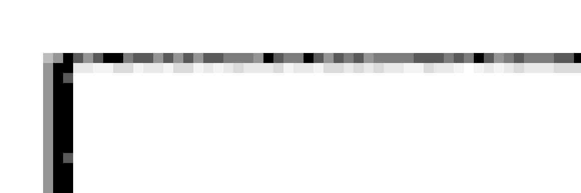
My only suggestion is the top & bottom line look “scratchy” on my monitor. I zoomed in and this is what I see. Such a thin line may need more fill and less shadow.
How does it look now, Jon? (I replaced the bottom pic in my original post)
No bird for us. T-Bone steaks. 1.25 inches thick, barbecued. Got 'em from a real meat market, i.e. they weren’t pre-packaged. Mighty tasty and not tough. Made a very nice meal.
Not going to give remarks on detailed views as the images are compressed to .png (or any other format) and the compression is blurring things. No way round except if you go vectorized. If you wan’t to judge that you need the full sized version … and as we are on the web, what counts if it is visually ok on screen
What I would like to give as input is alignment … Seems odd but believe me, align the elements … it’ll be more crisp and pro
below just a few lines to illustrate what I mean, I mention it as a constructive remark … not sure the software you use allows to play with letter spacing and interline spacing …
If you look at the current OEM logo, you’ll see the same odd-ball spacing. I tried to duplicate the original as closely as possible, hence the alignment in my image. Aligning the text and ajusting the line spacing is quite easy to do. I’ll fix those two items and post another image.
Robert suggested SVG. Looks like producing an SVG version is easy to do with Inkscape. That’s next…
Agreed. I noticed that too, but it is (or should be) very easily fixed. Having once been shown a few tricks of the trade by a graphics designer, accurate alignment might not be best, it is how it looks that matters. For example: Lining up the ‘e’ of emoncms and the ‘O’ of Open could be exact, because both are rounded, or it might be that the ‘O’ needs to overhang fractionally because it is a less bold colour and a lighter font. I’ll say that the ‘s’ of cms needs to be fractionally to the right of the ‘n’ to make it look aligned, because the ‘n’ has a solid vertical whereas the s is rounded. But I think it’s OK to have the letters slightly smaller than the dial, and the weight of the descenders ‘p’, ‘g’ & ‘y’ needs to be taken into account when lining up the bottom.
Your objective will be to position the text vertically so that it appears to be aligned horizontally with the centre of the logo. My guess (if you keep the text at the same size), is the descenders will go slightly further below the bottom than where Eric marked them. Again the visual weight of “Open-source energy visualisation” has to balance the strength of “emon” in emoncms. I think however the baseline mustn’t go below the dial but it’ll be quite close.
for me the second line might go a tat more to the right, 1 or 2 pixels ???
and another thing that strikes me now: all the blue is top and left. Why not try “visualisation” in blue ? Graphically maybe more balanced and we could read (if we follow colors and not just the lines)
emon visualisation (in blue)
open-source energy cms (in gray)
Not to sure it’ll ‘work’ but maybe give it a try if this doesn’t ask a few hours of work ?


