Thank you ![]()
I multiply the Input by a correction value before I log it to feed
Ah, I see, there are multiplier and offset processes under a calibration heading which I can add to the power input. So given the quoted slope and intercept values from the console, I should put them in here (as stages 2 and 3)?
(I can see using this multiplier would fix an approx. 10% under-read, but I’m not so sure whether the intercept is intended as an addition or subtraction).
Why the addition?
If you are over reading, you need to multiply by less than one.
Remember this will only work for readings going forward. You could run a post process to rebuild the feed with the adjustment (there was a discussion a couple of days ago about this).
Excellent improvements, @TrystanLea - thank you. I’ve not yet updated, but will do so soon. Can’t wait to see the averages views. They will definitely be useful.
Can I beg a couple of new features though, if you’re delving in code (and assuming you agree with them).
1 - the ability to enter a reference fixed-rate tariff for comparison, and have a line drawn on the graph at that point (ideally toggle-able on the view with a button or tick-box). I have noticed at times that it sometimes requires a bit of mental headflipping to visualise when the Agile tariff is cheaper than ‘your old tariff’ for comparison, and as such, a line would be useful. Not on all views, I’m sure; and certainly only really helpful when the Agile cost/kWh line is already showing, but you get the idea, I hope.
2 - the ability to ‘zero-fix’ the baseline axis (whether for Agile cost/kWh or consumption/cost per half-hour). They have a tendency to jump around day to day and this can stymie quick ‘how are we doing’ comparisons, if you don’t realise the axis has changed. It’s probably also worth mentioning that sometimes I get confused about which number is which, on the lefthand y-axes… one is obviously cost/kWh and the other is consumption/HH or cost/HH, but I can never remember which it is without a bit of a ‘double-take’ and a proper think. My maths teacher always told me a graph wasn’t a graph unless it had a title, and its axes were properly labelled in terms of their function/item name, and with their measurement units clearly stated. I’m not necessarily suggesting they need to be that perfect… but you get my point, I hope. I appreciate that there may not be masses of space for such things, in which case maybe a solution would be colour-coding of the y-axis to match the bars or Agile cost-line? And while we’re on that subject, how difficult would it be to have the Energy have different coloured bars (and axis) to Cost? I have, on occasion, looked at one, not realising it’s the other - until again, much mental scratching and realisation kicks in. Would be nice if these things just ‘leapt out at you’ and were consistent and clear, every day. My wife would thank you too! 
Last one, I promise (at least for now)…
The tickbox for ‘Show energy and costs based on Octopus smart meter data where available’ - any chance that there could be an option to hide the API-derived data from the bar-charts, when this was toggled off? Occasionally I get outages, and occasionally I seem to get variations, and if both feeds are shown, it can be hard to quickly spot such gaps and conflicts. If I could flick between local and API data, both in chart form as well as numbered averages/costs, etc, then it would be quite useful. The realtime vs API variation figure you’ve just added is a fine example of when such investigations might be valid to do, and will be very useful in any case, so thank you for that addition!
Many thanks for all this hard work. Your app is utterly indispensable in our family these days, and is a constant source of interest and a guiding hand in our peak-shifting exploits, you’ll be happy to know.
Why the addition?
In the console log, there are two values for calibration, a slope (ie. multiplication factor) and intercept (constant offset) for the best-fit calculation. The addition is for the constant offset. I’m just not sure of its sign.
If you are over reading, you need to multiply by less than one.
Indeed, but I’m under-reading compared to Agile metering, so I’m pretty sure this is correct for my hardware.
Do you mean the browser console? Pretty sure that is nothing to do with scaling the Input to the Feed, just how the graph is drawn. @TrystanLea will know more.
Sorry misread your earlier one. How is your voltage?
Currently showing as 216V±0.5V which seems on the low side. I’m using the AC-AC adapter from the shop for a reference, and I’ve not done anything specific to calibrate that.
Thanks @borpin, I’ve changed it to say disabled as its a little shorter, hopfully that sorts the wrapping for you:
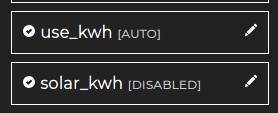
Your screenshot shows some strange formatting, the bounding boxes for the options all seem to be missing?
Both good ideas, but are unfortunately pushing against the way the apps are implemented as client side apps. I think this involves expanding the agile consumption data import script into a background service that also does these other things as well as fetching configuration information from the front end app configuration itself… It’s a bit complicated to get this right on the implementation side… but possible of course.
I’ve made a couple of improvements to the tooltips to fix this.
Thanks for the improvement suggestions @BigJacko I will take a look at these and hopefully update soon
OK, how about API access to that data then? If it is being generated for the App, could that same process be triggered by an API call?
Could it be an emonhub interfacer? Pull the data from emonhub.conf? Needs to use a different/specific publisher mechanism.
Just thinking of a simple way for users to get the data into emoncms.
Just within tolerances. I’d log it and see what it does over a period.
Yeah, it’s 220V now. I had a phone call from Western Power this morning because they had an outage overnight (we’re on their priority customer list). They said there was a temporary fix in place, so maybe that’s why it’s been a bit low today 
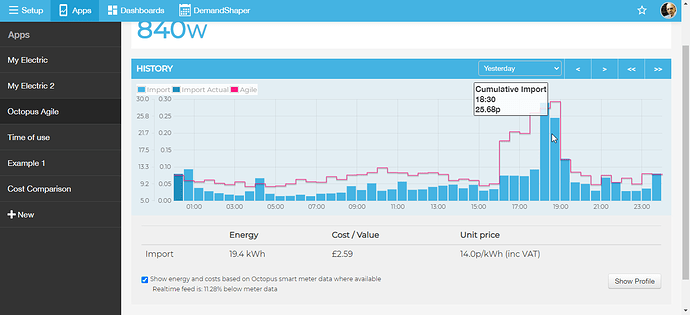
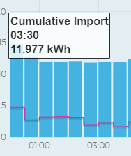
Slight problem… it’s now impossible to tell what day is being displayed, if, for example, one uses the ‘Yesterday’ button and clicks the << arrows a few times. Same for the ‘since midnight’ (which I use a great deal to refer back to Agile-days.
Example:
What day am I looking at here?
FWIW, I used this very system of (previously) dated tooltips to prove to Octopus how much money I’d failed to save as a result of a protracted meter-install failure. 60-odd daily screenshots with dates, times and consumption. They paid, too. Please don’t take this functionality out, because now it’s impossible to be certain what one is looking at on the graph, now, let alone prove it to anyone else! 
Yes agreed, but it is a bug.
If you refresh the page, it works as expected (with date).
Switch to profile it shows what you are showing.
If you change back to normal the tool tip does not revert.
@TrystanLea - it is not clear which mode you are in as the button does not change. - See above for my suggestion to make this a toggle.
Sorry, fixed the tooltip bug now and its now changing the title from ‘history’ to ‘profile’ when you change the mode.
Can you fix the release version, please?
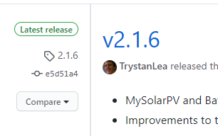
Done, created a tag 2.2.2 not a release at this point
Excellent.
Could you add an average to this tooltip? Text could easily be smaller - see size relative to scale text size.
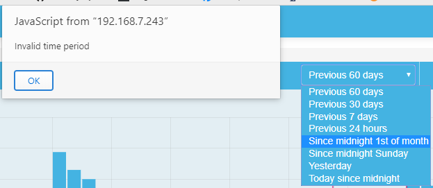
Still getting invalid time period for since Midnight 1st.
