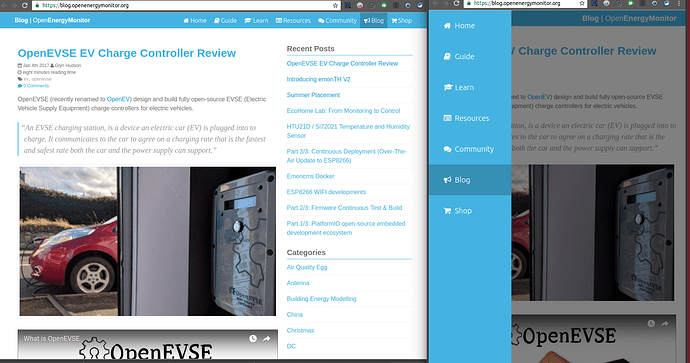
New homepage and building blocks website

@borpin Brian, you’ve managed to elucidate a lot of the points that I’ve struggled with for a long time. I think the key problem is that OEM had grown organically over time and …

Yes, but there comes a time when old stuff simply has to go. Or be incorporated into current data & practice. There’s nothing to stop you from marking the material “Obsolete” or something like that as a warning that it is superseded/not supported/not in development or whatever.

Having contributed a fair slice to Building Blocks, I’m only too well aware that there’s a lot of duplication in there. This is where a critical review based on “what would we have, knowing what we know now, if we were starting from nothing” should take place and only when that overall strategy been decided should you look at the old material to decide what is usable for incorporation.

But it does if it’s greyed out - it serves as a signpost to let you know where you are. Sorry Brian, but I hate menus that reload the page I’m on. [F5] does that if I need it.

I concur. When I was putting together a website for my friend’s B&B business, I spent quite a bit of time reading up about page layout and where to place things, and the point that everyone hammered home was “you’re only ever one click away from losing a customer”. Everybody involved here needs to step back and look at the site from an ignorant newcomer’s viewpoint. And make sure that new customer doesn’t click away for all the reasons everybody has mentioned.

That’s what I mean by ‘what is usable for incorporation’. They’re good pages. Students etc still use them and build projects with them. But they must not be shoehorned into a structure just because the structure is there. If ‘Learn’ is about Megni-supplied kit and OEM software, those pages should NOT be there. I think I’m with Trystan here - those pages demonstrate the theory, so that’s where they go (but maybe rewritten to incorporate the material better into the theory rather than transplanting them wholesale). Like a lot of the material here, there’s a lot of crossover, and that’s the source of many of the problems that are surfacing in this discussion.

That’s the biggest understatement of the year (so far). It’s not ‘not easy’, it’s very, very hard. And time-consuming. And not often appreciated. And definitely not cool.
But done properly, it’ll cut a slice off the support effort that goes into the forum.

3 Likes

Yes, this is exactly how ‘learn’ works, parts of learn e.g. zero carbon energy model come directly from a separate zcem github repo.

Ok, you have convinced me. We will aim to have an identical common top bar between all sites with the site the user is currently visiting highlighted to indicate user location. This is a nice idea. Looking again, this is how the platformio top bar works.

1 Like

Agreed and I was not suggesting that, but just keep the top menu consistent across all the different parts. If it is, you always have a way back to the domain home page and also to the top/home page of the part you are on. I don’t mind it being like the forum, that hides this as you scroll; I know it is there if I want it.

It is a jigsaw; all the bits will fit together to make a great picture but it takes time to arrange them and fit them in where they should go.

I’m not so hot on the actual technical stuff, but I can spot inconsistencies or potential gaps and also provide a perspective on where different parts could go so happy to help.

1 Like

Current page has been added to the navigation bar on the forum. If you have any ideas about it please let us know, otherwise this template will be used on the other sites soon.

1 Like

Just some initial feedback on the site, I had a look at the pulse counting and it describes how make various boards or download sketches but does not tell you how to do it from shop bought items, it also doesn’t even mention how to setup the various processors needed on the emoncms inputs. I have to say it could be still confusing to a novice trying to learn.

Regards
Dave

Suggestion for the Emoncms section near the bottom right corner of the new home page.

Presently it reads Cloud & self-hosted

Would it be better if it said Cloud and/or self-hosted?

or perhaps Cloud or self-hosted?

Hi @Dave,

Thanks for your feedback.

We have tried to create a distinction between setup for ‘official’ OEM hardware (as sold via the shop) and general technical education articles e.g. AC theory, how pulse counting works etc

The setup for ‘official’ OEM pulse counter (as sold via the shop) cab be found in the pulse counter section of the User Guide.

Again, this is in the User Guide under Emoncms logging locally setup.

The User Guide site is designed to be a quick-start booklet while ‘lean’ is desired to be extensive learning resources at a technical level and not necessarily specific to our hardware.

Why not call it that?

I’ve noticed with many things I’ve purchased over the last 10 years or so, the manufacturers often include a “quick-start” guide (often a single sheet of paper) in addition to a full-blown user guide/manual.

Another good example where, by merging this all into one resource, there would be a clear distinction between the two and avoid such questions / confusion.

Whilst I understand why you have the information split like this, and in theory it should work, the fact it continually has to be explained should demonstrate that it needs to be looked at again.

I agree there clearly needs to be a single place where all documentation resides (either a virtual single location or physical) this could be further divided into a “user guide” and a "wiki like gathering of other info such as theory, experimentation, development, general info etc,

Indeed and they are very useful, however I do not recall ever seeing a “full-blown user guide/manual” that omitted everything included in the “quick-start” guide because it was provided somewhere else, which seems to be the intention here.

I understand the desire to offer a helpful quick start guide, but it ceases to be one as soon as it is intended to replace a fuller guide, it can either be a quick-start guide in addition to a fuller guide or if it does contain all the user guide info it is not “quick start” it simply cannot be both “full” and “quick” as the topic is too complex.

On a previous discussion around these same points it was said the “quick user guide” was intentionally set up for use on a mobile phone for use in confined or remote places as that’s where many distribution boards and meters were eg under the stairs, I’m guessing someone working on all fours under the stairs wanting to know which end of an emonpi to plug in their optical pulse counter will not remain there to configure the input processing, feeds and graphs. I really like the idea of a mobile friendly “quick install guide” for this purpose but the current “user guide” is not really suitable, if we are struggling to find stuff using a desktop PC, using a mobile under the stairs is unlikely to be any easier.

I hope these comments are taken as “constructive” criticism, although they are not overly positive comments, they are 100% intended to help make improvements, the work done so far is appreciated and just as it has already been said in this thread (and many others), documentation isn’t an easy task and this is further compounded by the complexity of the content and the wide range of audience competencies.

The reason I have not previously posted on this topic is because I do not share the same opinion on the direction this is heading and I certainly would not want to stifle progress if I was alone in my thinking or I thought airing my points was unlikely to have any positive impact.

@Gwil the recent changes to the navbar look great, I did start to write some points I thought might be useful, but one of those inter-connected points was about the use of the word “community” when it had been previously decided to use the word “forum” in the navbars

I do not know if that decision has deliberately been overturned since it was made, but if it has there seems little point in discussing further, if there is interest or it is an oversight I would be happy to share some thoughts on the navigation.

Yesterday, I looked critically at “Learn” and “Electricity Monitoring”. In all honesty, copying material from the old Building Blocks was a good way to populate the site but it really needs rather more work than that to address all the points that have been made both in this thread and previously both in this forum and indeed in the old forum.

I’m going to try to write a contents list for what we want under the “Electricity Monitoring” heading, taking in as much as I can from the points made in this thread above and previously, and paying no attention whatsoever to the material that’s already written; then follow that up with a short synopsis of the content under each item. At that point, I’ll open it up for comment and then task of editing and extending the existing material or writing the missing pieces can start.

@pb66
I too thought that it had been decided that “Community” represented the people and “Forum” was the place for discussion. If I saw a heading “Community”, I’d expect to find something resembling a list of names and their areas of interest or expertise; i.e. a guide to who to address with a specific query.

Good idea, that sounds better. I’ve made the change

It’s now live: https://openenergymonitor.org/

It was, but I know it was done because of a sincere belief that “community” was the way forward. The community did however persuade us to change the name of the store to “shop”.

I’d like to hear your thoughts about the navigation, your perspective would be very useful.

The fist page of the Guide has been renamed to “System Overview” this title best describes this page:

The navigation on the guide has been updated.

2 Likes

Excellent - looks great.

Thanks to @Gwil the Blog navigation has been given the same treatment :smiley:

1 Like

A small housekeeping notice: I have added ‘Moved’ notices to the documentation pages (emoncms timeseries, android app & building energy modelling) that used to be located in the repository https://github.com/openenergymonitor/documentation. These now point to the new learn documentation locations.

1 Like

The links to emoncms documentation in the emoncms repository have now been corrected to point to Learn. I have also extended the emoncms user documentation section with links to videos and guides for using emoncms available in the guide.