It works a treat! Thanks so much @MyForest ![]()
It’s now been merged.
It works a treat! Thanks so much @MyForest ![]()
It’s now been merged.
Any way to send a notification in case the system randomly uses power over a threshold without generating heat?
https://emoncms.org/app/view?name=RVBHeatpump&readkey=4ce162af6750852a63e7ac631351b6e7
@glyn.hudson @TrystanLea also the temp graph lines/data look a bit off when comparing with other systems.
Sorry, I’m afraid this is not currently possible. Have you figured out why your system is doing this?
Your outside temperature data doest look right. What’s your emoncms.org username?
not mine, I was just looking around to see cooling data(none)
I think I may have found a bug in the calculations, for my system (Farnborough, Hampshire with Octopus Energy Services) the main page shows as 0 kWh/m².
I believe this is due to us using only the EPC calculations and not the detailed heat loss field.
Do we need to update the other field or is there a way to correct this so the calculation would work off of either set of values (with a preference for the detailed if entered)?
Is there any way to better represent the disinfection cycle on our heat pumps?
My Daikin Altherma 3 uses an immersion heater once a week as part of this cycle.
The electricity consumed by the immersion heater is measured and reported but not the heat produced as it doesn’t go through the heat meter. My immersion heater electrical feed is on a separate meter to the main heat pump as is my back up heater. The back up heater is ok as it is in the heat pump and therefore the heat generated is measured by the heat meter.
I think the energy consumed is worth seeing.
Is there a way to incorporate the heat produced, as the immersion is 100% efficient we know what it is.
would it be feasible to calculate and represent the data relating DHW cycles separately and allow them to be included / excluded from viewing depending on a user filter? This would be so that performance of heating alone can be compared between households that use a lot of hot water and those that don’t.
i.e. show me kwh (whole system) kwh (DHW only) kwh (heating only), COP, etc…
I was comparing my data HeatpumpMonitor.org with another similar
HeatpumpMonitor.org
recently and it was proving rather difficult as they have little/no DHW cycles whereas I have one a day at least.
I’ve noticed that my dashboard SCOP has been improving rapidly day by day as we are getting into the heating season - I only sorted my monitoring our properly mid-June, so I have 4 months of data populated with DHW only. which skews it of course!
the criteria for classifying “is it a DHW cycle” could be either: Time of day (if a known schedule), or Flow Temperature significantly exceeds the median , or for systems that have that capability, the value of a binary field that is readable.
There’s some discussion about this over here:
I don’t know if anybody else would like this.
I can do the maths more or less in my head but I would quite like to see instant COP at the top of the panel next to 30 minute COP.
It doesn’t mean much but at the moment I am watching what’s going on a lot as I try to work out how to get the best out of my installation.
Maybe other people would hate it?
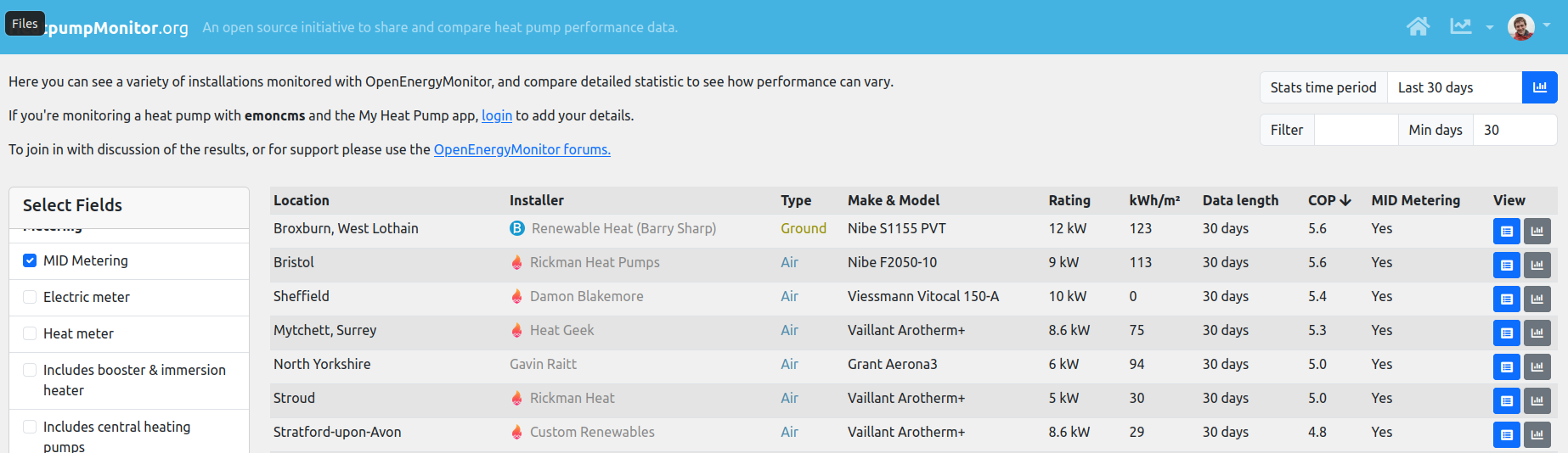
I’ve made a couple of modifications to the site, trying to take in people’s feedback about it not being clear enough when systems with only a few days are being compared with those with a full year.
HeatpumpMonitor now loads to show only the last 30 days by default and requires a full 30 days of data:
Then it’s easy to either click through the Stats time period: All which shows the list as before or Last 356 days which now only shows systems with a full 365 days of data.
Is this an improvement?
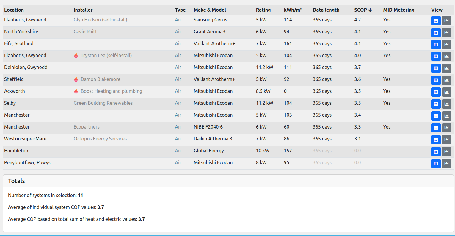
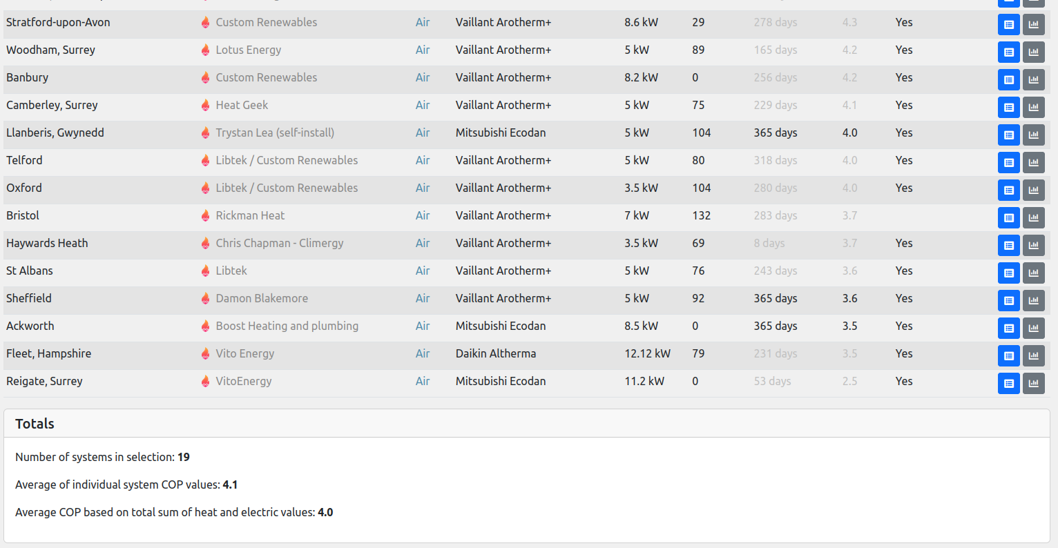
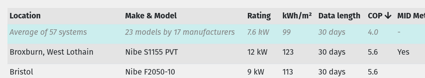
I’ve also added a very basic stats box at the bottom that gives the number of systems in the selection alongside COP as calculated by averaging all the system COP values individually vs the COP as calculated by first aggregating total heat and electric for all systems.
An example would be to filter by ‘HG’ for heat geek trained, here will all systems no limit on number of days:
The heat pump type, ground source or air source is now included as a column to make that clearer.
I like it. Thank you.
Thanks @matt-drummer !
Feature request: Please would you consider adding a column for average daily/hourly (when running) kWh consumption?
To save me dividing the total Electricity by the Data length (period). ![]()
![]()
Ooo… very nice.
…but how about having it as it’s own row in the table? Either at the top or bottom (or both), or even (dum dum DUM) in the middle? All numeric columns can be averaged (ignoring 0s) with the same rule, so it can show averages for any column that is added, and be sorted into the right place.
Nice tweaks @TrystanLea I like the default 30 day view and the basic stats box at the foot of the page.
It would be good if there was a method for messaging the owner of a system.
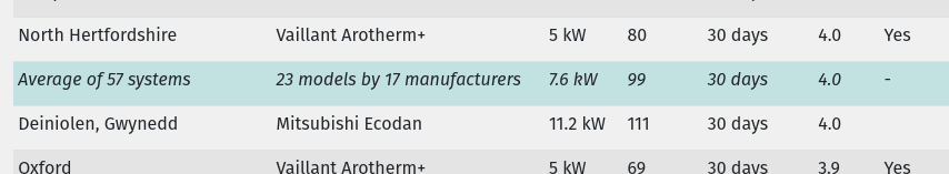
I have been comparing my system to others (it’s not doing great, a mixture of things I know about and probably not having the right settings yet) and there is another Ecodan 8.5kW (Brighton and Hove, self-install) that is doing much better on a similar sized house with a very slightly lower predicted heat demand.
They have marked it as having ‘Custom controls’ and I’d like to know what they’ve done to get their system operating so well.
It might just be that they have all new radiators properly sized whereas I have a mixture and one still to install. Also my primary pipework needs a sort out. But perhaps I could learn something that would help performance.
Excellent - yes I think it is a very worthwhile improvement.
Yes I think having a row of data for the “average system” would be excellent.
It could then perhaps also be used in comparisons on the graphing pages (might not work in all instances perhaps).
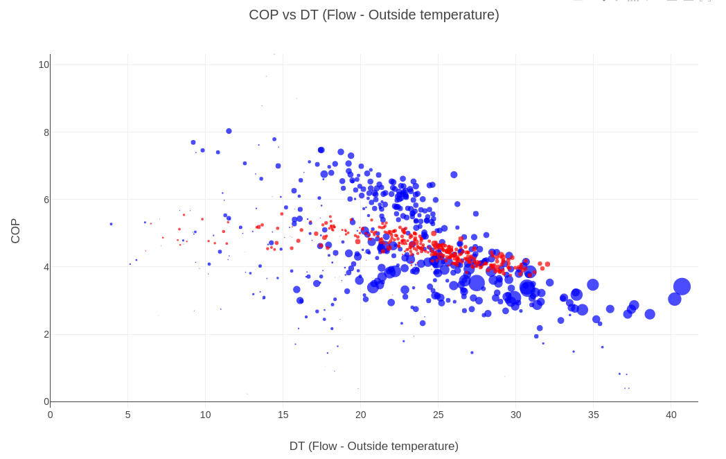
The compare feature is a useful way to see how two systems are performing differently:
(be sure to set the dates as the default may not be useful)
We can see that your system (blue) has a much broader spread of COP, and goes to a high flow temperature, and has had to deliver a lot (about 2x) more heat to the building since the start of October.
(If you’d like a deeper analysis of your system’s performance, I’d suggest starting a new topic)