HeatpumpMonitor.org: New Landing page

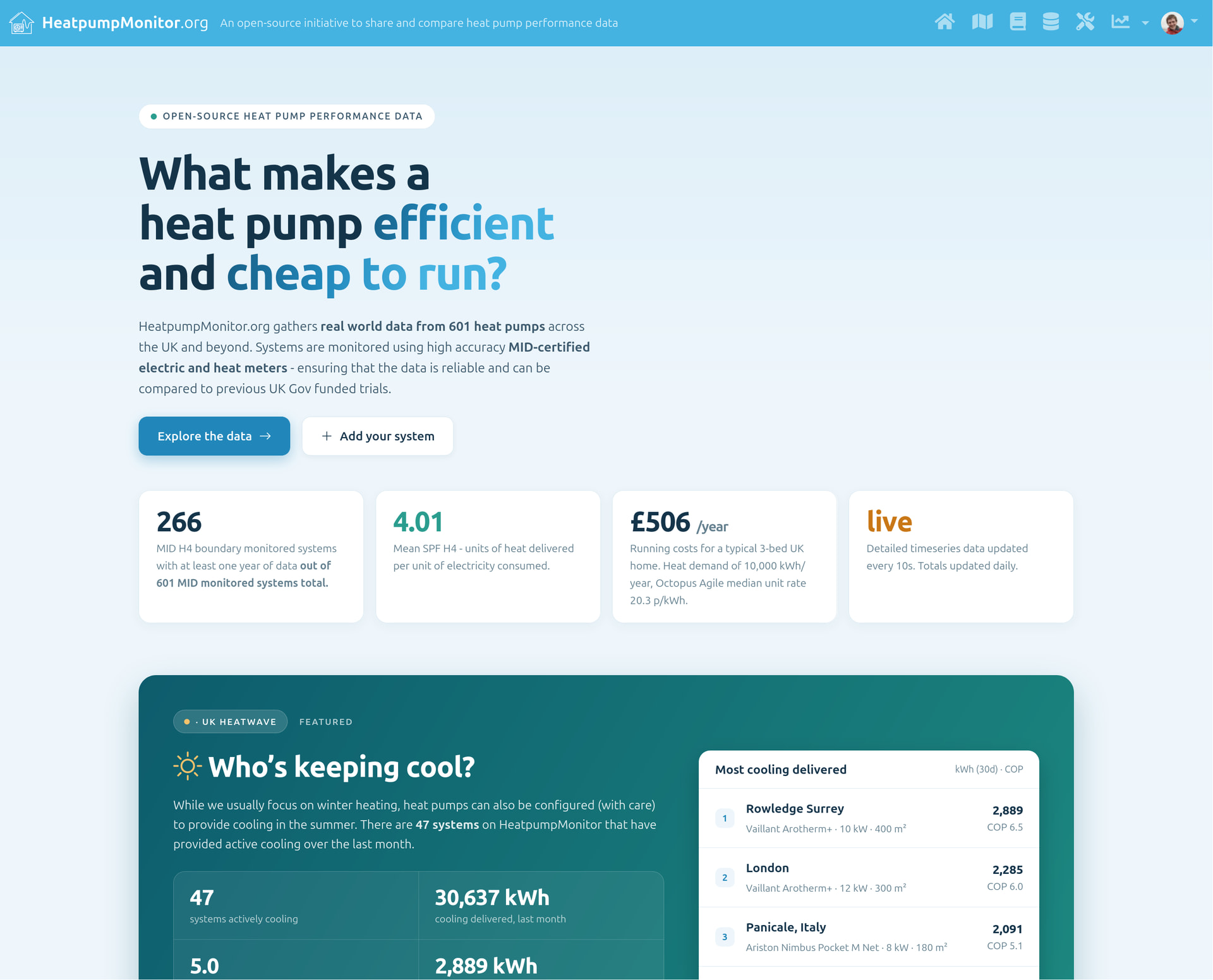
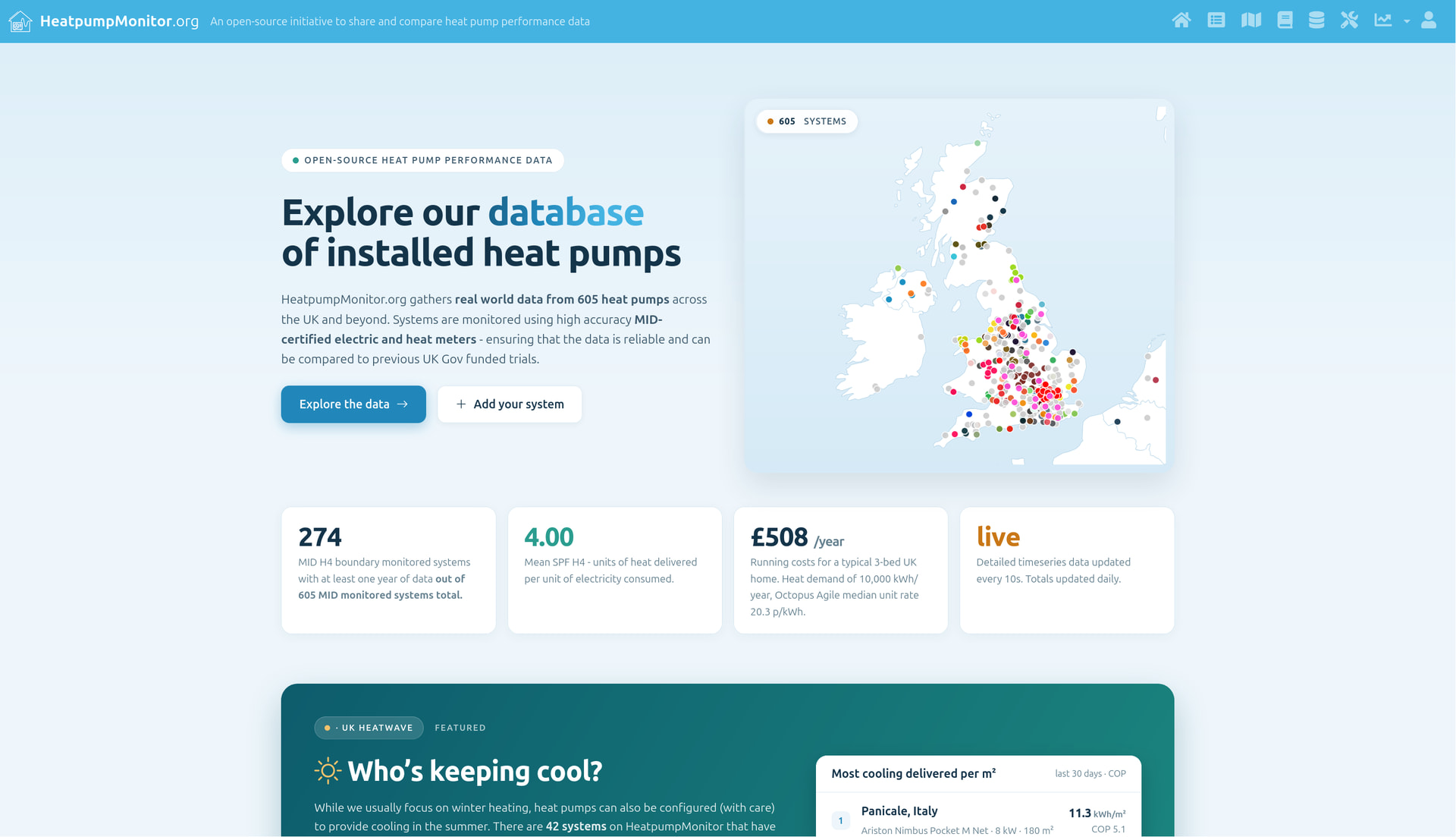
We’ve been working on a new landing page for HeatpumpMonitor.org over the last few weeks, the latest version is now live here as an early preview before we launch it properly, feedback welcome!

https://heatpumpmonitor.org/home

Key ideas are:

  1. Try to move away from the sole focus on the SPF leader board.
  2. Present a number of different interesting ways of finding systems on the site.
  3. Provide a simpler, more visually appealing landing page.

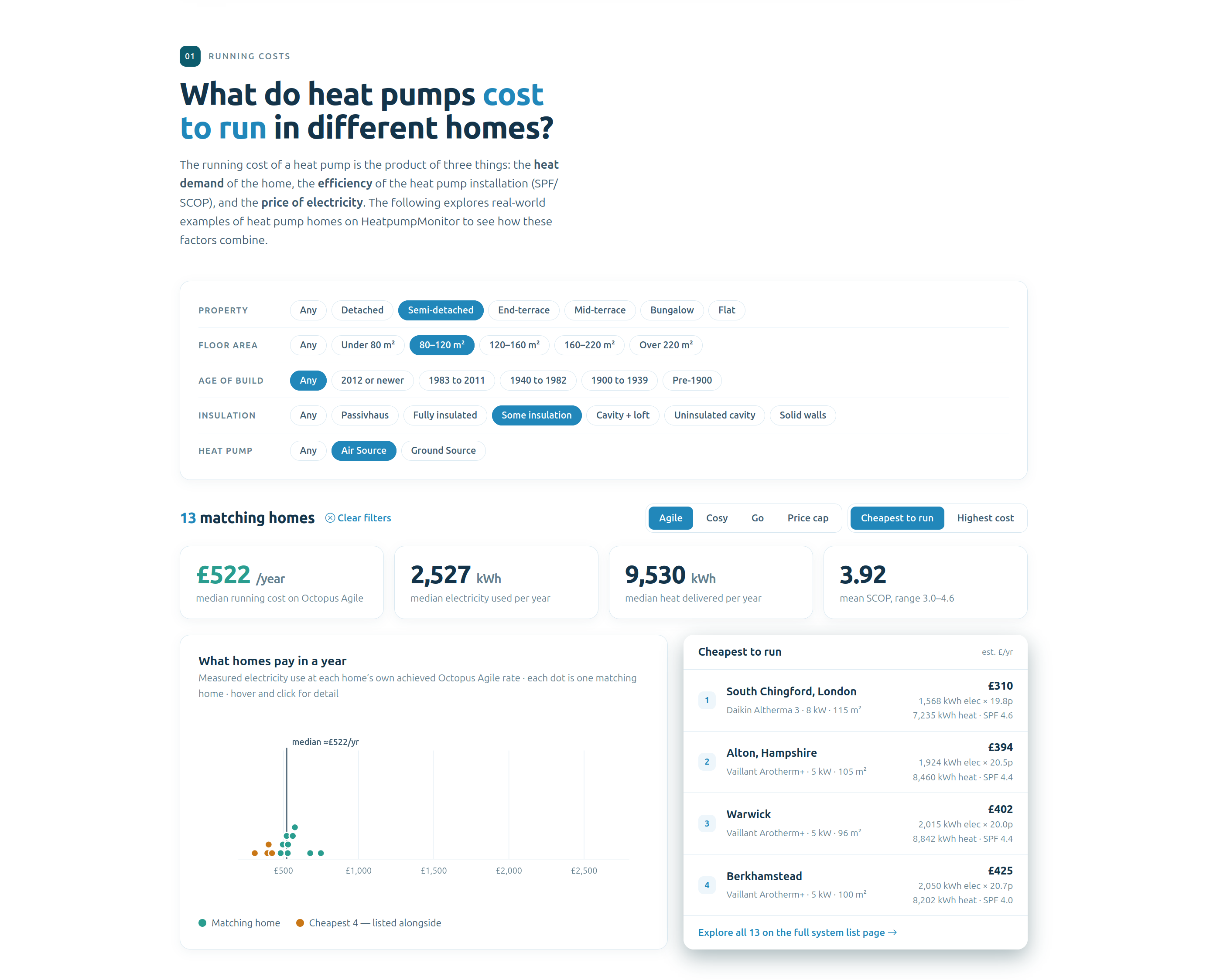
There is an increased focus on overall running costs and electricity unit rates - alongside performance. Highlighting that running costs are a combination of all three factors.

First there is a tool to find examples of running costs for different types of homes:

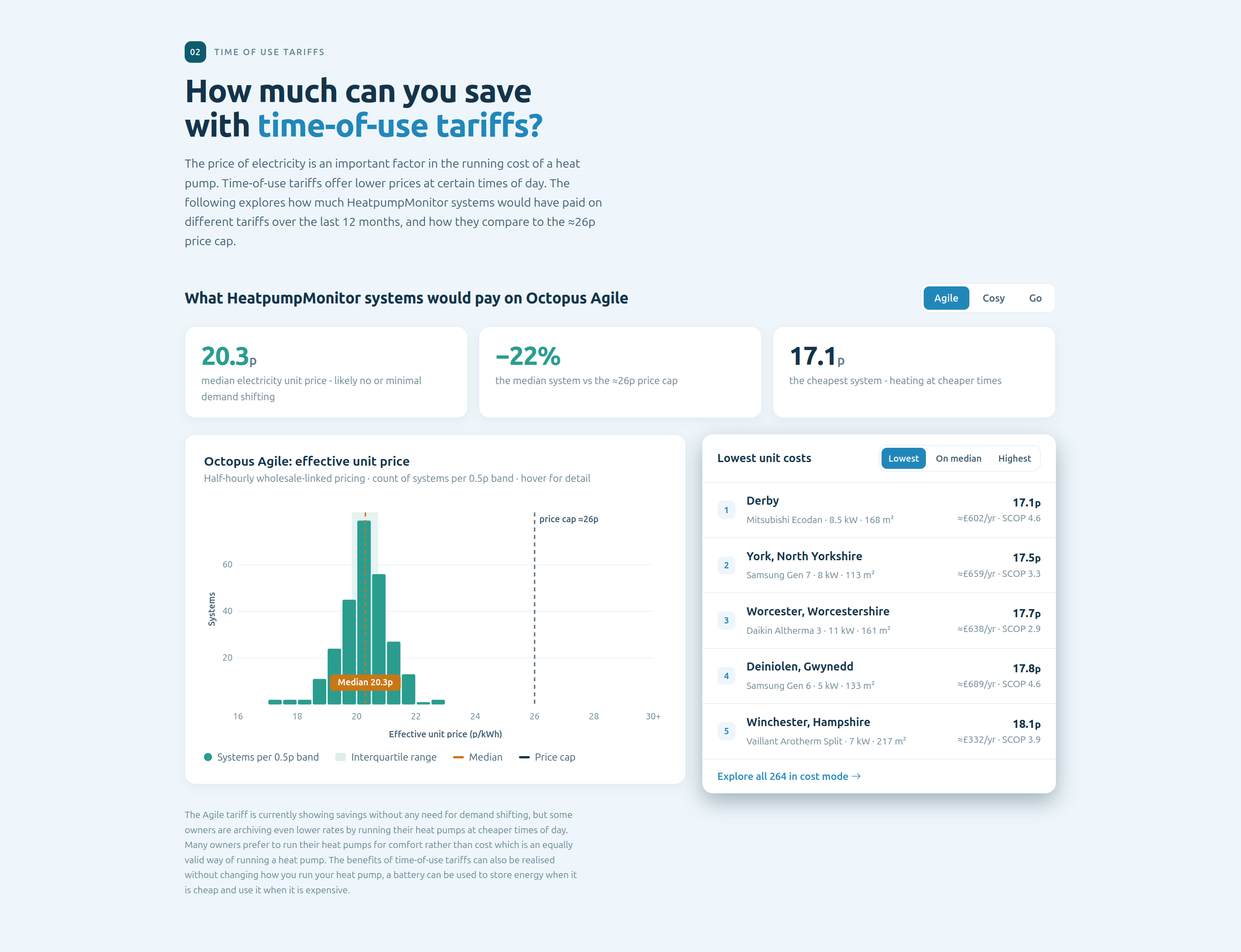
Second there is a live version of the tariff distribution analysis discussed in this thread: HeatpumpMonitor.org time of use tariff unit rate distributions

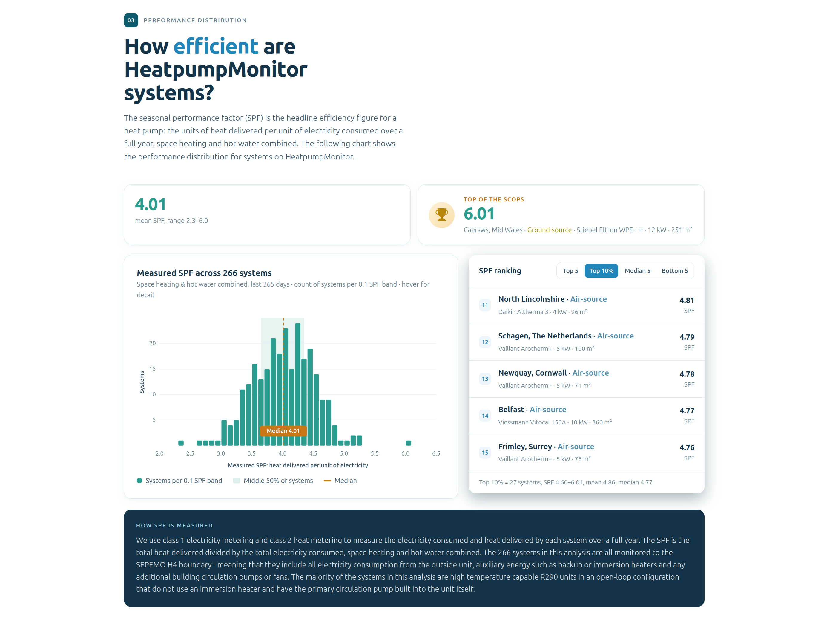
Third is the SPF performance distribution section, with option to explore, top 5, top 10%, median 5, bottom 5 etc.

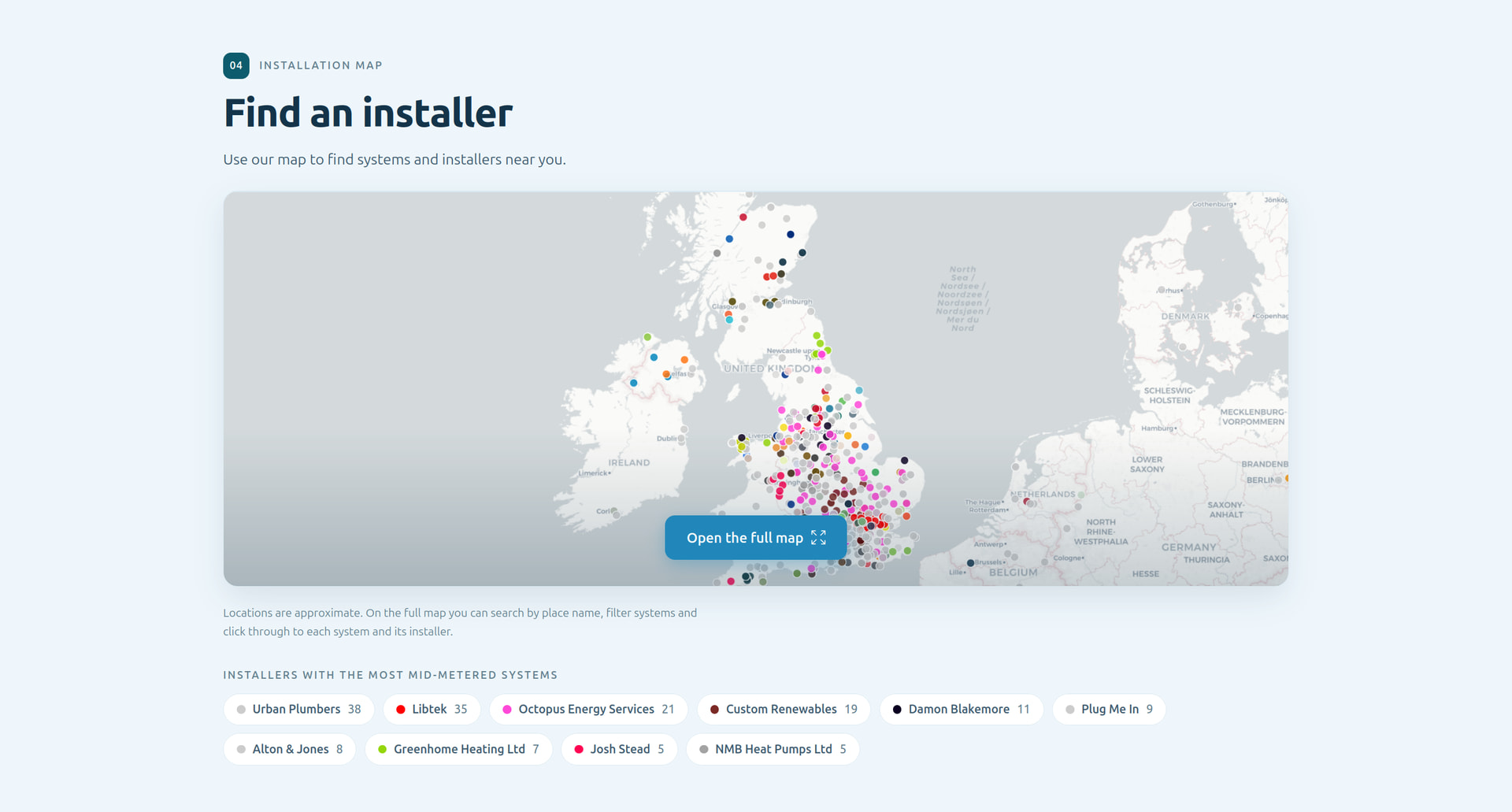
Fourth: Find an installer, a link to the map.

Thoughts welcome!

https://heatpumpmonitor.org/home

This is really good.

I like the focus on running costs over SCOP as I think this is primarily what is in the general public’s mind. The data is well presented and the default information pulled out by each dashboard is good.

One suggestion would be to add a region filter to the “What do heat pumps cost to run in different homes”.

Looks a better way to get into the site

Couple of comments a newby to heat pumps or monitoring systems may not understand

MID-Ceritifed?

Agile Tariff, it’s even a complex tariff to a lot that do understand it - would a new person to smart tariff draw a blank and really understand it or be drawn to savings they may not be able to realise, could using a standard tariff may be more meaningful to more people? Or include both for comparison.

Your cooling page will always feature big heat pumps. But may not feature cost effective ones.

Under the “What do heat pumps cost to run in different homes?” heading, there is an option to compare the UK price cap with Agile, Go and Cosy:

I think it would be better to use the price cap as the default here, then highlight the savings in the following time-of-use tariffs section.

Thanks @Jonathan good idea re region, will think about that!

Thanks @Johnmo , yes maybe more terminology explanation would be good.

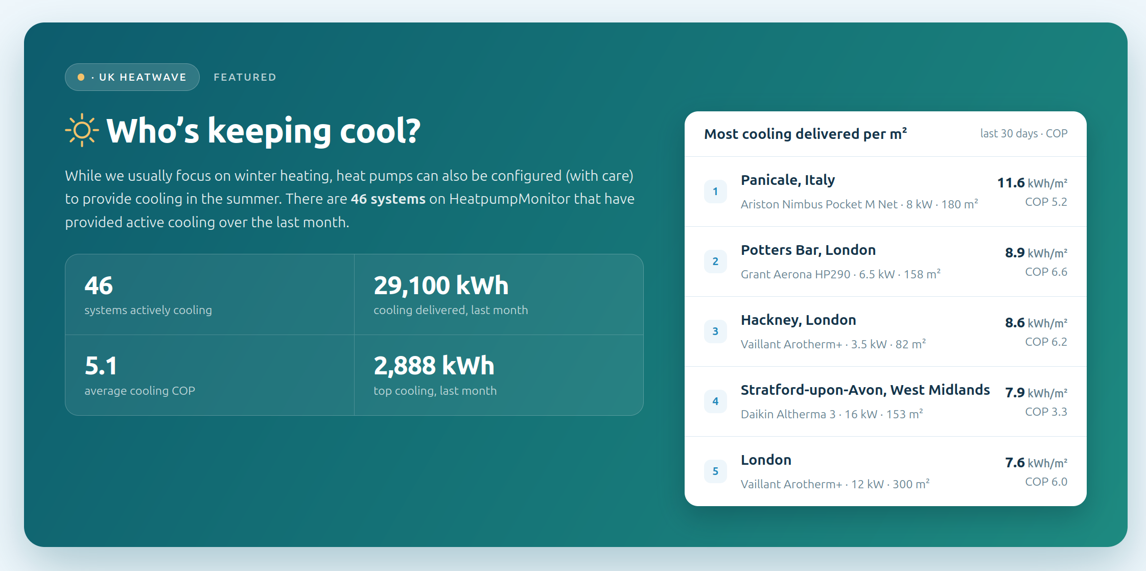
How about kWh/m2 cooling over the last month?

That may be better, but will always be a bit of a compromise

Il probably switch out the featuring of cooling sometime in the next few weeks anyway as the heat wave passes, so it’s more a section to highlight something different and interesting from time to time! Suggestions for what should be featured next welcome!

Looks great.

You should have a gas boiler house running cost in there and maybe also an oil boiler.

How about the top of the landing page being specific about what the user can expect :slight_smile:

The ‘running cost’ tool is nice. A couple of suggestions … a. could the window that displays the result be scrollable? Because it’s not currently, it means going to the full list of heat pumps then having to locate the one of interest. A bit cumbersome. and b. the result window shows floor area but not property type, insulation or age ie. if the “any” option is used for property type, insulation, age this info isn’t identified in the result - info that would help folk id. properties similar to theirs.

Nice! thanks for that clear suggestion @SteveW !

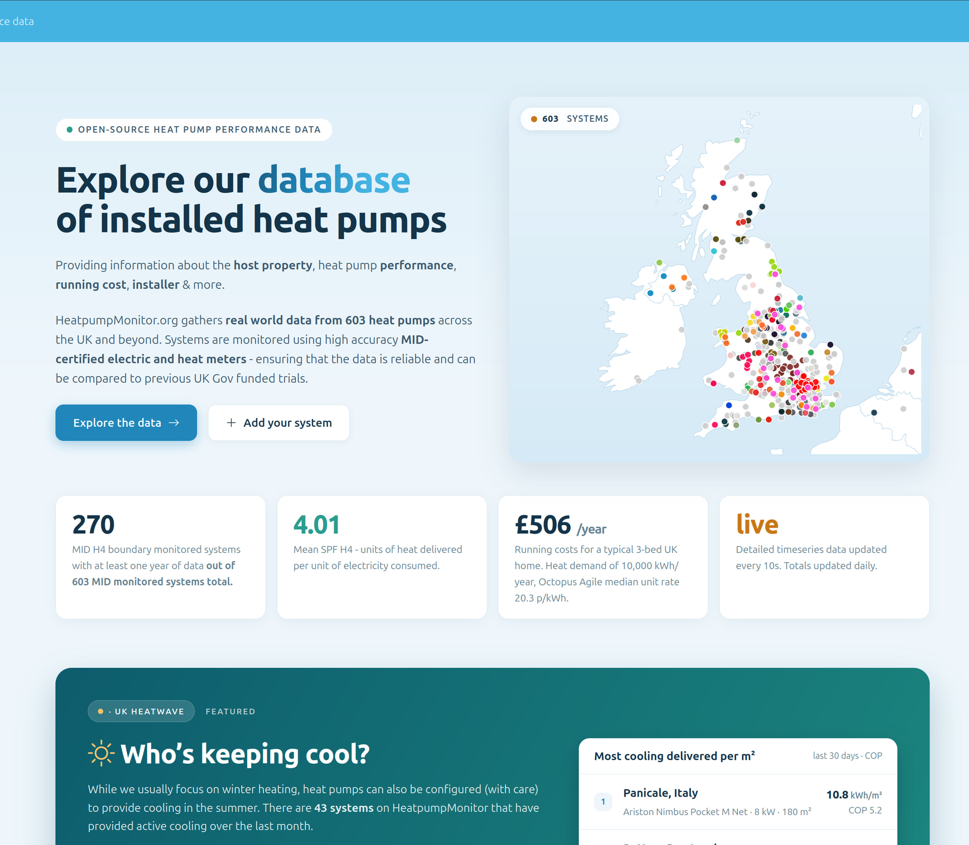
What do you think of the following @SteveW ? The map in that position is nice!

https://dev.heatpumpmonitor.org/

Is " Explore our database of installed heat pumps" the right title or should it be a sub heading to " What makes a heat pump efficient and cheap to run?".

Perhaps this should come first:

" HeatpumpMonitor.org gathers real world data from 603 heat pumps across the UK and beyond. Systems are monitored using high accuracy MID-certified electric and heat meters - ensuring that the data is reliable and can be compared to previous UK Gov funded trials."

followed by:

" Explore systems by host property, heat pump performance, running cost, installer & more."

Who are you aiming at, techie experts, Joe Public’s grandma or somewhere in between? Because it’s the answer to that which will determine how you pitch it.

“Explore our database of installed heat pumps” is fine if you know what a database is, have data for your own heat pump which you want to compare, or some idea of how to interpret data about heat pumps, while “What makes a heat pump efficient and cheap to run?” seems to suggest what they will read is like a Which? Best Buy report. If only.

My feeling is both are at opposite ends and too extreme to have a wide appeal.

The top screen-full of this page is what sells the HeatPumpMonitor.org website. That it has the data is important, that it’s a database is irrelevant here. That it is accurate and credible is important, MID-certified meters is irrelevant here. These are details that belong further down the page.

I’m trying to see @SteveW and @TrystanLea’s suggestions from the point of view of (maybe) the press or social media picking this up and the page being visited by people with a whole range of knowledge and expertise. What I think many prospective heat pump buyers and quite a few heat pump users will want to know first is, will my heat pump cost me more or less to run compared with what I have, and will it be “better” (defined how?), and can I make it better/cheaper and how? And if they have looked or start to look at the forum, the inevitable question will be, how can I be sure my designer/installer has or will get it right so that it will work at its best?

A minor technical point: is the headline value of 603 heat pumps a dynamic figure? If it is, why not say so somewhere?

@TrystanLea Roberts question ‘who is the audience?’ is a good one. I’ve assumed these updates aim to reach beyond the ‘early adopter’ to additionally cater for the ‘early majority’ type ie. people who generally don’t want/don’t need a detailed understanding. They’re mostly looking for reassurance - reassurance a hp will ‘work’ for them. Ie. simply observing that a large group of hp’s, 600+, are working very well would help to reassure. Being able to observe success (reasonable running cost, comfort level) in properties like their own would be a confidence builder. Knowing there is a good installer in their area is also reassuring. For this category of adopter, sufficient info to reassure but avoiding unnecessary data and tech speak.

Thanks @Robert.Wall @SteveW.

I’d say the intended audience is still fairly technical early adopter. A venn diagram between people who might like to read https://ourworldindata.org/ and those looking for a heat pump or working in the sector.. :slight_smile:

Beautiful work! I noticed the filters do not persist when moving from home page to the system table page, but maybe this is already a known issue :slightly_smiling_face:

I will pay for my pin on the map to have a hat. Just sayin’

I’'ve changed the title for now to your suggestion @SteveW, certainly up for considering other suggestions, @glyn.hudson is of the strong view that it’s a better title and I think matches feedback we’ve had from a few installers too.

The new page is a big improvement, well done and thanks.

I am not sure why you quote cooling per sq metre but not heating? (this question really should have more ???). All heating stats should be quoted per square metre. I think it is pointless to compare heating costs without looking at the size (area) of the building. (I know, age insulation, but you have to start somewhere). The data currently presented will be daunting to the normal non-techie adopter. I hear what you are saying about the audience,… BUT you have to move first, otherwise the non-techies will simply click off the site. They cannot and will not spend the time trying to understand the presentation of data which they do not initially comprehend, why should they! You’ll have to move first.

For example, let’s say X heating their home by fossil fuel, X is likely to know, the size (sqft, sqm), the amount I pay in bills, maybe even the property age. Give X a calculator on the front page, they can input size (sqft, sqm), input the age (or build-year range), and give them a spread of results based on the data, “you could be heating your home built in 1970 for between £abc and £xyz per year.” What better argument to fight the HP running cost myth.

One of the issues with ‘community stuff’’ is that many involved do have a life philosophy that if they do not know something, they go and find out, which is fantastic, but it can lead to a lack of empathy and sympathy with those that are not quite on the same wavelength,… often the community has an expectation that others should be and do the same, go and find out. Outside the community, it’s not like that, especially true when the site grows, the spectrum widens and it has to outgrow the likeminded founders and initiators if it wants to have a wider appeal and be useful for people that do not understand SCOP, COP, SPF,…

SPF/COP ranking/comparison is an over-complicated nonsense,.. there, I said it. …£/m^2 OR £/m^2/yr.

Ask the man in the street what the efficiency of their oil or gas boiler is, or the efficiency of their petrol car, they won’t know, so why do we keep pushing this ‘n’ on them? Ask them how much they pay for fuel (kero, gas, petrol, diesel) or their mpg and you’ll get a sensible answer most of the time. Of course mpg is a very tangible proxy for efficiency, COP is too intangible. £/m^2 is much better.