Nice work @icenov
I was asking some of those questions too.
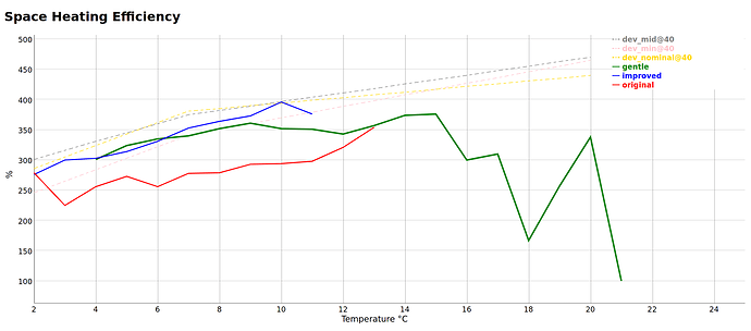
I opted to stop graphing by time. I found I was using “month” as a proxy for “ambient temperature” so I flipped the whole thing around and decided to actually graph by average ambient temperature for the day.
Like you, I have a lot of these graphs, but mine don’t look as impressive as yours.
My graph is a bit more weird because I’m segmenting the behaviour based on the control algorithm that was in place on the day too.
I haven’t yet worked out how to graph by something other than time in EmonCMS. However, seeing as I’m off-piste with my graphs in my MMSP Heatpump App in EmonCMS I’m tempted to just pick a different axis for my purposes.
Now, the interesting intersection with what you’ve done is that I do lots of Jupyter / Panda analysis elsewhere and I was trying to work out how to do the processing. Like you I run it outside EmonCMS because I’m reading every single reading at finest detail for all of time. I’ll be honest, I’m finding having stuff in EmonCMS incredibly valuable because it’s merging my heat pump, power usage and weather station data into one place. I just thing I’m going to overwhelm everything by pulling it all into the browser and doing the calcs there. I probably need to figure out how to get the job stuff working in EmonCMS.
