After having a battery installed earlier this year I wanted to get a better visualisation of how the integrated pv-battery-grid-hotwater system was operating across seasons. I’ve started with a basic heatmap, but also looking at some fancier possibilities…
Here are a couple of charts from my system:
PV output (W)

Battery SoC (%)
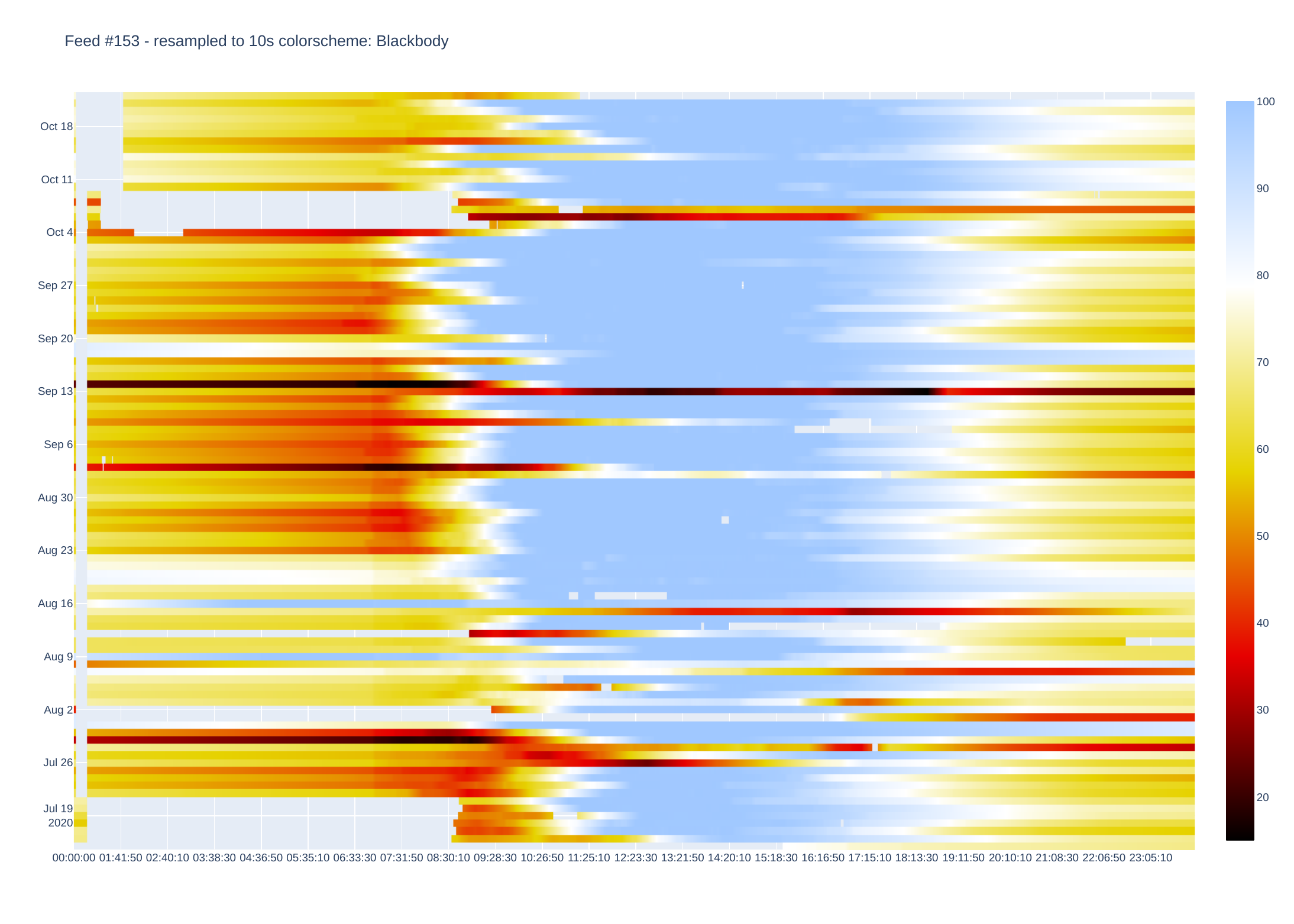
Grid power (Watts import/export)
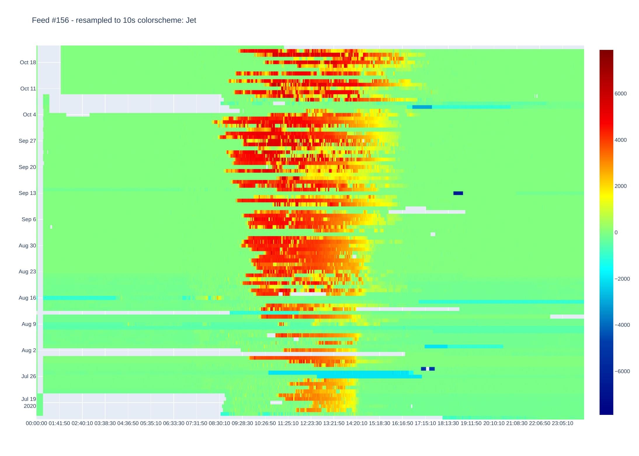
House load (Watts)
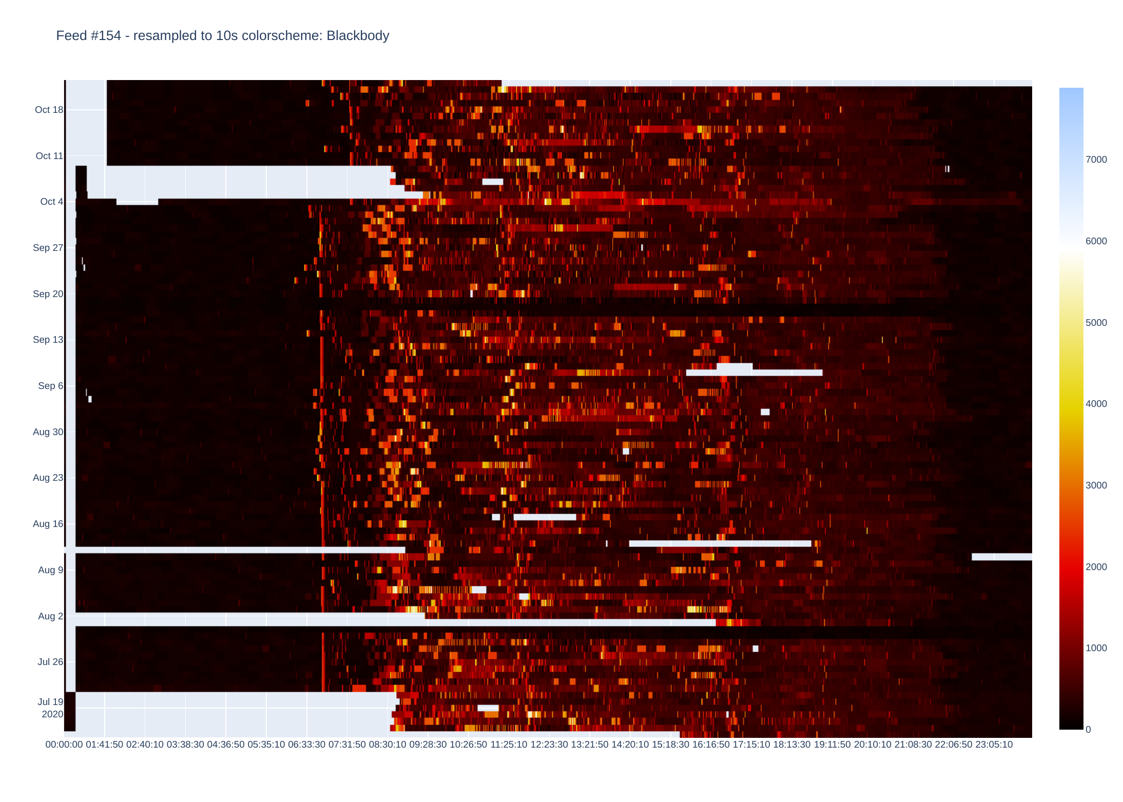
Gaps in the data are evident.
These are generated using a quite basic python script, that looks to read files using the OEM phpfina format, such as 66.dat and 66.meta (I think it could be easily adapted to the other formats). The data files need to be imported from the emoncms server using e.g. scp or filezilla etc. I don’t recommend running this script on the server if it is based on an early Raspberry Pi. The data files can be individually exported or extracted from a backup archive.
The data is imported and saved as a numpy file - which avoids unnecessary conversion to text unless requested.
The imported data can be written as csv text file but these can easily run to hundreds of megabytes and slow things down a lot.
Data is then imported to Pandas where some timestamps are added/corrected and duplicates removed, as well as resampling if required (e.g. 10s data can be down-sampled to 60 or 600s). A small amount of “forward filling” is undertaken to interpolate missing data. This can be changed - currently limited to 15 data points. Other means of filling are available in Pandas such as linear, back-fill etc.
There is an option to use the whole data set or sub sample by start/end dates and some basic error checking such as valid feed numbers, start/end dates etc.
The data is then “pivoted” to create a rectangular matrix with time columns and date rows such as:
00:00:00 00:00:10 00:00:20 00:00:30 ... 23:59:20 23:59:30 23:59:40 23:59:50
2017-01-26 18.500000 18.500000 18.500000 18.500000 … 17.700001 17.700001 17.700001 17.700001
2017-01-27 17.700001 17.700001 17.700001 17.700001 … 21.799999 21.799999 21.799999 21.799999
2017-01-28 21.799999 21.799999 21.799999 21.799999 … 18.100000 18.100000 18.100000 18.100000
2017-01-29 18.100000 18.100000 18.100000 18.100000 … 20.200001 20.200001 20.200001 20.200001
In this case there are 8640 columns (24 hours of 10 second data).
Plotly then creates a heatmap by assigning a colour to each data point. There are plenty of colour schemes, but I mainly use Jet and Blackbody. Blackbody is good for data that e.g. only goes positive (or negative) while Jet shows extremes well. There is an optional parameter which sets either Jet or Blackbody - if data is centered around zero (or some other midpoint).
The script asks to save csv and or image files - beware saving as csv as this can be painfully slow.
I use Plotly to process data as this does most of the charting (originally used matplotlib but heatmaps are fiddly to get right).
Colourscales etc can be changed in the script - see comments in script.
It is currently setup to display heatmaps via a browser, but images can be saved as pdf (other formats available by changing script).
The script uses Pandas, Numpy, Plotly, Pylab python modules, which are easy to install.
'''
Script to take data from emoncms phpfina data. See:
https://learn.openenergymonitor.org/electricity-monitoring/timeseries/Fixed-interval
feed files comprise both dat and meta
meta file has 16 bytes of unsigned integer for interval and start time
dat and meta files are binary so need to be read as such
these files need to be in the directory of this script
in linux I use scp to transfer to desktop PC
I don't recommend running this script on the same rPi that runs emoncms as it can take a lot of
memory and cpu as files get large.
my system is little endian - might need to check and/or change
for meta file - read interval bytes - 9,10,11,12 (eg 10 seconds), and start time bytes - 13,14,15,16
script can save data as text (eg csv) but files can get very large - hundreds of MB for a couple of years
of 10 second data
Currently setup for Australia/Sydney timezone, but can be changed
'''
import pandas as pd
import plotly.graph_objects as go
from plotly.offline import iplot
import datetime as dt
from pylab import *
import sys, os
import time
import numpy as np
# setup variables for testing input
feedtest = ''
save_csv = ''
plotdata = ''
saveimage = ''
zmidv = ''
# make sure valid feed and meta files are in directory
while not feedtest:
    try:
        feed = input('What feed number to process? ')
        if feed.isdigit():
            print('feed is a valid number!')
            metadata = feed+'.meta'
            feeddata = feed+'.dat'
            if not os.path.exists(metadata) or not os.path.exists(feeddata):
                print("Either or both feed and metadata file does not exist!")
            else:
                feedtest = 'True'
        if not feed.isdigit():
            print(feed, 'is not a valid feed number!')
    except:
        print('!!!!!')
f = open(metadata, "rb")
f.seek(8,0)
i = f.read(4)
interval = int.from_bytes(i,byteorder='little')
#print(i)
j = f.read(4)
start_time = int.from_bytes(j,byteorder='little')
print('start_time epoch = ',start_time,' interval secs = ',interval)
print(time.strftime('%Y-%m-%d %H:%M:%S', time.gmtime(start_time)))
# read 4 byte blocks, convert to float, store in np array
datanp = np.fromfile(feeddata, dtype= 'float32', count=-1,)
# create timestamp from interval and start_time
datatime = np.arange(start = start_time, step = interval, stop = start_time+len(datanp)*interval)
# combine arrays columnwise such that datatime,datanp align
feednp = np.stack((datatime,datanp), axis=-1)
feednp_file = feed+'.npy'
feedcsv_file = feed+'.csv'
print('saving data to npy file: ',feednp_file)
np.save(feednp_file,feednp)
# ask if need to save text file
save_csv = input('Save file to csv? enter/return for no, enter any character for yes ')
if save_csv:
    print('OK - will save file as csv')
    print('saving data to text file: ',feedcsv_file)
    np.savetxt(feedcsv_file, feednp, delimiter=',', fmt = '%10.2f')
    filesize=os.stat(feedcsv_file).st_size/1000000
    print('Text file size is', f'{filesize:,}', 'MB')
print('Finished...')
'''
Plotly has a huge number of options and settings - those below are basic
plots will be shown in a browser if running in ipython or Jupyter
but can also be saved as a png file if desired
colorscale can be changed using plotly keywords like Rainbow etc
see https://plotly.com/python/builtin-colorscales/
to save images to file need kaleido or other plotly image handler
if image is opened in browser, plotly has a few active icons for saving etc
'''
plotdata = input('Plot data as heatmap? enter/return for no, enter y/Y for yes ')
if not plotdata:
    print('OK - finished!')
    sys.exit()
# start plot routine
print('loading data into Pandas DataFrame...')
dffeed = np.load(feednp_file)
df = pd.DataFrame(dffeed)
df.columns = ['timestamp', 'feed']
# NB without correction times come in about 14hrs out...?
df['timestamp'] = pd.to_datetime(df['timestamp'], unit='s')
# use tz to correct
df.timestamp = df.timestamp.dt.tz_localize('UTC').dt.tz_convert('Australia/Sydney')
# set index to datetime for resample
# there are duplicate timestamps that have to be removed before resample
dfa = df.drop_duplicates(subset=['timestamp'])

dfa.set_index('timestamp', inplace=True)
# data is sampled about every 10 sec so drop to 10 min for very large files
resampleT = input('Default data interval is 10 seconds - enter/return to use default or enter new value as eg 60s ')
if not resampleT:
    resampleT = '10s'
    print('using default resolution')
if not resampleT[-1] == 's':
    resampleT = resampleT+'s'
dfb = dfa.resample(resampleT).mean()
# forward fill nan -
dfb.fillna(method='ffill', axis=0,limit = 15, inplace=True)
#dfb.interpolate(method='linear',axis=1,limit=None,inplace=True)
# use whole dataset or select start/end dates
print('Use date subsample of data?')
fstart_date = dfb.index[0]
fend_date = dfb.index[-1]
dformat = '%Y-%m-%d'
print('first date in file : ',fstart_date.strftime('%Y-%m-%d %H:%M:%S'))
print('last date in file : ', fend_date.strftime('%Y-%m-%d %H:%M:%S'))
start_date =input('What date to start? - as eg 2020-06-01 or return for start date of file ')

if not start_date:
    #start_date = datetime.date.today().strftime('%Y-%m-%d')
    print('OK will use file start:',fstart_date)
    #sd = datetime.datetime.strptime(fstart_date, '%Y-%m-%d')
    #fstart_date = pd.Timestamp(fstart_date)
else:
    try:
    #start_date =input('What date to start? - as eg 2020-06-01 or return for start date of file ')
        datetime.datetime.strptime(start_date, dformat)
    except ValueError:
        print('This is the incorrect date string format. It should be YYYY-MM-DD')
    finally:
        start_date = fstart_date.strftime('%Y-%m-%d')
    # check if entered start date is valid, ie in the range
    # need to convert date string to valid timestamp - localise etc
    sd = datetime.datetime.strptime(start_date, '%Y-%m-%d')
    sdc = pd.Timestamp(sd,tz='Australia/Sydney')
    # check that entered dates are valid - if not fall back to start
    if not fstart_date<= sdc <= fend_date:
        print('*****invalid start date***** - will use file start date!')
        fstart_date = sdc
    else:
        print('OK will use : ',start_date)
        fstart_date=sdc
end_date = input('What date to end? - as eg 2020-07-01 or return for end date of file ')
print('you entered ',end_date)
if not end_date:
    #end_date = datetime.date.today()+relativedelta(months=+1)
    #use_date = use_date+relativedelta(months=+1)
    print('OK will use file end date :',fend_date)
    #fend_date = pd.Timestamp(fend_date,tz='Australia/Sydney')
else:
    # check if end date is valid and in range
    try:
    #
        datetime.datetime.strptime(end_date, dformat)
    except ValueError:
        print('This is the incorrect date string format. It should be YYYY-MM-DD')
        end_date = fend_date.strftime('%Y-%m-%d')
    finally:
        ed = datetime.datetime.strptime(end_date, '%Y-%m-%d')
        edc = pd.Timestamp(ed,tz='Australia/Sydney')
        # check that entered dates are valid - if not fall back to start
        print('you entered....',end_date)
        if not fstart_date<= edc <= fend_date:
            print('*****invalid end date***** - will use file end date!')
            fend_date = edc
        else:
            print('OK will use : ',end_date)
            fend_date = edc
# check that start date is less than end and fix if not
if not fend_date > fstart_date:
    print('end date before start date! - will use file start/end dates!')
    fstart_date = dfb.index[0]
    fend_date = dfb.index[-1]
# use these dates
print('selected start:end dates :', fstart_date, fend_date)
dfb = dfb[fstart_date:fend_date]
df1 = pd.pivot_table(dfb,index=dfb.index.date,columns=dfb.index.time,values='feed')
df1cols = list(df1.columns)
df1cols_endpoints = [df1cols[i] for i in (0,-1)]
y_range = df1.index.tolist()
# y_range.reverse()
# if data values range from -ve to +ve the setting a midpoint improves contrast zmid=0
# if data basically from 0 to + or 0 to -, then don't use zmid
# colorscale choice depends on data - Blackbody good for 0 to +ve, Jet good for extremes
zmidv = input('is data centred around zero, i.e. going +ve and -ve? then set a midpoint like 0 else hit return ')
if zmidv:
    print('using zmidv of ', zmidv)
    colors = 'Jet'
    trace = go.Heatmap(x=df1cols, y=y_range, z=df1, type= 'heatmap', zmid=int(zmidv), colorscale = colors)
else:
    trace = go.Heatmap(x=df1cols, y=y_range, z=df1, type= 'heatmap', colorscale = 'Blackbody')
    colors = "Blackbody"
data = [trace]
fig = go.Figure(data=data)
plot_title = 'Feed #'+feed+' - resampled to '+resampleT+' colorscheme: '+colors
# change file ext to png, svg, jpeg etc for different figure types
figpng = 'feed'+feed+colors+'.pdf'
# does image need to be sized
fig.update_layout(title = plot_title, xaxis_nticks=24, yaxis_nticks=18, autosize=False, width=1400, height=1000)
# ask if image file to be saved to disk
saveimage = input('Save image to disk (feed#.pdf)? - enter/return for no or y/Y for yes ')
if saveimage:
    fig.write_image(figpng)
iplot(fig)