Graphical/Bar display for kWhPeriod

Hi,

On my overview dashboard (see below) I have bars showing total kWh for various things during that day. To do this I am using the bar widget with daily totals, which means I have lots of ‘kWh/day’ feeds which are only being used for that purpose. Ideally I’d like to get rid of those feeds (since I’m also logging the total kWh), but I can’t find a way to present the current daily use other than as ‘text’ using the kWhPeriod widget. You can almost do it with a bar chart, but because I want lots of them, they need to be small and the interface doesn’t really work.

Programming this kind of thing is beyond my capacity at present, so I wondered if anyone would be interested in developing it - perhaps as an add-on to the kWhPeriod widget?

Thanks
Rachel

2 Likes

Rachel,

I can’t help answer your question but wanted to say your dashboard looks epic! I wish I could create something like that. :clap:

1 Like

This is something I’ve very much like to have myself, and I might just have a go at it some time. What I’d really like to do is to have a stack of kwh bars, such that they add up to total consumption or whatever.

In the meantime, I’ve been able to create something similar using the ‘graph’ widget:

image

This shows where my electricity comes from (grid, solar, battery), what is consuming that electricity (house, immersion, heatpump) and where my solar generation goes to (house, battery, export). The main bar is for today, with the half bar showing yesterday.

My ‘recipe’ for this is as follows:

  • a graph for each, plotting delta* of cumulative feeds as stacked, filled bars
    (*daily totals would also work)
  • set type to be ‘Fixed interval’ of 86400 seconds (also ticking ‘Fix’ option)
    (‘Daily’ also works, though gives you 2 full bars)
  • set the period to be 12 hours - bit odd, but is what worked for me
    (Note that the period you initially see on the graph editing page won’t be right)
  • set the maximum axis to be the same for all graphs, for consistency
  • place the graph widgets on the dashboard, sized to personal preference
  • draw a ‘Container-White’ over the top to hide the graph controls…
  • …then add labels on top of the container.

This might only work with the latest version from master, as older versions won’t show ‘today’.

1 Like

If you run Grafana a multi-series barchart can be done easily and quickly.
I gave it a shot to see what’s involved. Took less than five minutes to produce two charts:.

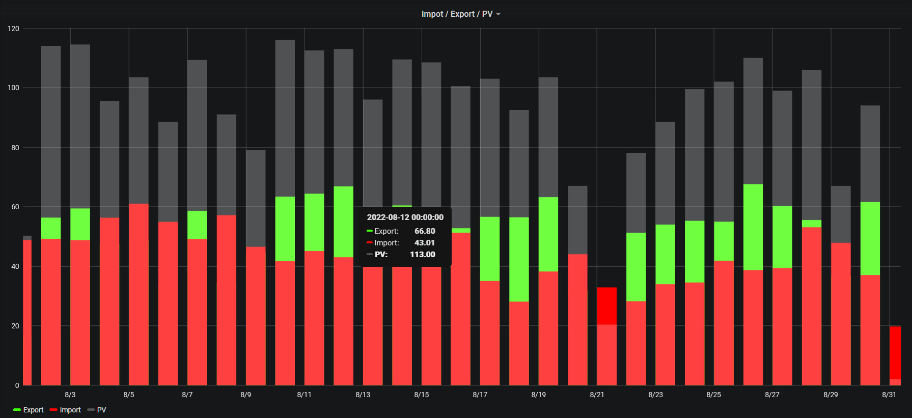
Stacking the values adds only three mouse clicks to the procedure.

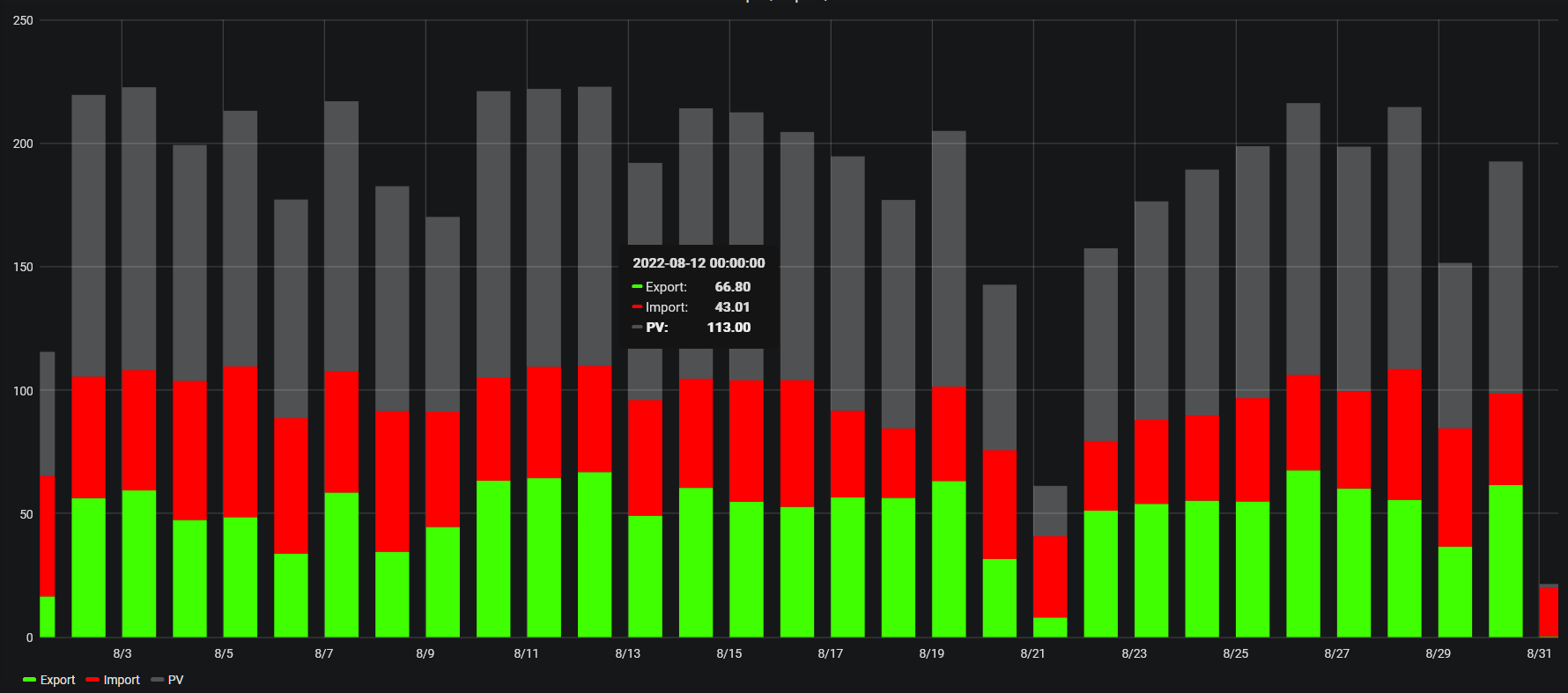
Hovering the mouse over a bar in either chart pops up a detail for that bar.

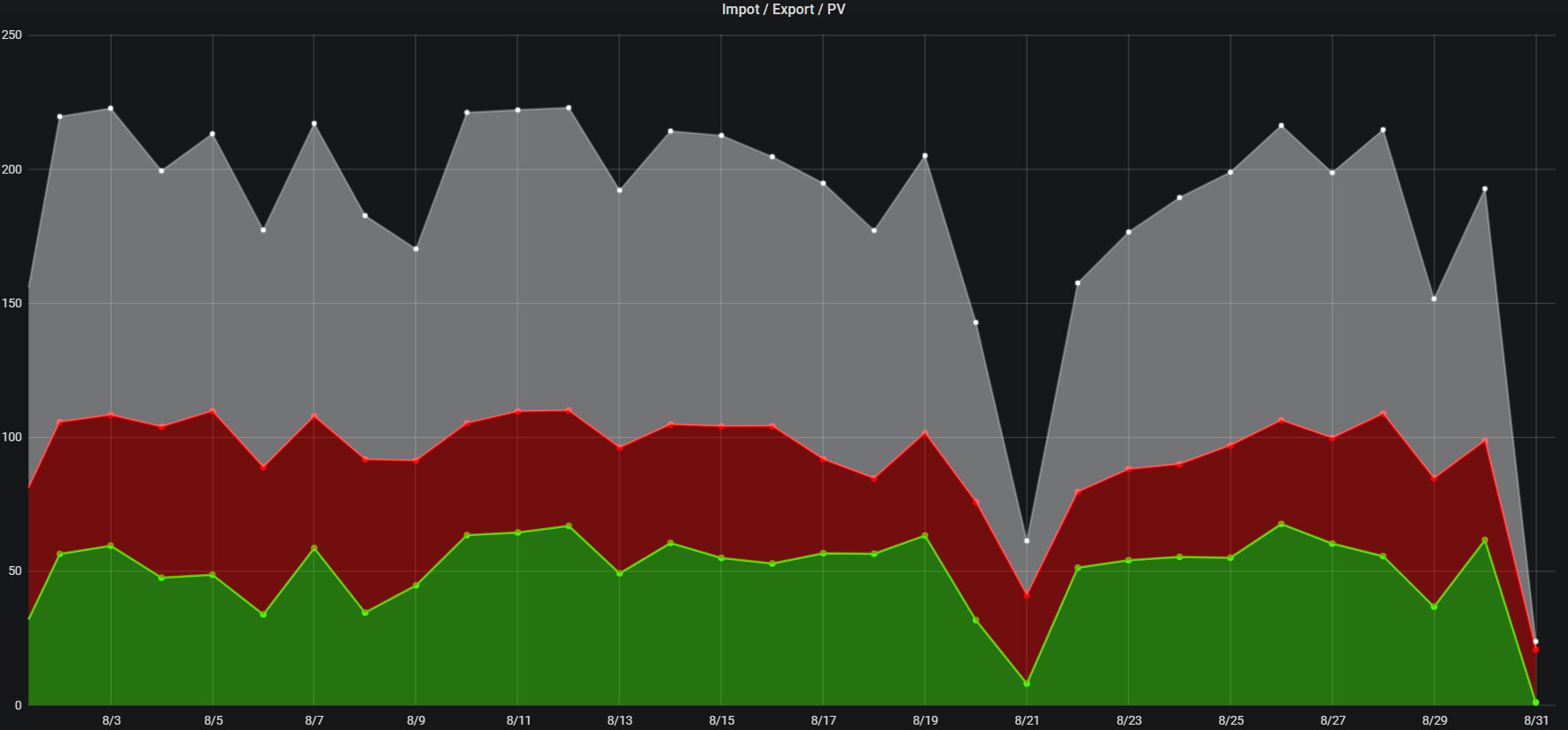
Same data with a line chart:

and again with only points:

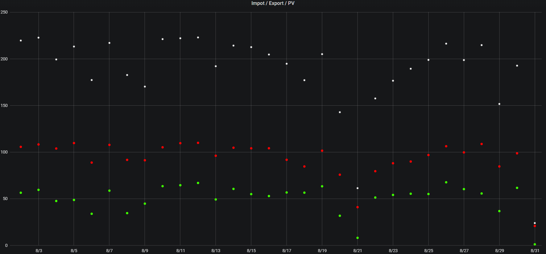
As with the bar charts, hovering the mouse pops up the data detail. I used a different method to capture the screens of the 3rd and 4th shots. The legend wasn’t captured along with the rest of the
shot. That’s why it, and the detail pop-up, are missing in those two pics.

Forum user Oleg has created a nice emonCMS/Grafana “interface.”

Hi Timbones,

That looks pretty good - better than I’ve managed; I guess the key is using the container to cover the controls and make it all look a bit cleaner.

I’ll give it a go when I get a chance!

Thanks…
Rachel

1 Like

Hi Rachel

Looks great - do you fancy giving a bit of a narrative about your set up and data feeds so we can understand quite how you’ve constructed it and what smart kit?

the hotwater tank looks like a mixergy for example? what kind of EV have you integrated with, and so on - I’ve lots of feeds but not managed to get such a cool dashboard and would like to have a go at replicating some of it

Thanks!

Hi Julian,

Most of my feeds just come through openenergymonitor kit. The set up is:

1 x Emonpi near consumer units (measuring import/export and solar PV output and one consumer unit)
1 x EmonTx near consumer units (I have 3 hence the need for lots of inputs!) - this also has an ambient temperature sensor and measures the ASHP and another consumer unit! (there is a third CU, but it has the solar PV, EVSE, ASHP and Solic diverter, which are all measured separately on this EmonTx (or directly from the EVSE).)
1 x EmonTx next to standard dual coil pressurised hot water cylinder
1 x openevse car charger
1 x T/H sensor (located next to ASHP controller/thermostat)

The EmonTx at my hot water cylinder has temperature two temperature inputs from pockets in the cylinder. I also have temperature sensors on the flow and return to the solar coil. I also have a current sensor on the supply to the solar thermal pump, which I use to determine whether the solar is running or not. There’s a float-flow meter on the collector circuit, so I have a fixed calculation that reads the delta-T across the coil and multiplies by the flow (which fixed) and a Specific Heat Capacity (adjusted for glycol) whenever the pump is running; that gives me my solar thermal power input.

Also connected to that EmonTx are flow and return temperature sensors on the ASHP. I’ve piggy-backed an ESP8266 A/D input onto the Ecodan Vortex flow meter to work out the ASHP heat output. That connects to my Wifi and directly writes to EmonCMS (web) input using the API.

As well as the openenergymonitor kit and ESP8266, I also have a few Shelly devices. So my solic for example has a relay on the output side which can open the output circuit on the Solic and (after a short delay) close another relay directly onto the supply to bypass the Solic. This allows me to have code (written in NodeRed running on the EmonPi) to directly heat the tank in certain circumstances - useful as I still have a 5p/kWh Octopus Go off-peak tariff! I also have a towel radiator with another Shelly Relay (this one with power monitoring) which switches a towel radiator on when there’s spare solar to dry the towels :slight_smile: . All the controls for those things (which integrate with the EVSE etc.) are programmed up in NodeRed (as are the calcs that determine how much solar is going to what (based on saying it’s house first, ASHP second and EVSE last).

I calculate carbon emissions (though not convinced I have that quite right yet) in NodeRed by reading the carbonintensity.org API every 30 minutes and multiplying up by the import. I also use that API to decide when to charge my EV at night - it charges to a level between 40% and 80% in inverse proportion to carbon intensity. If I plug the car in and it has less than 10% charge it charges to 20% immediately, if it has under 40% but more than 10%, it will charge to 40% in my offpeak period as a minimum or as the API dictates. So I always wake up with a minimum range of 100 miles but might wake up with 200 miles. The battery SoC is read via another API and a Node red Flow - only applicable to Kia and Hyundai, though I guess others are available!

Hope that helps
Rachel

1 Like