Great work @tamsin, sorry I haven’t been around much to help test since it’s been up on Play.
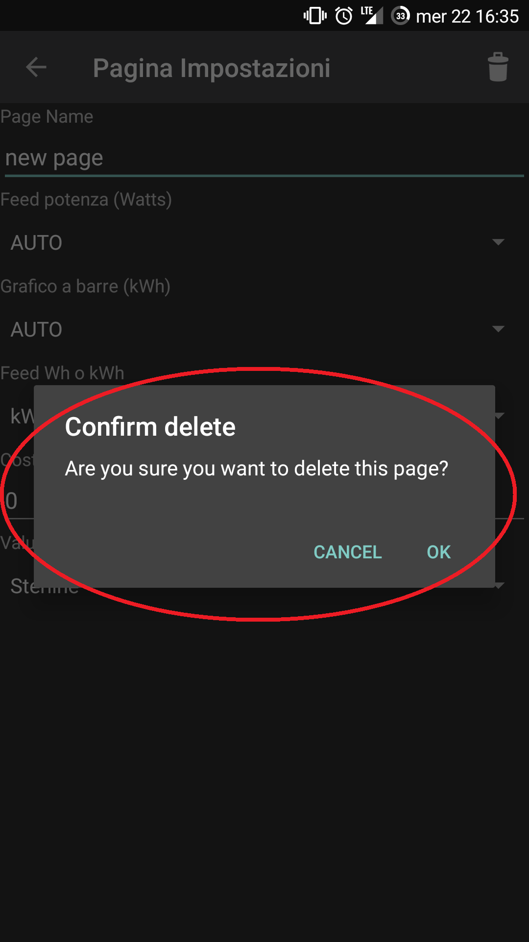
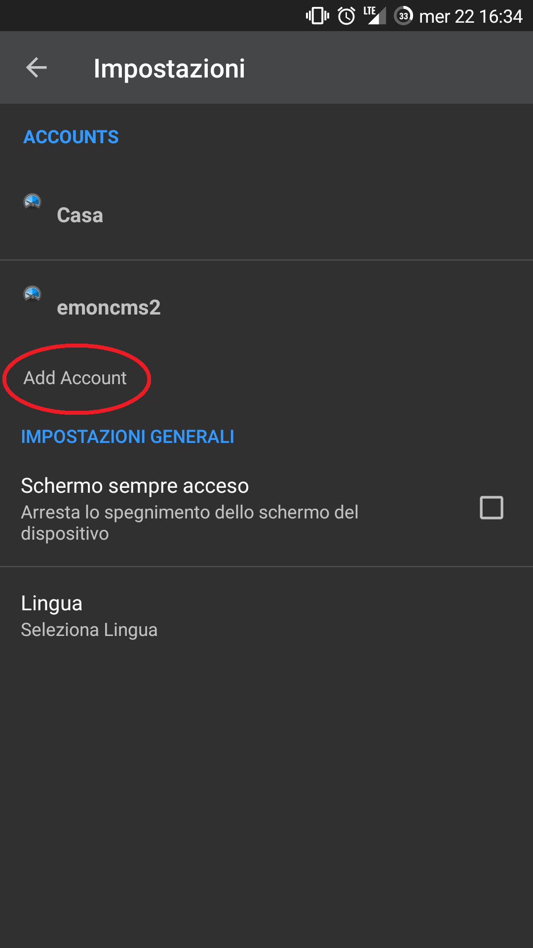
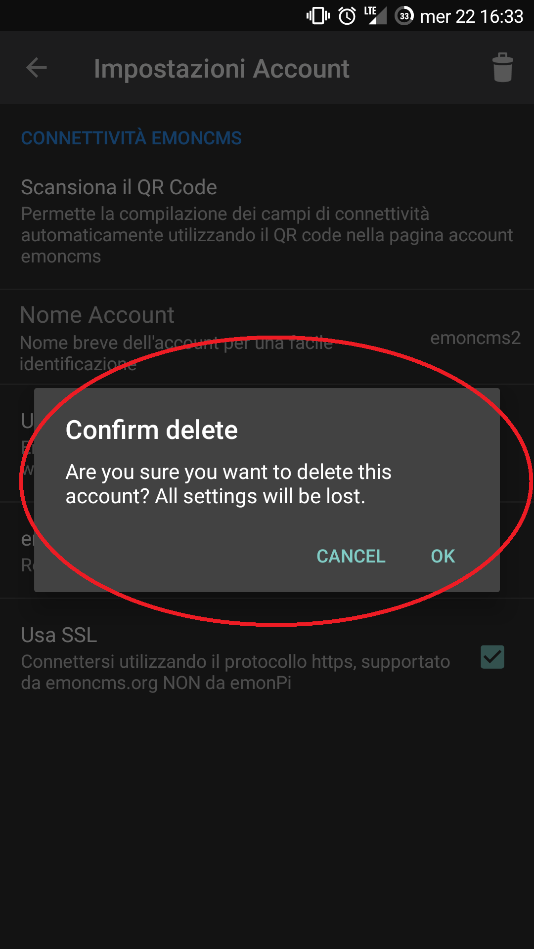
When I went to set up a load of different accounts to test fully I found I was limited to 6 accounts due to the “add account” link disappearing off the bottom of the settings page, I think it is purely a “screen not scroll-able” type of issue as I have since noticed the “GENERAL SETTINGS” section (keep screen on and language) gets heavily compacted to a tiny but scrollable sub panel when increasing the number of accounts until it disappears altogether.
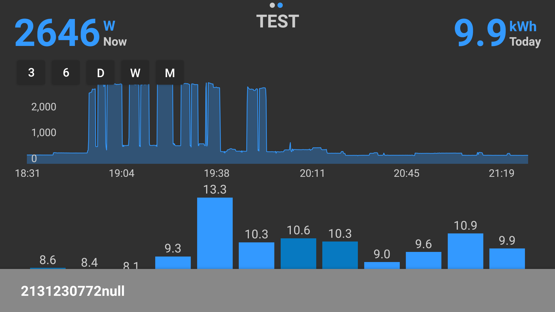
The issue with the upper graph’s x-axis is an old one not unique to this version, I think it’s always been wrong when viewing a period greater than a day. It would be good to see days rather than times definitely, also when zooming into any one day from a wekk or month view, it would also be good to have an indication of which day it is if not the current day.
What might work, rather than looking to add another label, might be to make the respective days label on the lower chart bold or Blue to indicate which day is being displayed in the upper chart if less than one day, If you take a look at the MySolar web app Trystan has made it so if you click on any day in the lower “historic” chart the upper chart displays that day, that would be a very neat feature that could tie the 2 together.
Another thing on my wish list would be to be able to select a different base color for each page, that would not only brighten the app up further but also make it easier to navigate when you have lots of similar pages eg set solar to yellow or heating to red or EV to green etc etc.
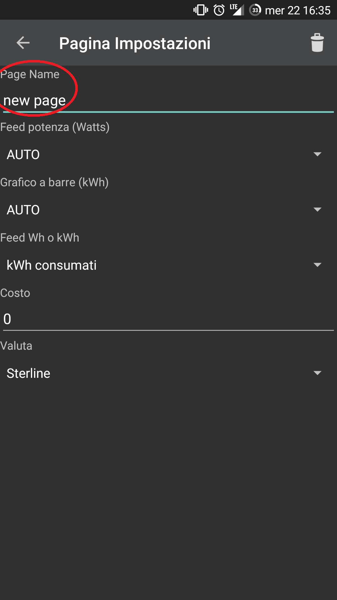
And on the subject of easy page recognition, it there a reason behind the capitalization of the page names? I have to say I’m not a fan, shape of works makes reading on small devices much quicker and flicking though lots of pages would be easier if quicker to read/recognize. I use a lot of CamelCase and capitalization for the purpose of speed reading and easy recognition, which is lost when capitalization is forced, if users prefer the look of all caps they can always write the name in caps in the settings. Is there a need to force it?
While I see the appeal of more detail, in this instance I do not think it would work well as in landscape mode the vertical space is very limited so adding secondary x-axis labels would be costly and in portraite mode we only see one week so it isn’t really needed. nice thought but probably not required until the lower chart can scroll horizontally and then months as well as weeks would need consideration too.
I haven’t seen any crashes since updating to v2 (via play) but to be fair I haven’t spent much time on it and have rarely switched to landscape but I will report back if I do (and send crash reports) I have whilst writting this seen my first “connection error” with this version but it may have been just a one off, I’ll keep an eye on it.
A fantastic improvement in functionality!