I think “–%” fits the job better. it is indicating the lack of a percentage rather than “making one up”. I can see why the question would be asked, as I too would prefer the look of a zero but it is not accurate.
When there is no generation it could be equally be said 100% of it is being exported if the math was based on the comparison of import and consumption. Take a possible but unlikely situation where there is near zero consumption, as generation starts it could actually be mostly exported.
I think percentage give’s the absolute value some scale, making it easier to digest and to share/compare with others, plus the UK fit payments being based on 50% give it some direct value that isn’t really shown anywhere else in emoncms.
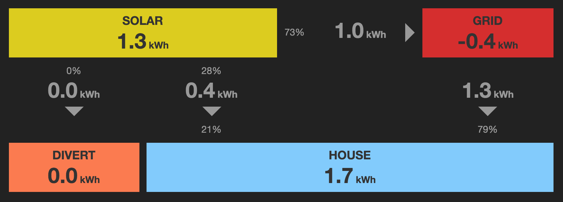
On a more general nore these percentages are not the most intuitive data displayed, this screenshot shows the 3 percentages and without much indication of what they are percentages of, it isn’t obvious what they represent, especially when they add up to 162%!
I agree the percentages should stay but wonder if the kWh’s should be large as they are absolute values (and they would then match also the other 2 kWh values) this may make it easier on the eye since zero would make sense and there is no reason to have a “NaN” or a “–” kWh’s. The percentages could then be smaller below the kWh’s and have under that some small print eg “of generation”
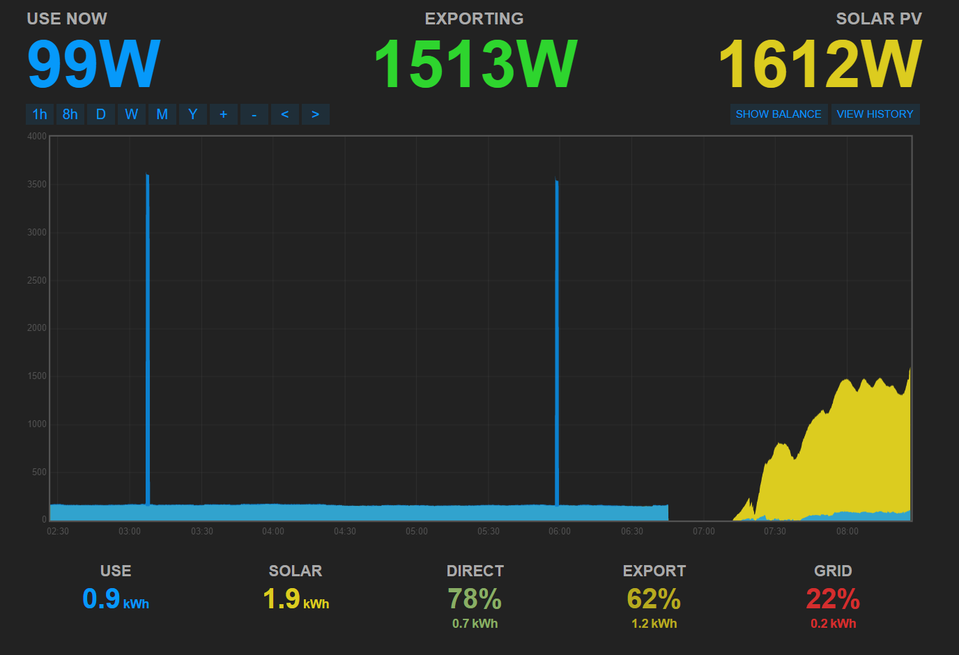
##export
#1.2 kWh
###62%
of generation
I also think a different order or grouping might help eg
use(all) <=> grid(import) <=> direct(pv used) <===> export <=> solar
This puts the 3 %ages in the centre (balanced page), the % of “use imported” v’s “generation” alongside “use” and groups the “generation used” and “surplus exported” next to the “generation”.
In fact there should be 4 percentage values, the “direct” should be shown as a %age of generation as well as a percentage of use, percentages (when displayed) will then always equal 200% (100% of use and 100% of generation). Positioning the 4 %ages to span the 3 centre values with use of color and spacing, could make it more intuitive.
But any alterations in this area should also consider Matts other contribution to the MySolar app
I think there are many ways the data could be made clearer and some or most of those would be debatable on how each individual reads the data. But to go back to the original topic at hand.
The “–%” is much better than “NaN%”, both on the eye and in the message it delivers, definitely a step in the right direction, thanks Matt.
EDIT - having just caught up on the more recent posts on the “diversion version” PR of the mysolar app, I see most of what I’ve said here is already being discussed on that PR thread. good progress Matt I like your direction (but agree the boxes need toning down a tad) . It would be good to see this as an android app too one day so please bear that in mind too when redesigning the layout (which I’m sure you probably are).