Ok here are various analyses I made based on my Sunday run…
I did tons of analyses struggling to find anything that would clearly influence COP of my machine in a certain direction but this was hard to prove.
I guess that the spread in measured COP itself is already a problem (or one of the symptoms of the problems my machine has?
First some elaboration on some processing I did on the data shown in the graphs below:
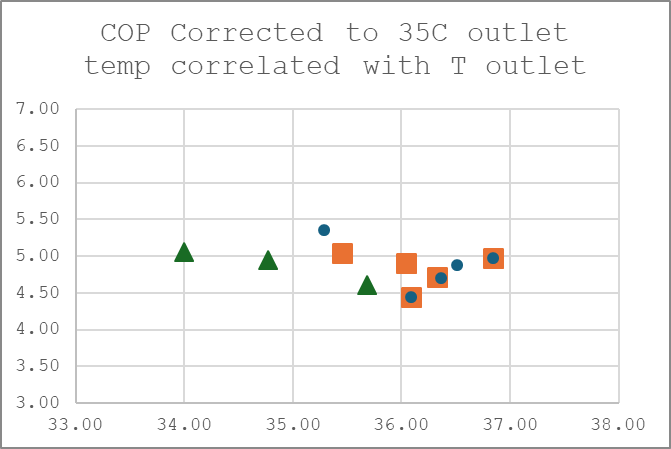
-“Corrected COP” means that I scaled the COP towards what it should have been at 35C output temperature. This is based on some datasheet I found months ago (but am unable to retrieve on the laptop I have with me in the time available on my holiday). In that data I found a nominal decrease of approximately 15% in COP per 5C increase of outlet temperature. Mind that this is derived from figures at as far as I could see high load.
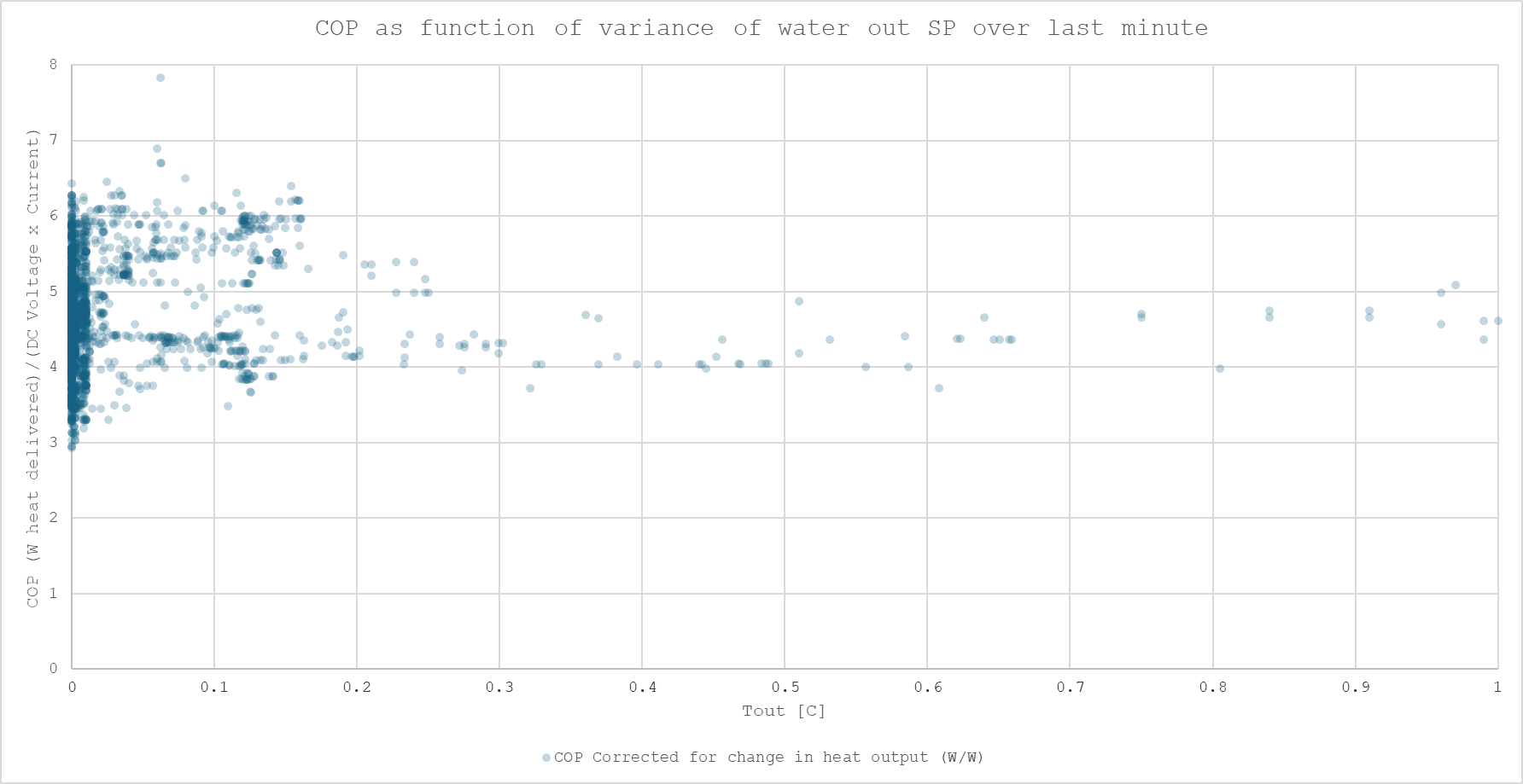
-“COP” was calculated as Flow (l/min) (bluntly translated into kg/min leading to a small overestimation) divided by DC Voltage x Compressor Current.
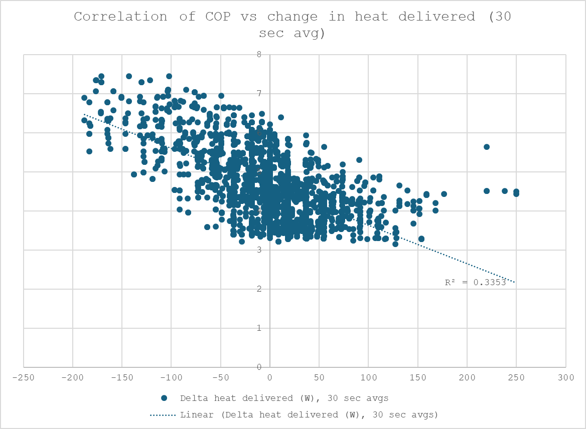
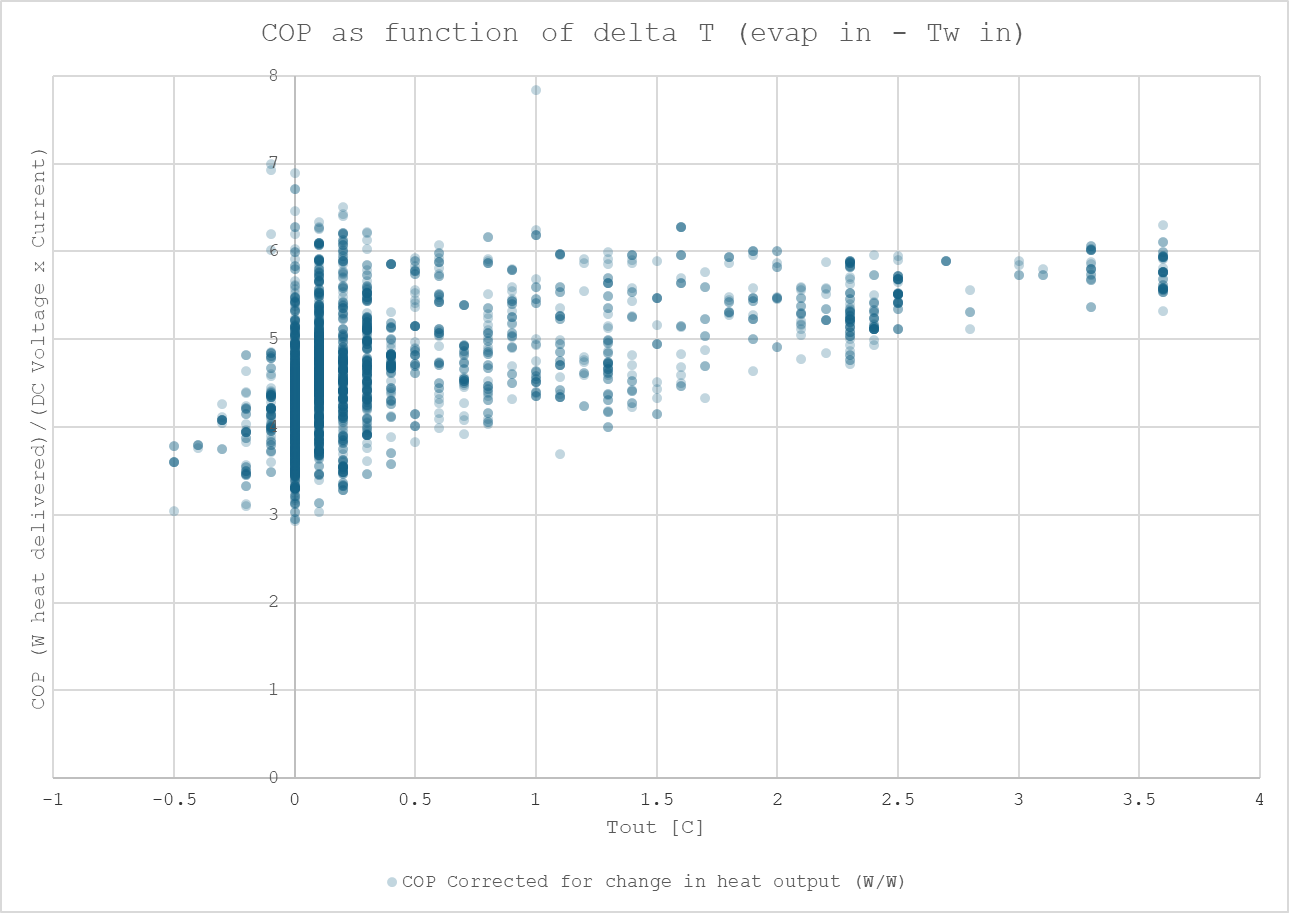
Then a blunt try to correlate COP with lots of things I could come up with. First the most clear one: A decrease in supplied heat always leads to a temporary significant increase in COP. This is logical as compressor work changes first and the heat exchangers with their thermal mass lag behind.
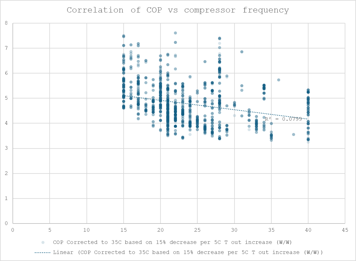
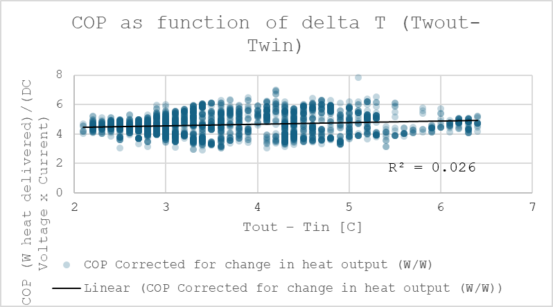
Then a lot of other correlations that generally do not indicate a lot. Most importantly I cannot clearly state that running the heat pump at the same heating power but with lower pump speed to get to the Samsung (actually Ambrava, the Dutch Importer) recommended 5C temperature difference would have lead to a strong increase in COP.
Note on the above: Having a lot of data points at near 1 operating point skews the trendline, I have yet to find an elegant way to circumvent that.
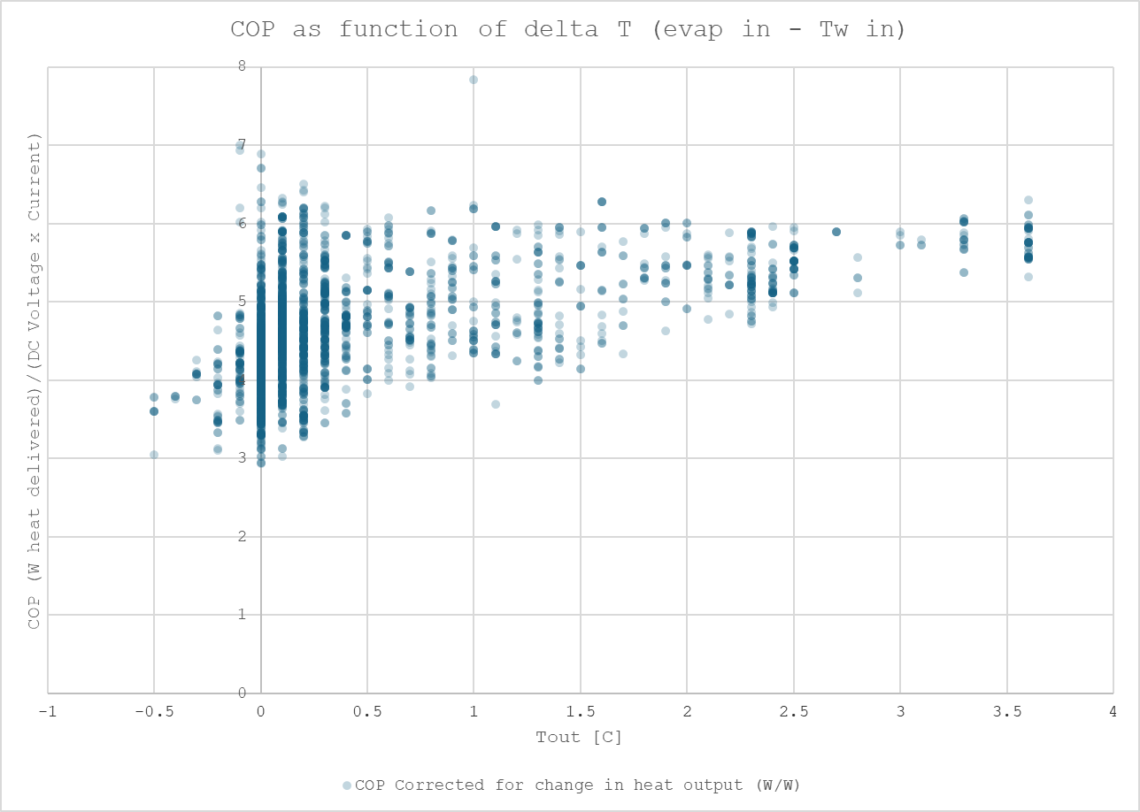
This one below has a little hint that if vapor is flashed over the EEV valve COP becomes lower.
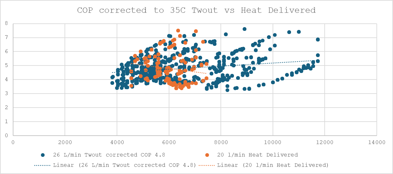
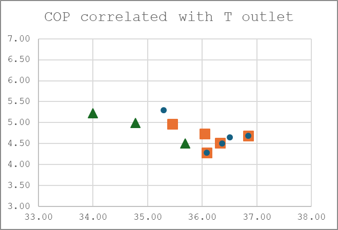
Below 2 graphs with COP not corrected to 35C in one graph and corrected to 35C in the other.
And the last one.
The excel file itself for those interested:
Samengesteld log 2025-04-23 - Only heat storage.xlsx (3.7 MB)
Note on the plots: In many of the plots I decided to put a high degree of transparency on the dots. That gives some impression of where most of the datapoints are located and is -in my view- sometimes helpful to judge the data better if you have a set where many points are clustered around some regions. This clustering can lead to fitcurves having a statistically very bad fit which should be attributed to the machine just being operated too much in certain regions for a “nice” dataset that is easy to work with using standard statistics.