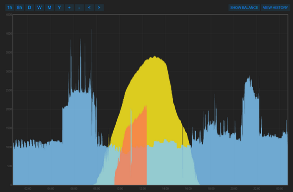
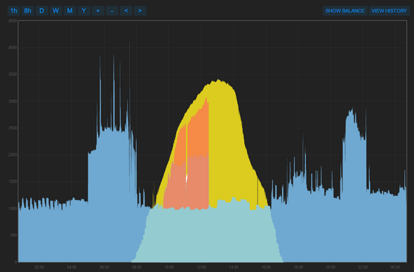
These are “My Solar Divert” vs “My Solar PV”. You can see in the top image that the ‘divert’ (orange) is not added to the ‘use’ (light blue). In the lower image the ‘use’, that includes the divert as it is not divert aware, approximates the solar generation.
With the previous version of the app the ‘divert’ sat on top of the ‘use’, and looked more like the lower image but made up of light blue and orange. You can imagine adding the orange to the light blue in the top image. Any orange that was greater than the yellow means that too much power is being diverted and is therefore using electricity from the grid. So ‘house use’ plus ‘divert’ should not be more than solar generation if the diversion is working correctly. Of course the house use may exceed solar generation, in which case there should be no divert at all.
I’ve edited the image using photoshop to approximate what it looked like before the apps were updated:
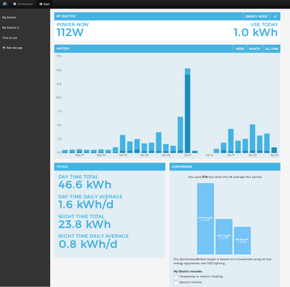
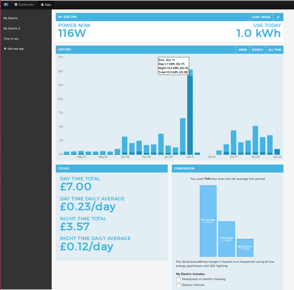
We recently installed a monitoring system for our local community hydro in Llanberis, North Wales. As a good demo of the new MyElectric2 app with the app title set to the hydro name and the energy comparison box hidden, here’s the live turbine output: