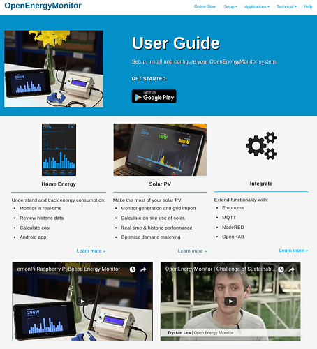
Over the past month I have been working on a new User Guide website to present all the info a new user should need to set up a new system in a tidy way in location. It’s far from finished but it’s slowly coming together  . Having a separate user guide should avoid new users getting lost following links which lead to development topics.
I would be interested to hear if you have any thoughts. This mini-site will replace the emonPi setup guide page on openenegymonitor.org
The new site should look great on a mobile device, something I think is important as a user might be following the guide while stuffed into a utility meter cabinet!
The site is build using Jekyll (markdown > html static site generator) and is fully open-souce on github. All the pages (apart from the font page) have a ‘edit on GitHub’ button for anyone to suggest a modification.
Just had a quick look and it is nice. Am midst an install of something else and can’t play long but I already saw something in solar. Something I suspected but didn’t have time to explore.
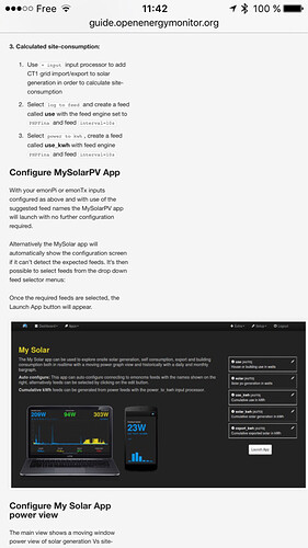
Had a look on my mobile phone and most was indeed adapting to the smaller screen except one image and as a consequence text was very small. Not sure it wasn’t low bandwidth or something else. Am loading some heavy files. Will for sure have a more close look this week end.
In any case, great work and for sure beginners like me will learn a lot in very few clicks
1 Like
had a look again via iPhone and an old Nexus 4 with konqueror
In both cases the same image wasn’t resized, on iPhone text is scaled down, on Android you end with scroll left/right. Just installed Opera on Android and same result visually as on iPhone caused by the same image
This is an image taken on iPhone with the culprit image
Fixed, images should now resize. Thanks 
Please confirm this works for you.
The front page has now been updated to have the title User Guide, this better reflects the purpose of the site.
sorry to say, nope … cleared cache on both phones and the image still shows full size to me
Server-side caching ?
perfect now. Image resized nicely and text is easy readable. 1 point down on your todo-list
1 Like
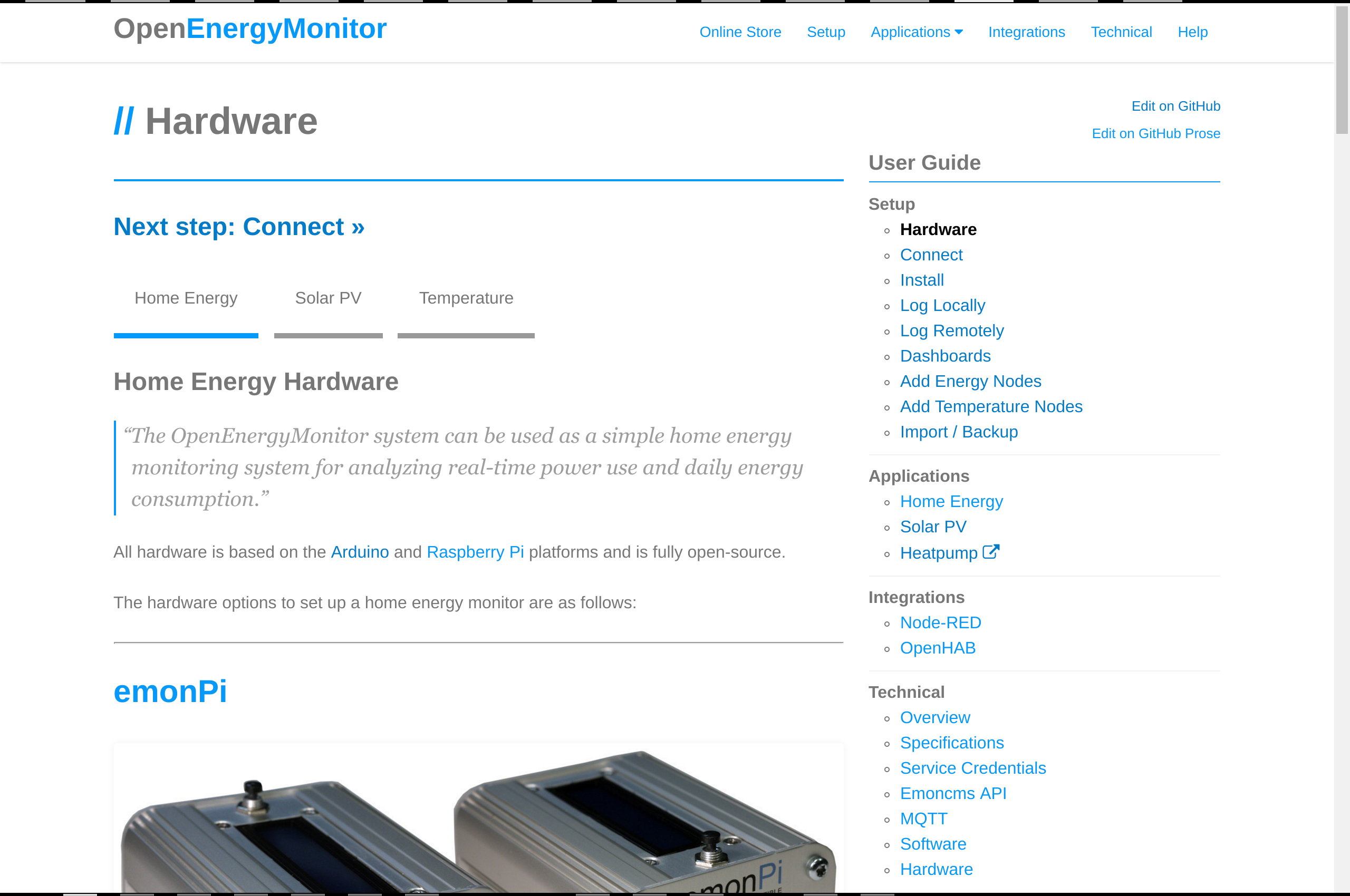
Setup part of the user guide is finished now, I’ve just added a nice overview navigation column  .
.
Please let me know what you think, hopefully an improvement over the old setup pages:
Next to finish the technical section…
2 Likes
 . Having a separate user guide should avoid new users getting lost following links which lead to development topics.


