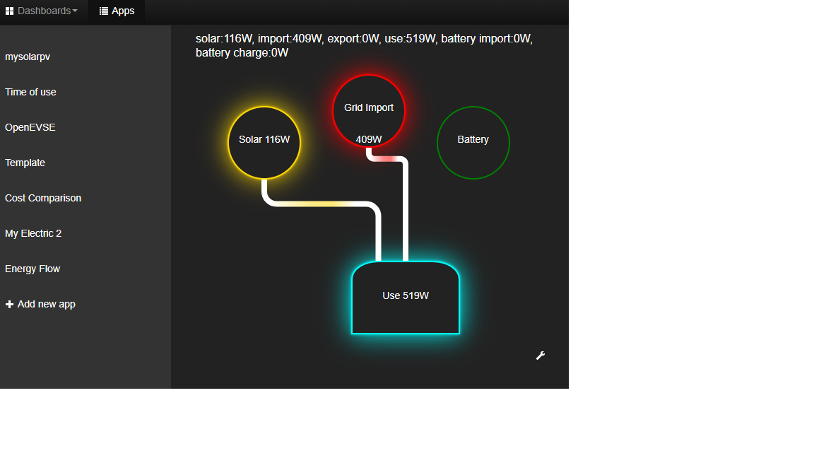
I’ve been working on a simple energy flow app to show the direction of energy in use - what do people think?
8 Likes
Nice!
Looks interesting.
Having just gone live with PV here today i’m now looking at creating a simple emoncms dashboard to show the rest of the family what they’re currently using vs what the solar is contributing. An app view would be a good alternative for this I think.
(they’re less interested than people like me with a dashboard full of detail - they just want to know if now is a good time to put the dishwasher on etc)
that looks great.
Looks really nice! @glyn.hudson and I have been discussing the need for something like this for the OpenEVSE Solar to EV diverter, looking forward to seeing how your work develops!
Wow! Awesome, nice work 
Yes as @TrystanLea says this would be perfect for visualising the energy flow from pv to ev to grid and potentially locally battery store.
These multi faceted systems will become normal in the future and require that dashboards like this to visualise what’s going on!
There is an area of colour on each of the connecting links, is this an animated display Stuart?
Paul
Yes, using HTML SVG and the links “move” to show direction of energy flow.
What I am struggling with is trying to determine how best to define the inputs to the graph - OEM records the use and import, but I currently use a virtual feed to calculate export - but don’t think virtual feeds are available on the emoncms site.
Are there any plans to standardize or at least recommend a way to configure the inputs and feeds in OEM for people who have multiple generation sources - for instance I’ve got 2 solar inverters and potentially a new battery storage system to look after!
I REALLY like the visualization you have. Very simple. The info is very useful. Well done! What is also impressive to me is the attention to detail you have done with the design. A thought I had iif the audience is family members, community is In/out bubbles based on money flowing in / out (biggest reason at least here in the US for Solar) or CO2 absorbed. Just a thought. Main point - excellent work!
1 Like
Looks nice!
Will the speed be variable/relative, like moving fast when high power usage?
Besides flows, will it also indicate ‘how full’ the battery is?
Don’t want to press you…
At the moment no!
However, can be added to the wish list!
Hi Stuart,
I like the app, looks good. As highlighted above, it would be good to cover off different use cases. In my case I’ve got a diverter for the immersion and would like to grow into battery and Open EVSE (just need to money for these extras and in particular buying the car!!! Hence would have a spray of connections to monitor.
Are you planning to expand it to include both current usage and then also a total over a period (e.g. current day)?
This is how I record export on my config, firstly locally:
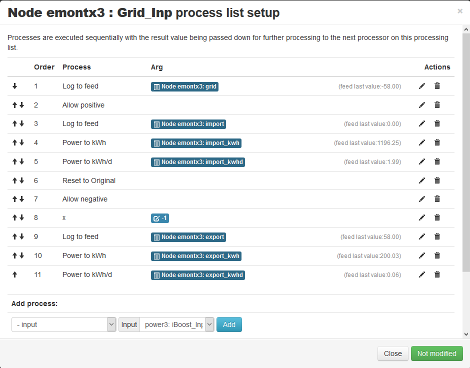
And then a similar approach with emoncms as it has a restricted set of processes:
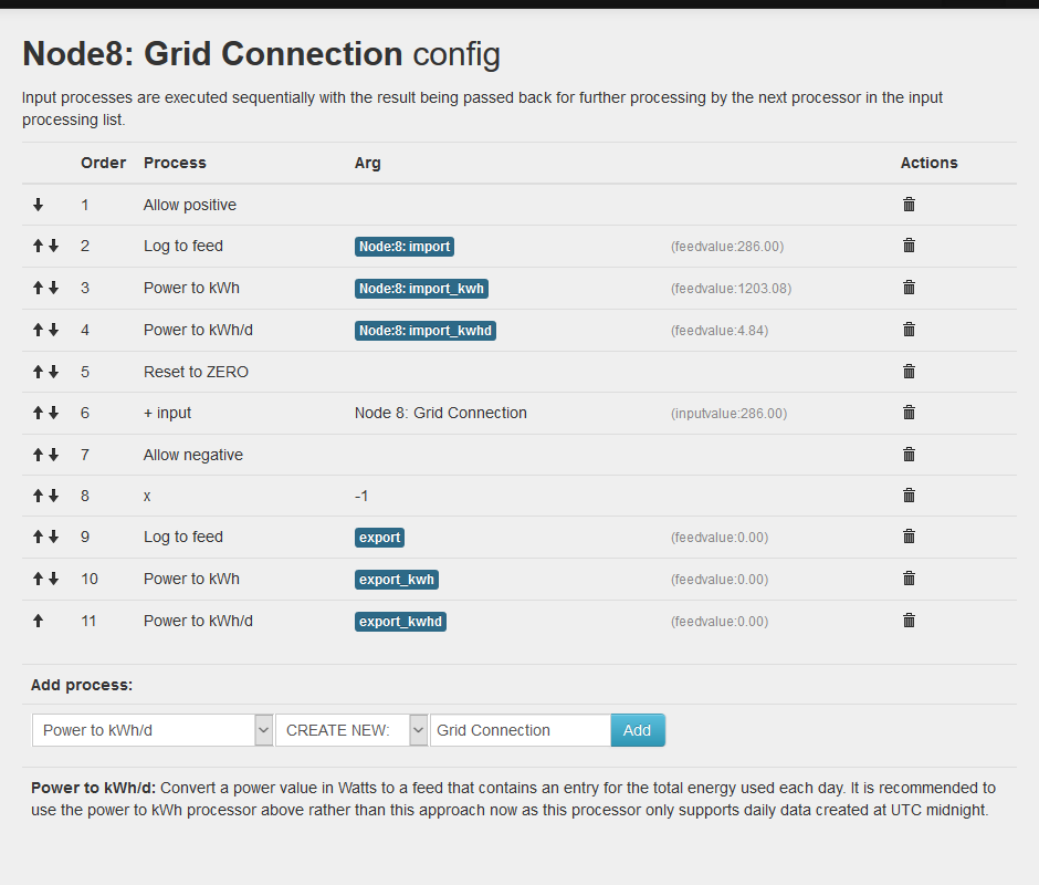
In both cases I wanted to store the Export as a positive figure, hence the “* -1”
I do have some gremlins with graphs with the stats I collect, but want to look into understanding what is happening and then comparing with others before potentially raising a new topic, but believe that this may relate to it picking up an input from the old time slice.
I’ll try and build it as flexible as possible, one of the problems (advantages?!?) of OEM is that everyone has a slightly different setup which can make configuration difficult.
Perhaps if I separate the generators from the consumers as configuration options that may work out.
Yes, the flexibility is what drew me to OEM, the others were too regimented and thereby miss a lot of opportunity. OEM gives the guides and basics for a simple setup and then you can expand if you wish.
The generator/ consumer approach sounds like a good idea. Maybe with a means of linking to deliver a graphic for a battery as it covers both.
When I started, I found the solar with divert guidance page really helpful as it showed me what it needed, which sounds a good option with your app. And those with more complicated setups are likely to be able to deliver the feeds you are interested in anyway to support your app.
I just tried to keep it simple by creating a basic dashboard and link for my household .
Looks like this : Green good, Red Bad
1 Like
Brilliant! Can you publish how you did this?
Simon
Sure can Simon…
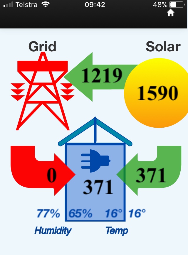
Forgetting for the moment the temp and humidity values I have for inside and outside my house in the above picture…. for simplicity.
The 5 feed values I use for this are simply: solar, export, import, used_solar, use.
For my first Dashboard attempt after I got my emonPi setup I added five Text elements and five feedvalue widgets and I was the only one who knew what it all meant. A stranger or non-techno householder would just see a set of numbers changing every 6 secs???
So my first learning dashboard attempt was a bit like this:
Solar: 1590
Export:: 1219
Import: 0
Used_Solar: 371
House Consumption: 371
Decided to throw the actual words (solar export, use, etc) away and draw a picture underneath the values to make it clear and simple what the number represented. Then I arranged them in a sort of flow that connected everthing.
The yellow ‘sun’ and the green/red arrows etc are ‘just’ some ‘svg’ graphics that I have positioned ‘under’ each feed value.
I created these simple arrows and sun graphics with a program called Boxy SVG on my Mac. It has an option to export the graphic in all sorts of formats one of which is SVG. Probably many other apps out there that do this.
Im not an artist or graphic person and it was the first time I did this so its not that hard for a beginner like me. You can get standard SVG arrows and objects from the net but I wanted each graphic to ‘fit together’ and I was designing for a small phone screen. I have a slightly different Dashboard with the values and pictures spread out a little when I sometimes use a tablet.
These svg definitions are then copied into the HTML config field of a text element.
Here is an SVG ‘definition’ for a green arrow to give you an idea:
<svg viewBox="229.13194274902344 61.9904670715332 110.64048767089844 85.26904296875" width="110.64048767089844" height="85.26904296875">
<path id="path-1" d="M 98.586 19.177 C 91.583 19.177 87.141 17.26 84.399 14.427 C 81.656 11.593 80.512 7.722 80.586 3.395 L 80.586 3.364 L 80.586 -10.698 C 80.587 -11.417 80.023 -12.009 79.305 -12.042 C 78.274 -12.092 75.866 -12.054 74.992 -12.042 L 90.242 -27.292 L 105.524 -12.042 L 101.242 -12.042 C 100.5 -12.042 99.899 -11.44 99.899 -10.698 L 99.899 -2.855 C 99.897 -2.823 99.9 -2.793 99.899 -2.761 C 99.826 -1.443 100.11 -0.124 101.086 0.739 C 102.086 1.623 103.437 1.864 105.086 1.864 L 110.805 1.864 C 110.803 7.626 110.745 13.397 110.742 19.177 C 110.139 19.177 99.467 19.177 98.586 19.177 Z" style="fill: rgba(24, 153, 7, 0.7);" transform="matrix(0, -2.3809523582458496, 2.3809523582458496, 0, 294.11290439069853, 325.8118892433303)">
</path>
</svg>
Once I did a few changes with a few graphics I realised the potential and I admit I got a bit carried away with my grid picture and my house 
[Edited to show svg - Moderator (RW)]
Thanks - will have to experiment. Guess you could even have a low res photo of the house.