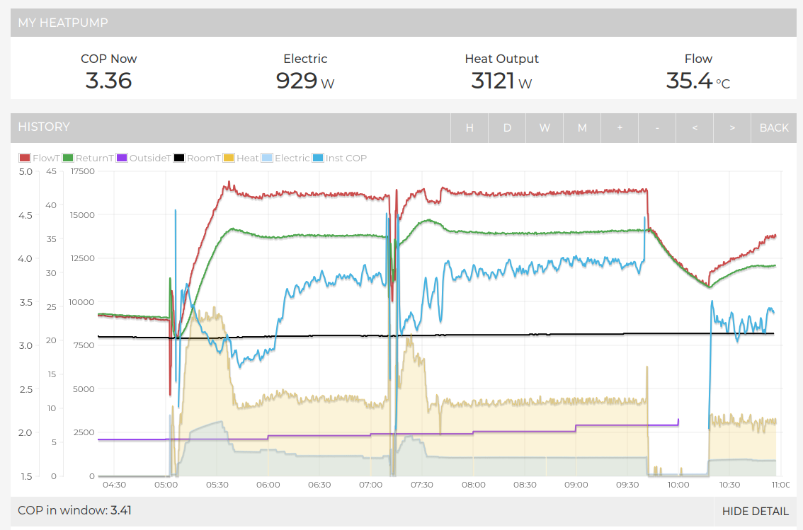
This feature can be enabled in the ‘SHOW DETAIL’ tab and there’s the option to filter the range of values alongside enabling a moving 3 or 5 point average:
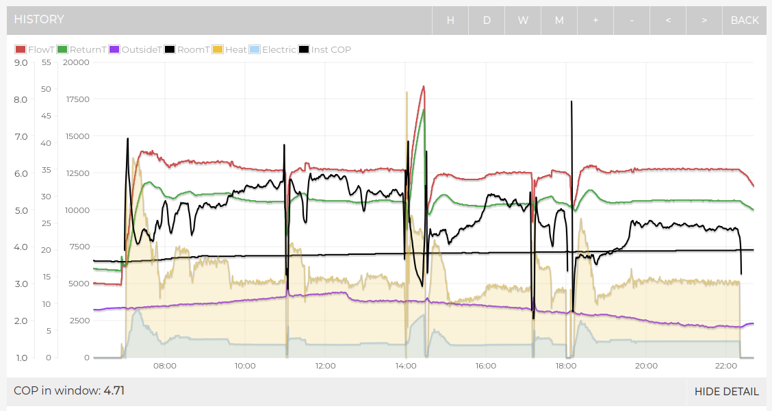
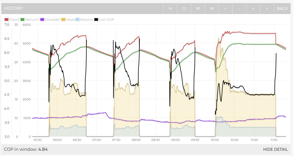
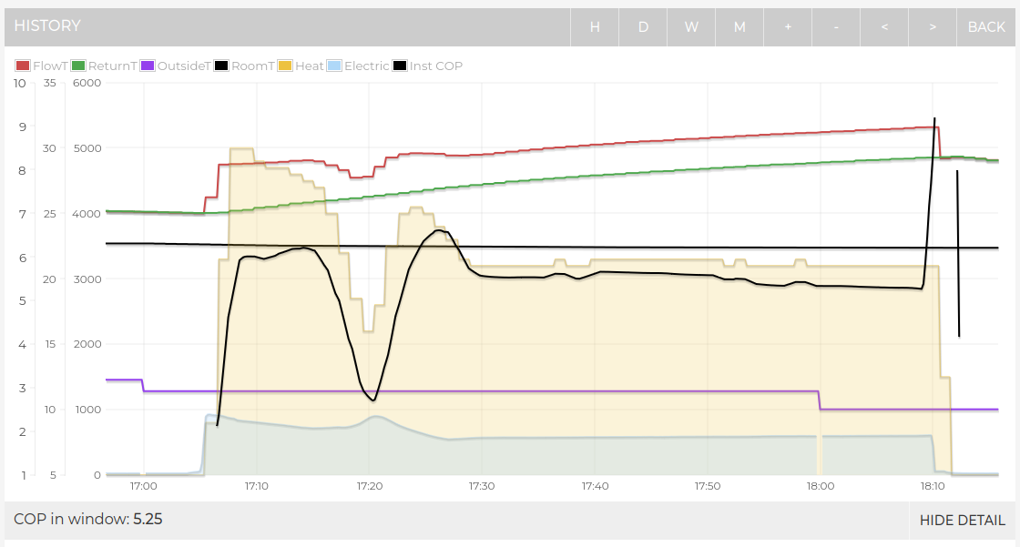
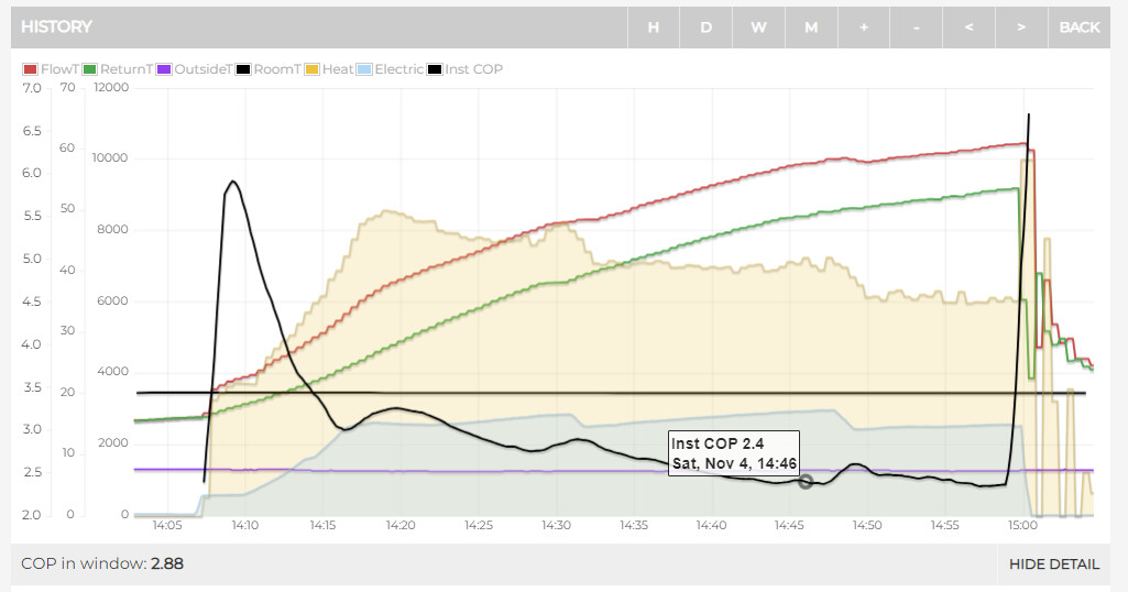
It’s probably worth being cautious in interpreting these very short timescales as the picture is complicated by the time it takes for water to go around the system, appear back on the return etc, alongside the short delays between electric consumption changing and heat response… as these more dynamic effects work through the system…
It’s interesting to look at but that wasn’t what I was suggesting.
All I wanted was something simpler, another number next to the 30min COP that just shows the COP at that instant by dividing the heat produced by electricity at that moment.
I only wanted it so it was in my face whilst I am watching what is going on, just to save my limited brain power from working it out myself!
I am bit addicted to watching it at the moment, hopefully it will pass soon.
But what you have done is really useful though so thank you.
Since I upgraded to this version on my local server it is only updating the flow temps on the graph every 5 mins unlike the other values. It is still working fine on the my emonCMS account
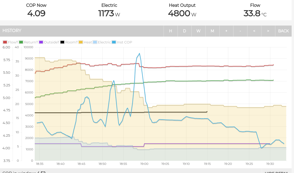
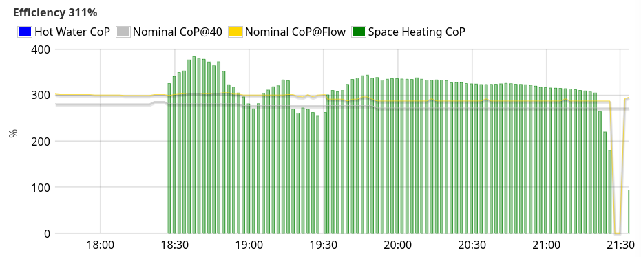
I quite like having the computer work out the CoP, especially in a scenario such as this evening when it decided to run continuously for the first time this season. I was wondering if that was a good idea but I could see it was mostly better than the nominal CoP for the flow temperature (the gold line). Notably, with the external temp and the flow temp moving around as it adapts (especially in response to a defrost) it’s nice to not have to keep pondering what “good” should be.