Yes, I think so: Aclara sgm1412-b
1 Like
I tried get a smart meter (smets2) installed at my late fathers (the E7 timer was bust) the EDF guy said he could do it, but on the day they had problems with them being ‘commissioned’ onto the network. If it didn’t commision they would have to take it out again ! The whole procedure could take 3+ hours !
In the end he just changed the timer 
Hi
It took about 3 weeks to get all the data base links operating and data onto the dashboard.
1 Like
Utter Madness on Octopus Agile tariff tonight.
Over 5 hours of negative pricing, so you GET PAID to use as much electricity as you want.

Min: -1.8p (02:30)
Max: 25.3p (17:00)
Average: 6.8p
Av Excl Peak: 4.2p
Go Period (0030-0430): -0.8p
Peak Time (1600-1900): 24.0p
Stats via https://www.energy-stats.uk/
Follow on Twitter: @energystatsuk
2 Likes
I guess the overnight negative makes up for the overall average increasing over the year - or is that just a winter pricing thing
1 Like
Here’s the complete history of Agile…
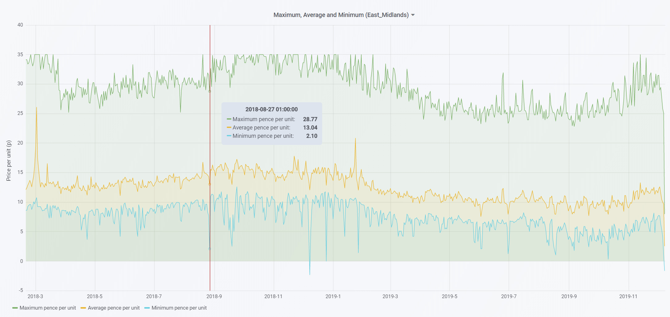
Peaks and troughs through the seasons… I think much has to do with the abundance (or not) of wind during quieter parts of the day when there is less demand (mainly overnight).
Thanks @Zarch, That explains it. I was only looking at the last year from your site and from that it appeared the tip up was in the last few weeks.
No problems Dave… now that we are getting close to two years of Agile, I may well extend the graphs from one year to two… but not always enough room to show lots of data across the page.

@Zarch Just an observation, would your graphs be even more readable with the ‘staircase’ option set under display so as the ‘spikey’ one now would be more staircase like?. I was thinking otherwise the graphs don’t show a clear price changeover time more dot to dot.
Great shout… have updated all the graphs. They do look better, thanks!! 
I was asked if I could add the daily Agile pricing in table format.
Whilst I can’t guarantee I can add everything asked for, this one seemed to work out ok.
So I’ve added table based pricing as an alternative to the graphs/charts to each of the 14 DNO regional Agile and Agile Outgoing pages.
For example: Octopus Agile Yorkshire - Energy Stats UK
Hope this helps folks.
1 Like
Hi Mick, just wanted to say thank you, and I used your Octpopus referral code when I joined Octopus 
Ian
That’s great to hear Ian, many thanks. I appreciate that.
I’ve made some changes to my code over the weekend which should now enable quicker updates to the website (https://www.energy-stats.uk/) and posting the Agile pricing summary graph out via @energystatsuk
I used to have a set cron job at 6pm that did all the work, but i’ve now put some ongoing checks from 4pm onwards looking for new pricing via the API and acting upon them when I see them posted.
Its seems to have been stable over the past few days, so hopefully will continue to work as planned in to the future.
1 Like
Not sure of the data flow, but, if anyone is pulling in data from your site, it might be worth enabling an API call of your own that will tell anyone else when the last update was?
You could even suggest to Octopus they do the same ![]() .
.
I managed to spend a bit of time over Christmas and New Year coding some new functionality for the site that I’ve just put live.
Download historical Agile and Agile Outgoing data.
Far and away the most frequent request I get to the site is “Where can I get full historical pricing data for Agile and/or Agile Outgoing?”
Usually cos they want to do their own geeky analysis of the figures.
Agile started on 18th February 2018.
Agile Outgoing started on 15th May 2019.
Both data sets go right back to day one for each tariff will be updated every day with the new pricing from the Octopus API, so usually sometime after around 4pm.
If you’ve had the daily graph tweet from @energystatsuk then you know the underlying data will have been updated for that day.
https://www.energy-stats.uk/download-historical-pricing-data/
Hope you find this useful.
1 Like
Nice addition, thanks @Zarch
1 Like
Just added a new graph to the site on each of the 14 regional “Go versus Agile” pages.
This new one is Go versus Agile (00:30 to 04:30) for the previous year, but shows Agile as a weekly average.
For example: Octopus Go versus Agile London - Energy Stats UK
Hope this helps.

1 Like
It was clear that comparing Go (00:30 to 04:30 with Agile (00:30 to 04:30) pricing is an unfair comparison.
I think a fairer comparison is Go versus an average of the lowest 4 hours each day of Agile, so the cheapest 8 x 30 min slots each day.
Note: The 4 hours (8 x 30 mins slots) may not well not be sequential. They could be picked randomly from throughout the day.
From today, you can now see those comparisons on each of 14 regional Go versus Agile page.
For example: https://www.energy-stats.uk/octopus-go-versus-agile-london/
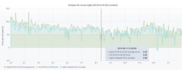
The same cheapest 4hr average stats are also available on the weekly summary graphs too that are on the same page.
Hope this helps.
2 Likes