Hi Glyn, all, data collection using the heatpump monitor board is working well.
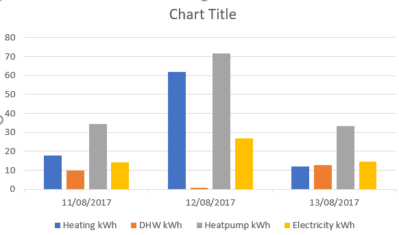
One small query about visualisation - I’ve got a simple graph with various delta values, and they are shown overlayed on top of each other, so some are hidden and you can’t show their exact value.
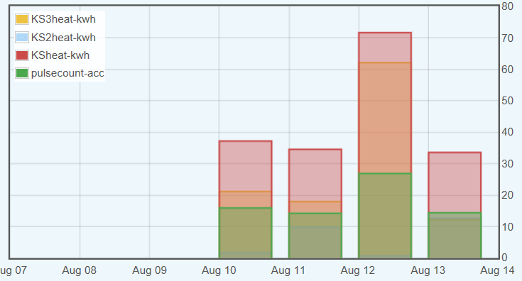
Is it possible to show them in the traditional bar chart format, as in the Excel example? I did have a look at multigraph but I couldn’t see the needed options