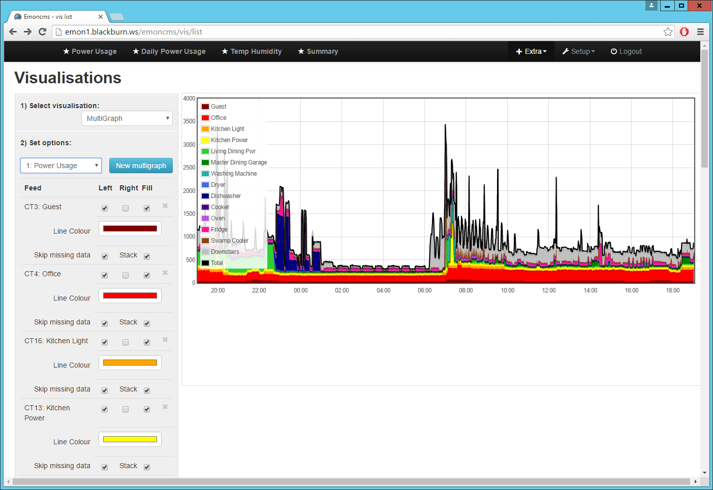
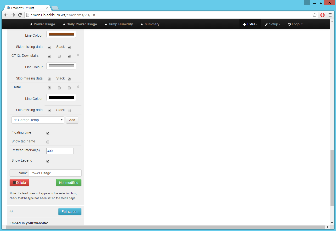
A couple of new options were just added to Multigraph:
Lines/Bars may now be flagged as ‘stacked’ on top of the previous feed. It’s an option on each line.
The graph can be configured to ‘auto refresh’ after a given number of seconds so that a dashboard page can be left up & will always show reasonably current data. The refresh will be disabled if the graph is scrolled so that then ending time is not close to the current time.
As an example, here’s the definition of a multigraph showing how a total power usage (black line, not stacked) breaks down between branch circuits:
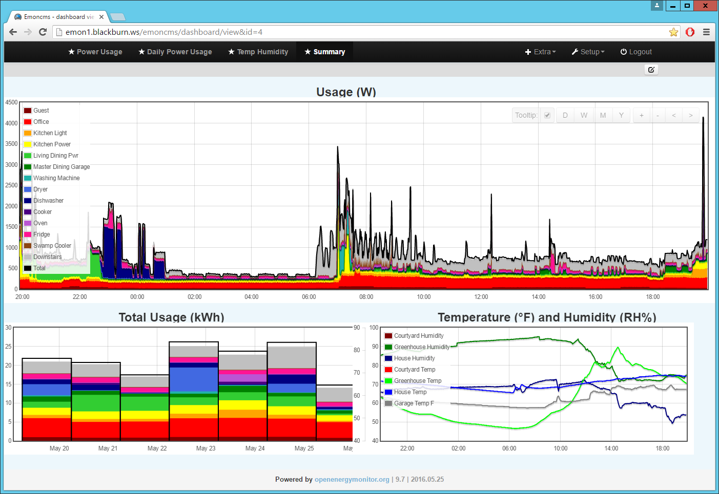
There’s also now an option to turn off the legend display - so here the usage & daily usage graphs have the same legend, but it can be shown just on one (it doesn’t fit very well on the other!)
The auto refresh is great! That’s one feature i was waiting for…
What would be awesome is the ability to deactivate feeds from showing on the multigraph and save that state.
So basically they won’t show up until you activate them from the legend.
Ok - i understand now.
But i will continue to use the .org version because its available on the internet, not only on the INTRAnet of my local installation. I hope that this version of emonCMS also gets updated regularly.
Hi Sandy,
Thanks for this post. I’ve taken this and got a stacked line graph. In my case, core house usage, diverted to the immersion and anything left exported to the grid.
I’d like to get an equivalent to your “Total Usage (kWh)” stacked bar chart, but haven’t worked out what or how to achieve this. I’m working locally and have run an update of my EmonHub, so should be up to date at least.
I couldn’t find anything about how to set this up, can you push me in the right direction please?
I like the ability to remove data sets from the graph, and notice that it hides all layers above it. With mine I display house, divert and export on top, if I unselect ‘divert’ it will also hide ‘export’. Is this working as designed, or something that would be quite difficult to change?
Hi Clive,
The only way I found to do that with Multigraph Is using another feed.
I actually keep 3 feeds for each of my CT inputs:
Log to feed - gives current usage
Power to kWh - total usage since beginning of time (or at least when the feed was created)
Power to kWh/d - this is where that Total Usage/day graph comes from.
I think some of the new ‘graph’ module visualizations have a ‘Delta’ option that will calculate the daily differences in the ‘Power to kWh’ data to dynamically generate the kWh/d data - but not Multigraph!
I too noticed the behavior with hidden feeds (or similar with missing data when a EmonTx goes off line). Unfortunately, this seems to be how ‘flot’ works (the graphing package the EmonCms uses). I did take a look at this a year or two ago and didn’t see a way to modify the behavior, but maybe I’ll take another peek - there could be an updated version by now.