Created a daily kWh plot on emoncms.org following the instructions provided here.
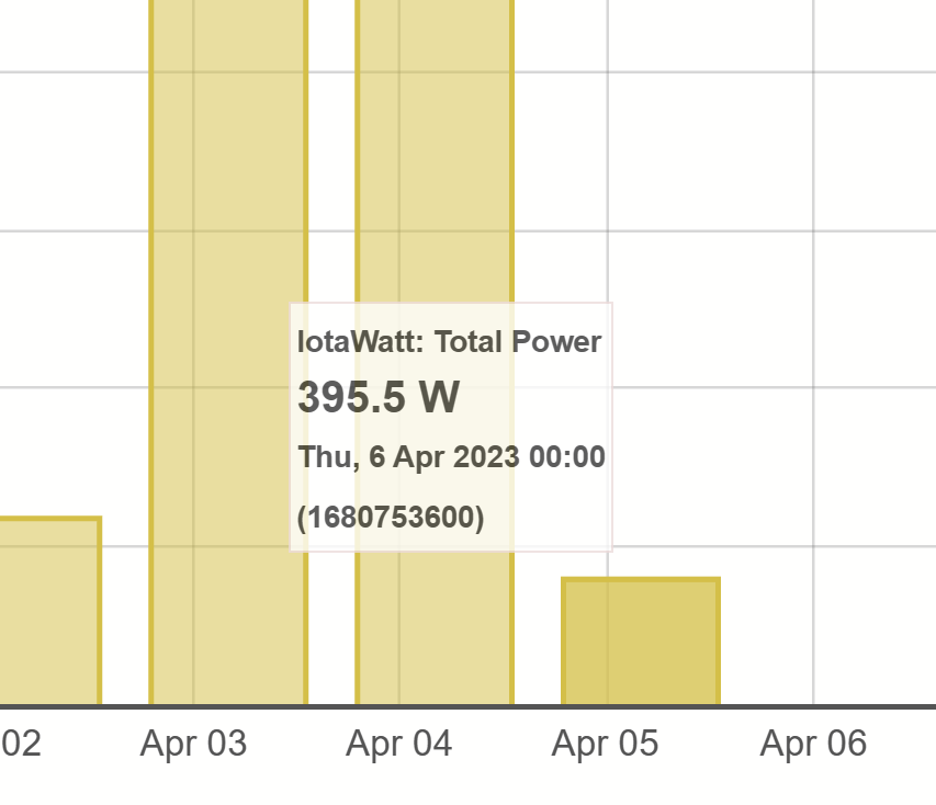
It appears that when zooming plots out to the “day” level (i.e. no times shown on the x-axis), the days are being placed on the wrong hashmark, resulting in a misleading display. In this daily energy use plot, I’ve hovered over the “Apr 05” bar. Note that the tooltip (correctly) shows that the data shown is actually for April 6th. All of the bars are similarly shifted. The CSV data correctly shows “April 6th” as well.
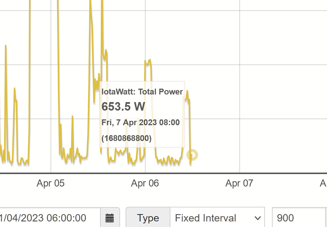
Switching the plot to “fixed interval” with an interval of 86400 shows the bars in the correct places – but then the output shown is different (not sure which one’s correct).
When zooming in, one can see that the bar is placed at midnight…only when zooming out does the day “collapse” to the wrong location.
Tried on Firefox and Edge on desktop and mobile, identical behavior in all. Is this is a bug or did I miss a setting?
I wasn’t able to find a time zone setting in Firefox per se, but I think it inherits from the OS (Windows 10). If I Google “current time” I get my local time and correct time zone (US Eastern Daylight GMT -0400).
My account on emoncms.org is set to “New York”, which correctly shows as GMT -0400. (Normally New York is -0500, but we’re in Daylight Saving Time so -0400 is correct now.)
Here’s a cleaner example showing the zoom-dependent nature the problem, with no totals or anything special – just a raw plot.
As I write this, it’s about 0800 on April 7th. Zoomed in, the latest data correctly shows this morning at around 0800: