All,
I’m a first-time poster, but long-time reader.
While digging into public data I found a way to track the renewable power that suppliers buy on our behalf - half-hour by half-hour. Using data from Ofgem, Elexon, and NESO, and with input from over 30 experts - including several suppliers - I’ve pieced together a clear picture of the power we are served.
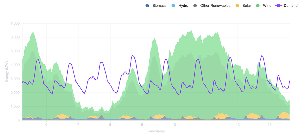
Here’s how it looks for Octopus over the year ending April 2025, in which they served power that was 69% renewable. The purple line shows the demand (i.e. the energy sold to customers), and the coloured areas show the renewables they buy on our behalf (mostly wind).

Zooming in, you can see the daily shape of demand, and how it interacts with the intermittency of renewables:
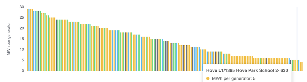
Octopus buys from 1,821 generators - exclusively from 890 of them - including 5 MWh over the course of the year from Hove Park School ![]()
![]() :
:
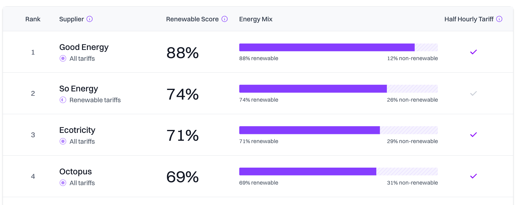
Octopus delivers 69% renewables on nearly 30 TWh/yr which is pretty remarkable. And when I add nuclear, the clean power score will be even higher.
Ecotricity and Good Energy are a lot smaller (1.7 TWh/yr and 0.4 TWh/yr) but do even better. And the trading team at So Energy helped me rate their renewable tariff (0.7 TWh/yr) too, which also comes out well:
You can explore the full results here. There’s been a lot of confusion around “100% renewable” claims because the current system allows winter gas consumption to be offset with summer solar. The approach I’ve taken here works with the same systems - REGOs, half-hourly settlement - but does the accounting properly, half-hour by half-hour, like the power market itself.
I hope this helps rebuild trust in renewable supply - and show just how far we’ve come in the last decade. Next steps: adding nuclear, and giving a matching score without biomass.
Comments and questions welcomed ![]()
Joe