I use the My Solar app to keep track of consumption/production throughout the weeks/months. I find the values displayed for this particular period misleading. I’d rather see zero as value if no measurements are available than the way it’s shown/calculated now.
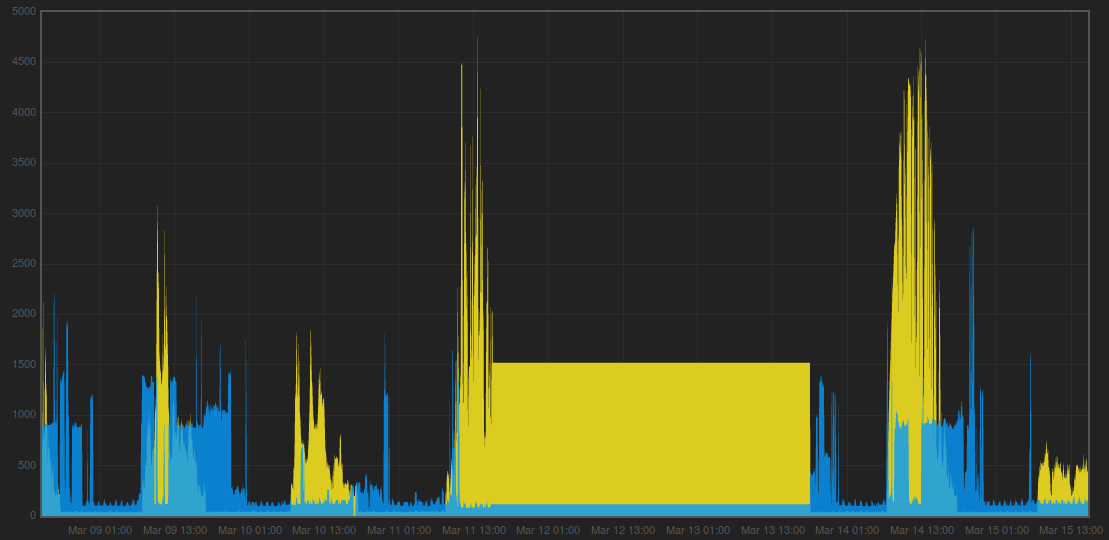
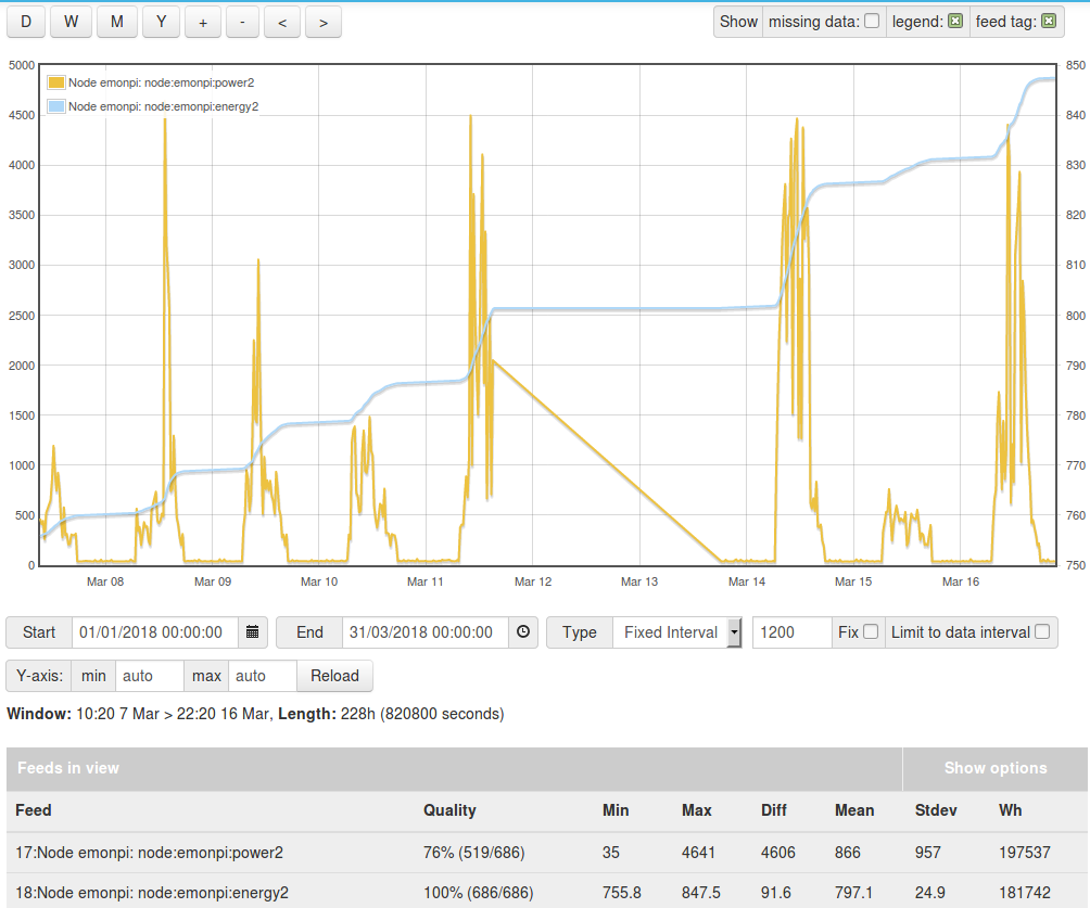
It’s obvious, something odd is going between 11 and 13 March. The root cause is easy, the measurement data is missing. The question is: how to handle this?
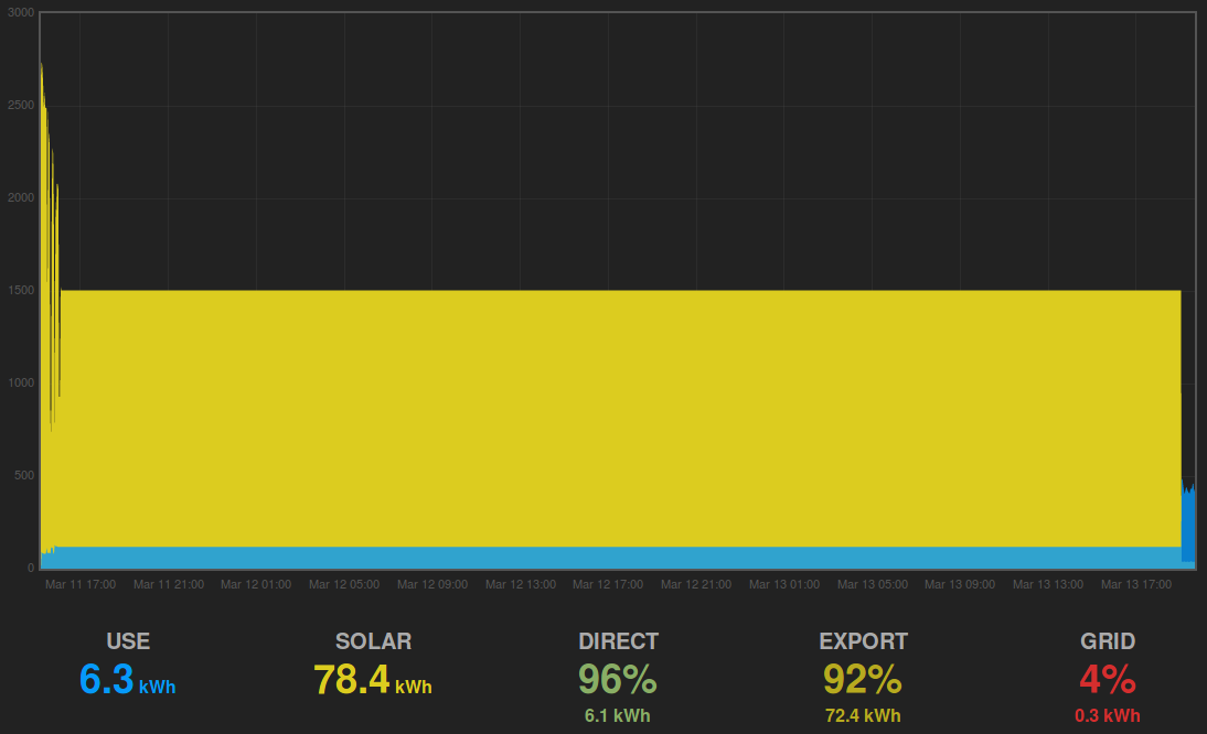
Zooming in on this area of interest shows the interpolated curve for solar. It displays a constant 1500W solar production, resulting in 78.4 kWh. The initial value is taken for as long as no new measurement data is available.
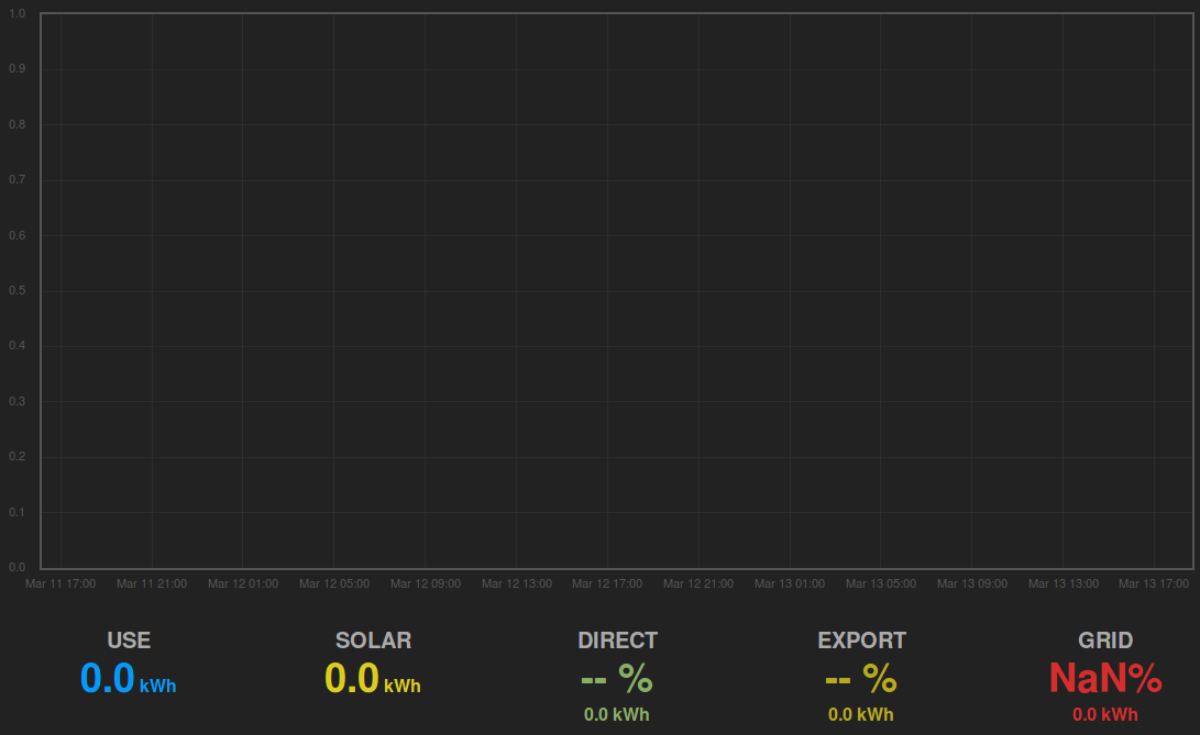
Zooming in just a little bit more so that the last measured value is not available, changes the graph completely. In the picture below, zero is taken as initial value (because no measurement data is available) and used over the whole time frame.
Although (almost) the same time frame is displayed, the consumption/production numbers are completely different.
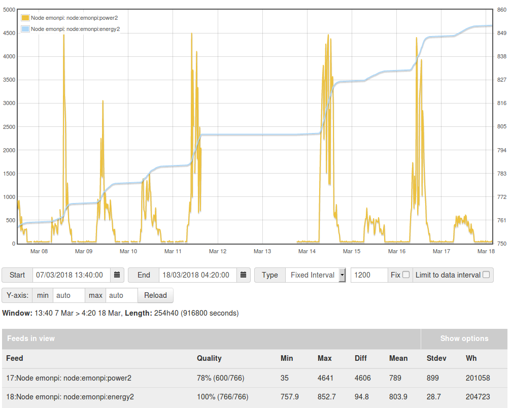
I’m fine with interpolation over short time frames (say 1 min or so). By doing so over longer time frames gives me a wrong impression. I much prefer the approach taken on the Setup > Graph part of Emoncms.
You only get that behavior in the Graph module if you have the “show missing data” tick box ticked. You’ll find if you un-tick that, you get the same behavior as the App.
It is available as an option in the Graph module because some people like it one way, some the other way
The problem you’ll find with the graphs within the Apps is that it is very difficult (impossible?) to distinguish 0 values from non-existent values because of the way they’re drawn, unlike the Graph module where there is clearly missing data.
If changes to include a “show missing” setting for the apps modules were be considered, I think the graphs would need changing to have a different shade fill to the line.
It is clear to see in the graphs module that data is missing (when using show missing) because the line just stops. Even if you select “fill” on the graphs module, the line is darker than the fill and you can still see the line ends, even when the fill links the end of the line to the base line.
In the apps module, it would be difficult to differentiate between a sudden drop to zero and a gap in the data because the line and the fill are the same colour so we can’t see if that vertical edge is line or not.
@Greebo, I unchecked the “missing data” checkbox.
Looks like it does not have effect on the energy graph. The energy is basically the sum of all power measurements over time. So, no power measurement equals zero. I see no better way to do it then this.
It does have effect on the power graph, it simply draws a line across the missing data time frame. That type of interpolation is different from the App.
“show missing data” Checked = Show the data is missing, ie there is a gap in the data displayed
“show missing data” Unchecked = ignore missed data and plot between all available points, ie there is no gap displayed. (Like the MySolar app).
All this does is change what is displayed, not the underlying data. The data is already persisted so how the data is displayed has no effect on the actual energy used or the power values.
When the data was not arriving there was no energy use calculated and when the data started flowing again, if the outage was over 2hrs it ignores the energy usage and sets the usage to zero as it is assumed that it was an outage and the “time” element of the energy consumption is invalid.
That is why your energy plot is flat whilst there is no data, rather than when the data resumes, it calculating the last 48hrs consumption based on a power value for the last 10secs.