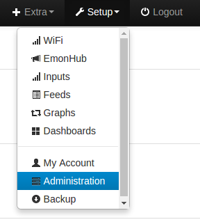
Currently, the icon used for Inputs clashes with the WiFi module icon. Any objections to changing the Inputs icon to an inward arrow? I think it’s better suited.
Open PR if anyone wants to test / make changes:
master ← bootstrap232
opened 07:16PM - 01 Feb 17 UTC
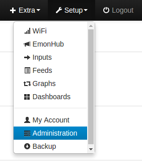
- Change 'Inputs' setup icon to avoid clash with with WiFi icon
- Minor bootstr… ap update (mainly docs URLS) V2.3.0 > V2.3.2
Before:

After:

Thanks for the comments on the PR @Jon @Paul
Update: merged into stable V9.8.0 Emoncms release, see change log: