Could it be possible add the default zoom level of the visualization (day , week, month, year) in the configuration panel? Makes sense?
I have implemented forked view of rawdata and I have modified it to use default day zoom. It is not way to do that. I try to implement it.
For example, default zooming in the rawdata is set in the line:
var timeWindow = (3600000*24.0*7); → Week zoom
If the line is changed as follow: var timeWindow = (3600000*24.0); → Day zoom
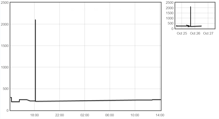
When yo are working in day zoom level, the bottom scale of the visualization changes from day&month to time. If you move left or right is very easy that you lose the reference day. I think that it is very common problem if you are searching detailed information.
I am searching the best way to add the references of the day in the day zoom. Maybe it is possible from the Flot library, from the visualization helpers, or maybe a mix of the two previous options. What do you think?
This second point is connected with the first one. If you configure two different dashboards, you can fix the zooming level in day and week respectively. By this way they can be see at first sight and and move them better.
I already change the default window from a week to a day, assuming I was alone on that point I have not suggested a change until I had time to look at the possibility of adding a “default period” in the rawdata vis user configuration settings.
But I would certainly support any suggestion to just alter the value as you suggest.
The second point is a bigger issue and seems fairly consistent though emoncms so yes it may be a flot thing, I couldn’t say but it would be a an absolutely huge improvement to have both date and time rather than just one or the other.
The small overview plot to the right has been connected to the large plot. The overview has x3 scale respect to the large plot. All the actions over the large plot have response in both plots.
Can I start by saying I’m really glad you are looking at tackling this and i appreciate any improvement you can add. Anything I say here is to bounce idea’s around and to give you honest feedback.
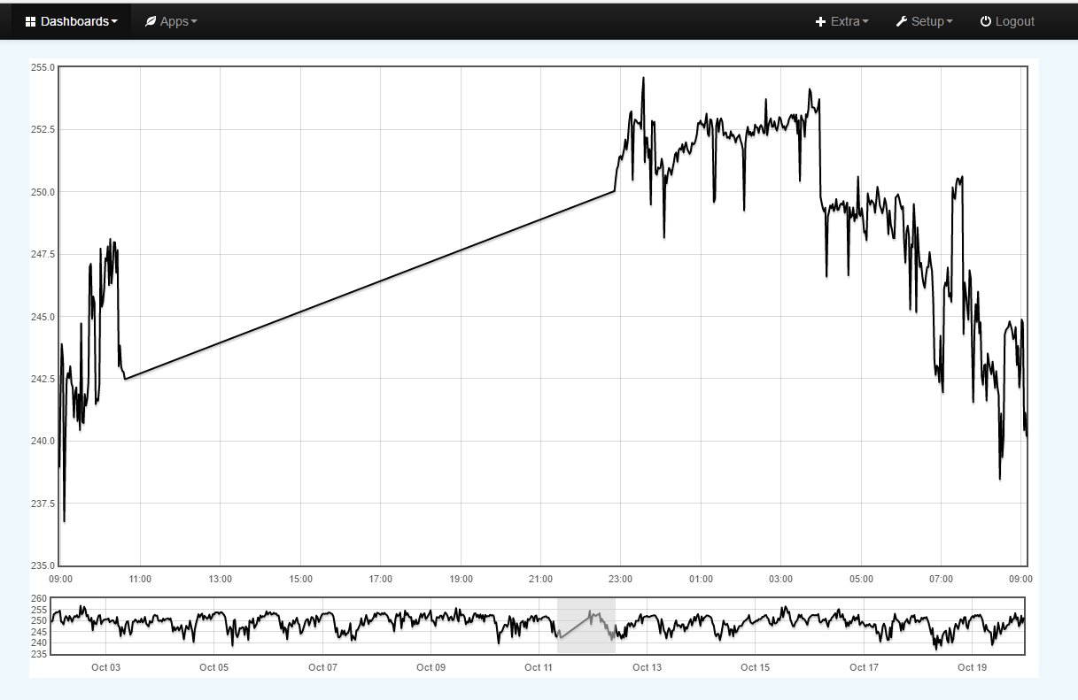
I was interested by your first proposed solution and wondered if rather than a second small “x3” plot a full width minimal height plot could offer a “timeline” that when an area is mouse-drag-selected from it shows that selection in the larger plot without changing the “timeline” plot, the area shown in the main plot could then be highlighted in the timeline plot like this mock up (the graphs and data are real, I just added some shading to indicate the selected area on the timeline)
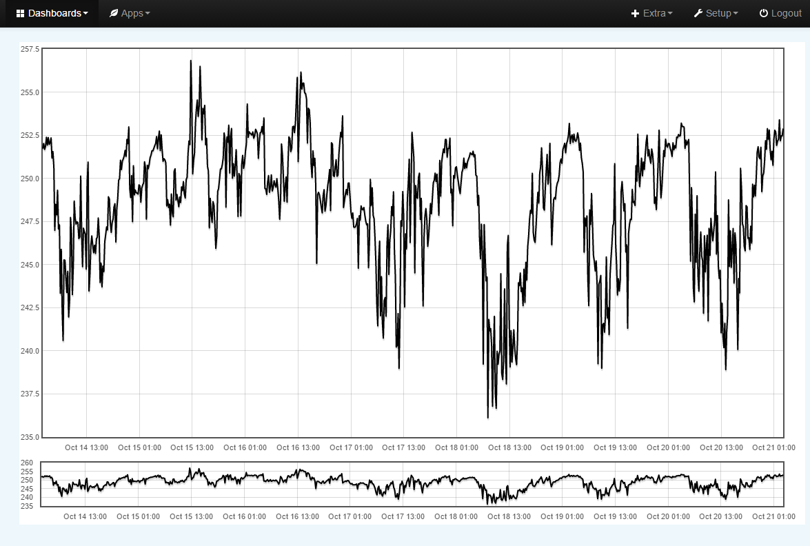
I have always wanted this type of “overview and detail” visualizations but don’t think flot do one. I do however think this is a lot of work and overkill just to make up for the absence of combined time and date axis labels when it is possible to get them under some combinations of plot size and data ranges eg
If we are not able to play with the thresholds and/or control which labels are shown then your “reference day” is a very good idea but I think it should be a “starting date” and not be limited to <24hrs for these reasons.
If you have =<24hrs displayed that spans 2 days, eg midday Monday to midday Tuesday a single date would be unclear, ie is middledate just before or just after midnight?
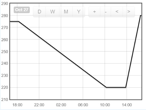
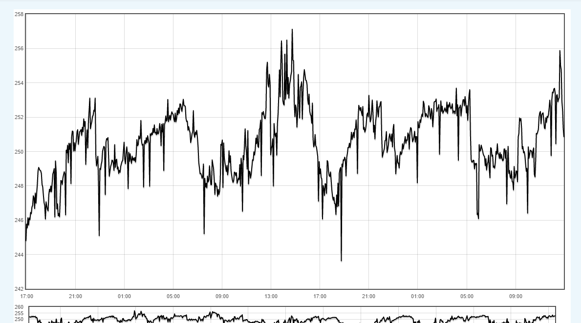
It is possible to get multiple days shown without dates eg this plot shows 44hrs and it’s not even full page width.
I did consider the option of a start date and end date in each corner at the top, but that obviously clashes with the nav buttons, also with putting from and to dates together in the top left, but that is not only using a lot of space, but would also spend a lot of time displaying the same date twice if the data set is all from one 24hr period, so I thought a start date was the easiest, even when looking at multiple days (time only) it’s easier to count from the left/start than going backwards (from middledate) on half the page and forwards on the other (IMO).
Having any reference date at all will certainly be an improvement so please do not see my observations as criticism in any way, I’m just chipping in some info for you to consider, should you choose to, nothing more.
According to my first approximation I am agree with you. Your proposed visualization is very interesting. I have the selection implemented with my approximation:
Now is only one direction interaction (main view to overview). I will add your proposed visualization and I will add the second direction interaction (overview to main view). It will be another visualization for EmonCMS.
In the case of the reference day I will do that you say. I will show the start and end day at the bottom of the graph. The value will be show when the time window is less than 24 hours. I will share snapshot of the result before do the PR.
Although if using a threshold to display the date(s) a longer threshold might be needed since periods longer than 24hrs can be displayed without dates, look at my second image, that spans over 44hrs.
The size of the frame plays a large part, but I just happened to know from past experience you can get multiple days with time only, I’ve been caught out a few times by this.
You can test by making a large frame and then just select (mouse-drag) different periods to try. I have not altered any settings in the examples shown, only the zoom and frame size.
Just to clarify, my thoughts were to have a start date only, I pretty much ruled out having a combined start - end date and also a separate end date, due to space and positioning, I also think the middle date is confusing and unclear, but it’s your show.
IMO and it is only an opinion, the start date only was the clearest option, but I understand the issue with the left axis resizing so positioning a start date at the start ie on the left is awkward, I would then look at using an end date instead and position it on the far right ie at the end (or less appealing is a labelled start date included with the nav/control buttons.)
Rubén, Would it be viable to further develop the existing graph vis instead of creating an additional one?
The disadvantages of creating additional vis’s with a similar common purpose, each with slightly different functionality would mean;
…that users could have function A, function B OR function C, but not have all 3 for the same graph.
it would mean that existing dashboards would have to be rebuilt to take advantage of the new features
by having numerous graph vis’s, new users may find it confusing which one to select (graph vis 1, graph vis 2 etc)
it would increase support/maintainance demands, as we would have to support 2 or more vis’s instead of 1
If it was possible to build this into the existing vis, could a checkbox be added to the vis config with something like “Display Timeline” to either show or hide it?
Ideally start date at bottom left, which as discussed is difficult to implement due to left axis resize.
I don’t like the idea of adding it to the toolbar, because on small graphs it makes the toolbar wider and may not fit, and on larger graphs the date could be offset from the left axis, making it unclear where the actual day starts.
IMO the other options described are not really intuitive, and rather than this looking like a hack, it might be worthwhile looking at other options, such as using more detailed tooltips to clearly identify the time/date for any given datapoint.