Any use as a visual?
Hot Water Cylinder Visualiser · dbuezas/lovelace-plotly-graph-card · Discussion #294
My version (isn’t quite right and only works in old Lovelace dashboards - I’ve stopped playing with it  )
)
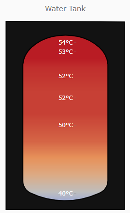
type: custom:plotly-graph
fn1: |
  $ex {
    vars.title = 'Water Tank'
    vars.mask_height = 175 // SVG

    vars.tank_height = 170

    // sensors from bottom to top
    vars.sensor_names = [
      'sensor.tank2_ds18b20_2_temperature',
      'sensor.tank2_ds18b20_1_temperature',
      'sensor.tank2_ds18b20_5_temperature',
      'sensor.tank_ds18b20_7_temperature',
      'sensor.tank_ds18b20_4_temperature',
      'sensor.tank_ds18b20_1_temperature']
    vars.sensor_heights = [
      1,
      66,
      92,
      113,
      136,
      145]

    // temp of a virtual top temp sensor
    vars.top_temp_factor = 1.0

    // colorscale
    vars.min_temp = 30
    vars.mid_temp = 38
    vars.max_temp = 55
  }
fn2: |
  $ex {
    // linearly interpolate between sensors in steps of 1cm (not accurate)
    interps = []
    vars.sensor_values = vars.sensor_names.map(sensor=>isNaN(hass.states[sensor]?.state) ? sensor : Math.round(hass.states[sensor]?.state))
    let Ts = vars.sensor_values.slice()
    let Hs = vars.sensor_heights.slice()

    Ts.push(vars.sensor_values[vars.sensor_values.length-1]*vars.top_temp_factor)
    Hs.push(vars.tank_height)

    for (let i = 0; i < Ts.length - 1; i++) {
      for (let step = 0; step < Hs[i + 1] - Hs[i]; step++) {
        let interp = Ts[i] + (step * (Ts[i + 1] - Ts[i])) / (Hs[i + 1] - Hs[i])
        interps.push([interp,interp,interp]);
      }
    }
    vars.z = interps;
    vars.x = [10,20,70];
    // array 0 - to height of tank (-1)
    vars.y = Array.from(
      { length: Hs[Hs.length -1] },
      (_, i) => i
      ).map(y=>y*vars.mask_height/vars.tank_height)

    vars.tick_height = vars.sensor_heights.map(h=>15+h*vars.mask_height/vars.tank_height)
    vars.tick_text = vars.sensor_values.map(v=>Math.round(v)+'°C')
  }
entities:
  - entity: ""
    z: $ex vars.z
    x: $ex vars.x
    "y": $ex vars.y
    type: heatmap
    zmax: $ex vars.max_temp
    zmid: $ex vars.mid_temp
    zmin: $ex vars.min_temp
    showscale: false
    colorscale: RdBu
    contours_coloring: heatmap
raw_plotly_config: true
refresh_interval: auto
ha_theme: true
config:
  staticPlot: true
layout:
  paper_bgcolor: rgba(0,0,0,0)
  plot_bgcolor: rgba(0,0,0,0)
  title: $ex vars.title
  yaxis:
    tickvals: $ex vars.tick_height
    ticktext: $ex vars.tick_text
    tickwidth: 0
    tickfont:
      size: 12
      color: white
    showgrid: false
    zeroline: false
    showticklabels: true
    showline: false
    visible: true
    position: 0.57
    scaleanchor: x
    scaleratio: 0.9
  xaxis:
    visible: false
  margin:
    t: 40
    b: 20
  shapes:
    - type: path
      name: cylinderMask
      path: >-
        M0,185 V0 H105.09 V184.46 Z M52.71,171.43
        C72.88,171.43,89.26,158.75,90.43,142.73 V28.37
        C90.43,23.34,87.75,18.76,83.62,16.65 L81.97,15.8
        C62.7,6.1,40.47,6.38,21.4,16.53 C17.41,18.71,14.86,23.22,14.86,28.13
        V142.71 C16.03,158.73,32.55,171.41,52.71,171.41 Z
      fillcolor: rgba(18, 18, 18, 1)
      line: null
      color: rgba(18, 18, 18,1)