Help on best graphing approach for insights into the Power Consumption Data

Hi

I am doing research on my general consumption for potential solar panels etc…
I have emoncms data since a long time ago and this AM was playing around with getting some further insights into how we are consuming energy in the house…

I have been reviewing the total Daily KWh and playing with hourly etc… But has anyone done some neat graphing logic to get potential insight into the following

What’s your usage like night vs day, midweek vs weekend, summer Vs winter?

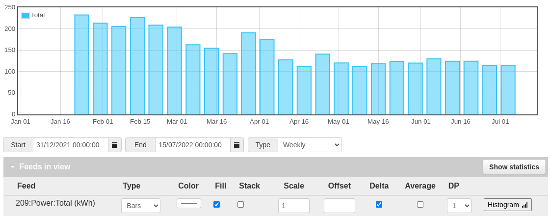
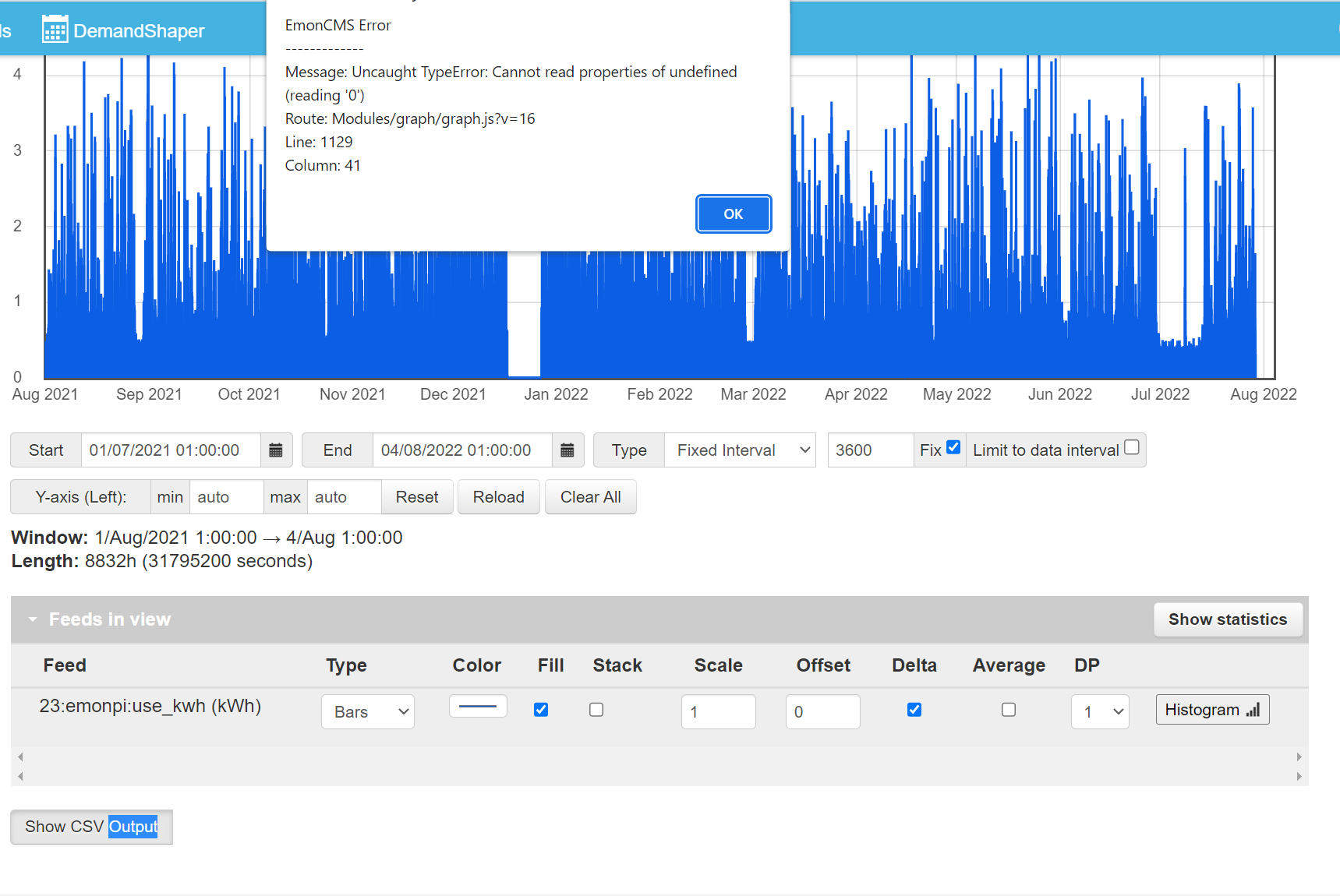
For starters, knowing the average daily kWh consumption will give you a good baseline. That can be worked out from regular meter readings. If you have a cumulative feed then graphing it as bars with the ‘delta’ option will tell you want you need.

Click Show statistics button to see min/mean/max values.

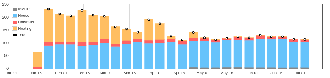
If you’re able to split your consumption into different appliances (immersion, heat pump, EV, etc) then that can be more illuminating…

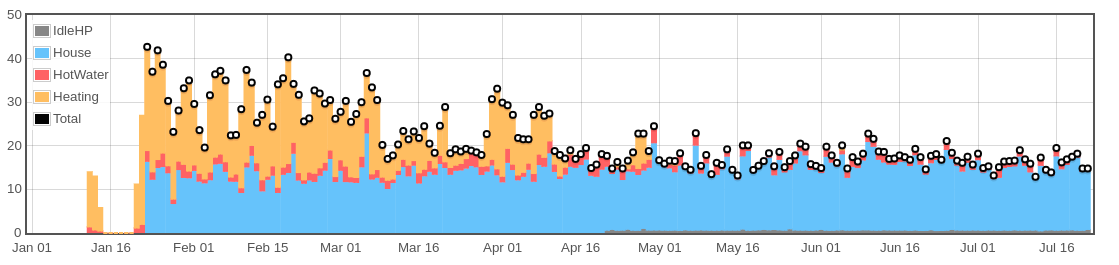
My weekly charts are quite even, with higher consumption in the winter due when the heat pump is in use. Switching to daily shows a little more variability, though broadly in the same ballpark as the average. There’s not much difference between weekday and weekend, as we’re in the house all the time.
Caveat: obviously every property and every household is different.

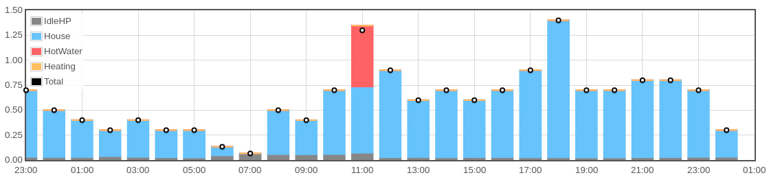
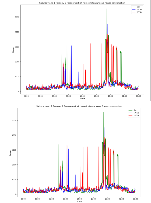
You can go further an look at your hourly consumption to see how it varies over 24 hours, but at the end of the day (ha ha) I only really care about the daily consumption. Be aware that depending how your hourly consumption is measured, there may be some inaccuracies due to how many decimals the feed has. [that dip at 7am is probably an anomaly]

Knowing how low the consumption is overnight can be useful as this is the “base load” of your property. If you can minimise this (turning off devices you’re not using, etc) can significantly reduce your overall consumption.

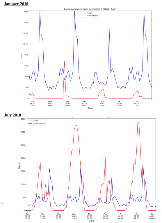
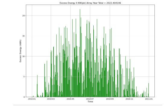
My recommendation for getting solar PV is to get as large a system as you can fit / afford. On sunny days you’ll likely generate more than you can use, but having lots of panels really helps on overcast days.

Oh, and definitely consider a battery. Again, as large as you can fit / afford. Ideally big enough to power the house through a dull day.

To estimate the potential solar power you might get at your location / orientation / roof angle, I recommend this tool: JRC Photovoltaic Geographical Information System (PVGIS) - European Commission

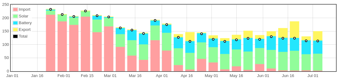
Once you do have PV, you can then start charting which source you’re consuming power from (or not):

[Charts shown from my own system for first 6 months of 2022, for a fully electrified property in the UK]

Thanks for the input Tim - really helpful

I did this kind of thing when I was planning a move to the Octopus Agile tariff: Domestic data science – energy use – scottishsnow.

1 Like

So I did similar to miker, (although no fancy blog!) - I took the emonPI data for consumption as a CSV and also generated the hourly solar data using the JRC site for a year all as CSV. All the analysis I did in Python, might not be your thing but if interested say and I can share the scripts.

As I was forecasting the future and we had all been at home during the pandemic future demand was not be the same as past consumption, So I generated hourly dummy consumption datasets for a year based on 0,1 or 2 people at home during the day on different days using the schedules we are now working.

Thus for each hour I had predicted consumption and the predicted solar generation. As I was getting a diverter for my immersion I also allowed for 10kWh of Electricty for hot water. A shower averages ~3kWh in my house (some members of the household take longer than others…) I then played with array size to work out the import/export each hour over the year to find what was a likely generation vs cost and payback.

Current Rates
Direct Use (electricity not imported) = 28p/kWh
Gas not burnt due to using solar diverter = 12p/kWh
Excess Solar sold = 7p/kWh

The key is to use as much as you can yourself!

As others have said within reason go as big as you can (either budget or available roof space) I have 4.5kw (pk) panels and 3.68kWh (G98) inverter.

There are a few biggish fixed costs like scaffolding, the incremental cost of another couple of panels in the initial project is not a lot, adding more panels later incurs the same fixed costs.

My budget went on panels. generally a battery can be added later without scaffolding! I don’t currently have a battery, going to get a bit more data yet to see if it makes sense, assuming a round trip efficency of 85% it would mean each kWh saved/reused would be worth ~=24p. An immersion diverter was only £300, 10th the cost of some batteries, although you only save 12p/ kWh.


Selection_003

1 Like

Yes please Carl, if you could pop over your scripts that would be so appreciated…

I have created CSVs from my energy usage and uploaded to a jupyter notebook and I am now trying to play with python / pandas to interrogate and graph some insight’s

Hi

Hoping someone can help point me in right direction. Like Carl and others I am exporting my data into other tools to interrogate the data. I am sure there is a setting I have wrong : really appreciate the steer…

I am able to export daily total KWh readings to CSV for right back to when I installed (1 July 2020). Which has been really insightful… , but when I try to do hourly and half hourly snaphots, the timeframes are limited… Is there something I am doing wrong on the graphing settings?

HOURLY:
I can only get a graph back to 1 Aug 2021 when I try to expand the timeframe, I get the following error when I click SHOW CSV, i get the following error and graph doesnt update…

HALF HOURLY:
I can only get a graph back to 1 Feb 2022 when I try to expand the timeframe, I get the following error when I click SHOW CSV, i get the following error and graph doesnt update…

sol_lt_forecast.zip (481.8 KB)
Here you go - the zip contains

  • The Python scripts
  • example CSV’s that I generated to generate day profiles
  • A word file with a few notes I made as I did it
  • A spreadsheet - from before I had emonPI where I worked out my consumption by a range of plug in meters, reading them and moving them round, or hot water energy consumption from flow rates etc. Might give a bit of context.

I also could not work out how to extract daily data, as I recall I did it using the raw data (taking out in batches) and then using Pandas resample method to get daily data, although there is probably a way solution!

What I really would like is something where I can make a “API” call e.g. something like…

http://emonPI/get_data?start=2022-01-01T00:00&end=start=2022-06-30T00:00&freq=1D&method=average.

And I get back a CSV or JSON data stream

I have a few project ideas where this would help, but I don’t think it’s possible. If you ssh to the emonPI you can (I think) extract data directly from the database, so possibly something could be done this way but at the moment I don’t have the time to play with it (and I have managed to wipe the private key I use to access the emonPI!)

@Timbones, I agree on the recommendation for solar PV. But I’m in doubt for your recommendation for the battery. As it is not cheap, it takes away capacity from electric vehicles, you have charge and uncharge losses, there isn’t enough green electricity yet to store in big capacity (if you can’t consume it, your neigbours probably will), technology is a work in progress (eg. Vehicle2Grid will be better in a few years).

Personally I would advise that if you have the money: invest in renewable energy corporations or companies.