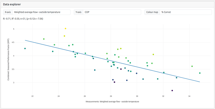
I’ve added weighted by kWh delivered, average flow - outside temperature to the measured params in the system list table.
It’s now possible to plot this using the plotting tool on the site, which also allows for colour coding the points by % carnot when running.
I think this result is actually quite strong:
-
Annual performance is strongly correlated to weighted by kWh heat delivered flow - outside temperature as we would expect.
-
We can see that higher % Carnot, yellower colours are above the line and lower % carnot bluer points are below the line. % Carnot being how effective the heat pump + system is at any given flow & outside temperature, what % of ideal carnot COP it’s getting.
I would have thought that it should be possible to deconstruct “weighted by kWh heat delivered flow - outside temperature” into:
- Design flow temperature for space heating
- Hot water target temperature
- % hot water demand vs space heating
- Seasonal variation in indoor temperature/comfort, e.g heating to higher internal temperatures during average winter temperatures vs coldest days.
% Carnot is a bit more complicated, my guess is:
- Make and model of heat pump and age/condition
- Length of primary pipework
- Metering error (air issue, quality of temperature sensor placement, water quality)
- Hydraulic separation (none or low distortion = high, maybe to a lesser extent than the above three).
- Hot water cylinder stratification in relation to coil position
- Outside temperature measurement error (most are from metoffice api, there will be local variation, effects of air restriction around heat pump etc)
