There’s something about graphs and data on emoncms.org which I think could be improved, the details explained to me might put me at ease about the whole thing.
The representation of data in Graphs. I don’t really understand how data is downsampled when zoomed out, viewing broad stretches of time. Is it averaged in between intervals? Or is a datapoint chosen at every interval? I want it to be really clearly displayed what method Graphs is using to modify the representation of data. Is there detailed descriptions of what’s going on somewhere in Guide or Learn? I find a very glancy mentioning of Graphs here 2. Log Locally - Guide | OpenEnergyMonitor
Minor point, but an aesthetic one, the default behaviour to draw a line across missing data, I find this misleading, easily checked-off and out of sight, so not a big problem.
Regarding data, I’d like to know a bit more about how the data download as csv works, how the auto interval selection works for example with FINA or TIMESERIES differently.
Also, although I’m sure simply asking for the original database files to be sent by email would be possible, if needed for any reason, I’m wondering how easy it would be to improve the user-data experience by giving a direct download of the database file and some simple tools to tap into it, perhaps based on python, php or js. I’ve been gawping at Chart Studio a bit too, and graphana looks really solid. I know it’s important not to compare too much but I just made a comparison, so there . To go a step further, how would it look to take exactly the same dataset from say, a FINA db, and upload a .csv conversion to plot.ly and graphana, and compare different view settings from those two compared to emonCMS Graphs, and if they are different, to analyse why they are different. Would this be a useful analysis?
I want to have an unshakable faith in the representation of the data.
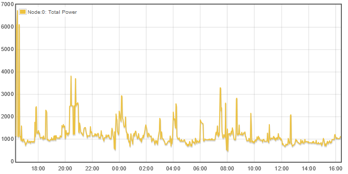
Strictly speaking, graph displays what it gets from the underlying database. In the case of Emoncms, the default query asks for the datapoint at each interval. Here’s a screenshot of a typical day:
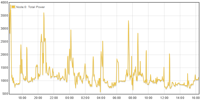
Now turning on “Average” and Reload:
Not a huge difference when each datapoint represents 2 minutes.
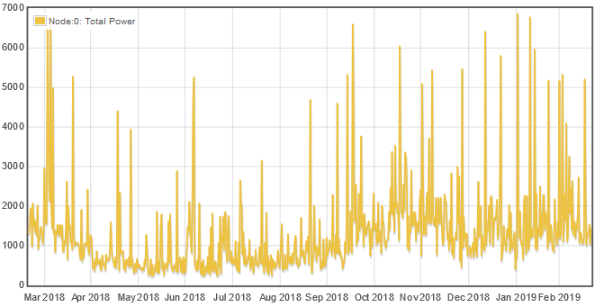
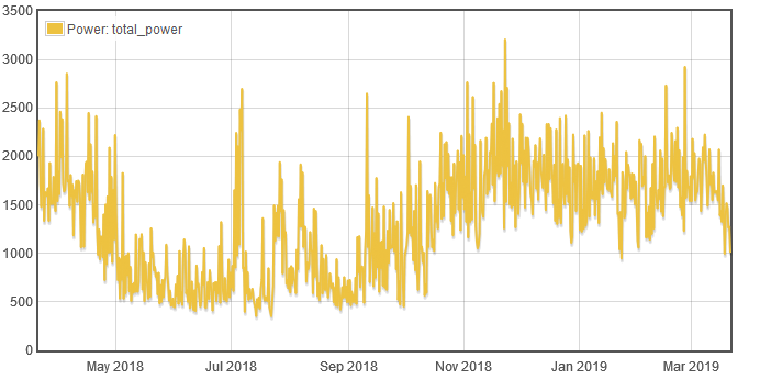
For a better contrast, lets look at a year:
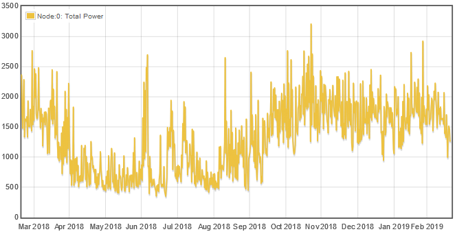
And with “Average”:
Pretty dramatic. All of the random 5,000 and 6,000 watt peaks are gone.
The first time you request averaging for a feed in Emoncms, there may be a delay while it computes the averages, but thereafter it seems to be just as fast as with the discreet interval requests.
IoTaWatt uses an older fork of graph. While the look and feel are the same, there are some significant differences, and averaging is one of them. The structure of the datalog always returns average for each interval. Comparison of an IoTaWatt graph and an Emoncms graph with averaging of the same data is identical. Here’s that year plot from an local IoTaWatt graph:
I do find this interesting, although, it is difficult to read and compare your graphs with a varying y-axis scale. You know what I mean?
The averaging does seem to make a big difference for the representation annual data it seems! This is exactly the suspicion I had.
Turn averaging on. Good, a +1 there. Let me guess this applies to FINA only, and not TIMESERIES?
You can normalize the graphs using the Y-axis min/max fields for comparison. Sorry I didn’t do that.
I don’t have a TIMESERIES to try it, but I doubt it. I think FINA gets converted to FIWA under the hood when you first request averaging. I believe FIWA introduces more disk overhead. A shame because a single time-series with 8 byte entries can produce average power values and cumulative Wh.
If you try averaging a timeseries you get an error. Worse, it appears to latch somehow so it is impossible to get rid of the error
Graph doesn’t work all that well with timeseries; there are all kinds of inconsistencies in its behaviour.
Averaging does not result in a feed being converted from fina to fiwa; it does averaging on the fly. I have hardly used it so don’t know much more that that.
Filling in missing data points by default seems like a useful behaviour to me to cover those instances where there are short radio dropouts, for example. Again, the behaviour with timeseries is inconsistent.
 . To go a step further, how would it look to take exactly the same dataset from say, a FINA db, and upload a .csv conversion to plot.ly and graphana, and compare different view settings from those two compared to emonCMS Graphs, and if they are different, to analyse why they are different. Would this be a useful analysis?