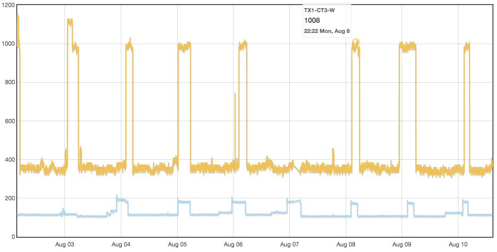
Have a look at this graph… when I mouse over any datapoint, the mouseover box shows the correct time of the datapoint reading. But those times shown (in this case, the spikes usually start around 20:00:00) do not correlate to the vertical lines on the graph. In other words, a vertical line should start at 00:00:00 and the 20:00:00 spikes should show up near the end of the day, not at the beginning. With DST I’m currently at -6 hrs from UTC. Is there any way to align the vertical lines on the graph with the actual datapoint readings?