[edit - I drafted this post earlier today but chose not to post it in case it was taken in the wrong way, but following @Paul’s post, I’ve decided to post it]
[edit2 -
that is dependent on your settings, see below.]
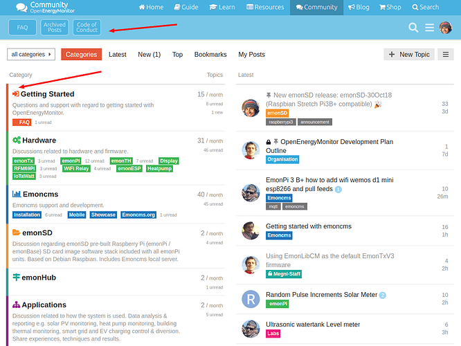
Can we please have the latest button back in permanent residency on the lower navbar?
Having a consistent location that doesn’t appear and disappear depending on how close you are to the top of the page for such a frequently used button is important, it is likely to be used more often than any of the FAQ, Archived or CoC buttons by most users.
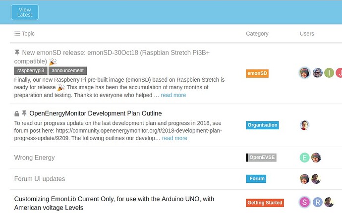
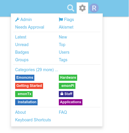
This change has effectively made the page I view most a 2 step process either via the cog then “latest” or scroll down (to reveal the button) and then “View latest” or as I’m currently doing due to muscle memory and years of habit, accidentally into FAQ’s (because that’s where the button was) and then to latest as the latest button then appears where it used to be.
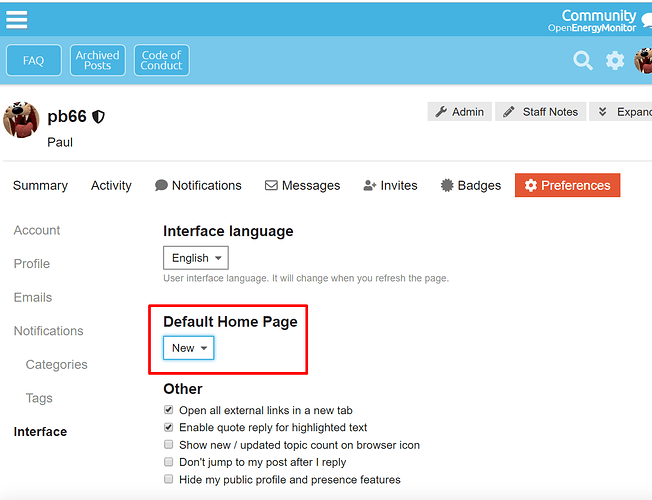
No. In fact it actually it takes you to the users chosen “default home page”
Which is categories by default if the user has not changed it.
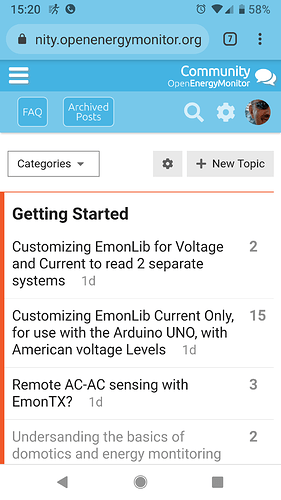
IMO changing this to latest is NOT an acceptable workaround for the above change to the latest button as even with latest set as the home page, navigating to said page on a mobile device is either via the “view latest” button top left or via “community” button top right depending on whether you are at the absolute top of the thread or even a fraction off the top, this is both inconsistent and awkward IMO.
If the decision was based on limited space on a mobile device, I would think that users are more likely to check the “latest” threads than do hardcore research into the archived forum from a mobile device so perhaps just show latest and faq buttons rather than faq and archived (although on my mobile there appears to be room for all 3)
BTW I’m really not wanting to enter into a long debate on this, I have expressed my opinion on that change alone and will leave it at that since it appears to be a done deal, there was no consultation prior to changes nor any request for feedback in the announcement of the changes.
My opinion on the decision to drop the latest button from the 2nd navbar (some of the time) doesn’t mean I do not appreciate @Gwil’s work, that decision seems have been executed very well and the overall appearance and operation of the navigation is great overall, but for me, this one point means I preferred the pre-updated navbar to the updated navbar. If this one change could be reviewed I’m sure I could then appreciate the entire update as a whole. Either way, @Gwil, your efforts to improve the site are appreciated, I wouldn’t want my comments to be misconstrued as anything but well intended.
