I’ve been working through some fairly substantial front-end refactoring of Emoncms with the goal of increasing consistency across user interface components with the view to making future development easier. I have also been updating key dependencies such as Flot Charts and Vue.js and removing deprecated dependencies like Moment.js and a number of custom UI component scripts accumulated over the years.
Initially, I had hoped to replace Bootstrap 2, which is now quite outdated, with a fresh design. However, I’ve had to hold that change back for a little while longer. I did the classic thing of trying to refactor too many things at once and so I decided to take a step back to push forward with releasing the mostly javascript focused changes first.
These changes are now available in the master branches ready for testing:
- Emoncms core v11.15.3
- Graph module: v3.2.1
- App module: v3.2.1
- Dashboard module v2.5.1
- Device module: v2.4.0
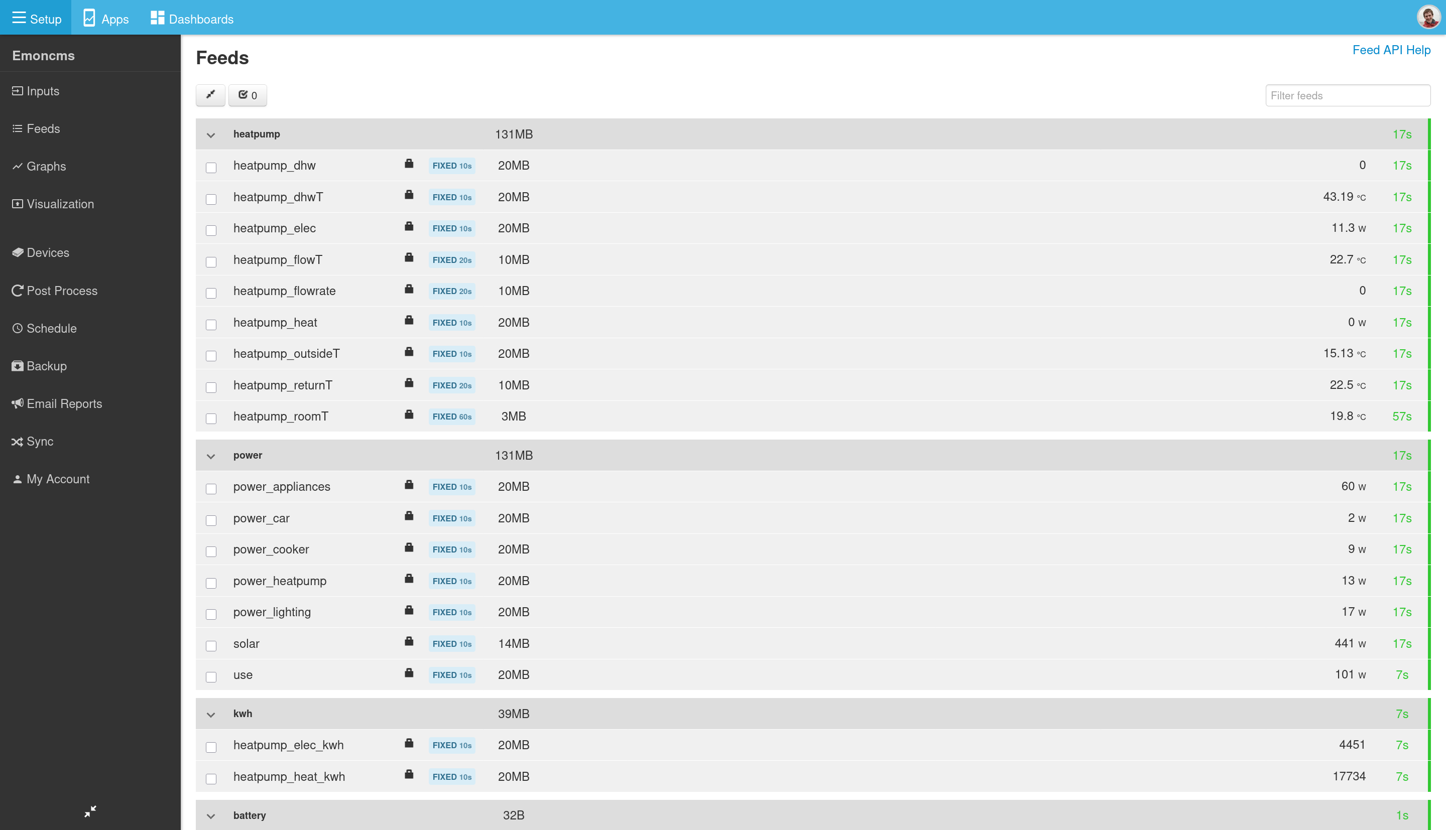
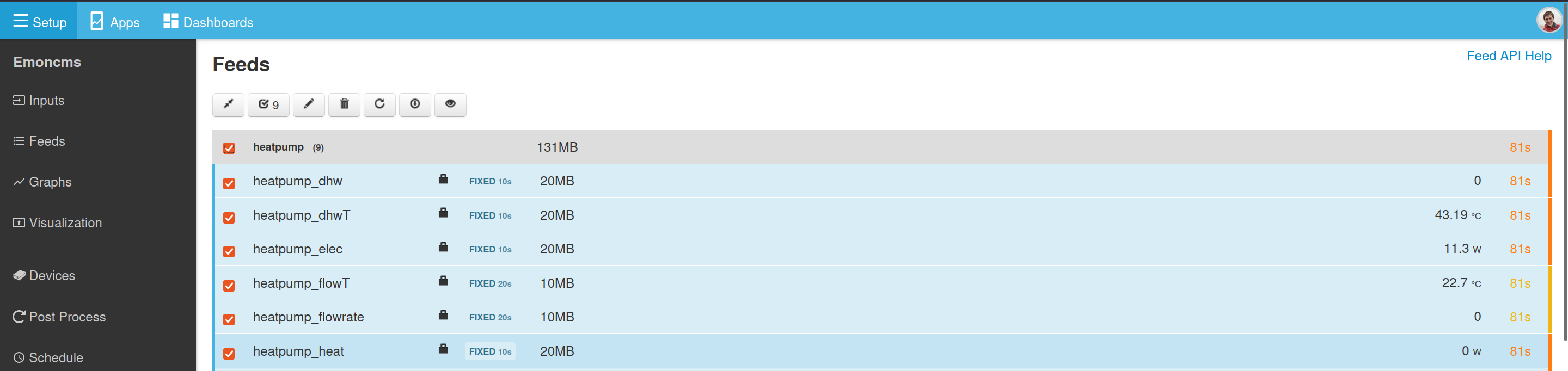
New feed and input list implementations
Both input and feed lists have filter/search option, implementation is now much faster.
Under the hood this now uses a modern css grid, vue js 3 and resize observer to do the full variable responsive column hiding for different screen sizes.
There caret icon now animates nicely rotating 90 degrees as you expand/contract the nodes.
Feed engines and intervals have nice badge styles.
Multi selected by node, same functionality as we always had on the input list, now works the same way for both input and feeds pages. Feed and input rows highlight blue when selected. Select count in controls bar.
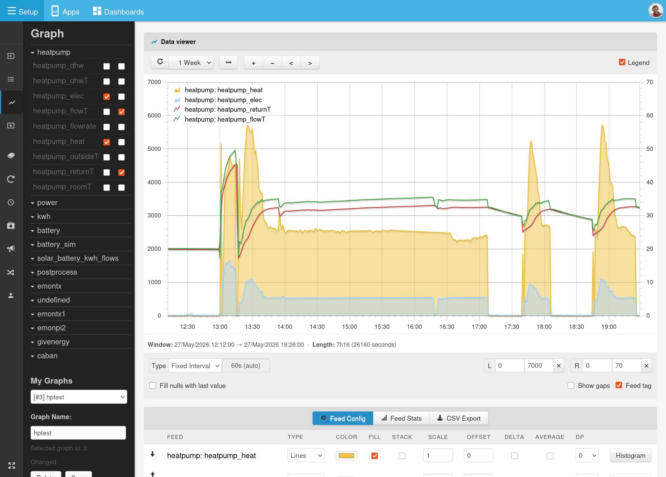
Graph module rewrite
- A complete rewrite of the javascript code to use vue.js v3.
- Uses the latest version of Flot v5.1.0, now maintained by Kevin Burke GitHub - kevinburke/flot: Attractive JavaScript charts for jQuery · GitHub - jquery is no longer a dependency, works well with vue.
- New card based UI css and focus on trying to clean up the controls - still more work to be done here with the feed config and stats table in particular.
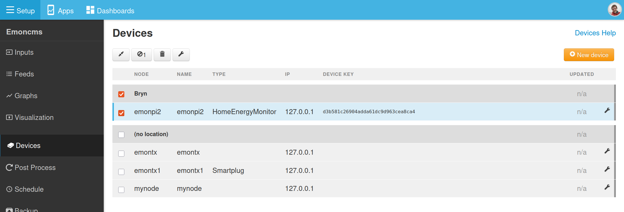
Device module
Now uses the same css grid + vue.js 3, group list implementation used for the input and feed pages. Removes the use of the older table.js code.
Dashboard module
Dashboard configuration/list page now implemented using vue.js v3, no longer uses older custom grid.js code - but functionally identical.
Apps, Schedules, Accounts.
There are also smaller changes to other modules for compatibility.
I have now released the above as a stable:
v11.15.7 fixes admin > shutdown issue
v11.15.8 caches admin systeminfo for quick initial load
If I might say so myself, there’s some really nice subtle ui improvements in this release. Deploying this on a new system over the weekend I was quite pleased  .
.
Next step is to get back to the mysolarpvbatteryfix branch and get that merged in as a separate app so as not to break existing configurations.
I also think it should be possible to integrate the sync module ui into the main feed list ui, so that you can see the feed sync status simply from the feed list page - this would also reduce ui duplication.
Emoncms app module stable release with new MyElectricFlow app: v3.3.0
Emoncms v11.15.x is now live on emoncms.org 
Here’s the new MyElectricFlow app visualizing a home solar (without battery) setup - replacing the MySolar app, the data for this is also coming from an emonPi3 and the input processing is as simple as could be just 2x log to feeds, one on the grid import/export CT and the other on the solar generation CT:
Same time window on the tariff explorer tab:
The graph module now has a built in datapoint editor removing the need for the separate editor ui that was hidden away in the Visualisations module:
Available in v3.2.3 of the graph module, both self-hosted and emoncms.org.
I have one small issue with the new graph module - it doesn’t plot any MySQL feeds.
Aha interesting, I dont use the MySQLTimeSeries engine and not a fan of that engine so never test for it  - Im sure however that the reason it’s broken will be relatively minor, any chance you could do some digging to see what it might be?
Narrowed it down to when the Average option is checked. Okay when not checked, or when the interval happens to coincide with period of the data (half-hourly in my example).
Interval 1800s showing fixed feed (orange) and mysql feed (blue), both averaged:
Interval 900s, mysql feed disappears
No errors, just empty data from feed/data.json. Same happens at larger intervals.
When Average is unchecked for both feeds, then the blue line re-appears:
A little more pressing; none of my feeds have updated since pulling the latest from git.
These use pushed as json to /input/post by custom scripts that pull data from other places.
Edit: Oh never mind - fixed the feeds by updating the database
Thanks @Timbones did the db update fix the above as well with averaging/no averaging or just the posting of new data?
Update fixed posting of new data, not the average chart.
I also note that ‘Average’ option appears to be on by default (it didn’t used to), as is ‘Skip gaps’ option (which also inhibits the chart of sparse feeds).
For small intervals, fixed feeds get interpolated points, whereas mysql does not (which I personally prefer).
It’s not a big issue, as I can work around it for now, just a little annoying.
Oh, and also the touch controls are broken. I used to be able to slide a graph sideways, but now it only jumps forwards in time no matter which way I swipe.
Thanks @Timbones touch controls were working fine on my phone so tested them on @glyn.hudson’s as well today, seems to be working fine for Glyn too. The way touch works is different now: press and drag left, press and drag right, a little blue bar appears to indicate the touch movement - it’s a much more stable movement than before. Did you test touch on your phone or laptop display? I do actually need to check a laptop display where there is both a mouse and touch screen present..
Just fixed another bug with Graph zoom, where it would zoom out suddenly if you zoomed to far in. I’ve also added datapoint date time seconds to the tooltip and fixed an issue with the start and end timestamp rounding.
Ah! The graph page works as you describe, but I’m talking about the graph widget on a dashboard, which does not have this behaviour, and is practically unusable.
[I’m using Chrome on Android]
PS: I also wish that vertical drag would scroll the page not the graph.
Thanks for spotting, just fixed the touch in embedded graphs 
Working perfectly now, thanks @TrystanLea.