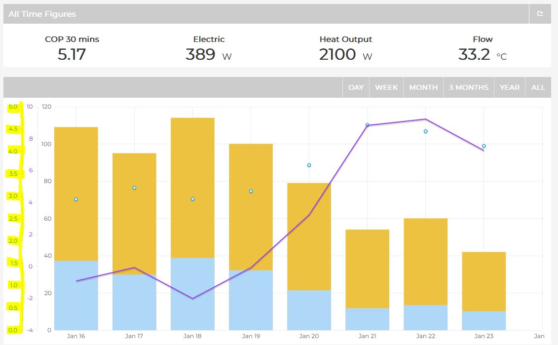
I am looking at the Heat Pump App and can see that while some graphs are dynamic (external temperature and kWh on the daily page) The COP scale always starts at 0 (this limits the range of the readings as most units should not be running this low).
Is it possible to have this field be more dynamic at the bottom end, maybe starting 0.5 or 1 point below the lowest value and ending 0.5 or 1 point above the highest, or possibly allowing the lowest and highest values to be configured as they can under the more details section on the daily view?
Why do you think this would be an improvement?
I personally feel that the origin should always be zero, so that you get a good sense of performance when looking at any system.
Having a wider deviation on the used portion of a graph that is more dynamic would allow you to see a difference across other systems clearer and it would just cut out a chunk of what is mostly (hopefully) dead space at the bottom of the graph. I get the argument that it may make the graph less easy to say system A is 2x or 30% higher than system b without the reference value of 0 (so would detract from some of the bragging rights  ) however this is why I started a thread here to open the discussion.
While starting from 0 may look more visually appealing we cannot do this for either temperature (especially for the last few weeks) or for the heat output (defrost cycling shows as negative) and without seeing these values it is not a true reflection on system performance. So if these are not starting from 0 would it be beneficial to also be more dynamic with other y axis elements?.