I would like to create a dashboard in Emoncms (Web/Online version) to show a graphical representation of import - Power is flowing from Grid to House, Export - Power is flowing from PV to Grid (& House) etc. Has anyone managed to do something like this? I’ve tried looking at the different type of widgets available but am not sure where to start with this?
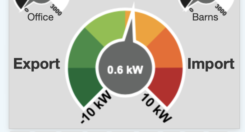
Not sure if I have understood you properly, but I have a dashboard with 9 “dials” on it, all showing various feeds. But this one is at the foot of the page, and shows what I think you are looking for? (Dial / Green to Red, zero at centre)
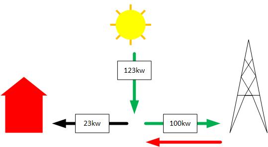
Thanks for this suggestion, I am working around the required solution by using the gauges at the moment, however, I am really wanting a graphic display such as the below
Ideally I am wanting the arrows to change colour depending on direction of flow, and amount if possible, i.e. if house usage is low then the arrow is green, slowly turning red on higher utilisation.
I’m fairly certain you can include graphics in your dashboard, but it means editing the PHP code. I’m by no means an emonCMS expert, so though I presume it would be possible to show the changing arrow by having several versions (or using CSS or SVG), whether it would be easy or close to impossible, I cannot say.
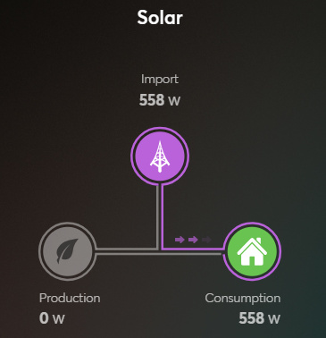
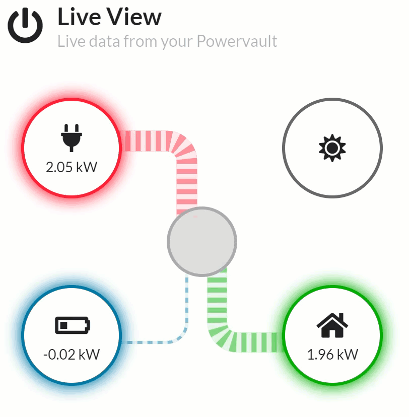
The width of the bar from/to the source is a measure of the quantity, the connector is also animated so you can easily see if power is flowing to or from the provider.