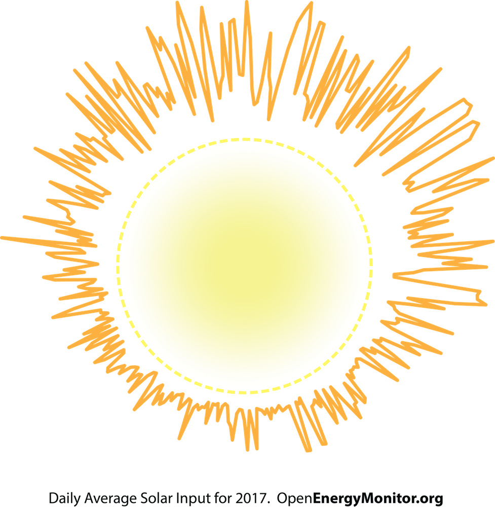
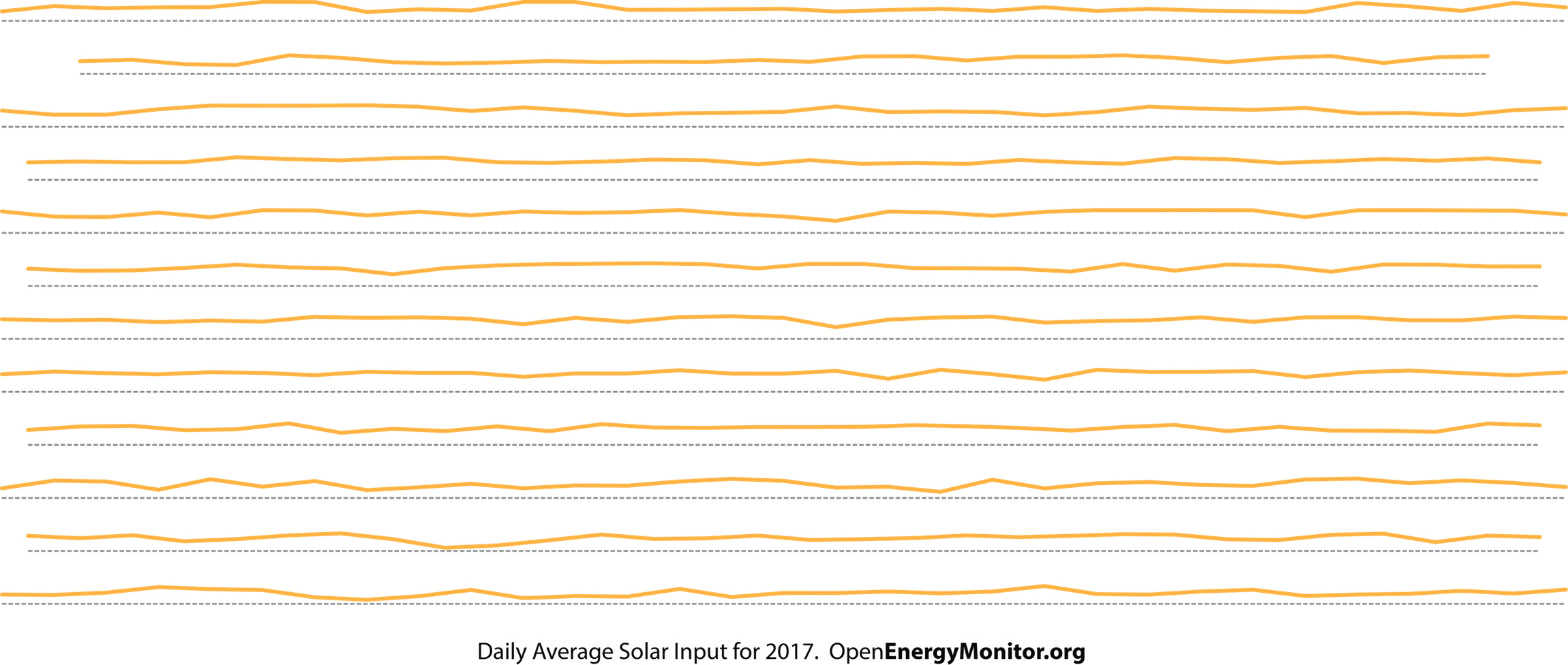
I’ve recently been playing with data visualisation. The first two images are made from solar PV generation data for 2017, the rest are other pieces of data from my usage. Below are a selection of my outputs.
I’ve thought of converting the information into audio/visual displays using Processing with plugins, given some of the outputs can be translated into sound waves. Not to mention for printing on mugs, teeshirts, coasters.
I’ll share some doco on the method soon. Currently I’m using mostly proprietary software that I need for other work because it’s convenient, however, open-source methods I’m sure can exist and might be something I look at in the future. Currently, if anyone would like a data graphic, send me a message.