Hi everyone,
I was wondering whether it is possible to incorporate histograms into custom dashboards? If it is then how have you achieved this? I tried creating a graph in the graph module and saving it while it was on the histogram style but it didn’t work.
Is there any way to incorporate the mean feed value that appears in the “show statistics” section of the graph module into a custom dashboard?
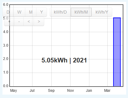
I am creating a dashboard for each of the houses that the mini district heating system I am monitoring supplies to. I have used the kWh period feature to include a daily, weekly, monthly and yearly use. The daily and weekly values work well. However, the monthly and yearly display as 0 kWh:

From how I have seen the weekly tool work it doesn’t appear as if it had to have been a week since I added that feature to the dashboard for it to work. Therefore, I am a bit puzzled by why the monthly and yearly are not displaying what has been used so far. Any idea on how to fix this?
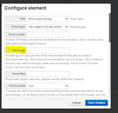
I would also like to use the data that has been recorded already but I don’t know how to use the “periods ago”. Has anyone used this before?
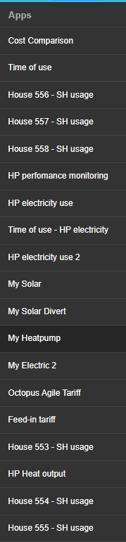
ps. Is there any way to organise the APPs manually on emoncms.org? At the moment they are all over the place and is hard to find the one I am looking for:
Thanks a lot in advance!
Rocio