in emoncms graphs, two recorded value points are connected by a direct line. this continuous visualization can be in some cases somewhat misleading, since it does not represent the real world measures between two points (i.e. temperatures) or because data is intrinsically discrete (i.e. device on / off)
Could be possible to have a discrete visualization where lines connect two points horizontally from the first point (along x asis) and vertically at the second point ?
I apologize if this has been already discussed in other topic I am not aware of.
not exactly.
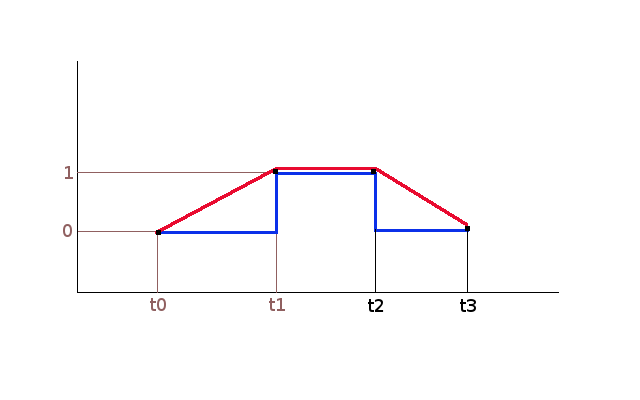
I would like to visualize data in emoncms graph using a line as the blue one in the picture below : my device is OFF (0) from t0 to t1 , then ON (1) from t1 to t2 and OFF (0) from t2 to t3 and the graph says exactly this.
Instead with the data visualization line in emoncms (red line) the graph does not represent real device behaviour : measurements do not increase from 0 to 1 in the t0-t1 interval
Do you have knowledge of any options to achieve this ?
thanks for your time
In the meantime I was thinking that there should be the possibility to display sampled data (and all data in emoncms is sampled) in emoncms graphs using a line along the X axis until next value change .
Think about temperatures : if I have two consecutive readings with values x1 and x2 the line connecting the two point should represent x1 on the Y axis until x2 happens and not “ghost” values in between.
Is there a way to change the current graph line drawing to achieve this ?
I succeeded in getting the right visualization of data that changes in large time span by creating “fake” data values (in my case I use nodered to resend the data value every few seconds until changes happen). Not ideal but it works.
BTW I think that emoncms should consider a different way to display data values that changes rarely in time.