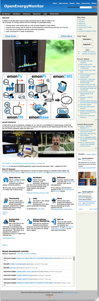
One of the issues of having multiple sites e.g. .org, Forum, Blog, Guide, Shop, Wiki etc is that a user might get a bit lost and might struggle to move between these sites. What we need is a consistent navigation scheme…
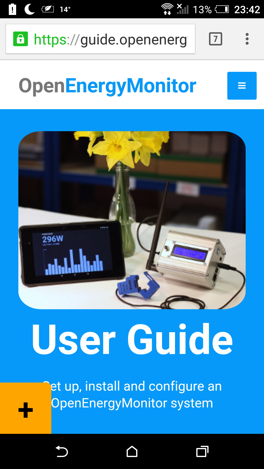
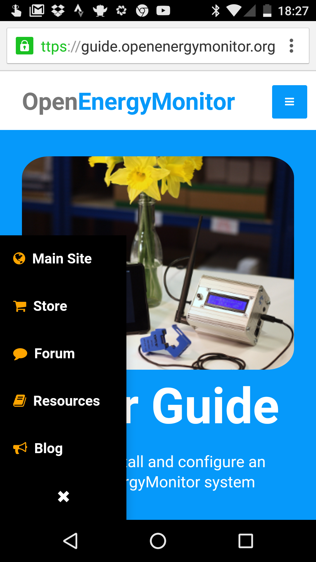
@Gwil has been testing such a scheme using a floating nav button which is live on the User Guide. Let us know what you think? If this works well (which I think it does) we could roll out the same consistent nav button across all our sites:
Seems to work on Windows 10 in touch mode as well.
Personally I’m not a fan of these but YMMV. One comment is that it has no way back to the guide (unless that depends on the site you are on but then it isn’t consistent across sites ).
Also resources does not end up where I’d expect to end up.
I still think the whole resources, tech wiki, github docs and the building blocks needs a thorough revamp and a single consistent ‘technical’ area is needed. The technical area of the guide is beginning to encroach and blur the boundary IMHO.
How does somebody who hasn’t seen this post know - without clicking it - what’s going to happen? And shouldn’t it pop up on mouseover? (OK, probably not for mobile.)
Just asking, that’s all. (I’m an arch-cynic out looking for problems!) Bottom-left corner isn’t exactly the acknowledged place for what is in effect the topmost layer of navigation in OEM. But I don’t know what the answer is. Once you know about it, I think it’s good.
Why does the ‘Cancel’ cross disappear completely when I mouse over it? Shouldn’t it turn blue like the rest. Or a blue cross on black if you want. The first time, I clicked it in hope rather than in expectation. Behaviour not what most would expect, I think.
Would I be right in thinking that you can’t use it on GitHub though?
Sorry to disagree @glyn.hudson , but aesthetically, it spoils the look of the new theme.
IMO, it’s cumbersome, obstructing the page - especially on mobiles, looks like a bolt-on afterthought, and doesn’t fall in line with the rest of the navigation links.
Couldn’t you have a item in the existing menu - ‘Site Links’, expanding to reveal links to the other sub-domains. This could be a common menu item across all sites for consistency.
Agreed (except the bit about mobiles - don’t have so can’t comment), but that’s all aesthetics. The principle is good - how it looks and where it is was the doubt that I had. If it were visually part of the navigation but fixed relative to the screen and not the page, is probably what I had in mind, but the concept hadn’t fully materialised.
As Glyn said[quote=“glyn.hudson, post:1, topic:430”]
What we need is a consistent navigation scheme…
[/quote]
Consistency is something sadly lacking around here, as Brian @borpin points out.
What is going to be the OEM starting point? If a new reader/user goes to openenergymonitor.org in the future what will they see?
I know there are multiple sites, but it would be good to tie it all together with one starting point via openenergymonitor.org and have as much consistency as possible between the sites. The starting point could be any one of the sites mentioned above.
Or it could be similar to the current openenergymonitor.org. It has a nice selection for each site: Forum (now Community), Blog, User Guide, Shop, etc. Maybe there should be a similar page with each sub-site sharing a spot. A Dashboard of OEM Sites!
I suspect very few visitors will actually start browsing by entering the url http://openenergymonitor.org/
I would think that most links would be made via the search engines, which will prioritise the highest rated links, so visitors may land anywhere within the sites, and not necessarily at it’s root domain.
I would agree. But at some point a new user will want to get their bearings and click on the home page or try and find their way to the top. A regular user should know where to click and just jump to one of the various sub-sites (sub domains).
Thanks for your feedback, we’ll keep thinking it thought. There is no ‘correct’ answer with regard to this. We could probably keep infinitely tweaking things, at some point we should probably get back to doing some real dev work!
Maybe this second nav button is complicating things, the jury is still out…this is just a trial.
I think a single technical area is impractical since it will not be possible to cater for all users. This was a common criticism of the old site is that there was no distinction between developer docs and developer chat and end-user docs.
I think we have made steps in the right direction creating a distinction between ‘user docs’ on the User Guide site (aimed at not confusion new users with overly technical info) and ‘developer’ docs (on github for software and wiki for hardware). I see the User Guide as a ‘one-stop-shop’ for a user who just wants to user the system as it is out the box to monitor XYZ without any particularly wild customisation or development.
Maybe! We are considering this option: a single landing page to act as a springboard for the various sites. Here’s a mockup@TrystanLea made.
Please keep in mind that this is a mockup and VERY experimental at this stage!
This isn’t the final iteration and it will change. I always planned on incorporating the navigation into the “hamburger” type menu and for it to be fixed to the top right of the screen while scrolling on touch devices (like on here, in fact). The current look is just a compromise.
@Gwil But we’ve already got a ‘hamburger’ menu top right on ‘touch devices’, are you suggesting two hamburgers top right, integrating the two, or replacing the existing?
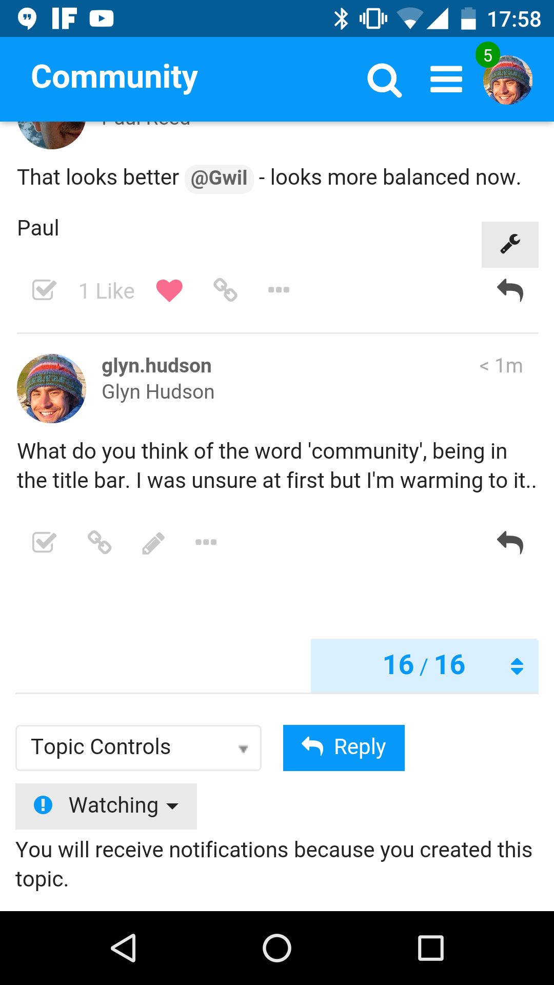
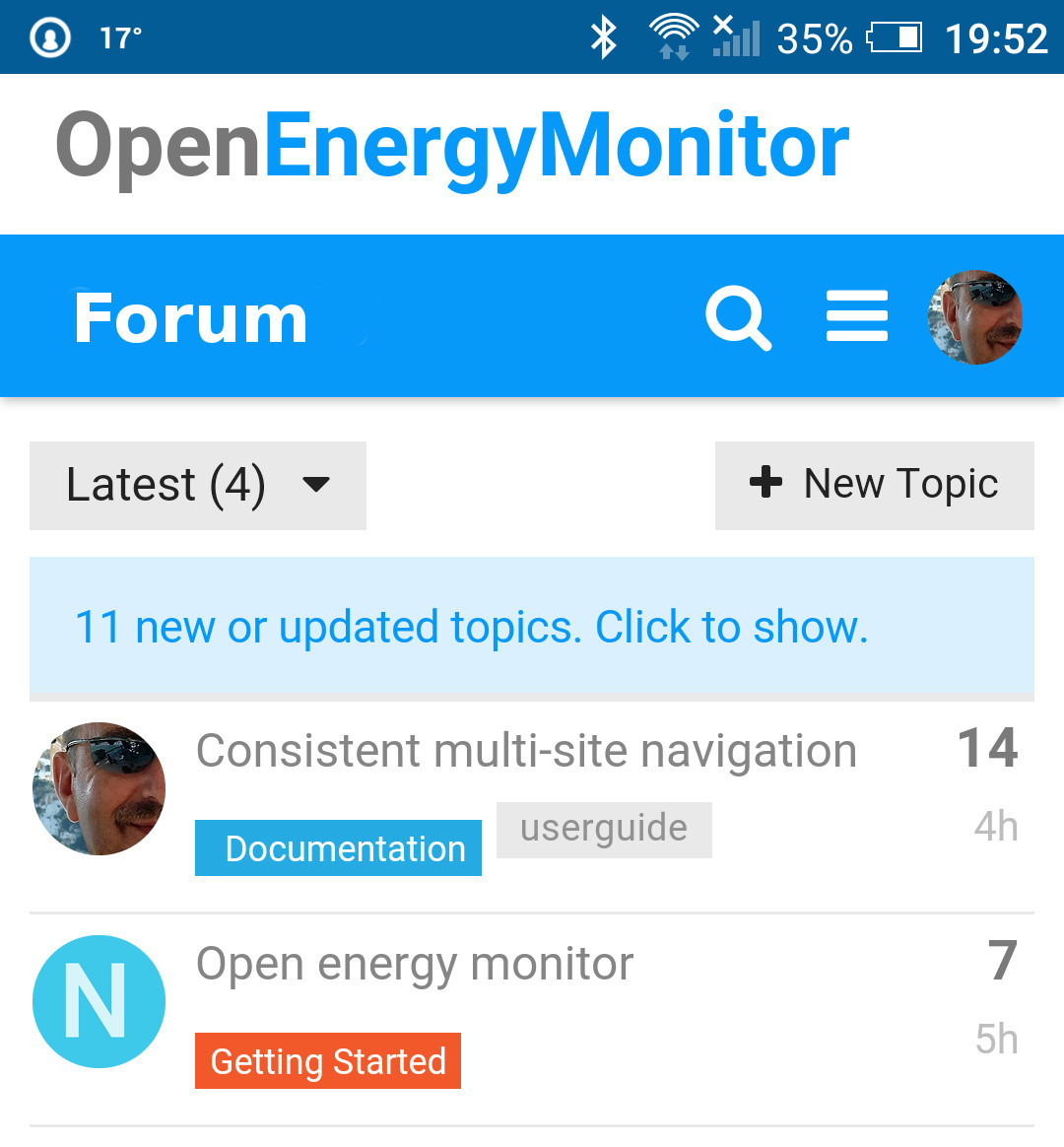
I’ve moved the site links to the top-right of the forum and also made some minor changes to the title and colour scheme. Let me know if you aren’t happy with these changes or if there are any problems.
Looks much better and works well, a couple of points
“Forum” would be better than “Community”.
There is currently no inter site navigation on mobile devices, would it be possible for the top righthand links (in full view) to collapse to a hamburger dropdown on mobile view?
The “Hamburger” menu you added seemed to work at normal speed. The one thing I remember is seeing two hamburger menus and wondering what kind of cunfusion factor that would be. But speed definitely wasn’t an issue for me.


 ).
).