There has been significant work by @emrys on further developing and polishing the sidebar implementation. It’s working very well know, I’ve been running for a while now and can’t find any issues. I’ve found navigation to be significantly improved on all size of devices with the new sidebar. It also solves the overflow issue in the old Setup menu when lots of modules are installed.
If anyone is able to test it would be very much appreciated. We’re aiming to merge into master in the next week or so.
To test Emoncms core and all installed modules need to be on the latest sidebar branch. See instructions in Emrys’s posts at the top of this thread or @borpin’s script.
Yes. We will ensure sidebar is merged into master on all module as the same time. On emonSD/emonPi/emonBase systems all the modules will be updated at the same time. Although emonSD users will by default be running Stable branch therefore they will not see any changes until we do an official release and merge into stable which will obviously not happen for a while.
We could provide a script (like yours above) to help self-installed users update. However, I think there is value in updating each module individually to check for any issues. Most users will only have a handful of modules installed out of the full list above.
That could be a problem as an update will pull master for some Modules as they do not have a stable branch` (IIRC). Will a module with these changes work with a stable master branch?
For anyone else who may have an issue, I needed to do a git reset --hard to cure things. I didn’t have any other changes so it was not an issue for me.
Nice work, I’m not sure why this was required by maybe some other changes had taken place. Running git status before pulling is often a good idea to see what’s going on.
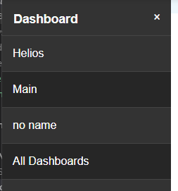
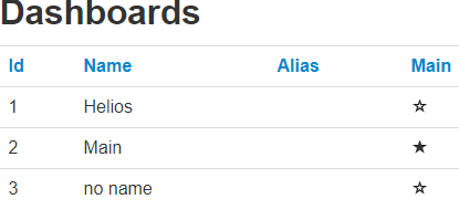
First issue, in Dashboards, if I select a dashboard, the ‘All Dashboards’ shows selected as well.
If I click on the dashboard icon at the top, I’d expect it to navigate to the ‘Main’ dashboard without a second click (my dashboard ‘main’ is also the ‘main’ dashboard. Perhaps it should be renamed ‘Default’ on all dashboards view.
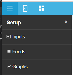
I know traditionally it was called Setup but I am thinking perhaps the data handling items should be divorced from the system management. There was a degree of distinction before.
So Inputs, Feeds, Graphs & Visualisation (for what I have) in Data Management and the rest in a System menu?
My Account is possibly the least frequently used menu item yet it is available in 3 separate positions .
Does look good though and seems to work for me (on my DietPi setup).
Your right, Setup has now evolved. How about renaming “Setup” to “Menu” or “Emoncms”? It’s useful to have something there as a placeholder for the ‘X’ icon which is useful on mobile devices to close the menu.
My preference would be to keep everything in one menu for the moment since adding more levels of menu will increase the number of clicks required. This is defiantly something to be considered though, maybe a “system” menu could be added which would contain “admin”, “Backup”, “account” “find” “Wifi” etc
Good point! We’re aware of this, we want to eventually remove it from menu but figured we would do one step at a time. I think clicking the user profile is a good place for account (same as this Discouse forum). Maybe we could make the pop out tray at the button of the sidebar the location for the “System/Setup” menu as we discussed above to hide some of the more admin like menu items.
Thanks, this has been a large amount of work for @emrys
I’d suggest an extra icon along the top. You have already split out from a hierarchical hamburger menu by adding Dashboards and Apps, so you currently have a mixed UI already. Therefore adding a fourth icon in would seem the logical extension.
In many ways you have already added the number of clicks required.
I’ve just become aware of this thread, when it was mentioned in the Graph Multi Axis thread. It’s rather long to read the whole thread before responding, so I haven’t and please accept my apologies if I’m duplicating anything.
First point, it’s suggested that I can try this beta by checking out beta-software onto my production emoncms system. Loading beta software onto a production system is not generally considered good practice and isn’t something I would generally do without a very good reason. It’s also a fair amount of hassle. Is the beta software available in a test installation on the web somewhere instead? That way I could just click on a link and try it.
Second, I’m not a big fan of sidebar menus, since they consume screen real-estate. I’ve come to accept the sidebar feed list in the graph module. What I normally do is keep the window width at 1023 so the feed list is hidden and the graph is as large as possible for the space allocated. I only need the feed list when I am setting up the graph initially. Reducing the cutoff width to 870 is a big backward step IMHO - can that width be made configurable? (on the admin page?). Ditto with the main menu. It’s a waste of space unless I’m actually using it - that’s why menus are popups! My typical use is to middle-click to open the new view in a new tab.
Third, the feed list shown in the first post seems to be missing various columns from the current feed list. How does the revised UI work? Same goes for inputs etc.
You can check it out into any system you like. I run several VMs so I can do it in there. In practice (as I am not really that bothered about the historical data) I just used my main system. It is only cosmetic changes and I use master branch normally.
Click it again and it goes completely.
Are you running the beta features? Go to your account page and click on beta.
Use at your own risk - a script to checkout the sidebar branches but by changing the BRANCH you can go back to master branches (not all repos have a stable branch).
 .
.